Features of gold color
Warm golden walls are associated with movement and activity. Here it is important to correctly combine bright wallpaper with curtains. Also, the color gold is always associated with the luxury and elegance of palace halls. If there is an excess of gold, the interior may lose the atmosphere of sophistication, so you need to combine wallpaper with neutral curtains and upholstery.
Most often, gold walls can be found in classical interiors (Baroque, Rococo), but gold-colored wallpaper is also used to decorate rooms in a modern style.
Features of using gold wallpaper
Since ancient times, the color of the precious metal has symbolized prosperity, wealth, and luxury. In order for the decoration to make the interior attractive and emphasize the refined taste of the home owner, it is important to adhere to several rules:
- The most important condition when creating an interior is compliance with the measures. Gold belongs to a warm color scheme, therefore it leads to a visual reduction in space. An excess of finishing in golden shades is difficult for our eyes to perceive, especially in the presence of glare from the sun or electric lighting. Experts recommend combining it with other tones in a ratio of 1:3.
- If you know that your own sense of style may let you down, it is better to entrust the creation of a gold-colored interior to professional designers. It is important to make one large or several small accents. So, if golden wallpaper is applied throughout the room, then most of the additional accessories are selected in calmer colors.
- Strict adherence to one style direction. If the canvases on the walls are decorated with classic monograms or are full of patterns, oriental pillows or Art Nouveau lamps will look out of place.
- Playing with different shades of gold. Muted tones with signs of antiquity are suitable for the classical direction, bright and shiny - for the modern style.
Gold-colored wallpaper will never look tasteless if used correctly in the interior.
Types of wallpaper and their properties
There are the following types of gold wallpaper for finishing residential premises:
| Paper | Eco-friendly, breathable, and available in a wide selection. They fade quickly, absorb odors, and do not hide uneven walls. There are single-layer and double-layer with embossing and relief. Suitable for living room, bedroom and nursery. |
| Non-woven | They allow air to pass through, have a dense base, can hide wall defects, and are widely represented on the finishing materials market. Suitable for all rooms except kitchen and bathroom. |
| Vinyl | Due to the durable PVC layer, they can imitate stone and wood. Resistant to moisture and sunlight. They come on paper or non-woven base. Poor breathability and some types of foam vinyl may contain chemical additives. Suitable for kitchens, bathrooms and hallways. |
| Liquid | They hide all the unevenness of the walls, do not have harmful impurities, and consist of threads, cellulose, glitter and dry glue. There are smooth and embossed. They are applied like plaster and allow air to pass through. |
| For painting | There are vinyl, non-woven and paper. They are a white canvas with prints, patterns or bas-reliefs. Such wallpaper can be repainted several times without harming the walls. |
| Textile | They have a paper or non-woven base with a top covering of fabric fibers. Among the minuses, it is necessary to note the difficulty of cleaning from dust and the soiling of the material. |
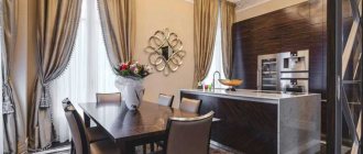
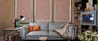
The photo shows an example of a living room design with textile wallpaper that creates a glowing effect from any angle.
Design and texture
The texture of gold wallpaper depends on its type and the degree of expression of the pattern. Plain wallpaper acts as a background for furniture and looks good with textured curtains, molding and edging.
Wallpaper with patterns can visually change the perception of space. For example, vertical stripes lengthen a low room, while horizontal stripes make it wider.
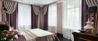
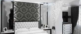
The photo shows a classic-style bedroom, where decorative gold stripes visually lift the ceiling.
Geometric motifs are suitable for art deco and high-tech styles. It is important that the curtains are plain and do not repeat the wallpaper pattern.
Floral patterns are preferable for a bedroom with a light and romantic atmosphere.
The photo shows an example of a golden floral pattern on the wallpaper in the dining room. This wall decoration makes the room luxurious.
Patterns and monograms on gold wallpaper will decorate a living room or bedroom in a classic style. The pattern can be a contrasting color or a similar shade.
A unique accent can be created using 3D wallpaper in the nursery, kitchen or bedroom. It is important that the wall to be pasted is level, there are no shelves or sconces on it. Backdrop wallpaper can be thematic, or simply create a volume effect.
The photo shows an example of how a simple interior can look unique thanks to a 3D image on the wall.
Types of curtains
The overall atmosphere and style of the room depend on well-chosen curtains. Therefore, you need to choose not only their style, but the length and method of mounting on the wall. Now there are no problems with this. In stores you can buy ready-made ones or order them in custom sizes. Having selected a fabric with the necessary light transmittance, a cornice or mechanisms.
Roman
It is distinguished by a high degree of practicality in window design. And combined with a golden color or pattern, this type of curtain can become a highlight of the interior design. They do not burden the space and fit into any style, even the most elaborate. In addition, they shade well and do not block the penetration of sunlight during the day.
Golden Roman blinds look original in a bright room with a lot of light. And you can dilute their solemnity with turquoise, various shades of brown, gray or white. Their introduction can be in the form of stripes on fabric, geometric shapes, and floral patterns.
Rolled
Usually used as a supplement. But today their variety on the market is impressive and in some styles they are used as independent window textiles. They are lightweight, easy to use and provide good protection from prying eyes from the street. If you want something special, then you should opt for gold roller blinds.
The fabric can be dense, which shades well, or more loose. Decorated with embroidery, interesting patterns, scallops or tassels. And the rich palette makes it possible to please even the most whimsical person. For example, for classics, an aged golden shade or tones close to bronze are suitable.
Thanks to a wide selection of fabrics and colors, they can be combined with any style, but look best in minimalism, art deco and shabby chic. With them you can avoid heavy curtains, leaving light tulle.
Blinds
This option provides good protection from the sun. But usually they are not taken into account, since the first association is with the horizontal golden type. But they can also be vertical and wooden, reminiscent of shutters. If in the first option the variety of colors is poor (white, black, brown and bamboo), then with the rest everything is more interesting.
Vertical golden blinds are usually used to decorate office spaces. For example, golden color against the background of dark walls and furniture looks contrasting. Visually, it lifts the mood and gives warmth.
But wooden ones can be painted any shade. Thus, the golden color fits organically into the interior of a bedroom, living room or bay window, and they also shade well. And an unusual tone transforms the space, visually enlarging it.
Classic long curtains
In the last few years, curtains have been used that are 10-20 cm longer than required, that is, their lower part lies on the floor. But for gold curtains, the ideal length is up to the middle of the baseboard. Thanks to their rich color, they visually raise the ceilings and expand the room.
They also do not necessarily require a pattern; you can add zest by using double-sided dense fabric. On the front side it is golden, and on the other side it is contrasting burgundy, blue, black, light blue. It all depends on the general background of the room.
Short curtains
Despite their presentable appearance, short golden curtains are not recommended for use, especially on large windows. Since when using them there is one rule - part of the window should not remain open. But here everything is purely individual, much depends on its very form.
If you still want to choose just this option, then you need to compensate for the length with edging in the form of fringe or lace. Choose a fabric that is not plain, but with a light, unobtrusive pattern. Additionally, use wooden blinds or shutters, translucent tulle. This option is often practiced in creating a rustic and Provence style.
French
They have been known for a very long time, as they were actively used in the classical Empire style. They are made of light translucent, often plain fabric, gathered into scallops. Therefore, they can decorate the window themselves, as they look voluminous and luxurious.
If you do not complement them with long curtains, then you can give preference to pale or, on the contrary, bright shades of gold with a nondescript floral pattern or monograms. This composition looks self-sufficient and attracts the attention of guests. Looks best on large and wide windows.
If you add curtains to the floor, then it is better to stick to calm tones, and choose the second curtains to match the color of the general background of the room.
Window with lambrequin
A golden lambrequin will visually add solemnity to the room and help hide an unsightly cornice. Nowadays it is used less and less or only in large rooms. Because it is in them that such jewelry looks most advantageous. It comes in any size, length, but must be supplemented with decorative elements.
Pairs well with white and beige light tulle. With cool shades: blue, olive, burgundy, graphite, brown. Among pastel colors, it is interesting in combination with peach and lilac. But it is important not to overload the space, using no more than 2-3 colors in the interior.
Which style to choose?
When choosing wallpaper, it is important to maintain unity of style in the design of walls, curtains and furniture.
- The classic style is recognizable by its characteristic print: white monograms and ornaments on a gold background, or gold patterns on a dark background. The size of the patterns depends on the dimensions of the room. Plain wallpaper will be decorated with embossed borders, moldings and decorative items.
The photo shows an interior where gold wallpaper is decorated with moldings. This way you can decorate not only the bedroom.
- Modern style is distinguished by restraint and practicality, so here you can see plain wallpaper with gold accents, geometric patterns and straight lines.
- The loft style is characterized by created negligence, monochromatic walls and decorative items made from scrap materials.
- Art Deco is characterized by luxury, an abundance of gold, glass and geometric patterns. This style is suitable for a spacious living room or kitchen, since there should be a lot of decorative interior items.
Tips for choosing curtains
Properly selected curtains, which are combined with wallpaper, furniture and other textiles, create an overall complete picture of the interior.
There are several options for selecting curtains, for example:
- curtains can be matched to the color of the walls, but with a difference of several tones;
- plain curtains of a contrasting color are suitable: white, black, blue, red, or with a gold pattern;
- curtains can match the color of the carpet, upholstery or bedspread;
- the pattern should be either on the wallpaper or on the curtains. You can also match the pattern of the curtains to the pattern on the wallpaper to achieve a unifying effect.
Color harmony
When choosing golden curtains, you should focus on the color of the wallpaper, furniture and textiles. Such curtains are very bright and can overload the space. Curtains of such a rich shade go well with pastel colors; they visually mute their pomp.
Dark shades of brown and chocolate on the floor, walls and furniture can, on the contrary, emphasize the window opening. This looks especially advantageous when the windows do not face the sunny side. In this case, cool shades (turquoise, green, blue, indigo or gray) are also often used. It is suitable for kitchen or living room.
For the bedroom it is better to use gold curtains in combination with beige, red, white, blue and olive. They calm, give peace and set you up for sleep. Naturally, these are basic recommendations, everything is very subjective.
Combination options
The versatility of gold allows it to be combined with other colors. Additional color can be presented in different proportions and forms, for example, it can be a contrasting accent wall, a pattern, or the effect of color transition from floor to ceiling.
Gold goes well with white and beige colors, all shades of brown. This combination is typical for classics.
Red and gold colors look noble in the interior, and burgundy furniture with gold patterns will emphasize the triumph of the room.
The combination of gold with cool colors of turquoise, lilac and greenery is suitable for sunny bedrooms.
The photo shows an example of an interior where wide stripes of lilac and gold visually cool a well-lit room.
A blue living room or bedroom with gold ornaments will emphasize the nobility and tranquility of the home.
Deep shades of blue and purple combined with gold are suitable for a spacious living or dining room.
For gold color, gray acts as a good background in any shade. Suitable for a bright bedroom or kitchen.
You need to be careful when combining gold with yellow, black and silver, since yellow is very similar to gold, silver does not go well with gold, and black, if there is a lack of lighting and space, can create melancholy.
The photo shows an example of a successful color combination, where black is the highlighting touch of the entire interior.
How to choose
Gold-colored wallpaper in the interior is suitable for those who strive for luxury, palace aesthetics, and an atmosphere of warmth and comfort. To create a stylish design that demonstrates the good taste of the home owners, you must follow several rules.
Gold and red look solemn and pompous
The most important thing is a sense of proportion; gold should not overwhelm the rest of the finishing elements; it is better if the proportion is 1 to 3. It is also necessary to clearly check the style; here you should carefully select the shade, pattern and texture of the wallpaper. And finally, the unity of interior design, which requires that all decorative elements must harmoniously resonate with each other.
And vice versa, burgundy canvas with gold looks restrained and noble
Of course, the interior of a room with golden wallpaper can be made in an eclectic style, but such a design solution is difficult to implement on your own; it is better to turn to professionals. But if you feel that you are up to this task, before you buy wallpaper, look through the catalogs, there you will find many interesting ideas for combining canvases. Gold-effect wallpaper in the interior should be selected very carefully; it can look completely different in rooms with different functionalities.
Textile wallpaper, gold and black, a clearly thought-out shade of the ornament refreshes the interior
Bedroom
In the bedroom, gold wallpaper will serve as an excellent basis for creating art deco, baroque, rococo, and oriental style. For light and light interiors, you should choose a canvas with a light background: white, beige, pastel colors with a gold pattern, complement them with textiles to match the main colors and furniture, its color is best matched to the design style.
Gold wallpaper in the bedroom, photo of color combinations, light background lightens the interior
For example, white wallpaper with a gold pattern looks good in combination with a white bedroom set and gold curtains, bedspreads, and decorative pillows. And beige-gold wallpaper goes perfectly with dark furniture.
For creating boudoirs, burgundy wallpaper with a gold pattern is ideal; in addition to burgundy, the background can be blue or even black.
Blue and gold wallpaper goes well with monochrome furniture and textiles
This design is successful in large rooms; for small bedrooms, light or monochrome finishes are more suitable.
Muted colors create an atmosphere of peace and tranquility
Living room
In the living room, most often they try to create a classic interior or in the Art Nouveau style. Here, golden wallpaper helps create an atmosphere of aristocracy, luxury and presentability. As a rule, they make one accent wall with an ornament on a colored background, and the remaining walls are covered with plain or textured canvas.
An accent wall with gold decor will decorate the interior
If the walls are decorated with a monochrome fabric, then dark furniture is very appropriate in such an interior: modern from innovative materials, wooden in a classic design or with upholstery to match the finish.
Diamonds on gold wallpaper are balanced by smooth lines of furniture
For a hall covered with colored wallpaper with gold decor, the furnishings will have to be selected more carefully.
Colored wallpaper with gold should be balanced with laconic-shaped furniture with plain upholstery
Other options
Of course, gold wallpaper is used to decorate kitchens, hallways and bathrooms. There is one rule here: since these are small rooms, the wallpaper should not be dark, preferably without a colored background, but an ornament to match the main gold color.
In small spaces, gold wallpaper is best combined with pastel-colored furniture
Most often, monochrome textured canvases are used in these rooms and complemented with contrasting decor and furniture.
An ornament to match the wallpaper will decorate the room, and plain, simple furniture will emphasize the nobility of the interior.
It is also important for kitchens, bathrooms and hallways to buy washable vinyl wallpaper so that they are easy to care for.
Combination with furniture, floor and ceiling
Depending on the saturation of the wallpaper, different colors of furniture will be suitable. You need to follow the rule: the darker the walls, the lighter the furniture, and vice versa.
- For gold wallpaper with brown patterns, furniture that matches the pattern is suitable.
- Light furniture will suit dark gold walls.
- The ceiling and floor should be the same color, or it could be a dark laminate and a white ceiling.
- There is no need to make the walls and ceiling the same color in a small room.
How to choose interesting curtains to match yellow
So, when choosing the right colors, all that’s left is to make the right decision and buy curtains that are on trend. Striped canvases look trendy with sunny walls. They can be made in the same range or be multi-colored. Both horizontal and vertical stripes will work. It all depends on what effect you should expect from the curtains. If you need to raise the ceilings, it is recommended to opt for vertical lines. Horizontal stripes, on the contrary, will help to slightly expand the room itself.
Abstractions are in great demand today. They are perfect for an interior with yellow wallpaper in Art Deco or Art Nouveau style. Using abstract drawings, you can visually change the geometric proportions of a room or hide sharp corners.
Floral prints are always welcome in yellow rooms. They help highlight the natural essence of color. These curtains are ideal for a country style room.
Geometry will decorate a bright children's room. Geometric black and white patterns on curtains also go well with a yellow living room or office. Blue or green figures on fabric will look great in the bedroom or dining room.
Curtains with large patterns should absolutely not be used in small rooms. In turn, small patterns will be lost in a spacious room.
You should be careful with decorations for curtains under yellow wallpaper. It is better not to get carried away with silver and gold products. The ideal option would be wood or its imitation.
See a few more photos of curtains and curtains for yellow wallpaper and walls in the interior of different rooms:
Save
Save
Wallpaper in the interior of rooms
It is important not to overload the room with gold if it is not intended to do so.
- For a spacious living room, a combination of gold wallpaper with red velvet, neutral beige and white will be suitable, which will become the basis. Candlesticks, gold fittings, and carved furniture would be appropriate in a classic interior. Modern design welcomes clear lines, simplicity of furniture and its functionality.
The photo shows an example where golden walls are the background for the furniture and textiles of the living room.
- Vinyl or 3D wallpaper in the dining area are suitable for the kitchen. If the kitchen is small, then you can combine white with gold.
- Pastel colors of blue, green with light gold ornaments or an accent wall made of textile wallpaper are suitable for the bedroom.
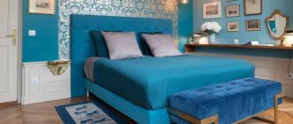
The photo shows an example of a bedroom in light colors with blue accents, where the wallpaper is decorated with a gold print.
- The children's bedroom will be decorated with walls with gold stars. It is best to choose paper wallpaper that will not harm the baby.
The photo shows an example of a children's room, where white wallpaper with a gold pattern was used to decorate the wall in the recreation area.
- For the hallway and corridor, plain vinyl wallpaper is suitable, which can be wiped with a damp sponge to remove street dust. The hallway sets the tone and creates the first impression of the owners, so it is important to think through the style so that it is not overloaded with decor.
The gold color is suitable for the interior of any room, provided that there is a balance between the colors. It comes in different shades, so everyone will find their own option.
Indoor color combinations
Since golden curtains in the interior come in a variety of color intensities, fabric textures, with and without ornaments, you need to know what and how to combine them with. What is better not to use? They are easier to perceive in combination with other rich colors. Can be used in edging, patterning, tiebacks and lambrequins, with tulle or using the gradient technique.
White and gold
This combination is considered a classic design solution. White calms the solemnity of gold. Therefore, when using it, it is necessary to additionally hang white light tulle. The presence of faded, not clearly expressed ornaments is allowed; too bright, eye-catching ones will be superfluous.
To avoid making a mistake, you can apply the three-color rule. One of the successful options is white, gold and brown, possibly beige. They complement each other. For example, bright curtains with a lambrequin can be emphasized with light, white or milky walls and floors. Wooden furniture and linen upholstery will add contrast. Pillows, carpet and decorations should be chosen in pastel colors with small floral patterns.
Blue
This option is known as the Baroque style. It is characterized by a combination of blue and gold, a voluminous flowing canopy over the bed, blue curtains to gold wallpaper, furniture and large folds. As a result, the combination creates a moderate warm effect in the room. The palette is suitable for a bedroom or kitchen. But if executed well, it can become a decoration for a living room or hall. The game of contrast is important here.
Turquoise or blue color
Curtains in cool shades harmonize with a golden background and vice versa. But this technique is successful for medium and large sized rooms. This range creates dynamics, refreshes and balances the interior. But smooth transitions are required here. To do this, you can use plain golden walls with blue curtains, decorated with abstractions and monograms. Or, on the contrary, wallpaper with a pattern combined with monotonous double curtains and light tulle made of organza and silk.
Brown and gold
This combination is often found in the office and living room. Usually this is dark brown furniture and gold textiles diluted with beige. The floor is dark or, conversely, light in contrast to the color of the walls. The second option, on the contrary, is heavy, dense curtains of a brown shade, coffee with milk or cocoa. Moreover, one fabric should repeat the pattern of one of the surfaces in the room.
With a successful selection of shades, you can adequately decorate a kitchen or nursery in this style. At the same time, diluting the relatively strict style with bright decorations or paintings.
Red and gold
A room decorated in this color scheme is distinguished by the solemnity characteristic of the era of kings, balls and feasts. The walls are usually plain red, decorated with baguettes and columns, but the ceiling and curtains are golden. The furniture and floor are strictly dark or light, without contrasting accents.
Gray-gold
Gray is considered a basic color; it combines well in any design. Recently, a rich graphite shade has been used. Against such a background, a pattern with gold, bright decorations, and lighting look good. For example, gray curtains combined with light transparent tulle and slightly visible gold threads will sparkle with special colors. Especially if the windows face the sunny side. You can complement the interior with bright yellow textiles and fresh flowers.
Beige
If, on the contrary, you want to emphasize and focus attention on gold, then beige is a good background for this. It is calming, neutral and creates a basis for flights of fancy. But if the walls are already bright, then you need to use beige curtains and furniture in calm tones.
Black and gold
This combination is appropriate only in a large room, and in this way you can emphasize its size. But in a small one, the palette will add gloominess. Even if there is an abundance of light, there will be a feeling of its lack. But if you still want to use these two colors, then you need to play with contrast. Golden walls, pastel floor colors and black curtains, dark furniture.
Greens
A varied palette makes it possible to use green in any room. Olive is beautiful in bedrooms and children's rooms, bottled is interesting in the hallway and living room, light green in the kitchen. But here it is necessary to dilute it with a light or dark color. Then the interior will look luxurious, soft, balanced.