Which shade of green should you choose?
Color appears when yellow and blue are mixed, and its shades differ in the saturation of one or the other tone. At the same time, black is added to dark ones, and white is added to light ones.
Recently, rich, deep tones have gained great popularity:
- malachite;
- emerald;
- needles;
- turquoise;
- nephritis.
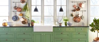
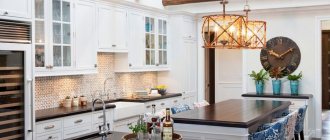
The photo shows a stylish spacious kitchen
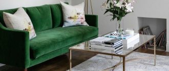
Armchairs, sofas, poufs, headboards and other soft elements in dark velor upholstery look noble and elegant. Deep shades of green in the interior look no less impressive on visually smooth matte surfaces. You can't go wrong with contrasting white.
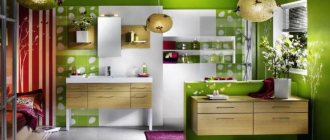
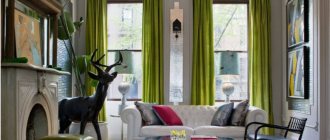
Light colors give a feeling of freshness, cheerfulness, and fun. Unsaturated olive, mint, pistachio, and lime are even used on the walls, but a bright green room will look too much—poisonous tones are only allowed in details.
The photo shows a yellow-green combination
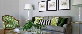
A separate group includes gray-green shades: asparagus, marsh, camouflage. Complex green tones are appropriate in any interior: from classic to modern. Walls, large furniture, and textiles look good in these neutral shades.
The photo shows an example of combining different tones
The influence of green color on humans
Green color symbolizes nature and peace. Therefore, it has a calming effect on the human psyche. It is associated with nature and relaxation, so it has a relaxing effect on people. It is for this reason that green can often be found on the walls of hospitals and schools.
Many doctors and paramedics also wear green uniforms, which are intended to inspire confidence and reassure patients.
The best combinations of green with other colors
In fact, what color goes with green in the interior depends on the shade of green. Let's look at the main tandems.
Interior in gray-green color
Gray is universal in itself, so it will suit any occasion, no matter what green shades of the room you choose.
A win-win rule is to combine dark with dark. Wet asphalt or graphite with emerald. And for light mint or salad, on the contrary, choose Gainsborough or platinum.
Typically, grayish walls act as a backdrop for bright greenish furniture.
The photo shows accents in a gray room
Blue-green interior
The green color in the interior in combination with blue becomes colder, keep this in mind when decorating the room. A room designed in these shades does not tire or irritate; on the contrary, it promotes relaxation and gives the eyes a rest.
Advice! Use blue-green colors in the kitchen if you set yourself the goal of losing weight or maintaining weight. This palette reduces appetite.
In the bedroom and children's room, blue in combination with pale green promotes quick sleep and quality rest.
The photo shows bright blue details in the living room
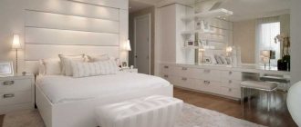
White-green color
Universal white is suitable for shades of any saturation: pure. dusty and dirty, light and dark. But it looks best in contrast with a bright or deep color.
White, like gray, becomes the background - decorate the walls and large details with it, and add accents with green furniture and accessories.
The photo shows an accent wall in the bedroom
Green with brown tones
It is difficult to find a more natural combination of green with other colors than this. Look at any tree or plant and you will see how the shades harmonize perfectly with each other.
The best duet is formed when using a complex undertone: olive, emerald, malachite, asparagus. Brown, however, is better to take dark: chocolate, coffee. But even with light beige the combination will turn out to be interesting.
The photo shows soft green kitchen facades
Black and green interior
Dramatic black enhances any other, an effect known to any artist. So if you want maximum contrast, use it as a background.
The combination with green looks exotic, reminiscent of the jungle, and repeats the colors of some reptiles. Looks great with both bright lime and grayish viridan.
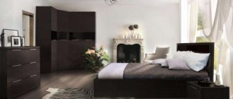
The photo shows a black bed and curtains in the bedroom
Examples with bright accents
The duet of green with other shades is dictated by the color wheel:
- The analogue combination of similar green and yellow in the interior looks bright, summer-like, reminiscent of juicy ripe fruits, and breathes of revived nature. Will fit perfectly into the design of a veranda or country house or cottage.
The photo shows a bright unusual combination of shades
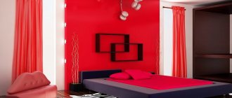
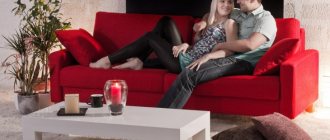
- The contrasting duet with red is energetic, invigorating, lively. If you don’t want the interior to be oppressive, use scarlet in limited quantities, it should not be enough. At the same time, do not forget that the darker the green, the deeper the red should be.
- Tandem with purple can also be called complementary. A combination with yellow-green shades - citrus, chartreuse, lime, pear - will look more harmonious.
Shades of green: names and photos
Designers are constantly trying different combinations, studying the properties of different shades of green. But which of them can you use yourself without risking ruining the entire project? Shades of green in the interior can give it freshness and dynamics, but at the same time they can bring calm and tranquility.
When preparing this article, materials were used from the sites: www.domino.com, www.mydomaine.com, www.bhg.com.
Add to bookmarks
How does it look in different styles?
In the last few years, green has won the hearts of many people and has found its way into many interiors.
- Scandinavian. Noble shades of precious stones are used. Combined with white or light gray walls, as well as furniture and flooring in a natural wood shade, the result is a trendy design.
- Loft. A muted color like kale pairs perfectly with orange brickwork, which is why it is often used for furniture in industrial apartments.
The photo shows an example of classic American style
- Classical. Adherents of the classics prefer non-contrasting combinations of warm beige and light green. Used for curtains, furniture upholstery, textiles.
- Modern. Exceptionally complex undertones, usually deepening into sea blue, matte textures. The walls, kitchen fronts, and headboards look trendy.
Green in the interior: how it affects well-being
A wedding in a hurricane is my greenest experience.
We had an on-site registration in nature, at some point the wind rose and it began to hail and rain. And the balloons flew through the forest very happily. It turns out that green can dominate at home too. Elena Gorodilova Florist
Who doesn't love the first spring grass and summer coastal palms? It’s difficult to stop time, but it’s so easy to extend this joy for yourself 24/7!
Just get yourself a green pet. No, not a crocodile! Home plant! I have flowers in every room: the most unpretentious orchids and succulents. They even live in the bathroom. Try it too!
Color affects our perception of time, length and weight. So, in a room with green walls, time passes faster, length decreases, and weight increases.
Non-flowering plants will bring the breath of nature into the house: palm trees, monsteras, large ficuses of various types, indoor trees: these friends were super relevant in the 70s and 80s.
Green fans are pedantic and kind: they are good citizens, responsible parents, reliable neighbors. Opponents of green are solitary people; they do not like to think and act like everyone else.
Cacti, succulents, ficus, “mother-in-law’s tongue” will decorate houses that are too spacious and bright.
Analogy with plants: green is associated with growth, renewal, fertility. The more home flowers, the newer the house looks
For mini-gardens, the design of the apartment is not as important as the responsibility of the owner. Basil, mint, rosemary, parsley, thyme - edible herbs can be placed on the windowsill, kitchen work surface or rolling shelf - convenient to transport from the kitchen to the living room and back.
By the way, there are even basil farms inside a kitchen cabinet drawer. Manufacturers of such kitchens took care of light, ventilation and water supply.
Green is healing and essential for human survival as green plants are mostly edible.
Not everyone knows that you can create a real lawn in your apartment, and a vertical one at that. The so-called phytowall. It fills the room with oxygen, enriches the house with moisture, gives a feeling of comfort and excellent sound insulation.
There is no need to go to the village for a beautiful photo if there is a photo wall in the house.
Green space will improve the interior, prevent the owner from becoming lazy and give him several years of life. Arrowroot, with its spectacularly colored leaves, absorbs negative energy and belongs where conversations are taking place - in the living room or office. Peperomia will protect against colds and ARVI, and with dracaena, wounds on the skin of your household will heal three times faster. And if the apartment has linoleum, get a shade-tolerant scindapsus (“golden lotus”), which will clean the air from benzene emitted by the floor covering.
Green is the color not only of peace, but also of money! If you want to succeed, use different shades of green in the same room.
Do you want to know how your favorite colors affect your comfort and mood? Read:
Rules for combining white and green tones
Green color, despite its lightness and softness, does not like excesses.
Decorating a kitchen requires proper prioritization. A room overloaded with the chosen color can turn even the most attractive shade into an aggressive one, which will put pressure on the eyes and act depressingly.
The popular combination of white and green will not give even a novice in design a chance to make mistakes. Whiteness is associated with purity and perfection, which is important when used in the kitchen, where sterility is not only the key to comfort, but also safe food for family members.
On a white background, any green color looks organic and impressive, evoking feelings of peace, calm and stability.
The main rule in this combination is that the richer the shade of the main tone, the more white is used.
The variability of using white in combination with green in the kitchen space is almost limitless.
White kitchen with green wallpaper
Green wallpaper will add cheerfulness, festive mood and summer notes to a snow-white kitchen.
A harmonious mix of white and green will make the room look more spacious.
The more white there is in furniture and decor, the brighter the shade of green should be on the wallpaper.
You can complement the interior with blue, pink and yellow details. The white tone will soften other colors, and the kitchen will look noble and elegant.
White kitchen with green apron
This combination is a vibrant mix of fashion trends and classic elegance.
The greenery of ceramic tiles looks aesthetically pleasing against the background of snow-white furniture facades.
An excellent alternative to ceramics is skinali with all shades of green.
The bright inclusion of a rich color scheme will dilute the monochrome of the interior and make it play with beautiful highlights.
Floral photo printing on a glass apron depicting green grass, juicy apples or delicate daisies will add freshness to the white kitchen.
White kitchen with green countertops
The light color of the kitchen lightens the room and visually enlarges it, but monochrome looks unattractive. An original accent for white facades can be a work surface made of dark shades of green. On such a countertop, stains and knife marks will be less noticeable.
Due to the variety of materials, the green surface can be diluted with various textures: gradient, stains, marble chips. The play of contrasts in the combination of snowy white and dark green allows the room to look stylish.
White kitchen and green curtains
Properly selected curtains for the window can perfectly emphasize the style and effectively transform the interior of the kitchen.
Green curtains for a white kitchen do not have to be chosen in a single color.
Curtains made from natural materials can have different patterns, the main thing is that they blend harmoniously into the overall design.
The tone of the curtains is matched to the color of the walls, but you should not look for the exact shade. Curtains or blinds in combinations of green with yellow, white and beige will look advantageous in a white kitchen.
White kitchen top and green bottom
The horizontal division into a light top and a green bottom part of the kitchen is considered one of the successful combinations.
White color favorably sets off any shades of the main color scheme, the saturation of which can easily be adjusted to suit the mood.
The kitchen will look non-standard and presentable by choosing an interesting design for the apron of the work area.
An original transition from a green bottom to a snow-white top can be a photo print depicting fruits or grass.
The design of the wall with imitation brickwork, painted in shades of green, also looks unique.
The division into a white bottom and a green top can be emphasized with a dark tabletop.
