Brown color in the interior is the personification of comfort, safety and coziness. Designers consider this color to be as indispensable as basic white. According to Feng Shui, brown belongs to the element of earth and symbolizes staticity and constancy. Psychologists claim that it has a calming and relaxing effect.
Important! Brown is not spectral, it is obtained by mixing green and red or orange and blue. Therefore, it is best combined with natural, natural shades.
Brown has many shades that are completely different from each other. According to the palette proposed by Pantone, there are 195 of them. The most popular are:
- Chocolate.
- Red-brown.
- Coffee.
- Walnut.
- Coffee with milk.
- Red-brown.
- Cognac.
- Caramel.
- Terracotta.
- Wenge.
Dark shades of brown give the room a touch of mystery and look more luxurious. They must be used following color rules, since visually they reduce the size of the room.
For poorly lit rooms, it is recommended to choose light brown, red and red-brown tones - they will make the space more cozy and cheerful.
For interior decoration, use no more than 3-4 shades of brown. Emphasize different textures, designs, patterns. With brown it is very easy: untreated or varnished wood, leather, natural and artificial stone, wallpaper and tiles that imitate natural textures, wicker elements.
Rules for using brown in the interior
Many consider brown to be a classic warm tone, but it also has cool shades: wenge, taupe, dark chocolate, etc. Such tones are recommended for use in well-lit large rooms. In small rooms - perhaps as accents.
Light shades will help expand the space: coffee with milk, golden brown, milk chocolate.
Nuances of using brown color in the interior
- This is a neutral tone that does not seek to attract attention or dominate. It can be simply a background for another color in the decor, or a fundamental element.
- Brown is considered a natural color and is therefore well perceived by human vision. An interesting fact is that no matter how much brown there is around us, we practically do not notice it. Psychologists say that a brown interior promotes decision-making and has a calming effect.
- Brown is a universal color. Along with gray, white and black, it is considered basic, as it can be combined with almost all shades.
- Brown “loves” multi-level lighting and a variety of textures and textures - this makes it look more rich and interesting.
- An interior designed only in brown tones may seem boring and faceless. We need bright accents.
Using brown color in different interior styles
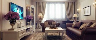
Classic style
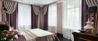
Designers say that most often reserved people prefer brown interiors. Brown looks very noble and expensive, so it is indispensable in a classic interior. It is important to choose natural materials! Plastic (even if it imitates wood) is simply inappropriate. Accessories in white, orange, beige, burgundy, and black will help “dilute” the severity of brown.
Country
Unlike classics, where glossy and varnished surfaces dominate, it is better to use matte shades in a country-style interior. Use 2-3 shades of brown - this way you can visually adjust the room and place accents. Deliberately rough shapes, more natural untreated wood, checkered and floral prints - this is the “recipe” for the perfect country style.
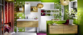
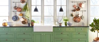
Eco style
Cozy and as close to nature as possible. Brown can be accompanied by grassy, salad or olive green, white, beige, orange. Accents made of wood, bamboo, natural stone and other textured materials will help give the interior volume and expressiveness.
Minimalism
A good solution for a room of any size. Choose cool shades of brown. They go well with sandy yellow, beige, gray, and turquoise. Use no more than 2-3 shades, the emphasis should be on visual expansion of space and functionality.
Japanese style
The Japanese live in harmony with nature, so when arranging the interior they use only natural shades and materials. Raw wood, wicker mats, bamboo, simple decorations are the attributes of this style. Try playing with contrasting shades of brown.
Scandinavian
The leading role in this style is given to white and beige, but brown is also present. You can make the interior more catchy by adding a chocolate shade or wenge, or you can visually soften the interior by choosing walnut or coffee brown. Focus on deliberately rough and untreated surfaces.
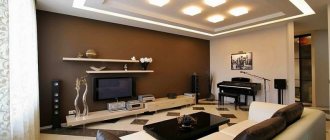
Loft
Brown goes well with grey, white and beige, which are the basis of this style. Rough boards on the floor, wooden beams on the ceiling, furniture - the role of brown is accentual, but it gives the room a special coziness and warmth.
Victorian
Rich and catchy style. To pair with brown, you should choose gold, beige and burgundy. You can use 2-3 shades of brown (for example, coffee with milk and wenge), delimiting them with moldings. It is better to choose glossy shades rather than matte ones - they look richer and more interesting.
Brown furniture and accessories
In brown interiors, white or light wood furniture is best suited. They can be further combined with other brighter colors such as bright reds, greens, blues or yellows. As a result, the brown color of the walls will emphasize their shape and color. In this type of interior design, it is worth focusing on accessories in pastel colors: pillows, bed linen, curtains, candles, etc.
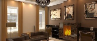
When decorating a brown interior , it’s good to think about additional light points that provide warm and soft light that will slightly brighten everything. As a result, the interior will become more comfortable. You can choose dark brown walls, especially in a bedroom or home office with a bookcase.
Brown accessories are also becoming increasingly popular. These could be mirrors bought at flea markets in old decorative frames that will contrast with a modern bathroom, or upside-down table lamp bases. A composition of your favorite modern graphics can appear on the wall, but in old wooden frames.
A corner of the living room can turn into an indoor jungle, where the bright green color will be a nice change from the warm brown color. And so on. The only limit is imagination. Such accessories will definitely add character to the interior, making it more cozy and relaxing.
Brown also appears in textiles. Anyone interested in the world of interiors probably knows that sofas and armchairs with caramel brown leather trim have been in fashion for several seasons now. They even appeared in Ikea. While we're not big fans of these finishes, we do appreciate their timeless appearance and practicality.
Velor , which has been used in interiors for several seasons, can also be a good basis for using brown. Velor makes every color deeper and more noble. It's the same with brown. While brown velor curtains may not be suitable for some, for others they can be the perfect finishing touch to a classic interior.
If you want to create a relaxing atmosphere in your interior, choose pillowcases and blankets in warm, muted colors and textures that are pleasant to the touch. We guarantee that such additions will improve your well-being.
We cannot fail to mention the use of flax. This is a material that is returning not only to interiors, but also to the world of fashion. Its properties mean that it can be used successfully in a variety of ways. Of course, it looks best in natural tones - from cappuccino beiges, muted greens and terracotta to browns. It brings an additional interesting texture to the interior and creates an atmosphere of idyll, celebration and freedom.
Combination of brown with other colors in the interior
The good thing about the brown palette is that it does not differentiate, but rather combines different shades into a single whole. The huge advantage of this color is its combinatory nature and versatility; it is compatible with almost all shades.
Table of successful and unsuccessful combinations of brown
| Brown + | Recommended Styles | Design tips |
| Beige | Classic, Baroque, Victorian, Loft | These shades belong to the same color palette and balance each other. The interior is pleasing to the eye, and you can diversify it with bright accents. |
| Orange | Eco-style, Modern, Oriental | Use orange as accents. It goes best with dark shades of brown. |
| Red | Country, English style, Japanese | These are related colors. If you don’t like bright red, choose muted tones - wine, burgundy. |
| Green | Eco-style, Minimalism, Ethno, Oriental | This interior promotes relaxation and looks as natural as possible. Choose natural shades of green - pistachio, olive, salad. |
| Blue | Marine, Country, Mediterranean | The highlight of this interior is stylish prints. Both brown and blue are an excellent backdrop for interesting furniture and accessories. |
| Grey | Loft, Minimalism, Fusion, Scandinavian | It is important to choose a darker shade of brown so that the surfaces do not merge. Don't be afraid to use supporting colors. |
| White | Modern, High-tech, Provence, Eco-style | Brown and white are a light and contrasting tandem. Use several shades of brown. |
| Pink | Shabby chic, Provence, Pop art | To prevent the interior from being too glamorous, use complex shades of pink - ash rose, fuchsia, carmine. |
| Turquoise | Provence, Minimalism, Marine style | Use 2 shades of brown or choose a secondary color. Turquoise makes the interior moveable, while brown makes the interior static. |
| Unsuccessful combinations of brown | ||
| Violet | The interior turns out gloomy and depressing; you don’t want to be in such a room. | |
| Acid shades | They don’t go well with natural brown; they need a light neutral tone. | |
Brown walls
An ally of brown furniture is a light background, not necessarily white. Also with light beige, light yellow, sand, ivory walls, brown furniture will come to the fore. Brown wooden furniture looks very elegant against a background of blue or powder pink.
However, bright colors are not the only successful solution. An equally pleasing effect can be achieved by using more saturated colors, but be careful not to overload the interior. Bright greens, oranges, purples and rusty reds are becoming increasingly fashionable these days. If you have a small room, decorate one of the white or pastel walls with colorful geometric graphics.
If you decide to paint one wall entirely in an intense dark color, then it is better to introduce many light accessories that will make the interior look light. This can be bright textiles with geometric patterns, pillows, bedspreads, curtains, rugs in shades of yellow, beige, gold, blue. Brown furniture in combination with dark red, orange, purple, or different shades of blue and green can look very advantageous.
However, when creating such interiors you need to show good taste and intuition. Brown furniture comes in different shades. The color of the walls must be skillfully selected to match the style and color scheme of the furniture. Don’t forget about bright accessories so that the interior is not bulky.
The best ideas for combining brown with other colors in the interior
Many people think brown is a dull color, but they just couldn't find the right pair for it! Brown color goes well with different representatives of the color palette:
- Neutral shades (these are background colors - white, beige, gray).
- Contrasting colors (against its background they look even brighter).
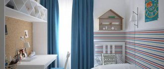
Brown and blue
Brown is a rather static color, while blue gives the interior mobility and expression. To prevent the room from seeming too gloomy, use a third color - turquoise, beige or white. Matte shades of blue look more interesting - they add a touch of mystery and nobility.
Brown and white
This is a classic combination, but choosing a sterile white color is not recommended. Note creamy, milky white, ivory. You can add dynamics to the interior using voluminous textures and bright accents. White should dominate, the ideal ratio with brown is 60:40.
Brown and green
Green and brown are a combination that is as close to nature as possible. Such an interior has a beneficial effect on the nervous system and promotes relaxation. Bright herbaceous shades will help make the room more expressive, while olive and marsh shades will make it calmer. Green can be both an active color and a soft background color.
Brown and gray
Gray color often acts as a background for brown furniture. It creates a light and pleasant contrast and does not bore you with an abundance of colors. Bright accents or voluminous textures - prints, 3D panels or tiles, imitations of brickwork, wood, concrete - can add sound to the interior. To prevent the room from seeming bulky and heavy, avoid massive furniture.
Brown and beige
For designers, this color scheme is considered a win-win option. Brown and beige are wonderful partners that complement each other. Beige brings light and softness to the interior, brown – static and a certain brutality. This tandem is good even without bright accents. Accent walls, panels, and textured finishing materials will help make the room more expressive.
Brown and yellow
Yellow is one of the brightest colors in the palette, so it is important not to overdo it. But it brings a “piece of sun” even into the darkest rooms! If you want a calmer interior, choose mustard, canary and orange-yellow. Bright lemon and sunny yellow are best used accentually. White, olive, blue, gray, and beige harmonize with this combination.
Brown and red
Considered a traditional English combination. It is important not to use a lot of red, otherwise it will create an oppressive impression. Calm shades of red - marsala, mahogany, carmine, burgundy - will help soften the interior. Red itself is a rich color, so there is no need to use an abundance of prints and textures.
Brown and pink
This combination may seem unexpected and a little childish, but it is important to choose the right shade of pink. This is a romantic and relaxing tandem, which is considered beneficial for the nervous system. Faded shades of pink look more noble, bright shades like fuchsia or purple-pink bring a touch of joy and revitalization to the interior.
Brown and black
A controversial but stylish combination. Your task is to choose the right shade of brown (focus on a light palette) so that the room does not turn into a dull box. It is very important that the room has several light sources and proper zoning. If desired, you can use bright accents - white, yellow, orange, red, beige.
5 advantages of brown color in the interior
- Naturalness. Brown is appropriate in any room; it brings a touch of comfort and warmth. The brown interior will appeal to people of all ages!
- Many shades. If you wish, you can decorate the room only in shades of brown, and it will not be boring or dull! The palette is very wide: from coffee and caramel to wenge and red-brown!
- Practicality. Brown interiors do not lose their attractiveness for a long time and are easy to maintain. However, we must not forget that dust is more noticeable on dark floors and furniture.
- Versatility. Brown can be both a wonderful background and a catchy accent! It goes well with warm and cool shades. Even novice designers are unlikely to make a mistake!
- Always in fashion. This color surrounds us everywhere, we’re just so used to it that we hardly notice it. This is an excellent solution for both modern and classic interiors.
Combination with white
White color in the interior always gives a feeling of cleanliness and freshness to the room. In combination with brown, it has a beneficial, calming effect on the psycho-emotional state of people. Therefore, the combination of brown and white is ideal for decorating a bathroom, bedroom, living room, hallway or other areas of the house.
It is worth remembering that using dark brown or chocolate alone is the wrong decision! This color is very dark for this application. It will have a depressing, overwhelming effect on the psyche of the people in this room. Therefore, its use is possible with the addition of lighter colors, including white.
The combination with white is a neutral option for room design. To some, this palette of colors may seem boring and uncomplicated. To avoid this negative effect, you should add a few bright notes to the design: experiments with green, pink, and purple colors are encouraged.