Characteristics, psychology and characteristics of color
Blue color belongs to the cold range. It is considered a natural shade, therefore it is favorably perceived by the human eye. From a psychological point of view, heavenly color creates an atmosphere of peace, relieves everyday stress, and gives a charge of positive emotions. Blue has a unique and contradictory property of increasing the efficiency of mental activity, while improving the quality of rest and relaxation.
You need to use blue wallpaper or other types of finishes correctly, carefully selecting color combinations. If you introduce too many blue tones into the interior, they can evoke melancholy and depression, because despite their beauty, they lack warmth and comfort. But the delicate blue color visually expands the walls, making the room taller and more voluminous. That is why this light tone is ideal for low, small spaces. This rule only applies if there is sufficient lighting, so if there is a lack of sun, you should take care of installing a variety of lighting fixtures.
The main characteristic features of blue color in the interior
Blue belongs to the cold range, or more precisely to the blue part of the spectrum. Made by diluting blue with more white. Due to this, a certain pastel and tenderness of this shade is achieved.
When decorating blue walls, you need to be very careful. Since too large a space, made in a given color, can lead to a certain coldness in the perception of the room.
In order to avoid this, it is necessary to correctly and competently combine all other elements in the interior space.
The main feelings and emotions that blue evokes:
- calm;
- confidence;
- tranquility;
- melancholy;
- if used too intensively, it can cause depression.
Tips for using blue
When decorating apartments, designers use many shades of blue; it is difficult to list them in all their diversity. These are white-blue, heavenly, airy-sky, the colors of clear water, blue sea, foggy blue and others. The most popular are delicate pastel shades, as well as azure, cornflower blue, Bristol, and sky.
In order for the room to look unobtrusive, beautiful and harmonious, when decorating it you must adhere to certain nuances:
- In too large a mass, blue can lead to melancholy, so the interior should be balanced in color scheme. For example, if there are walls of a heavenly shade, invigorating colors are added: orange, yellow or other bright colors.
- To prevent the room from looking cold, you need to balance the light blue color with warm tones: beige, shades of wood, milky, cream, caramel.
- The inclusion of matte structures in the interior and the exclusion of gloss will also help reduce the feeling of coldness. The latter should be used in large rooms, where it will further enhance the feeling of expanding space, or in southern rooms with excess light.
- If the windows of the room face north, east, west, the blue tint can be used as an additional color; for rooms located on the south side it may well become the main one.
- The finished look of the interior will be given by textiles, which can be matched to the furniture or made contrasting with the main decoration.
- Natural materials go well with the blue color: wood, marble, wicker, rattan, as well as metal parts and forging.
Where to use the sky palette
As already mentioned, the blue color palette is suitable for absolutely any room and style. Without these shades it is impossible to imagine noble classic interiors; they also fit well into modern designs, which are at the peak of popularity today (Provence, Mediterranean style, Scandinavia).
In an apartment or private house, you can decorate absolutely any room with shades of blue. You can use the palette of sky and ocean in such details as:
Popular stylistic color trends
Most often, heavenly shades are used in the design of rooms in a marine or Mediterranean style. This direction is characterized by combinations of white, gray, blue, milky. The effect of stripes is definitely introduced, for example, in sofa cushions, curtains, and accessories. Walls and furniture are usually made plain, light, and textiles are made more saturated in color.
Blue also fits perfectly into the Provence style; a kitchen in these colors will resemble a country house, and the living room will look light and airy. Floral wallpaper patterns and combinations with pink, lilac, and green tones are welcome.
Classic and modern style are also successfully combined with all shades of blue, which are more often used as decor or background furniture. The heavenly color is well suited for vintage and shabby chic styles, and in the first case, aged surfaces will become the calling card, in the second - a “floral-patchwork” design.
Photo of blue walls
Read: Striped wallpaper: features of application in the interior. 125 photos and videos on how to use striped wallpaper correctly
Did you like the article? Please share with your friends 
1+
Write a comment
New designs
Modern kitchen
Modern kitchen appliances: ovens
Natural wood furniture
How to choose good cement?
What colors goes with blue in the interior?
A monochrome interior is acceptable only for southern rooms; in others it will make the room too cold. Other colors in the decoration will help give it cheerfulness. Celestial shades go well with many tones, the main combinations are described below.
White
The blue and white interior is incredibly popular in the bathroom: it promotes relaxation, mental rest, and adds light. The same combination is recommended for small rooms that have small windows and lack daylight. To enhance the airiness effect, pink and beige tones are introduced into the decor. Plain blue wallpaper can be enlivened with the help of snow-white curtains, tulle, a leather sofa, fluffy carpets, and the white ceiling will even begin to resemble clouds against the sky.
Beige
Beige and blue are a classic combination, so it is often used in the appropriate style. This tandem is ideal for small spaces, as it visually expands the walls. Adding a beige tone deprives the heavenly color of its coldness, and the interior immediately becomes more homely and cozy. To prevent the room from looking too pale, you can add a few accessories in chocolate or dark blue.
Green
The combination of green and sky, as two natural shades, is considered natural and pleasing to the eye. This combination is suitable for the living room, nursery, bedroom. From the green range, it is better to take herbal shades or pistachio tones: the picture will be incredibly gentle and cozy.
Blue
Blue is a lightened blue, so the interior when combined with dark blue will be considered monochrome. To give a bright look to the room, you can use the gradient or ombre technique: use darker tones at the bottom, moving to lighter ones closer to the ceiling. It is better to avoid such a combination in the kitchen: it looks too “northern”.
Orange
Bright orange shades will bring notes of energy and awakening to the interior. Such a tandem will look ideal in a children's room, in the kitchen, as well as in a living room designed in a modern style.
Yellow
How to create a feeling of a summer day filled with sun in a room? You need to use blue wallpaper, a white ceiling and yellow accents - textiles, accessories. An environment with such a color scheme will certainly lift the mood and please the guests, helping to maintain a friendly conversation. You can complement such an interior with beige and milky tones in small quantities.
Silver and gold
Both “precious” shades tend to combine successfully with almost all tones of the range. In a blue room, gold will create a feeling of solemnity, pomp, and luxury. The silver color will provide a cooler and more understated yet elegant feel. It must be remembered that for this interior, the rest of the furnishings should also be effective and of good quality.
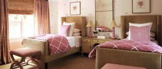
Pink
The combination of pink and blue is most suitable for a children's room, including for children of different sexes. This tandem can also be used in the kitchen. Depending on the brightness of the pink, the interior can be either dynamic or restrained and calm.
Brown
The decor in brown and blue tones looks very harmonious and elegant. Light shades of brown wood, as well as the color of brick, are ideal for heavenly. It is worth decorating the floor in darker colors by choosing the appropriate materials: porcelain stoneware, tiles, laminate, parquet.
Red
Red and blue provide a sharp contrasting combination that is not used too often. If you use a pink-red shade or a color with a hint of orange, paired with a heavenly one they will look more harmonious.
Grey
Those who prefer a calm, cozy environment are advised to pay attention to the “gray + blue” pair. The interior will be very elegant with plain blue wallpaper and gray furniture, as well as with canvases of a combined gray-blue color. To prevent the room from being faded, you can add notes of peach, orange, and white to it.
Black
A room in blue tones with the introduction of black accents is a bold and unusual solution. This type of finishing is used in the Scandinavian style and is suitable for the living room, office, and hallway.
A color scheme
You can combine almost any color from the palette with a heavenly tone, and this is clearly proven by the photos used in the article. But the best companions for the blue range are:
Every shade of blue deserves attention. This palette is very natural and the vast majority of people like it.
To keep the interior light and not have a strong psychological impact, it is better to choose light tones of the heavenly range and combine them with calm colors, basing your choice on natural combinations.
Interiors in blue tones
Blue wallpaper and other types of decoration of this color are suitable for a room for any purpose; they will only emphasize its functionality and chic.
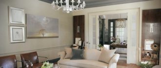
Living room
In the living room, the sky color goes best with wood and beige tones. A modest interior can be diluted with textiles and accessories in rich colors. Also, using successful combinations, they zone a room, for example, allocate a small office in it. Adding a blue accent wall will help visually expand an overly narrow room.
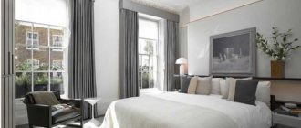
Bedroom
Here, the heavenly tone will promote relaxation and good sleep, and add a touch of freshness to the interior. But if there is too much primary color, there is a risk of making the bedroom cold and uncomfortable. This room combines blue with white, beige, gray, brown, as well as lavender, blue, and lilac. It is better to introduce bright accents in the shades of the headboard, bedspread, paintings, rugs: we are talking about yellow, orange, pink details. As for furniture, if there are blue walls, it should be gray or light brown.
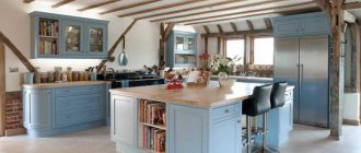
Kitchen
It is recommended to use a sky tone in narrow, small kitchens that are well lit: this way you can visually give the room wider dimensions. Matte textures that are ideally combined with natural materials will look better: wicker, rattan, wood, cotton.
A brown or beige kitchen set and the same doors go perfectly with blue walls. You can complement the range with accents of orange, pink, green, yellow.
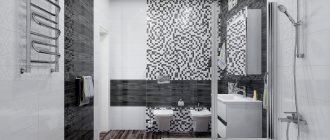
Bathroom
A light blue tile color will help create a beautiful look in your bathroom. In a marine style, to achieve the effect of depth, the following technique is used: half the wall is finished with a darker shade, and higher - with a lighter shade. The bathtub, toilet, and sink should be made snow-white. A good solution would be to add green details that will support the marine theme. The ceiling is usually decorated in white, but the image of the sky in the bathroom will look beautiful. White or beige ceramics, chrome handles, and warm (yellow) lighting will fit organically into the interior.
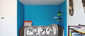
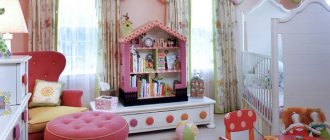
Children's room
Most often, blue is perceived as a boyish color, so it is usually used to paint the walls of a nursery for male children. The nautical style is perfectly complemented by ship or pirate elements: anchor, rudder, blue and white stripes. Green, yellow, orange accessories or textiles can serve as bright accents.
Hallway
Delicate heavenly shades in the living room will look good, expanding the space, because this room is rarely large. It is worth complementing the interior with furniture in oak, walnut or grayish tones, as well as providing bright artificial lighting. In the interior of the hallway, discreet decor would be appropriate: key holders, paintings, posters.
How to match the ceiling color to blue walls
A room entirely made in blue tones will not look very advantageous. Depending on which of the saturated tones the shade of the wallpaper tends to, you can choose the color scheme for the ceiling.
- Blue wallpaper has a pink or raspberry tint, then the ceiling can be made with a raspberry or lilac tint.
- Orange and blue colors go well together. Blue wallpaper with orange is a great combination for a living room where the ceiling has a pink or orange tint.
- Turquoise, giving off a green color, will go perfectly with the shade that whitewash can give not only with a special color, but also with ordinary greenery. A blue interior in this color scheme will be bright and optimistic.
- Blue wallpaper tending to ultramarine needs to be set off with a slightly lighter ceiling in the same color scheme. A pink ceiling may also go with this color, but here in the interior you will have to use rich purple draperies, curtains, decorative pillows or bedspreads.
Related article: Green is the apartment color for optimists
Considering that a white ceiling is perfect for any interior, you don’t have to philosophize, justifying the unconventional tone of the ceiling, but take the path of least resistance. The blue color of the interior can be complemented by a bright green – rich emerald shade on upholstered furniture. The harmony of this combination is proven by nature; this is what the sky looks like with the water of the bays on the horizon on a sunny day. Few can say that they don’t like this combination. It is a combination of serenity and calmness, so it can be used with confidence.
The beige and blue interior will be no less attractive. The cold color scheme of the walls is balanced by the warmth of the beige shade of cabinet furniture, linoleum or carpet. Bright red covers for upholstered furniture can organically fit into the design of a room where blue is dominant if there are curtains with red elements on the windows. Such a room will seem bright and sunny even on cloudy days.
Ceiling
Colored ceilings are considered a fashionable design solution. It is not necessary to make them too dark; using a heavenly tone is enough to enhance the feeling of lightness and airiness of the room. If the walls are also blue, the ceiling should be white or pastel blue. It is better to choose bright and effective lamps for suspended ceilings, just like the plinth. The latter looks good in silver or gold, of course, if it matches the style of the room.
Floor
The blue floor looks quite familiar except in the bathroom; in other rooms it is a very non-standard solution. In addition to tile coverings, self-leveling flooring techniques are often used, with which you can create unique creations based on individual projects. In the bedroom or living room, it is better to place an interesting carpet of a heavenly shade on the floor - plain or with a pattern, as well as lay a carpet. It is also not forbidden to paint the boards in a heavenly color, if this is provided for in the room arrangement plan.
Furniture
To choose furniture that really suits the style and color scheme, you need to follow a number of tips:
- upholstered furniture should have a color that will become the second most important in the interior;
- cabinet furniture is chosen in harmony with the main background of the walls or floor;
- classics welcome the entire palette of natural wood, while modern styles welcome bright colors, glass and metal parts, and interesting decor.
A blue and white sofa is perfect for a living room done in pastel colors. Even massive chairs of this color will look elegant and completely unobtrusive. For upholstered furniture in heavenly shades, it is recommended to select fabrics that are pleasant to the touch: velvet, velor.
In the kitchen, a blue set will give the room freshness and nobility and will harmonize perfectly with the light dining area. Hand-painted drawers, benches and small cabinets look lovely and add unique charm and personality to the kitchen.
Scandinavian style
Living rooms look best in this style, as minimalism allows you to create an ergonomic space that is comfortable for all family members.
In this case, the blue walls in the living room should be made in a delicate blue color with a dash of gray. that is, it should be as neutral as possible, giving a feeling of colorlessness and space.
We recommend reading:
Turquoise walls - design ideas, stylish combinations and design features (130 photos)Photo frames on the wall - placement ideas and options for decorating walls using photo frames (115 photos and videos)
Panels for wall decoration: stylish and modern wall design options. 130 photos and videos of the use of decorative panels
Since the blue color is quite capricious, and the Scandinavian style is especially sensitive to this, the windows in such a room should be large enough and the room should receive a sufficient amount of daylight.
Lighting
Every room decorated in heavenly colors should have very high-quality lighting. In addition to the central chandelier, all areas should be illuminated separately: we are talking about the work area in the kitchen, in the living room, the play area in the children's room, etc. In the area of the work desk or sink, the lamps should be bright enough to prevent discomfort to the eyes. If the blue tone occupies more than ½ of the area in the room, only lamps with a warm glow are used; in other cases, it is permissible to use white (cold) light.
Accessories, decor, textiles
The abundance of decor is the prerogative of the classics; here you can decorate the room with paintings, luxurious mirrors, panels and stucco moldings, figurines. In modern style trends, usually no more than 2-3 accessories are used: photos, posters, candlesticks, potted plants, vases.
Textiles in blue tones are sold everywhere, so finding a suitable option for a room will not be difficult. The introduction of a heavenly shade in curtains, sofa covers, bedspreads and blankets will help change the appearance of the room even without renovation. Noble fabrics look beautiful: tapestry, silk, velvet, enhancing the feeling of luxury and rich decoration of the room. On the contrary, linen and cotton fabrics give a feeling of lightness and home comfort, liveliness and dynamism, so you need to select textiles depending on your style and personal preferences.