Burgundy color looks elegant and expensive, so it is often used in interior design. Shades of burgundy are not as catchy and assertive as shades of red, but they are distinguished by depth and expressiveness. Burgundy color is ideal for decorating a kitchen interior, as it has the ability to harmoniously fit into a variety of styles - from classic to modern.
Specifics
Burgundy color is a combination of red and brown, and looks quite rich and sophisticated. It lacks the lightness and simplicity inherent in light red tones. It should also be noted that this shade is associated with power, strength and maturity, making it an excellent choice for ambitious people.
If you decide to choose a burgundy kitchen, you should be prepared for possible difficulties when arranging the interior. Despite this, this tone looks good with a fairly wide range of shades for walls. Moreover, the final effect depends on the aspirations of the designer.
It is also important to consider the placement of furniture and lighting features.
What kitchen interior elements should be made in burgundy color?
To make your kitchen look attractive and stylish, you need to carefully consider which elements can be made in burgundy. Such a rich shade should be used with caution so as not to “overload” the room and not oversaturate it with dark red tones.
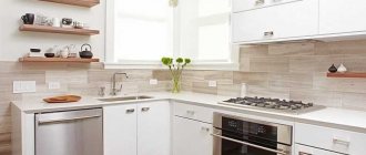
Kitchen set - an excellent solution would be to make facades in burgundy color (lower or upper, or all at once). Chrome-plated metal fittings, as well as glass elements (glass can be frosted or transparent), will help complement the sophistication of this piece of furniture.
As for the set itself, a glossy sheen would look good in modern interiors. You can also use this color when arranging a kitchen in a classic style.
Wooden carved facades, painted in matte burgundy shades, close to brown, will look luxurious and noble. They can be complemented with gilded fittings and carved elements.
Curtains - in burgundy color they look very respectable and expensive. The main thing is to use only high-quality natural textiles. If the kitchen is spacious enough and the windows are large, you can hang long, heavy curtains that fall down in soft folds.
For a small kitchen, light burgundy-colored curtains tied with a satin ribbon (gray, white or brown) are suitable. If desired, you can choose elegant tulle for the curtains - this option will look great in the kitchen-living room. If the kitchen is an ordinary city one, it is better not to use tulle, giving preference to practical blinds or roller blinds.
Kitchen apron - made in burgundy shades, this important part of the interior can become a real decoration of the room. The material you can use is ceramic tiles, tempered glass and even wood panels.
However, a mosaic that combines shades of wine, black and red will look especially impressive and original. The working surface should be made in black, using natural or synthetic stone - this combination of textures will look expensive and unusual.
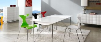
Table and chairs - made in burgundy color, they will become a bright highlight of the kitchen, equipped in one of the modern styles (high-tech, minimalism, art deco, loft). Burgundy table and chairs can be wooden, glass, made of chipboard or MDF.
A good option would be a combination of several materials - for example, tempered glass (tabletop) and chromed metal (legs).
A massive table made of natural wood, painted with matte burgundy paint, will look very original. Around it you can place light chairs made of transparent or white plastic, with metal bases (the eclectic style is very popular at the moment).
A burgundy chandelier is only suitable for a spacious kitchen with good additional and natural lighting. Made of glass and metal, this accessory looks luxurious and original.
For a kitchen in a classic style, a pendant chandelier with elements stylized as bronze or aged gold is suitable. A ceiling structure made of wine-colored glass will look great in modern interiors.
Tip: Burgundy color can increase appetite and energize, so it is ideal for the kitchen. However, an overabundance of such rich shades can cause a feeling of discomfort, so you should not overuse them.
Disadvantages of burgundy kitchens
This color version has the following disadvantages:
- the tone is dark, therefore it helps darken the room;
- the need to carefully think through color combinations.
Relationships with other colors
The burgundy shade is a complex tone. To compensate for this, it is better to use it in combination with warm, light colors, especially if there is only one small window opening in the room (in other words, if there is a lack of natural light).
Placing the headset in a dark area against the backdrop of dark walls can lead to a visual reduction in the volume of the room. It is recommended to use as a partner for furniture in burgundy shades and walls in cream tones.
The following burgundy color combinations in the kitchen interior are also fashionable:
- with gray;
- with white;
- with brown;
- with yellow;
- with gold.
It is important that there is not too much burgundy. Even if you are a rabid admirer, try not to overdo it. Use this tone only to emphasize the nuances of the room’s design - this way you can add individuality to it.
Which interior style is best for a kitchen in burgundy tones?
High-tech style
An ultra-modern interior style in which burgundy color will look very organic. To equip such a kitchen, you should choose furniture with glossy, shiny facades. It is recommended to use chrome-plated metal fittings, as well as glass elements.
As for the materials for manufacturing the facades of such sets, most often preference is given to plastic, MDF, chipboard, which are decorated with enamel.
When creating a high-tech interior, it is important to adhere to its basic rules: use synthetic materials, combine no more than three shades, abandon decorative elements, and do not use textiles. A burgundy-colored self-leveling floor in combination with the upper facades of a set of the same shade will look great in a high-tech kitchen.
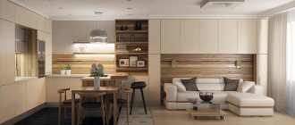
Minimalism style
An ideal solution for furnishing a kitchen in burgundy tones. The main rule to follow in this case is to use a minimum of furniture. An excellent option would be to install a built-in headset with household appliances from the same manufacturer. Burgundy color can be present in elements such as cabinet fronts, kitchen aprons, chandeliers, and blinds.
This interior is created without the use of textiles and various decorative decorations. All kitchen utensils, dishes, pots, pans, etc. must be hidden; in no case should they be put on public display or used as decoration.
Classic style
A set made from MDF or solid wood with matte fronts in deep burgundy tones will look very bright and unusual. Elegant metal fittings with shiny gold plating will help emphasize the splendor and luxury of the classics. You can install a large chandelier in the center of the ceiling.
In this case, it would be very appropriate to use textiles in burgundy shades - in the form of a tablecloth, curtains, napkins. If there is enough space in the kitchen, you can put a large display buffet, placing porcelain dishes, tea and coffee sets, glass and crystal glasses in it. All burgundy tones look noble and expensive, so they are ideal for creating an interior in a classic style.
Rules for using burgundy color in the interior
When using a burgundy shade in a kitchen interior, you should adhere to a number of rules:
- If the kitchen is small, burgundy should be present in its design in a minimal amount.
- You can achieve a visual rise in the ceiling if the furniture has glossy facades.
- The optimal color partners for burgundy are cream, white, gray, light blue.
- The best decor is silk or velvet textiles, leather, plastic or glass elements.
Design of an apron, walls, ceiling and floor in the kitchen in burgundy colors
If it is decided that the set will be burgundy, you need to think through the concept of everything else. When combined with white, a bold idea of a snow-white floor covering can arise. It looks really impressive, but there is an option that it will not retain its original whiteness for long. Therefore, it is better to make the floor neutral (you can leave it light, but you should tone it down a little).
It’s good if the apron matches the tabletop.
In any case, it is better to leave the ceiling light: a dark color will steal space even in a spacious room. If you decide to decorate the room in black and burgundy, you can make a light gray ceiling. It will fit harmoniously, but will not visually make the kitchen smaller and create a depressing atmosphere.
The walls, as opposed to the burgundy kitchen, should be done in pastel shades so as not to overload the room. It is better to ignore drawings and flowers on them.
An interesting solution in the form of a black and burgundy kitchen will not appeal to everyone.
Style directions
Below is a list of styles that allow the use of burgundy color in the interior:
- Art Deco;
- glamorous;
- Bohemian;
- romantic;
- Arab.
Note!
- Blue color of the kitchen - ideas for combining blue color in the kitchen + 130 photo reviews with decor options
Turquoise kitchen: TOP-150 photos of fashionable turquoise kitchen design ideas + reviews of stylish interiors
- Light green kitchen - TOP 130 photo reviews of light green kitchen design and decor. Features of the style of furniture and decor in the interior
Design solutions
The interior design of a burgundy-colored kitchen can radically change the idea of a given location. Furniture can be made:
- Made from natural wood. The main disadvantage of such headsets is their high cost.
- From MDF. Such furniture is produced with one of two types of facades - glossy or matte.
- Made from acrylic. Acrylic sets are popular due to their glossy surfaces and chrome fittings.
You should also take a closer look at aged furniture. It echoes the country style, but in this case you will have to add textiles, ceramic dishes, and wicker items to the decor.
Choosing a floor covering
In theory, a white floor would look amazing in a situation like this. In fact, this color scheme is impractical, since any contamination will immediately be evident.
Designers recommend choosing flooring in beige, green or gray. A tile that matches the color of natural stone is ideal. Parquet or laminate is also appropriate.
Pros and cons of Bordeaux in kitchen design
Bordeaux in the kitchen is always exquisite.
Advantages and disadvantages of burgundy kitchen in the interior:
| pros | Minuses |
| expressiveness, originality, which will always look expensive; | a dark shade can visually reduce space, so it should not be used in small kitchens; |
| burgundy – bright, festive, but at the same time peaceful and soothing, giving an atmosphere of comfort; | in combination with dark colors it can create a gloomy, oppressive atmosphere; |
| in a kitchen of this shade, dirt is less noticeable than on white, beige or other light-colored surfaces; | risk of color oversaturation. |
| capable of awakening appetite. |
The combination of burgundy and dark colors can be psychologically oppressive
Examples
The ensemble with a set with a glossy burgundy facade, a white countertop and an island looks most advantageous. In this case, it is desirable that the walls, floor and ceiling are boiling white. Unfortunately, only a clean person can afford to have such a kitchen. In practice, such a solution is extremely irrational, since it requires daily cleaning.
One of the variations of the burgundy-white-black combination, when wine tones play a dominant role in the furniture, there are a couple of pull-out cabinets, black hanging shelves and a white island. And all this against a snow-white background. In this case, it is recommended to put a dark laminate on the floor.
The combination of burgundy and silver looks great with light walls, island and countertops and dark burgundy cabinets. It is also better to keep the floor in a silver color, as well as household appliances.
When striving for a more neutral color combination, the tone of ripe cherries should be diluted with a beige or milky color. In this case, the colors of the headset will seem more consistent.
Note!
Purple kitchen - nuances of using purple. Modern kitchen design ideas with photo examplesGold-colored kitchen: 110 photos of the best ideas for decorating a gold kitchen. Selection of furniture and finishing materials in suitable shades
White kitchen: features of using white color, choice of interior style. Fashionable kitchen design ideas with photos of the best examples
A burgundy-colored kitchen is unusual and stylish. Not everyone can afford it. If you nevertheless decide on such a design, then be careful in choosing color combinations.
How burgundy color combines with other shades
Burgundy color can be divided into four groups of shades:
- deep burgundy tone is a classic option, which is a mixture of red and brown colors;
- garnet tone - looks rich and bright, looks great in combination with contrasting shades, especially white;
- ripe cherry is the deepest and richest shade of burgundy from the entire palette;
- deep carmine tone - it is distinguished by a certain coldness that is not inherent in other shades of burgundy; it contains a slight note of blue.
Combinations of all shades of burgundy with other tones look very original and attractive.
Burgundy and white
Thanks to the contrast, burgundy shades in combination with pure white look even more rich, multifaceted and deep. It is worth using this combination of tones if there is a need to visually expand the room, fill it with light, make it lighter and weightless. White color is also used to tie together several shades at once.
A kitchen in red and white colors is not uncommon; it is a very popular and sought-after interior design option. A classic example: a set with burgundy-colored facades installed against a background of white walls. You can also use white countertops that imitate marble with burgundy veining. Red and white tones will look great in a high-tech style.
Burgundy with black
You should combine both of these tones with great care so as not to make your kitchen too inhospitable and gloomy. To create the perfect interior, it is recommended to take white and burgundy tones as the base, using black details to create the necessary accent. The resulting result will amaze with luxury and elegance.
Black and burgundy shades, without adding a white tone, should not be used to create the interiors of any rooms, not just the kitchen. Ideal option: black self-leveling floor, burgundy kitchen facades, white walls and a kitchen apron in the form of a black and white mosaic.
Burgundy with gray
An aristocratic and very refined combination of shades. If both of these tones will play the role of the main ones in the interior, then gray should be as light as possible. It is recommended to use decorative details of various light colors. It is necessary to use gray color according to the same principle as black - that is, all combinations of gray and burgundy should be diluted with a white tone.
An excellent option for kitchen design: gray laminate flooring, lower facades of the furniture in burgundy, gray countertops made of artificial stone, light gray upper facades of the furniture, white kitchen apron and curtains in burgundy tones.
Burgundy with beige
This is a very pleasing to the eye and soft combination of shades. Ideal for furnishing any kitchen. Both of these colors can be primary, but other colors in the form of small details will also look good in a similar interior.
There are many beige shades; the following combinations of tones will look most suitable in the kitchen interior:
- burgundy with warm beige and light shades of olive - a very original and calm combination of tones;
- burgundy with cold beige and light blue is an excellent option that looks organic and original;
- burgundy with rich coral and orange is a bold combination of colors that requires great care (if combined inappropriately, the kitchen will look tasteless).