» Pink colors » Hot pink color and combination with it
Hot pink is not a spectral color, but it can be extremely bright in its medium light value. Like any bright tone, hot pink amazes with its expressiveness and glow, which sometimes causes irritation. Regarding truly cold colors (such as blue, white), it is closer to warm, but in the line of pink shades it leans towards the cold side of fuchsia. Fuchsia, in turn, comes from purple. Hence the meaning of bright pink, as feminine royalty, patronage, self-confidence, at the same time inflated self-esteem, and also the lack of objectivity that pink as such carries.
In nature, such coloring practically does not occur, which suggests that it is a cultural product. It’s not for nothing that hot pink is often associated with the glamorous trend of advanced youth. This desire for novelty, the desire to stand out, to lead, advises a fragile psyche and viewing everything through the prism of limited experience. However, it is possible to use this tone meaningfully, and not at the call of an impulse. Color focuses attention on itself, making you feel protected. It also provokes sexual sensations, which is good for show business. The ability to correctly evoke the right emotions is an art, and hot pink is a powerful tool for this.
The combination of hot pink in palettes
bright flower
Flowers are one of the sources of bright colors, including pink, but its perception depends on the quality of lighting. Hot pink with a purple border is a magnificent embodiment of a harmonious natural combination. The composition also includes such shades as white-lilac, fainting frog, thunderstorm, dark chestnut.
Rose gold oxfords
Shoes, like a work of art, are designed to captivate the imagination. Such oxfords look festive, you won’t be ashamed to go on stage in them, and the chic combination of glowing pink, discreet gold and burgundy color is impressive even without the wearer of this item. The palette is supported by colors such as white-gray, light yellow-beige, yellow-brown, golden chestnut.
Pink fog
It is unlikely that you will see such a picture in real life, since it is a product of the imagination of the artist and photographer. Of course, the sunset rays reflected in the fog will give it a pink glow, but it will not be as intense. The unreality of this phenomenon gives the picture a distinct color aesthetic! The range is created in the following tones: carnation, hot pink, purple-pink, berry, wormwood, eggplant, black.
tree flower
This palette is also a product of creative perception and color processing of photography. This is a strong contrast of warm hot pink and cool blue-green tones, everything else is supporting details. The combination is made up of light grey-green, light blue-green, hot pink, fuchsia, golden chestnut, indigo and black.
Combination of hot pink with other colors
Hot pink color combines richly and brightly with other colors. He can choose to pair with the same vibrant colors as himself, or maybe paler ones - then we see a bright contrast. Dark shades look just as good with it, but neutral tones that do not argue with the shade, but calmly give it primacy, are especially attractive and noble.
The combination of hot pink and pink is a range made up of shades of the same color. Additional pink tones will help the main one increase its expressiveness, achieve vibrant shine, volume, and place accents. The palette consists of carnation, sunset pink, fuchsia, purple pink, and crimson.
Combination: bright pink and red , significantly shades the latter. This tone may look like a cool shade of scarlet: this is the result of their comparability in brightness and the presence of the red spectrum in hot pink. There is also a slight warm-cold contrast. The range lies in the tones of coral red, port, ruby, bright burgundy, and wine.
Hot pink and orange combine to create a striking, fashionable pair that is designed to surprise with its warm-cold resonance. The shades can be of the same brightness and lightness, but it is advisable to dilute them with neutral tones, for example, white. Consider paring for a base tone: light peach, coral orange, burnt orange, red-orange, red.
The combination of hot pink and yellow is light, rich, frivolous. This festive combination maximally emphasizes the feminine expressiveness of the main tone. The palette includes pale yellow, sunny yellow, corn, bright gold, amber.
The combination of bright pink and warm green could be called natural, but it is exaggeratedly bright for nature. The composition includes light green, chartreuse, light green, moss, and pine needles. The combination is expressive due to the proximity of hot pink to red, which is complementary to green.
Hot pink and cool green are a colorful combination based on the difference between cold and warm. Through it, a sense of balance and harmony is achieved. The combination includes neon green, jade, mint, emerald green, malachite.
The combination of hot pink and blue is similar to cool green, but this pair is more pronounced in its contrast: blue is the coolest shade. Rich, pure tones of blue successfully support the main color, for example, paired with aquamarine, bright blue, turquoise, blue-violet, indigo.
The combination of hot pink and purple also applies to combinations with similar colors. The contrast of the pair lies in the difference in brightness and lightness of the colors. The main tone glows against a background of purple shades. The range is composed of blue-violet, lilac, purple, red-violet, and grape.
Hot pink and brown are a combination that reduces the flashiness of the first: shades of brown add elegance and harmony to the couple. Contrast is based on the difference between bright and complex, muted colors. The composition includes camel, yellow-orange, red-brown, chocolate, and dark chocolate.
Hot pink and neutral are combined in a contrasting combination of saturation and lightness.
Tones such as white, gray, black are an ideal pair for very bright tones, of which hot pink is no exception. Consider combinations with creamy, papyrus, light gray, anthracite, black.
Shades of pink
As mentioned earlier, this color is formed by mixing red and white (sometimes with a drop of yellow), depending on the amount of these colors we get one or another shade of color.
- Delicate is the softest shade. There is very little red in it and it is very light and delicate. Mainly suitable for summer outfits or office outfits. For a business option, it can be combined with gray things, for example, a gray skirt + a pale pink blouse, and for a walk, a great option is a combination with white, blue, beige or pale yellow.
- Pearl - with a light beige undertone, suits everyone and goes well with pastel colors.
- Dusty pink is a sophisticated, muted shade that looks great as an evening dress color or in everyday looks. It is better to combine it with the same complex (dull) shades or create a total look with it.
- Flamingo is a beautiful delicate color with a slight peach undertone.
- Pink is a classic shade. It is perfect for evening dresses and can be worn paired with beige or white shoes and accessories.
- Salmon - obtained by adding orange, white and a drop of yellow to the mixture. It has a warm undertone and will harmonize perfectly with cool colors, such as blue, purple, rich blue or turquoise.
- Pink blush is a bright, but at the same time slightly discreet shade that looks very feminine and will harmoniously highlight the image.
- A bright, rich tone will be an excellent solution for a cocktail dress.
- Magenta is one of the neon shades, incredibly bright and flashy. Being present in a set even in small quantities, it can attract all the attention, so you need to be careful with it. Remember, the most important rule: where you use it, all the attention of others will be directed, so you should not emphasize your problem areas to them.
- The color of fuchsia is not inferior to magenta in terms of impact, brightness, and saturation. It is bold, daring, frank, however, it can also be incredibly elegant and stylish, especially when paired with black, dark blue, or sea wave. → FUCHSIA color in clothes - the best combinations >>>
Ultra pink color and its combination
This shade of hot pink borders on purple. It can also be described as the coolest bright tone of pink. All shades of hot pink will lie between this tone and the main one. They are like two poles of possible extremes. Surprisingly spectacular, luminous, unforgettable. Ultra pink is a demanding tone. Everything should be perfect in what it was placed on: satellite colors, shape, skin tones. Any shortcoming against its background will be noticeable, but if everything is of the highest standard, then everyone will notice and appreciate it.
Combine ultra pink with sakura, orchid, classic red, peach, fiery, orange-yellow, apple green, kelly, bright blue, blue-violet, violet, grape, bronze, white-cream, anthracite.
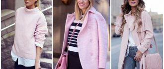
Hot pink color in clothes
Bright pink in clothes and does not suit everyone. In addition to the fact that it is catchy and elegant, it also has negative sides: it makes the tone look fuller and enhances skin defects. Therefore, you should be very critical of yourself in choosing it, so as not to harm your appearance. This shade is suitable for representatives of the “spring” and “winter” color types. Their clear skin tones will not spoil the brightness of this shade, but on the contrary, it will emphasize the warm skin tone of “spring” and the contrast of appearance of “winter”. This shade is definitely festive. It is unlikely that you will be understood if you wear a piece of clothing to work. It tones, excites, encourages active action. In clothing, it symbolizes self-confidence, leadership and femininity.
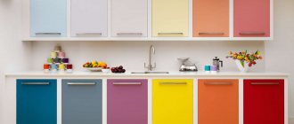
How to combine pink and brown colors in the interior?
I think you will agree that the combination of chocolate and pink shades can already be called classic today. At the same time, the apparent harmony of these colors over the five years of their existence could not become trendy, as a result of which other color solutions took the fashionable baton. Has the pink and brown interior gone into oblivion? Not at all. It has become more often used in clothing and accessories, and recently, individual designers have been trying to revive it in the interior. Moreover, not without success. I am going to describe to you possible options for combining brown and pink shades in interior design, and you will draw your own conclusions regarding how rational the use of the combination is in modern conditions.
In addition, you can also check out other pink combinations:
Harmony of pink and brown colors
What is the harmony of chocolate-pink splendor? These two shades, which, in fact, cannot be called full-fledged colors, are distinguished by their softness individually and contrast in relation to each other. That is, if you decide to take these two colors as a basis when decorating the interior, then at least you will create a non-boring composition. At the same time, your interior cannot be called overloaded or annoying to the eyes. Such an optimal idyll. The chocolate-pink combination is also good because it is truly universal. I personally admired the use of this combination in the kitchen, living room and bedroom. In every single case, the interior looked simply great. domisad.org
At the same time, despite its versatility, the chocolate-pink interior is somewhat highly specialized. He is very soft, gentle and sensitive, which is suitable only for ladies with the appropriate temperament. In a certain frame, such an interior can look romantic. But if in your house, besides you, at least one man or even a boy lives, then the chocolate-pink interior will cause a storm of internal indignation in him.
The main thing that I personally would recommend that you pay attention to is the excessive requirements for chocolate-pink textures. Yes, the colors themselves create a certain effect, but they are completely devoid of detail and attention to individual accents. So if you have a pink pillow, make it with velvet polka dots. And for a chocolate blanket, stripes the color of milk chocolate will suit.
Age-related shades of pink and brown
Depending on the age of the room's inhabitants, the richness of the chocolate and pink colors will change. Moreover, saturation is radically opposite. Think about it. Bright pink color, due to its activity and richness, is more suitable for the room of an equally active teenager. But soft pink wallpaper will appeal more to older girls. With chocolate everything is exactly the opposite. Milk chocolate is the choice of the same teenage girl who will see the taste in it. But the rich dark shade of dark chocolate will make the room more classic, which will appeal to older ladies.
As for accent colors, it’s quite difficult to decide on them in a chocolate-pink extravaganza. I would recommend opting for white and peach tones, which will complement the light pink interior. But if you decide to use a more active pink tone, then an additional red or burgundy color will be more suitable for it. In the latter case, burgundy will become a step between chocolate and pink. If you position it correctly, you can achieve an excellent effect. As for other colors, you need to be extremely careful with them. Unless, I would recommend considering soft green as an additional color, which will place unobtrusive accents in the right places.
Wardrobe selection with hot pink
A stylish bright contrast is achieved with a combination of hot pink and black.
And if you add white to this pair as part of the border pattern, the effect will be amazing.
Gray softens the contrast, but brings the main color to the fore.
White in combination is freshness and lightness. Such a couple improves mood and creates an image of infallibility.
Beige gives style to a bright, sometimes even vulgar color.
Brown supports color.
Combinations with red and orange will be exotic and elegant.
Yellow enhances hot pink. The combination is intense and eccentric.
Blue, like the color of water, refreshes the main color and gives it tenderness.
Green - enhances the saturation of the tone.
Blue - adds severity.
Soft pink tones smooth out the harshness of the main shade and add more femininity.
Purple makes hot pink “glow against its background.”
Hot pink in the interior
Choosing this color for the interior is a bold move. However, in skillful hands it can become a stylish solution, especially in a modern interior with a coloristic twist. The one-basic rule for its use is moderation. Neutral shades are always added to it: white, beige, gray. A good addition would be soft purple tones. By painting the wall bright pink, you can advantageously place interior items or accessories against its background, which will emphasize their shape (with an advantageous difference in lightness) or their colors. For example, green against such a background will be very juicy, yellow will fill the entire setting with sunshine, beige and gold will shimmer with luxury. We should not forget about the irritating influence of this tone on the psyche, so it is worth seriously weighing the pros and cons. The color is suitable for rooms intended for relaxation.
VIEW COMBINATIONS WITH OTHER SHADES OF HOT PINK (click on color)
Combination of pink and classic shades
Pink is a complex color, so it does not go well with all shades. Let's list the most interesting and successful options.
Pink-black
The most popular bow among famous designers. In the last 10 years, this combination has become a classic. A little gilding would be a great addition. Perfect contrast is achieved by contrasting colors. Black symbolizes seriousness and maturity. Pink – lightness and serenity. By combining these two colors, the image will be bright and provocative; thanks to the dark shade, the woman will not look like a teenager.
Combination of pink with other colors in the interior
Modern apartment design in pink combined with other colors
Room interior in pink color
Pink color in the interior in combination with other shades
Apartment design in pink combined with other colors
Pink-white
Also a favorite solution among many designers. Both shades are associated with childhood, little girls, and innocence. The combination of pink can be complemented with silver and ivory. In this case, shoes, sandals or a handbag can be white. This color scheme is often used to decorate clothes for babies, children's cosmetics, and toys. But even a girl over 20 can afford this combination in her wardrobe. Most often these are summer, lace items. White is the background, pink is the drawing.
Pink-red
Artists know that in order to get pink, you can lighten the red, so they can safely be called analogues. The combination of these two shades will be successful if the red is very rich and the pink is warm and light. To prevent the image from being too flashy, it can be diluted with accessories in gray, beige, and white colors.
Pink-beige
A traditional solution that can be used daily. Can be complemented with an ashy shade.
Pink-blue
You can add cream or silver details. This combination of pink color is characterized by comparison with spring, youth, and romance. Incorrectly selected variations will look childishly ridiculous. It is better if there are three of them in clothing items.
Combination of pink with other colors in the interior
Modern apartment design in pink combined with other colors
Room interior in pink color
Pink color in the interior in combination with other shades
Apartment design in pink combined with other colors
Pink-brown
For clothing, brown shoes, trousers or a sweater are suitable.
Pink-blue
Two rare and contrasting colors. They look especially good in festive outfits. Classic blue goes well with pink and gray.