The true power of color
Color has power. It can optically change the shape and size of furniture, as well as the shape and size of the room itself. Color regulates temperature and controls lighting. And most importantly, it should have a positive effect on a person’s well-being. How to choose the interior color scheme yourself? It is enough to know basic information about colors and their influence, and further work on the composition will be simply a pleasure. We will tell you how to use yellow in the interior!
In the nursery
The bright color of the sun is loved by children of younger, preschool age, it excites and activates the child, therefore the use of yellow colors is recommended for the children's play area, but calmer shades are desirable for the bedroom, for example, blue, gray, green. Correct dosing of tones will help create a pleasant and fresh interior in the room.
Try not to overdo it and choose saturated colors for the baby’s room evenly adjacent to neutral ones, especially for children who are active by nature; yellow is recommended for melancholics and pessimists, and for hyperactive children it is better to abstain from them.
Proper dosing of tones will help create a pleasant and fresh interior in the room.
The bright color of the sun is loved by children of younger, preschool age
See alsoSwedish style in the interior: 10 rules of Swedish furnishings
Yellow + violet, magenta, lilac
The combination of yellow with violet, lilac, purple is classified as the highest expressive pair, as it is based on the principle of additional contrast (colors are on the same straight line in the Itten circle and when mixing color rays they give gray). This combination is an amazing tool in the hands of the creator, who can force you to plunge into complete harmony, only thanks to these two sensations of color. However, in some cases the combination will seem too clumsy, intrusive, and flat. Therefore, the more complex and cloudy the tone of both the first and second, the more pleasant the overall impression.
Yellow is combined with purple: white-lilac, blue-lilac, lavender, amethyst, blackberry. Neutral: light cream, lead, wet asphalt.
Bright yellow goes well with violet: blue-violet, violet, orchid, purple, grape. Basic neutrals: snow-white, steel, dark gray.
Golden yellow is combined with violet: blue-violet, lilac, amethyst, gray-violet, brown-violet, eggplant. Basic: creamy beige, taupe, black and gray.
Yellow-orange is combined with violet: glycine, thistle, gray-violet, blackberry, charoite color. Basic: soft cream, gray-lilac, wet asphalt.
Yellow + brown
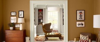
Yellow color is combined with brown, creating life-affirming compositions based on family unity, natural beauty and deep light and brightness contrast. A calm, soothing palette is usually created on the basis of complex yellows, pale, dusty ones. These are the ones we most often see in nature, to which our consciousness and aesthetic feelings are drawn. But we can also imagine the opposite side, where rich browns set off bright yellows, enhancing the richness of the contrast. We recommend viewing the combination with chocolate color
Yellow goes well with brown: oak color, cinnamon, light chestnut, milk chocolate, sepia. Basic: light cream, gray-purple, wet asphalt.
Bright yellow goes well with brown: oak, tan, sepia, chocolate, coffee. Basic: snow-white, gray-beige, wet asphalt.
Golden yellow goes well with brown: coffee with milk, milk chocolate, golden chestnut, chocolate, dark chocolate. Neutral base: creamy beige, mouse, black.
Yellow-orange is combined with brown: yellow-brown, golden chestnut, coffee bean, coffee, dark chocolate. Neutrals: soft cream, old wood, sulfur gray.
Yellow + orange, peach
The combination of yellow and orange colors is a warm, related range, which does not deliberately create a gradient, since the eye completes the intermediate shades. This allows you to deepen the underlying tone and give it pure fervor, like the fire of a flame. The darker the orange, the more pronounced the light contrast, but more complex tones will add a restraining factor. The most successful expression of this composition is with a yellow-orange tint, since the unifying red will bring the harmony closer to natural. Soft, pastel pairings with peach and pale orange will give the palette a romantic direction.
Yellow goes well with orange: peach, orange-coral, carrot, copper, red. Basic: light cream, light gray, graphite.
Bright yellow goes well with orange: peach, orange-coral, bright orange, fiery, red. Neutral basic: snow-white, light gray-beige, dark gray.
Golden yellow goes well with orange: golden copper, ocher, sienna, copper, dark orange. Basic: creamy beige, old wood, graphite.
Yellow-orange is combined with orange: orange-coral, carrot, brick, red-orange, red. Base: soft cream, gray-lilac, dark gray.
Yellow + blue, light blue
Yellow and blue or light blue is a combination based on the maximum contrast of warm and cold. Everything about it screams about the difference in shades and this is what makes it so graceful and complete. Each color blooms in this union with lush colors, demonstrating its merits. And this quality is appreciated by many artists and designers. The palette contains a bright drama, violent feelings and an eternal craving for the opposite. Light, blue tones emphasize the tenderness and femininity of colors, while blue and dark blue are like a challenge - originality, idealism.
See also combination of blue color, combination of blue color
Yellow is combined with blue: aquamarine, blue, thrush egg color, sea wave, Prussian blue. Base: light cream, platinum, black-gray.
Bright yellow is combined with blue: the color of water, bright blue, azure, cornflower blue, sapphire. Neutral: snow-white, light gray, black-gray.
Golden yellow goes well with blue: sky blue, denim, blue-gray, dark blue, sapphire. Basic: creamy beige, asphalt, black and gray.
Yellow-orange combines with blue: water color, turquoise, dark turquoise, Prussian blue, sapphire. Basic neutrals: soft cream, gray beige, wet asphalt.
Yellow + yellow, gold
The combination of yellow in its range is based on light contrast with slight deviations into various subtones. Another accent will be metallic shine, since almost all gold tones are shades of yellow. Lighter, darker, or different shades create the illusion of volume and even shine if the “shadows” and “highlights” are combined in the right order. Pure tones always come to the fore, and dark ones are removed, while at the same time, lighter, paler ones balance the composition, serving as a factor neutralizing excessive brightness. It will be interesting to consider combinations with gold color.
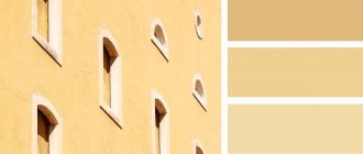
Yellow goes with yellow: vanilla, sand, gold, yellow gold, bright gold. Neutrals: light cream, light yellow-beige, graphite.
Bright yellow goes with yellow: pear, curry, wheat, dark yellow, bright gold. Basic: snow white, light brown-beige, anthracite.
Golden yellow goes well with yellow: apricot, sunny, banana, sand, old gold. Basic: creamy beige, medium brown beige, graphite.
Yellow-orange goes with yellow: champagne, apricot, curry, golden oak, bright gold. Neutral base: soft cream, medium orange-beige, anthracite.
Yellow + grey, silver
Yellow is combined with gray or silver as a rich and neutral, but unlike the previous option, it has a thermal contrast that enhances expressiveness. The combination is distinguished by stylish rigor. In the case of light shades, the couple gains lightness, sunny joy wins the battle with dullness. Gray and dark gray in combination activate a light contrast that is more striking, strict, and expressive. The darker the gray, the closer it is to the scandalous yellow-black duet. You can also check out the combination of gray.
Yellow is combined with gray: white-gray, platinum, old wood, gray-brown, wet asphalt. Basic neutrals: light cream, light orange-beige, wet asphalt.
Bright yellow is combined with gray: light gray, greenish gray, silver, anthracite, wet asphalt. Basic: snow-white, medium yellow-beige, black-gray.
Golden yellow is combined with gray: silver, olive gray, asphalt, graphite, wet asphalt. Neutral: creamy beige, dark brown beige, black and gray.
Yellow-orange is combined with gray: platinum, gray-lilac, lead, slate, anthracite. Base: soft cream, dark orange-beige, black-gray.
VIEW COMBINATIONS WITH SIMILAR SHADES (click on color)
USEFUL ARTICLES ON THIS TOPIC (click on the picture)
