One of the gendered clothing shades is definitely pink. This color is firmly tied to the female gender in the minds of most inhabitants of the globe. The separation begins literally from the threshold of the maternity hospital - with a ribbon on the blanket, everyone they meet is informed about what gender the child has been given to the parents. The girls are dressed up in pink dresses, ribbons of the same color are woven into their hair, and even the doll cars they play with are painted, as expected, pink.
Interesting fact: until the 40s of the twentieth century, blue was considered a “girlish” color, and boys were supposed to wear pink - as a softer version of the aggressively masculine red color. Pay attention to Cinderella's dress in the Disney cartoon - it is no coincidence that it is blue.
However, in the modern fashion world, pink has virtually no place in a man's wardrobe. Therefore, all the colors in this palette belong entirely to women, and especially to young girls. Pink has been associated with youth since the times of the ancient Roman Empire - this is exactly what young people are depicted wearing in ancient frescoes. But women of an elegant age also willingly use shades of pink in their wardrobe - with the right choice of tone, it is refreshing and youthful. You can't miss the opportunity to look younger just by wearing the right set of clothes.
Pink is also considered a very tasty, “edible” color - it is no coincidence that confectioners strive to add this color to their desserts: to enhance the attractiveness of the product and increase its sales.
Basic shades of pink
The variety of halftones of this color allows absolutely everyone to wear it. Do not assume that it is obtained from a mixture of red and white. In fact, it may include yellow, purple, and orange tones. Depending on their saturation, pink is divided into 7 main tones, which designers use when developing new clothing models and ranking the most fashionable colors of the season:
- pale pink;
- lilac-pink;
- salmon;
- crimson;
- fuchsia;
- coral;
- magenta.
Cool shades of pink
In cold versions, blue, lilac, and purple colors are visible. Pink becomes warm due to the presence of yellow, peach, and orange notes in it.
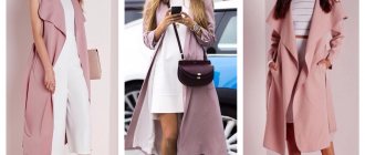
Pale pink, or pearl, tea rose, camellia - all these names refer to that pastel, highly bleached shade in which a minimal amount of red color is seen. Such a soft, delicate color will be a good frame for a woman of any age. In its light powdery incarnation, it is especially recommended for ladies over 40 - both for business, office wear, and for festive occasions. Also, soft pink remains the favorite choice of brides (after white) for a wedding dress.
Mauve-pink is sometimes figuratively called the shade of “dusty rose” or “withered rose”. Due to the barely audible violet pianissimo, there is more coldness in this color. It is no longer as refreshing for older women as the previous color, but is still full of elegance and style.
Salmon is illuminated with an orange flare, and is therefore recommended for women of a warm color type. Its variety is shrimp and that fantastic natural color called “pink flamingo”.
Raspberry pink, sometimes called berry pink, is unusually harmonious, slightly cool and very appetizing, with rare exceptions, it suits almost everyone. A special coziness is felt in knitted clothes of this dark pink shade: a raspberry jumper or a sweater dress will be the ideal canvas for playing with accessories and bright details of the image.
In contrast to raspberry, rarely does anyone go for bright and explosive fuchsia - the most complex of pink tones. It needs to be muffled, dissolved and diluted so that the set does not look provocative and, frankly, arrogant. However, despite the audacity of this color, absolutely all women can wear it, with the exception of ladies who have crossed the 70-year mark, if you wear it at the bottom of the outfit - in the form of trousers or shoes.
The farther fuchsia is located from the face, the more complimentary it is towards a woman - this rule must be remembered.
Coral color is sometimes lumped into the same group as salmon, however, this is not the case. They have a common orange base, but the coral has more pink, so to speak, and the salmon has a slight hint of brown.
Magenta is a neon shade of pink that contains purple and blue notes. It’s cold and hurts the eye just by looking at it, so it’s only shown to equally bright and contrasting female representatives. It is this color, in its various variations, that is popularly called the “Barbie color.” Due to its richness, it is difficult to combine and is limited in use for women over 20 years of age.
How to make your own pink background
A beautiful profile is built on one idea. To create a pink background, pictures of the same shade are added. You can create a style using a photo background, filters, and objects.
There are 3 design options:
- publish images in pink;
- choose several tones (light, powdery, bright) and alternate them;
- change the theme color to the current one (for example, switch from light pink to dark).
Also read: How to chat on Instagram with another person from a computer
Play with shades, add a new tone to each line. This will make the profile easy and interesting. In this way, you can highlight profile categories and conveniently distribute products into groups.
Image selection
Planning the visual content is not as important as the quality of the frame, its execution and idea. Photos must correspond to the focus of the account and be processed with the same filters so that a single color scheme is maintained.
The pink photo should match the style of the account.
Images can be arranged in a checkerboard pattern, using a dedicated stripe. Posts with photographs with captions on them attract attention. If you make frames, you get the impression that all the pictures are stuck on a delicate background.
Processing Applications
If you create a page in the “rose” style, then process the images using filter settings or in the Lightroom, Afterlight, A Color Story applications.
What shades suit each color type?
It’s not for nothing that stylists have lost their tongues, tired of answering the question: who will wear pink? Any color type has room to develop, and the most important thing in the color scheme of your personal set is that the pink color takes up as much space in it and exists in exactly the shade that corresponds to your age group.
Winter color type
Contrasting girls of this color type will suit bright, even flashy tones of pink. You should avoid calm, soothing shades that do not correspond to the “winter” expressiveness in terms of their impact on others. Cold and intense pink colors, even dazzling neon, will fit perfectly into the wardrobe of this color type. The only warm shade that they are allowed among the entire pink palette is intense coral.
Spring color type
Salmon, pale pink in various variations, coral, flamingo - all this is very suitable for a warm, golden spring. You should focus on the color of your natural blush - the skin itself will tell you what kind of pink color it needs. Cold magenta, dusty rose, clover variations with a lilac flavor extinguish the natural beauty of “spring” women. Perhaps they are the only ones who are contraindicated in fuchsia, except in very small “therapeutic” doses and at a great distance from the face.
Summer color type
Summer is always friendly with those shades of pink in which the influence of gray and blue is felt: “faded rose”, crimson, pearl, pink-lilac, dirty pink must be present in the arsenal of a “summer” beauty of any age. “Dusty rose” and dirty pink must be handled carefully - with a high degree of whiteness or, conversely, the presence of obvious gray in pink tones, skin prone to blueness or grayishness can take on an unhealthy, faded appearance. Therefore, it is better not to wear sets in which these colors predominate and, moreover, are concentrated in the upper part of the outfit.
Autumn color type
For some reason, in the fashion space, on the pages of blogs and websites about style, among readers and participants in discussions, there is a widespread opinion that red hair color, often inherent in this color type, and the pink color in clothes are written antagonists.
In fact, this is not true. Copper-red, brown, golden hair harmonizes perfectly with the right pink: lilac-pink, crimson, cyclamen. The subtlety is that the color has a clear structure - without halftones and without faded, indistinct shades. Autumn is contrasting and active - give it a worthy frame in the form of bright colors.
The importance of profile style
On Instagram, not only the quality of individual posts is valued, but also the style of the page. Even professional content needs to be presented beautifully, according to trends. This can be a decisive factor when choosing a product or subscription.
In an effort to maintain one style in pink tones, the main thing is not to forget about diversity. No one will be interested in following an account that contains 500 photos of the same type, even if they are in harmony with each other.
The mood of the profile should reflect the essence of the product. If you sell wedding dresses, then you need to create a gentle atmosphere in your feed. If the caps and panama hats are multi-colored, then you should focus on bright colors.
The combination of pink color in clothing sets
The most difficult thing about wearing pink is to be able to limit yourself in the amount of it. This sweet, seductive, feminine color often becomes hostage to the owner of the outfit in the desire to show the whole world how sweet, weak, defenseless she is in this world of men.
How to properly combine pink with other colors so as not to become a caricature of Barbie is easy to understand if you follow simple rules.
Pink and white
A combination that has long become a universal classic. White color smoothes and evens out the radiance of any shade of pink: fuchsia will add nobility, reducing its explosive power, and pearl will add internal energy. Of course, this is not a winter combination, and it is of little use for the off-season, however, paradoxically, acting as outerwear or accessories - a scarf, hat, boots - it is quite acceptable.
Pink and brown or beige
Pink and brown must be the same in tone temperature. This is the only combination that has easily migrated into the men's wardrobe: a pink tie perfectly sets off a strict brown suit. The same combination is suitable for a female office look.
To wear pink with beige, make one of the colors more distinct and noticeable so that the set does not become a shapeless blur. Both colors are close to the skin color of Caucasian women, and if she is also a natural cool blonde, a poorly thought out outfit without bright color accents will turn its owner into a vague shadow.
Pink and blue
The two colors will make friends and spend a wonderful day in your set - creating a great mood for you too - if they do not argue with each other about who is the brightest. Only one of them has to be intense. Two saturated tones together, especially those close to neon flashes, will sound like a discordant cacophony in the outfit and hurt the eyes of those around you. The combination of pastel pink and pale blue looks great. This choice will highlight both lips and eyes at the same time - even if they have a different iris color than blue or blue.
Adding brown in the form of accessories or shoes will add rigor and elegance to your outfit.
Pink and green
This combination, so often found in garden beds, is difficult to translate into clothing. It is not easy for an ordinary woman to choose shades that are suitable in color and intensity, which will merge in harmony, and will not look like two separate centers of attention in one outfit.
A combination of soft pink and mint colors is considered a win-win. It rejuvenates, refreshes and invigorates. Blends well with many calm tones of pink and grassy green, deep color. But light green, due to its high content of yellow undertones, is combined with pink only in details. It is better to avoid combining large scales of these shades in an image.
Pink and yellow
To complete the set, the duet of these two colors lacks a third, which is not at all superfluous. Yellow, pink and brown - the image is discreet and stylish. The mint color will make a yellow-pink outfit incredibly “edible” and memorable. Burgundy will add a touch of chic to the combination of these shades.
If you replace the yellow color with gold, you will get a completely casual outfit, but an “occasional” look. The brighter the shine of gold, the more the pink piece of clothing should match it - satin, silk, metallic thread should be in it.
Pink and red (orange)
Without being a stylist, it's so easy to miss when putting together an outfit with these colors! It seems – what’s special, because pink is almost red, only slightly diluted with white. And orange is the brother of red, and therefore pink.
However, logic and features of color perception are incompatible things. If you really want to try and you are determined, go for it.
There are probably only three rules:
- do not include other colors in the set in proportions greater than one-fourth of the outfit as a whole;
- do not use accessories and shoes that match the shade of pink, red or orange from the set;
- makeup must be neutral, and hairstyle must not be shocking.
Pink and purple
The more blue or lilac undertones are visible in pink, the easier it is to combine with purple clothing items. The shade of the second color, called “grape,” will be universal in all cases. Black color will add solemnity to this combination, and white will add lightness and mischief.
Pink and gray
What pink goes with is gray! By playing with the temperatures and shades of these colors, you can create both magnificent, memorable outfits, and slide into the corner of oblivion as an uninteresting gray mouse.
Gray color has the extraordinary ability to tame even the difficult fuchsia, calm the impulsive magenta, highlight the timid camellia and perform well in pairs with raspberry.
In combination with gray, not a single shade of pink will look comical or cloying. Just avoid combinations of dusty and too whitened tones of both paints - it looks dull and outdated.
Pink and black
One of the most powerful combinations in terms of its impact on others. Keep in mind that while gray calms shades of pink, acting as a moderating factor, black acts as a catalyst on the same colors: it enhances everything. Bright fuchsia will make it simply unbearable to look at, soft pink will turn it into a dirty white, unappetizing shade. Raspberry will become cloudy and thick, and coral will lose its cheerful yellow note in the presence of strict black.
To smooth out this blemish developer effect, add white to the set. In the presence of positive white, black stops sulking and happily becomes part of a bright and stylish outfit.
Pink accessories
You need to carefully combine a pink accessory with other elements of women's clothing. Here, color decides everything - the brighter the shade, the less space it should take up in the outfit. A bright coral summer hat can match the color of the bracelet, but adding coral sandals here will be unnecessary. The cyclamen-colored belt is completely self-sufficient and does not need additional amplifiers of this color. Pink shoes are unique shoes, it is better not to distract the attention of the audience from her solo performance in the set.
If you want to keep a pink accessory in your wardrobe for a long time, choose time-tested colors: powdery, raspberry, light pink. These shades will never go beyond the focus of fashion designers.