How to choose the right color for your bathroom
Each color has its own characteristics of visual and psychological perception of space. By skillfully using color in bathroom design, you can visually increase or decrease the size of the room and create a certain atmosphere.
Things to consider:
- correspondence of the chosen color and shade to the size of the room. To adjust the space, this is very important: the smaller the bathroom area, the lighter the color scheme and the degree of shade saturation;
- The style of the bathroom should fit into the overall design of the apartment as a whole. A harmonious and correct combination of all decorative elements can transform any room;
- individual color perception using expert recommendations.
Purple color in the bathroom
The iris shade combines ideally in the bathroom with watery green tones, which are recommended for tinting glossy wooden surfaces and sanitary fittings . The jagged blue in this composition is optimal for bright accents (lamps, small decor). Take a pink-lilac tone as the main color for the floor.
| Iris: #63387d (HEX). RGB (99, 56, 125). HSV (277, 55, 49). | |
| Watery green color: #cce4e4 (HEX). RGB (204, 228, 228). HSV (180, 11, 89). | |
| Dark watery green color: #acc4c4 (HEX). RGB (172, 196, 196). HSV (180, 12, 77). | |
| Jagged Blue Color: #5b727a (HEX). RGB (91, 114, 122). HSV (195, 25, 48). | |
| Mauve color: #a294b8 (HEX). RGB (162, 148, 184). HSV (263, 20, 72). |
White color
A universal classic option that is always relevant. Creates a feeling of cleanliness and easily fits into any design solutions. Visually increases the space, so it is ideal for small spaces.
We also recommend:
Shower cabins - 150 photos of new products in the bathroom interior- Bathroom cabinet - 70 photos of popular options in the interior
Bathroom tiles - modern innovations and photos of interior ideas
The disadvantage is a certain coldness of perception. Using other shades of white (milky, pearl), you can add warmth to the feeling.
Black color
Strict, elegant and stylish. Refers to luxury classics for elite interiors. A special chic is created by the combination of black with all metallic shades of gold and silver.
In small rooms it looks gloomy and visually reduces its size. Experts recommend using only for spacious rooms and in combination with other colors.
We also recommend:
Bathroom design: TOP 200 photos of beautiful interior ideasBathroom furniture - photos of the best new furniture from the 2017 catalog
- Walls in the bathroom: TOP-120 photos of new products of perfectly designed walls in the bathroom
Color combination of ceramic tiles for the bathroom
There is a lot of water in the bathroom. When water dries, it leaves white spots. These are the salts that were dissolved in it. No adequate filter options will save you from this, trust your experience. To make beautiful tiles not only on the stand:
Standard colors for bathroom tiles are light. Otherwise - permanent white spots.
And 2 more hard facts:
- For a stylishly non-boring bathroom design, neutral colors are enough.
- Almost all colored tiles are terrible.
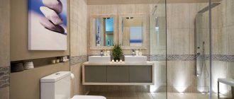
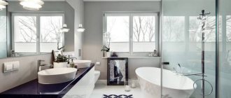
This is especially true in the interior of a small bathroom. And to immediately prove that even a bathroom completely decorated with gray tiles can be cool and not boring, here is a photo:
With the design of color options, everything is very complicated because... almost all of them are rubbish, which cannot be saved either by a perfect layout or other tricks. But there are rare exceptions. Therefore, any colored tile is a risk.
Sometimes it can turn out well, but you need a sense of taste and proportion, a very painstaking choice. Colored tiles for the bathroom when it comes in and doesn’t (the line is very thin):
But even good colored tiles should be accent and not main.
The base color should always be neutral. In no case should you make aggressive colors like red, pink, purple, green dominant. In short, the same rules that are described in the material about color combinations (for example, why pure red is almost impossible to fit into the interior properly).
For example, light green ceramic tiles for the bathroom will fit perfectly into the country style.
The muted tones of ceramic tiles are appreciated over time. Bright ones always please, but not for long, but as in the photo, they are used for a long time. They are less irritating, you get used to them faster and you can’t start the morning sacrament without them.
Its delicate shade will harmonize well with pastel colors and brass fixtures. Pink and greenish ceramic tiles for the bathroom also look nice.
There are products that are very reminiscent of snake or crocodile skin. You can make almost any fantasy come true.
Red color
Emits strong energy, raises tone. Too much red can be depressing and irritating. It is best used for large rooms, combined with white, gray, black and metallic colors.
Deeper tones of red are psychologically perceived better (for example, burgundy). It is necessary to observe measures in the use of such energetically active colors.
We also recommend:
Bathroom curtain - photo of original bathroom accessories- Black bathroom - photo of how to create a stylish dark-colored bathroom design
Corner bathroom: photo review, advantages, types and characteristics
Blue color
Deep and stylish. Shades of different intensities are used: from blue to dark tones. Light colors calm, expand space, add freshness, but can be cold and uncomfortable.
The combination with white, beige, gold and wood color adds the necessary warmth to the perception. Dark shades of blue should be used sparingly. It is necessary to select the desired shade, following the basic rule: the smaller the size of the room, the lighter the tone.
The combination of colors in the interior of the bathroom is blue
The interior may be monochrome, but it is still more popular when arranging a bathroom to use companion colors for blue.
When choosing them, you need to take into account the rules of good compatibility of tones, otherwise the result will be far from harmonious.
White
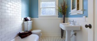
A blue and white bathroom is the ideal solution; it is considered a classic of the genre. The combination of white and soft blue is perfect for people who value a cool type of interior, as well as for a small bathroom.
White will become the background for light blue, emphasizing its depth, eliminating the “aquarium effect”.
However, a blue-blue interior may seem too detached and cold, so it is recommended to bring some warm tones into it in the form of accents. You can also use the technique of combining different materials and textures, for example, by combining ordinary tiles and ceramic mosaics, panels.
Grey
The gray-blue interior looks very organic and stylish. Gray gently absorbs the energy of blue, reducing the presence of the latter without oppressing it. Typically, the combination of gray and light blue is liked by men, since the atmosphere is brutal and gives purposefulness and determination.
Yellow
The yellow shade looks great when combined with blue, and it goes equally well with dark blue wall tiles. Yellow reduces the coldness of the heavenly color, eliminates the depressing effect on the psyche, and gives the room warmth and a feeling of a bright sunny sky.
Yellow will look especially beautiful in accessories and furniture.
Red
A bathtub in red and blue tones is rather an exception to the rule. Designers rarely use this option for decorating a room. The colors carry opposite meanings, have different temperatures and contrasting emotional colors, and therefore do not suit each other well.
It is better not to carry out unjustified experiments, otherwise the interior may turn out pretentious.
Orange
Unlike red, orange and blue look great. This solution is ideal for rooms designed in a Mediterranean style; it is reminiscent of the sea coast, sand, summer day, and juicy fruits. The interior in orange and blue tones invariably turns out to be bright and dynamic.
Green
The combination of green and blue necessarily requires dilution with white, because these tones are related, so they will merge without differentiation. The blue-green color scheme symbolizes the sea, and can be used to decorate a stylish interior with a thematic focus.
An excellent option is to replace green with turquoise: in a duet with soft blue it will look attractive and fresh.
Black
In order not to make the room gloomy or too oppressive, it is recommended to use black only as accents, and use blue in the lightest colors. It is better to exclude dark blue colors, because they will merge with black and cause an unpleasant feeling.
Using other shades
In addition to the colors listed, all shades of beige and pink are no less popular. They are attractive in their own way and are used very often. Sometimes less popular colors look good in the bathroom: yellow, lilac, brown. It is necessary to take into account that each of them emits different energy.
With the right combination of bathroom tile colors, plumbing fixtures, accessories and decorative elements, you can correct the shortcomings of any room.
Knowing how to choose a color for your bathroom, you can experiment and fill the space with the energy of your favorite color. The harmony of colors will give you a feeling of comfort and good mood!
Inspirational yellow
Do you love to soak in the bath and fantasize about your next big idea? This sunny color radiates joy and is associated with intelligence, creativity, warmth and vitality.
If this sounds like how you want to feel every day, don't be afraid to choose a bathroom tile color in a bright yellow hue for the brightest possible room.
Cool things down a bit by adding a fresh coat of white paint to your window frames, doors and ceiling. Keep the design yellow and white for harmony, or add shades of gray for a modern feel.
When it's time for a change, you can easily transform your yellow haven with other decor colors, including stylish black, rich blue or pretty pink.
