- October 26, 2019
- Repair Tips
- Marina Duritsina
Terracotta, which many people associate primarily with the type of ceramics of the same name, has softness, visual purity and some kind of natural elegance. But ask a person who is not experienced in color to answer what color it is - terracotta? In 90% of cases the idea of this tone will be incorrect. And it’s a shame, because this is one of the favorite colors used in design. When used correctly in design code, it can make the interior of a living space more natural and harmonious.
What is color
Terracotta (Italian terra - fired, cotta - clay) is the color of fired ceramic material made from colored clay. Refers to tertiary colors - that is, formed as a result of a combination of primary and secondary or two secondary colors. What color is called terracotta, what accents does it consist of? In particular, terracotta color is formed after mixing red and brown tones. Of course, terracotta color is not at the forefront of the palette, but it has a unique coloring that sets it apart from other tertiary colors.
Terracotta color - what shade is it? Classic terracotta is usually associated with the color of the earth. This is a soft, warm brick shade that instills a sense of calm, instills a sense of stability and security, calms the nerves and immerses a person in a favorable meditative atmosphere. Feng Shui practice involves having calming terracotta elements right at the entrance. However, moderation must be observed - walls completely painted in terracotta color cause the exact opposite effect, creating a feeling of discomfort in a person.
How to get the right color
So you've taken up interior design and want to incorporate terracotta into your home's color palette? In this case, you will definitely need knowledge on how to get this color.
How to get terracotta color, what shade is it? If we consider it as a brown shade of red, as is customary in coloristics, then it is quite obvious that these two colors should be used to form the shade - red and brown. The main questions arise already at the stage of choosing paint: in what proportions should colors be mixed? What kind of paint should there be more? The answer is simple - it's up to you to decide. The distribution of proportions when mixing paints affects the final result, but it will still be a terracotta color. There will be more red - the color will be brighter and more aggressive. There will be more brown - the shade will be softer, and sometimes even slightly gloomy.
How to get a light terracotta color, what shade of color is it? To make the tones even richer, you can add a little orange admixture. For lighter, more optimistic, yet soft tones, you can add yellow. You should always experiment with shades, because this is how a new range appears, but try not to overdo it, so as not to lose the terracotta. When mixing different shades in small proportions, make sure that the classic shade (a mixture of red and brown) is not lost.
Combination with other colors
Many designers call this color universal. It belongs to natural shades and, accordingly, it is easy to combine with other natural tones. But you should be very careful with artificial, unnaturally bright and acidic shades - it’s better not to experiment with them.
It goes well with a delicate pastel range of cold and warm tones. A classic win-win option is to combine it with white.
It brings a feeling of freshness to the room, diluting the sunny terracotta with its serenity, and visually expands the space. A good combination will also work with milky and light beige tones.
Terracotta color looks good with various shades of red and brown. With this combination you can create a very cozy and harmonious interior.
A very beautiful and rich effect is obtained when combined with green.
Particularly unusual combinations include combining terracotta shades with turquoise, blue, gray and even purple tones.
Gray furniture goes well with the terracotta color of textiles
What colors does terracotta go with?
In the design environment, this shade is considered universal. It pairs well with most primary natural colors while still standing out from them. However, you need to be wary of adding overly bright, acidic shades to the interior that contrast with soft terracotta. But adding cool tones from a pastel palette will only improve the perception of the room.
What color goes with terracotta brick and what combination will be the most successful? Here are a number of recommendations for combining colors that we recommend you listen to:
- Shades of brown go well with shades of white. This tandem is a true classic of colorism and is used to visually expand the space.
- To create a harmonious and cozy atmosphere, you can use a combination of terracotta and beige, milky, cream, caramel shades.
- The harmony of terracotta and dark green creates a special, “natural” impression in everyday life.
- If you focus on black, it will create an interesting contrast that will only benefit the interior.
- Terracotta and orange can be a good pair if you add a little yellow, olive, beige and other paints that will slightly dilute the monochromatic palette.
The easiest way is to choose a terracotta color from a photo. It’s already clear what color it is; it’s interesting that its palette can be combined with almost any shade, the main thing is to design it correctly. For example, if you decorate a terracotta finish with small elements of purple, emerald, or blue, this will well demonstrate the individuality of the room.
Range with an orange-yellow undertone - what color is it? Terracotta? The color in the photo above is one of the variations of this shade, and it is not very successful. Such a tone can damage the entire interior and be unpleasant to the eyes. Also, excessive contrast of cold tones like light blue or turquoise with hot and bright terracotta does not always create a successful tandem. You can use a soft grey-bluish, reminiscent of a light morning mist, and with it, you can further bring out the welcoming terracotta color against it.
Red terracotta - what color is it? This is the predominance of burgundy and copper shades. Milky, creamy, ivory goes well with it. However, you can use a soft grey-bluish, reminiscent of a light morning mist, and with it you can even better bring out the welcoming terracotta color against it.
Shades
Terracotta color, like ceramic products, can be completely different: depending on the percentage of the three components (red, brown, orange) and their saturation. Terracotta shades start with a muted almost beige, go through bright carrot and end with almost pure brown.
The main option that most people think of when they hear the word “terracotta” is dark. The color of rich red brick, fired clay pot. The light shade is the same in temperature, but has less saturation - close to salmon, but more earthy.
By changing the ratio of pink-scarlet and orange colors, you get red terracotta - similar to mahogany, but lighter. Or orange - a warm shade reminiscent of rust.
In the photo there is a bedroom in the shade of terracotta
Stylistic decisions
As already mentioned, brick red terracotta color is a design classic and fits perfectly into traditional formats such as safari, oriental or country. Often used to transform the interior in ethnic style. The color fits perfectly into the vintage style, as well as into various variations on the theme of ancient Greece and other historical periods. Designers often use it in avant-garde and minimalist works.
Universal terracotta - what color is it? The main feature of this shade is that you can apply it to any artistic idea for working with the interior of a room. Terracotta has an excellent rapport with stone, wood, as well as textiles and ceramics. To give the color a feeling of luxury and solidity, try to use matte surfaces, since glossy ones can indicate your bad taste. You can pleasantly surprise visitors by decorating terracotta walls with textiles made from natural materials. Curtains or upholstery can be made of patterned fabric and have a beautiful design.
If you are working on a large space with windows that receive direct sunlight, then you may not be afraid to use terracotta as the main color. However, in the case of small spaces, too much terracotta is more likely to be harmful, so it is recommended to use it as a background color or add some light colors. For example, if you decorate a small room with wallpaper in light shades, but with a prominent red-brick pattern, it will seem visually larger.
Frequently encountered stylistic combinations with terracotta color in the interior:
- The use of various shades of this color scheme is common in classical and antique styles.
- It’s a rare designer who can refuse red-brick shades in a classic interior.
- The shade looks good in ancient Egyptian or Indian style.
- When creating an ethnic atmosphere, less bright shades can be used; when decorating in a boho or avant-garde style, more saturated ones can be used.
The advantage of using terracotta as the main color in the interior is its ability to perfectly convey the aesthetic beauty of the relief and the texture of the finishing material. Therefore, when covering the walls of a room, use plain wallpaper covered with a beautiful relief pattern. However, the material should not be littered with various decorative unnatural elements such as sparkles, vanilla gloss or golden plating. The trick of finishing in a terracotta shade is its “naturalness”.
In addition, be wise when choosing fabric for upholstery upholstery - terracotta upholstery, made in a classic style, decorated with ethnic patterns and having a fluffy, fleecy texture, is the best choice for a classic room design. Nevertheless, experts categorically do not recommend the use of terracotta when sewing curtains, in particular on windows facing the sunny side. Direct sunlight entering the room through terracotta curtains paints the room in alarming red tones, which can cause a deterioration in well-being and even psychological problems in a person.
Show me the terracotta color. Terracotta color: what is it and why we should know about it
Most often, our knowledge of colors is limited to the rainbow and a couple of favorite shades. The Pantone Color Institute educates us on this issue every year. But what color most likely has not received enough of your attention is terracotta, one of the most beautiful and eye-pleasing summer shades of earth, clay, sultry southern sun, hot tiled roofs and the fertile Italian Mediterranean. We tell you everything that is important to know about terracotta color in summer 2021.
A bright terracotta-colored outfit or accents from accessories will definitely attract the positive attention of others, but first, it is important to understand which shade can be called terracotta.
- What is terracotta color?
Terracotta color is the color of baked earth or clay. The simplest example where we could see it is clay flower pots. It is often described as a shade of red with the addition of brown, some simply call it brick. The fact is that terracotta color can have shades.
So it meets pink, orange, beige, yellow undertones. Brown and red can also be expressed in different strengths within its color spectrum, which will give the terracotta color a brighter or darker, muted hue. Catchy shades of terracotta are formed in combination with fashionable orange, and muted terracotta is shaded with pink or brown.
The Pantone Color Institute has announced fashionable colors for 2021, and among them is Flame. This color can also be classified as a terracotta shade, which goes perfectly with any of the colors proposed in the table.
- Terracotta color is in fashion
Terracotta color has become fashionable due to its unobtrusive brightness, which does not tire the eye like red, orange or yellow. Since this is the natural color of earth and clay, which is often found in nature, we perceive it as a pleasant, light shade on which the eye, as they say, “rests.” Designers often use terracotta color in spring-summer and cruise collections. He also quite often falls into the lens of street style photographers during world fashion weeks.
- Fashionable terracotta color in the wardrobe
It is believed that terracotta color is most suitable for girls with an autumn color type. Terracotta will look best on “warm” brunettes or brown-haired women, while “warm” blondes and fair-haired women should pay attention to the lighter orange shade of this color. If cool colors suit you more, then choose terracotta with a pink undertone, and combine it with white and a light tan. In addition, the terracotta shade with related colors: brown, beige, yellow and ocher-yellow and gilding, as well as with contrasting ones: black (and white, of course), fuchsia and hot pink, blue, turquoise, sea green, blue , gray. The combination of terracotta and green always looks harmonious, especially with herbaceous shades. Despite the fact that burnt earth is associated with the desert, fashionable terracotta does not look dry, but on the contrary, it enlivens the image.
Hallway
The hallway is the “face” of the entire house. This is the first room that a guest encounters, which means it should leave a good impression. But at the same time, the interior of the hallway should not be strikingly different from the interior of the rest of the house. Therefore, it is recommended to use furniture in brown or another dark shade against the background of terracotta-covered walls and floors.
A good option for a terracotta color in the interior of a hallway is to add small portions in the form of a wardrobe, a wardrobe or sliding doors in a red-brick shade. The upholstery of the walls can be done with soft cream wallpaper, and the furniture can be white (the use of brown or black furniture is also encouraged).
How to get a terracotta shade by mixing paints
If you couldn’t find the current color option for finishing the room in a hardware store, you can try to create it yourself. To do this you will have to mix several colors. How saturated the tone will be depends on the percentage of the desired shade.
For example, to create a bright orange shade, you will have to mix red and yellow in equal proportions. If you need a muted shade that is not too saturated, then it is better to add as much yellow as possible.
In order to get a complex red tint, you need to add a few drops of purple to the existing red and yellow. However, the more of it there is, the darker the terracotta color will be as a result. When trying to lighten the resulting tone, you should add a little white.
Creating a terracotta palette for interior design from several colors Source mrrestavrator.ru
The rusty-red shade is considered the most interesting for modern interiors. It can be obtained by combining orange and yellow. To partially lighten the resulting consistency, add a small amount of yellow color.
In order to obtain a calmer shade, it is advisable to add a gray tone of paint rather than black.
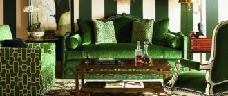
Living room
Planning a living room design is traditionally considered one of the most difficult aspects of design work. The living room is the largest and most important room. If the hallway creates the first impression on the guest, then by the interior of the living room he already judges the entire furnishings of the house.
To organically and appropriately distribute terracotta color in the interior of the living room, first start decorating the walls, textiles and other accessories. It is recommended to decorate the walls in lighter colors, while the floors, furniture and textiles should be slightly darker. This is due to the fact that flashy accessories in the living room can cause a feeling of bad taste. If the visual environment in the room is calm, then this indicates self-sufficiency and harmony. For example, if you upholster an upholstered chair with bright crimson-brick textiles, then against the background of delicate light shades of the walls it will look classically luxurious. But if the wallpaper is in the same color scheme, then the room will only cause ripples in the eyes.
The combination of wood furniture with brick trim deserves special mention. This is a true design classic. Dark wood and white painted walls are especially combined with this shade. The article contains photos with combinations of terracotta color in the interior with wooden furniture, stairs, and decorative elements. You can always choose a good option.
The best accessories to decorate your living room:
- clay and wooden floor vases;
- designer carpets made of natural materials, animal skins;
- bright paintings in orange, red and terracotta colors;
- curtains and textiles in natural shades.
It is recommended to use only natural materials: linen, cotton, wood, etc. Beautiful linen curtains and textiles, upholstered furniture upholstered in natural materials, solid furniture made of quality wood - all this can be called luxury, but at the same time a sign of good taste, especially for a room like a living room. Similar principles are used when decorating a kitchen.
An important note: to add extra flair, try subtly accenting the look with green accessories. However, the color should not be bright and poisonous; you need a soft, pastel shade of green that would harmoniously combine with the terracotta background and not overshadow it.
The terracotta color in the living room can be made brighter and more saturated, but in this case the scope of its application should be limited. If you plan to cover most of the room in this color, then tone it down slightly. Walls made in calm, slightly dark terracotta can be combined with a white, cream or beige interior. A good solution is to use the contrast between terracotta walls and furniture in blue or black shades. Finally, to make the room brighter and more cheerful, you can add “autumn” tones - a dark yellow or orange palette, with the addition of blue and greenish tint accessories.
Terracotta in the interior
The shade of brick can be used in any room without exception. It can be made primary or additional: as desired, depending on the other tones used, the size of the room and the degree of color saturation. If the room is spacious and faces the sunny side, terracotta can be made basic: decorate the walls and floor with it. In small rooms it is better to take the lightest tones of terracotta or use dark shades, but in the form of accents.
Hallway
In this room, terracotta will welcome guests and household members with a friendly, warm atmosphere and will promote calm. It is quite discreet, non-staining, and looks very stylish. In a large corridor, you can use terracotta wallpaper, but only if there is good artificial lighting, because there are no windows. White furniture looks especially impressive against the background of such decoration.
In a small hallway, it is better to strive for a visual expansion of the walls, so they should have light shades. The furniture can be terracotta, black, brown: it will only emphasize the pleasant freshness of the vertical surfaces.
Living room
For a living room, terracotta will come in very handy; it will add calmness and cheerfulness to the atmosphere. Usually the walls are decorated in light brick colors, while the floors, furniture, and curtains are made darker. Another successful option for decorating a room is to have walls in light pastel colors, and a sofa and armchairs in terracotta, or add this color to the flooring and accessories.
In sunny, southern rooms, the terracotta tone can be diluted with cool shades of turquoise, blue, and green. Additional colors in textiles will look good: curtains, pillows, rugs, blankets. For cold rooms, light terracotta is a good idea to combine with red and white tones, and beige shades. Wooden furniture, dark wooden floors, natural carpets and soft textiles look great against the background of brick walls, which is especially suitable for country style.
Kitchen, dining room
In the kitchen, terracotta will fit well into the interior, remind you of spices, pottery, and provide an excellent appetite. It has a positive effect on vision, so it can be present in decoration in significant quantities. Most often, terracotta is used in kitchen furniture or flooring along with a ceramic apron.
You can also introduce the color of brick in textiles and accessories against the background of light furniture, especially if the room is small. Potholders, cups, clocks, vases, and wall plates will help to enhance the style and make the room spectacular.
Bedroom
It is better to make a sleeping room light and airy in appearance, so terracotta is used only in the form of pastel colors as the main one. But furnishings can be bright, but they should not be used in large quantities. Terracotta looks great in:
- furniture upholstery;
- pillows;
- bedspreads;
- curtains;
- sconce;
- frames of paintings;
- ceramic accessories.
Terracotta goes well in a bedroom interior with gray and blue colors. The ideal pair would be terracotta walls and white furniture; this combination is relaxed and light.
Children's room
For children's walls, it is recommended to use only natural materials: for example, paper, non-woven, fabric wallpaper. It is better to use rich, cheerful colors, so terracotta is usually used to decorate only one wall or area, or use the color in the decor. Yellow, orange, green, light green, blue look good with a brick tone - all these shades will suit the child’s taste. Teenage rooms are often decorated in a loft style and a brick wall is used as an accent wall.
Bathroom
Typically, the bathroom is decorated in terracotta color by those who prefer conservatism in everything, including the interior. Preference should be given to matte surfaces, which look more stylish, but with a combination of orange, beige and terracotta, it is quite possible to use a glossy finish. In spacious rooms it is permissible to use darker colors, in small rooms only light, pale ones. A limited introduction of terracotta in textiles and accessories would be appropriate. Green, pink, and red accents will complement the decor.
Cabinet
The terracotta color is perfect for an office: it will give this austere room a more homely look and help set the mood for calm but fruitful work. It is better to use accessories of this range in the office (floor vases, panels, figurines, paintings, lamps) or furniture: armchairs, sofas.
Bedroom
Don’t think that the bedroom is less important for the perception of a house/apartment than the living room. This room is primarily a place where a person can relax after a hard day, so the environment in it should be calming. This means that when decorating a bedroom, it is recommended to use softer and pastel shades. For example, a mixture of pink, brown and orange gives an airy shade that is ideal for a bedroom interior.
What colors does terracotta go with in a calm bedroom interior? Let's look at several design options and their features.
Option 1 - “Light terracotta with a pink tint”
The use of light shades in the bedroom is justified by the low natural light in the room. Natural clay in such a space looks just like a dark spot, but in a light pinkish tone it is a completely different matter.
Option 2 - “Light terracotta with an orange tint”
Terracotta color, in principle, does not have cold shades. It's always a warm and eye-catching color, especially when you add a little orange. At the same time, it does not go well with pure white, so it is better to replace snow-white bed linen with items of a more saturated shade.
Option 3 - “Terracotta and textured coatings”
Terracotta color is not recommended for use on a smooth glossy surface. Instead, it works well on bumps, rough spots, and soft and fluffy finishes. Wallpaper should not contain sparkles or multi-colored sprinkles; silk pillows should also not be used. When painting walls, you should follow the classic technique with streaks.
Option 4 - “Terracotta + vanilla”
The terracotta color in the bedroom interior in combination with brown and vanilla fits perfectly into the decor of the room. Unlike red, orange and other richly bright colors, terracotta retains the elegance of design solutions and is practically not distracting, while the surrounding space, made in vanilla and brown shades, creates the ideal bedroom atmosphere.
How the terracotta palette behaves in different living rooms
The declared palette looks perfect in almost every room in the house. The main thing is to skillfully use shades, be guided by restraint and measure. Let's consider design options.
Terracotta in the living room
In the living room or hall, the shade is most popular. For example, they try to use terracotta color exclusively in wall decoration, and to compensate for such richness, it is necessary to select furniture made of natural wood in darker tones. The finished interior can be diluted with textile accessories: sofa covers, curtains, carpets. However, these details may differ in shade from the main furnishings.
Living room in a pale terracotta shade with a gray small sofa Source pufikhomes.com
On a note! When using carpets in the living room, it is better to give preference to paths with wide stripes. It is advisable that they do not occupy the entire floor area. The surface covering must be visible. This will emphasize the completeness of the interior in the chosen palette.
If the living room is small in size, then dark terracotta is absolutely not suitable for covering surfaces. Here it is better to pay tribute to light tones: light terracotta color, pale orange. At the same time, sofas and other sets of furniture should be a little darker so that they stand out against the general background of the room. Also, do not forget about the presence of discreet black. These could be some elements of fittings or furniture legs.
Living room using light terracotta colors Source modernplace.ru
Kitchen
The most interesting looks are splashes of terracotta color in the kitchen interior. This predominantly small room takes on a unique atmosphere of coziness and warmth. The color of burnt brick is associated with a fireplace, inside of which a burning hearth crackles. It is not without reason that psychologists note that terracotta kitchens stimulate appetite and make you want to sit longer. This is precisely why terracotta is often used in the restaurant industry.
Of course, we are not talking about decorating the kitchen exclusively in this color. It is enough to paint the walls, the surface of tables or even the sink. This color can focus attention on a particular element, for example, on sofa cushions or a tablecloth. A good option is decorating furniture facades, kitchen appliances, etc. You can also combine terracotta with other natural colors - light brown, orange, red and other light shades. You should not combine color with unnatural, neon, toxic tones.
You should also understand that decorating a kitchen in this color suits large, spacious kitchens, but not small ones. In small kitchens this style will seem inappropriate and overly dark, but in a large room it will create an atmosphere of luxury and classics.
Bathroom
There is no point in having a debate about whether terracotta color is appropriate in the bathroom. In the end, the decision must be made by you, and if you are tired of the classic white/gray palette, you can choose shades of the brick we already know.
Successful combinations of terracotta colors in the bathroom interior:
Option 1 - “Terracotta + copper”
Using mostly natural colors is always advisable, but you shouldn't limit yourself to anything. If the bathroom decor allows, then try adding a little copper color to the surface of the bathtub or shelf. The floor, accordingly, is decorated with terracotta tiles. You can add many more different accessories, preferably also in copper color.
Option 2 - “Terracotta + wenge + beige”
Decorate your bathroom in a more classic style by painting the walls and ceiling terracotta and adding a wenge-colored chest of drawers. A room in this design is already associated with luxury and antiquity, but that’s not all. As a final stroke, lay out the tiles in beige color. It will not set off the natural brown that dominates the room, but will make the visual perception of the room a little easier. Of course, such a bathroom setting should only exist in conjunction with other rooms decorated in a similar way.
Application in a modern interior
If you want to decorate your interior simply, yet elegantly, then you can give preference to straight straight curtains in the classic version. This model will always be relevant. Photos of similar terracotta curtains in the interior can be seen below.
For rooms with high ceilings, it is possible to provide the use of lambrequins. The tiebacks can be very simple; you just need to decorate them with a gold cord or provide them with beautiful tassels.
Curtains on the windows are additions to the interior design of the room. Therefore, they must be in harmony with the overall color scheme of the room, and must be combined with the wallpaper on the walls.
A style that combines several pure shades, of which no more than three are used, can be chosen as a basis. Some other designs use adjacent shades and undertones of brown and orange without restrictions.
Successfully composed interior combinations allow you to enliven an insufficiently colorful environment, add brightness and combine well with living plants. Even in a minimalist style, a feeling of energetic interior will be created, an abundance of sunlight will be created and the beauty of natural materials in the design will be emphasized.
Children's
The children's room is decorated in light, sunny colors, and the terracotta interior adds an atmosphere of order and tranquility. Psychologists say that burgundy, crimson, and dark orange shades in the room make the child more diligent and improve concentration.
If a girl lives in the room, it is recommended to decorate the walls with gold or soft green. Wallpaper in a rich terracotta shade is just right for a boy. In both cases, furniture must be selected in lighter colors: bluish or light blue. Or, on the contrary, as in the photo, terracotta color in the interior of a children's room is not the main one. It is added with careful touches to the cream and blue. Thanks to this design move, the style of the room turned from strict to playful and modern.
You can arrange the room in the same style as the living room - this is a more “adult” option, with a predominance of strict lines, large arches, contrast between the floor, wall and furniture. The advantage of this method is that the room will not need to be redone again when the child grows up. “Childishness” can be left on multi-colored curtains or canopies above the bed. In the future, you can add some furniture in light shades, which also will not get lost against the white background.
A good backup option is to add terracotta elements in small portions, as if emphasizing the already existing color scheme of the room. It is well known that a green interior is best served with a wood-earth support - it is the latter that is provided by splashes of terracotta. Try adding furniture in brick red tones in particular. Saturated with warmth and freshness, terracotta will look great against the backdrop of a room breathing freshness and greenery, thus creating an amazing atmosphere of summer and warmth.
Ways to introduce color into the interior
The special warmth of terracotta tone, its attractiveness and harmonious combination with other tones – these are the possibilities that are actively used by designers. The color is considered universal and very flexible, so almost any terracotta-colored material will look good and modern.
Walls
Terracotta color is an excellent choice for country style and when decorating a country house. You can complement the decor with natural coatings: stone, untreated wood, as well as forging and other metal parts. If we are talking about a city apartment, the choice of shade will depend on the style and size of the room. It is better to use soft, pastel colors in combination with gray, beige, and cream. Orange and yellow accessories and greenery look great against the background of terracotta walls.
Tile
Tile coverings are widely used for finishing bathrooms and kitchens on the floor, walls, and kitchen backsplash. Terracotta tiles are good for courtyards, verandas, terraces, and open areas. In hallways, a combined floor is often installed, combining warm tones of ceramic tiles and natural wood, parquet, and laminate in wood tones. The classic option is square or rectangular tiles. You can also find more unusual types of finishes in stores: for example, hexagons, diamonds, honeycombs, petals and ceramic triangles.
Furniture in a terracotta palette
Terracotta is often found in furniture colors, especially in the appearance of kitchen facades. There are also sofas, armchairs, and beds with soft backs, upholstered in leather, eco-leather, suede or terracotta-colored fabric. Such furnishings will become the highlight of the interior and will look very stylish and elegant.
Terracotta textiles and accessories
Plain curtains in terracotta shades are an elegant option for decorating a room. They look chic in the bedroom and living room, and go well with furniture of the same color. The use of such textiles will be a way to quickly change the appearance of a room and add comfort and warmth to the home.
Textiles in terracotta tones harmonize wonderfully with pottery, vases, sculptures, as well as candlesticks, curtain holders, cushions, lampshades, and lamps. All decor must correspond to the general idea and style direction. In this case, the room will become harmonious and pleasing to the eye!