Is gray wallpaper boring or stylish?
What is gray color? This is the border between white and black. These concepts are completely opposite. Designers and decorators play on this: they connect the unconnected: finishing materials of different styles, furniture. Against a gray background, even laconic sofas with bright upholstery or a dark-colored slide become art objects.
Border between white and black
A room decorated in this color becomes interesting if you apply design tricks.
It is necessary to choose the right complement to the “capricious” color.
- Don't decorate all the walls in the same color, as this will cause boredom. Apply one of the three options described below.
- If you want the same wallpaper, choose a different texture.
- Plain walls become a good backdrop for bright details.
- Choose beautiful furniture (that attracts attention with color and shape).
Apply the law of color, proper lighting, decoration depending on the size of the room and the room will turn into a masterpiece.
The room becomes interesting if you apply design tricks
Interesting wall decoration:
- One wall is decorated with wallpaper with a large print. Choose a design in one color and different shades.
- Similar to the first option, but the drawing has a different color scheme. It becomes an art object. Don't decorate the entire wall; frame it with moldings or stucco. You can create a handmade painting.
- Three walls - smooth wallpaper and one with a large texture. In this case, variety is guaranteed, and textured options become an additional decoration of the room.
Don't decorate all the walls in the same color, it's boring
Advice Do not combine diametrically different styles: kitsch and empire, high-tech and baroque. Otherwise, the room will turn into a “hodgepodge”.
Gray is indispensable in offices. A business atmosphere will be ensured. If you combine gray with brown, the room takes on a solemn look. Choose smoky, steely shades that provide a sense of maturity.
A business atmosphere will be ensured
Dark gray goes well with other colors
The combination of pink and dark gray can be either bright or piercing depending on the shade of the former. Delicate, soft tones, both pure and hazy, will soften the combination, while bright shades of fuchsia, on the contrary, will add audacity, but will not forget about grace. Combine the main tone with white and pink, sakura, ash rose, magenta, raspberry.
Color combination: dark gray and red retains the priority of a bright spot, but at the same time acquires classical severity. In this combination, red can be either bright or restrained, even burgundy. When using it, one should not forget about simultaneous contrast. For example, consider pairs with garnet, Chinese red, dark red, ruby, and cherry.
Dark gray is combined with orange following the example of red: orange, as a warm, bright shade, is opposed to monochrome, standing out significantly against its background, however, its intensity is muted and ennobled. A tandem with light peach, coral, carrot, fiery, red-orange would be interesting.
Dark gray is combined with yellow - as a softer version of the black and yellow contrast, at the same time expressive, although closer to everyday colors. Muted, golden shades of yellow create a soft, natural pairing. For example, take a look at the combination with sand, corn, mustard, yellow gold, bright gold.
Warm green and dark gray work together as a calm and stylish pair. Warm gray-green shades intertwine with the main tone creating a soft color, light and cold-warm contrast. This natural palette, full of harmony, is calming. The combination includes avocado, fainting frog, swamp green, khaki, dark green.
Cool green is combined with dark gray , forming a stable cold range. For a harmonious color scheme, both cool gray-green shades and bright, expressive tones are suitable. They form a stable, cool, attractive tandem. Example: with light gray-green, wormwood, jade, patina, emerald.
Color combination: dark gray and blue, light blue. Depending on the lightness of the blue color, the nature of the combination changes: light blue tones create a spectacular contrast, when darker shades flow into the main tone, deepening it and themselves. The palette is composed of white-blue, water color, sea wave, Prussian blue, sapphire.
Purple combines with dark gray as a delicate lilac tone or a bright purple hue, giving the pair a feminine charm, introducing an element of mystery and exoticism. This is one of the most successful combinations with the described tone. Check out pairs with pale lilac, lilac, purple, grape, violet.
The combination of dark gray and brown is gloomy on the one hand, but natural, sophisticated, and deep on the other. The colors flow into each other, enhancing the sense of volume, light and shadow, and light brown ones give a glare effect. The tandem includes tones of cocoa with milk, coffee with milk, golden brown, golden chestnut, chocolate.
Neutral combinations with dark gray. Shades tending towards monochrome create a palette of light and shadow, which can be either independent or a background for other contrasts. Tones such as milk, latte, beige, steel, dark black are relatives of dark gray and look good in its company.
How to make a monochrome gray and white interior beautiful?
Don't be afraid of calm colors. The great Leonardo da Vinci said: “White is the first of the main ones.” But few people dare to choose a pure white interior. A large number creates a cold atmosphere, internal tension and memories of hospital wards.
For lovers of serene peace, a good option is the gray and white design of rooms with fragmentary inclusions of bright details. What could it be? Dark wooden furniture, picture frames, fresh green flowers, bright lighting fixtures or curtains.
“White is the first of the primary colors” Leonardo da Vinci
Such a basis for the interior becomes a “blank canvas” for other items. It charges with energy and gives purity of thoughts. The combination of two basic shades can be complemented with any others and it looks harmonious.
The use of materials of various textures:
- gray walls painted with decorative paint and furniture with glossy doors;
- white walls and gray furniture upholstery, gray and white carpet, anthracite facades and furniture tabletops;
- One of the walls is decorated with white, and it becomes the background for paintings, floor vases, upholstered furniture, and decorative shelves. The remaining three are in gray.
The combination of two basic shades can be complemented with any other colors and it looks harmonious
This interior is the easiest to transform and change. You can organize seasonal decor: in winter, add warm colors: red, orange, yellow pillows; in spring - green vases, bedspreads for sofas and armchairs; in summer - provide coolness with blue or blue; in autumn - pink or lilac tones.
Grey+red, pink, fuchsia, burgundy
The combination of red and gray looks solemn and noble, especially if gray shades are the lead in the duet, and red acts as an additional accompaniment: accessories, shoes, red lipstick.
Gray and pink create romantic, delicate ensembles. In such combinations, both colors can appear in equal parts. However, if pink is closer to fuchsia (especially when a fuchsia-colored item is made of glossy fabric), the proportion of gray in the outfit should be greater. In this case, gray will softly muffle the flashy richness of hot pink, and the image will definitely not seem vulgar.
Variants of the relationship between gray and fuchsia in an outfit.
The combination of burgundy and gray in clothes looks elegant. This is a great option for the office, and it is suitable even for a strict dress code. You can take colors in the same proportions, as in the photo on the left, in trousers and a jacket, or you can add an accessory of the same shade to a gray suit, as in the image on the right.
Variants of the ratio of gray and burgundy in an outfit.
How do curtains change the appearance of a home?
Textiles transform rooms, emphasize the chosen style, balance the severity of laconic design, and protect the room from the environment. What do designers offer? Natural materials and their imitation:
- linen;
- cotton;
- silk;
- taffeta;
- velvet.
Gives you the opportunity to play with different textures
Consider the location of a particular room. For the north side, choose light shades; the south side needs good protection from the sun, so rich colors are quite appropriate. It does not distract from other interior items and becomes an addition rather than an accent detail.
This year's fashion trend is natural tones.
Gives you the opportunity to play with different textures. Thin curtains are chosen with the texture of linen and cotton fabrics. A satin or silk curtain with soft folds smooths out sharp corners. Unless you are decorating a room in a neoclassical style, forget about lambrequins. They have lost their positions.
Textiles transform rooms and emphasize the chosen style
Want to provide variety? Make three-layer curtains of different shades. You can cover the windows with light or dark canvases, thereby changing the appearance of your home.
Use tiebacks for draping. They provide soft, even folds. It is desirable that curtains and other textiles are in harmony with each other. This allows you to create your own comfortable atmosphere.
Beautiful combination
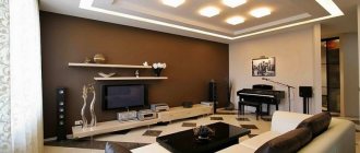
Sofas
Furniture needs to be fashionable and functional. Gray gives elegance and sophistication. It's the graphite leather upholstery that looks great, not black. We will consider two options: gray upholstery of sofas in interiors of other colors and colored furniture in gray rooms. Both options are possible.
For those who like experimenting, two sofas are installed in the living room: one gray, and the second white, black or brown. Variety and exclusivity are guaranteed.
Elegance and sophistication
A similar approach can be used for kitchen sofas in open-plan rooms. The upholstered furniture in the living area is large and gray, and the kitchen corner has bright upholstery. This approach balances the monochrome interior, but does not irritate with a riot of colors.
White, black, blue sofas with gray pillows and armrests decorate the interior and create a sophisticated atmosphere. This technique looks better than bright monochromatic models.
Furniture needs to be fashionable and functional
Tip Play with the texture of the upholstery: gray background with a dark gray pattern;
plain seats and backrests with colored armrests can completely change the appearance of the environment.
TOP 7 designer tips for using gray shades
- Can be used as the main tone in a room of any size. It is worth remembering a simple rule: the larger the room, the darker the shades you can choose; in small rooms, limit yourself to a light palette.
- If your interior will be made in pastel colors, choose a light gray or pearl gray background. For bright accents, more saturated dark tones are suitable - graphite, wet asphalt, lilac-gray and others.
- Using the right combination of tones, you can emphasize the geometry of the room. You can visually enlarge the room by painting the ceiling light gray, and the niches and protruding elements dark.
- Be careful with monochrome interiors. Saturated gray color easily absorbs light, so the room can look gloomy. Provide high-quality multi-level lighting and combine several shades of gray.
- The right tone will help correct the shortcomings of the room. For very large rooms it is worth using cold light colors - silver, steel, for narrow and small ones - warm ones (yellow-gray, gray-green).
- In design, it is not advisable to use gray furniture of the same tone as the walls. If gray is the background, the furniture should be either very light or dark. The exception is small rooms, where some of the furniture is made in similar shades to appear less bulky. Often these are cabinets, racks, shelves.
- The gray interior itself can be called faceless. Be sure to use decorative elements that will attract attention. Posters, figurines, paintings, vases, green plants, photographs - everything is appropriate.
Advice! Gray color can also be used accentually. For example, a large gray shag rug or a sofa with a gray print will definitely attract attention. It is not at all necessary to turn to acidic and flashy shades.
Kitchen doors, what color is fashionable?
Gray is often used in the design of kitchens and hallways. Why am I suggesting this color? Brown in various interpretations is already boring. Manufacturers come up with:
- unusual inserts with stones;
- sandblasting patterns;
- stained glass;
- bindings of various shapes.
A simple version of kitchen doors
If you want to quickly update the interior, but not renovate the entire apartment or house. Try installing gray doors. The effect will be amazing. The color range is extensive:
- pearl;
- light gray;
- smoky;
- ashen;
- graphite.
What is their advantage:
- Doors refresh a room and make it cozy.
- No visible dirt.
- Doors and floor coverings of these shades become the ideal background for green, cherry or black.
- Beige and gray options provide a warm, intimate environment.
- A door leaf with a bluish tint gives a refreshing chill and emphasizes cleanliness.
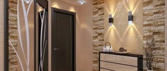
Gray is often used in the design of kitchens and hallways
Doors become the boundary between two rooms. Choose models in the same style, otherwise discomfort is guaranteed. For children's, bedrooms, and bathrooms, models with solid fabric are preferred. In living rooms and kitchens, door leaves with textured, colored glass look good.
In what interiors are they suitable? Smooth canvases with laconic moldings for modern houses and apartments. Imitation of aged light wood emphasizes country and Provence style. A silver palette, curly ornate panels, and decorative overlays complement the classic styles. Bindings with glass for eco styles, Japanese and minimalism.
Doors refresh the room and make it cozy
What should you avoid?
- Do not place a smooth door in a room with a neoclassical style. Otherwise, the interior loses its value and looks cheap.
- Graphite and anthracite tones are not acceptable for a small room. They visually steal space.
- Eclecticism and Empire style do not go well with gray doors.
Dark brown wall decoration and the same doors evoke negative emotions. But the interior with pastel walls becomes larger, and luxurious accessories and furniture acquire charm. The graphite door sets off the furniture in different shades of white: baked milk, ivory. Steel also supports elegant blue and light blue.
Model in a silver palette
Blinds, roller blinds or simple gray curtains
The design of gray curtains can also be varied. Most often, owners of houses and apartments choose classic models of curtains for the living room or bedroom. The set is equipped with a crisp white curtain and beautiful curtains in a noble gray color.
However, there are options to buy gray roller blinds for the bedroom or living room, which can be successfully combined with a standard curtain or lightweight curtains in lighter, darker or contrasting tones.
Note!
Turquoise curtains: advantages and disadvantages of turquoise colors. Rules for combining turquoise curtains with interior elements. Selection of fabric materials (photo + video)Olive curtains: advantages and disadvantages of olive color for curtains. A range of combinations and varieties of shades. Types of olive curtain designs (photo + video)
Curtains for a small kitchen: TOP-140 photos and videos of curtain options for a small kitchen. Tips for choosing length, number of layers, fabric and colors
A large number of people prefer fabric vertical blinds in a noble gray tone in the bedroom, living room or loggia.
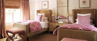
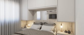
Bedrooms
It gives an atmosphere of peace in the rest rooms. Becomes a good background for other items and your life in general. It does not distract, but allows you to focus on yourself and your loved ones. Combines with pink and yellow. Gives positive energy.
Natural shade and fashion items
Well complements colors for environmental styles:
- green;
- brown;
- orange;
- blue.
This creates an oasis of peace, even in a smoky and noisy city. In long rooms, paint the short walls a tone darker than the long ones and you will see that the room has been transformed and visually acquired different parameters.
Natural shades and fashionable items, interior elements provide a harmonious combination of nature and modernity. This technique guarantees relaxation and a feeling of harmony.
Gives an atmosphere of peace in rest rooms
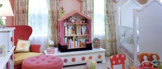
Advice Gray is important for children with hyperactivity. They need calm and an environment that will balance excess emotions. However, additional bright details are sure to be added to the nursery: bedspreads, tables, toy boxes, curtains.
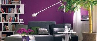
Living room
To prevent the interior from seeming monochrome, it is enough to dilute it with contrasting objects or bright accents:
- floor lamps;
- sconce;
- lamps;
- vintage curtains.
In the interior of the living room
Gray and red are an unusual combination. But it is well suited for rooms facing north and northwest. Usually these rooms do not have enough light. Red acts as a pop of color and provides warmth. It is associated with classic Empire style interiors.
Tip If you have a large room, choose upholstery of upholstered furniture in this color, plus gray walls and the room will acquire a palace charm.
Note : Experiment by painting all the walls light gray and stenciling them in graphite or silver. You don’t have to select the required wallpaper pattern or waste time on pasting. With a minimum investment, the effect is amazing.
Gray and red - an unusual combination
For living rooms, color nuances help avoid a riot of colors and give peace, which is necessary for relaxation. Owners have a wide range of decor choices:
- paintings;
- vases;
- lighting fixtures;
- floor coverings.
It’s easier to choose textiles and change them according to your wishes.
Fans of Japanese style will love the combination of gray walls, flooring and furniture, finishing materials, and wooden doors. Anthracite-colored furniture with a laconic shape is also quite appropriate. In such interiors, all the details serve to help people listen to themselves, their feelings and enjoy the world around them.
Helps avoid a riot of colors and gives peace
Light shades of gray are needed for decorating small rooms. The same can be said about :
- fur capes;
- carpets;
- decorative pillows.
If you want to quickly change the interior, replace textiles, play with texture. There used to be satin, take a tapestry, replace the fur with linen. The world around you will immediately sparkle with new nuances.
Introduction of warm colors into the interior: yellow, orange give peace and a feeling of sunny mood. Use this technique in the fall and winter to prevent a depressive mood and not lose your sense of joy.
Light shades are needed for decorating small rooms
The best combinations with gray
Gray + black and white. This is an indispensable contrasting trio for minimalist interiors. If you give preference to light colors, you can visually expand the room. You can make one accent wall black and keep the others in light colors. Rough textures look stylish.
Gray + pastel colors. You can choose both warm and cool shades. They will make the room more voluminous and lighter. You can choose light, pearl or more saturated gray - graphite, cobalt gray.
Gray + green. It is more appropriate to make a light gray background with bright green shades. Do not use too dark shades - the interior will turn from lush to faceless and prim.
Gray + yellow. A cheerful and trendy solution. You can replace yellow with orange. Pinkish and pale yellow tones go well with light gray, and sunny yellow goes with dark gray.
Gray + red. Do not choose muted shades of red: scarlet, crimson, fuchsia look bright and fresh. Even a monochrome design will sparkle in a new way.
Gray + turquoise. This combination refreshes the interior and attracts attention. If you want to make the room darker, take the third tone - chocolate. Lighter - beige or sand.
Gray + blue. The rule applies: if you take dark blue, choose light, cold gray; muted shades go better with bright blue.
Important! Gray color loves light and shiny surfaces. It will go perfectly with bronze, glass, mother-of-pearl, and silver. Don't forget glass trinkets and mirrors!
In an instant, gray can give the interior an urban or light natural touch, it all depends on the companion colors! This is a great base color to experiment with!
More about colors in the interior:
- Green and its combinations in the interior
- Pistachio color in the interior
Gray-blue
Gray gets along well with blue, similar blue and turquoise. In the bedrooms and living rooms, pearl shades of decoration and blue furniture and textiles provide classic chic. These colors and shades are intertwined and complement each other.
For high-tech style, where chrome-plated metal is used, furniture facades with a neon tint, glass countertops are an acceptable choice. You don't have to think about flashy details. The room is calm, pleasant and not boring.
Gray gets along great with blue
The classic combination of blue + gray has its roots in Baroque palace interiors. This trend does not go out of fashion, since everything created in the past remains with us at the genetic level and includes the necessary strings of the soul. As a result, there is no explosion of colors, but there is nobility of lines and restrained fashionability. Turquoise upholstery and decorative pillows set the necessary accents and add cheerful notes.
Calm, pleasant and not boring room
Gray-white – light nobility
Don’t like the explosion of color spots that fans of pop art and kitsch offer. But tired of the beige palette - the trend of recent years? Pay attention to the tandem: white and gray.
White color dilutes the main gray tone and provides a visual enlargement of the room. The fragmentary use of graphite or anthracite shades will help diversify the interior. It could be:
- frieze of ceramic tiles;
- door frames;
- window sills;
- bar counter.
Tandem: white and gray
This combination suits Scandinavian style décor. And this is not surprising: residents of northern regions with snow bring natural shades into their home design. They are needed for those who value the comfort of their home and inner peace. Remember the snowy plains, what peace they give with their pristine purity. Gray and white interiors give such sensations.
In north-facing rooms, use soft white shades:
- creamy;
- baked milk;
- cream.
They guarantee a soft transition and do not make the room cold. A winning option: anthracite flooring, neutral gray walls and snow-white furniture.
White color dilutes the main gray tone and provides visual enlargement of the room
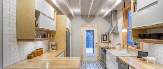
What can linoleum give to the interior?
Wooden floors and tiles never go out of style. But linoleum flooring remains popular. The main advantage is the price, variety of patterns, versatility, and the ability to quickly replace the floor covering . Let's talk about color and pattern.
The advantage of such linoleum is the price
It is enough to go to construction stores or online sites to understand that linoleum imitates:
- stone;
- marble;
- tree;
- parquet;
- abstract drawing.
Compatible with other materials:
- tiles;
- parquet board;
- laminate
It is enough to purchase transition thresholds, the connection problem is solved.
This material helps you avoid making large financial investments and quickly change your interior. Small clarifications. For the hallway you need linoleum with good wear resistance. For living rooms, a foam or felt base is important. Otherwise, comfort is difficult to achieve.
Linoleum flooring is still popular
What do you need to consider?
What kind of floors are we used to seeing in interiors? Most will say: brown in different color and texture interpretations. This is why I suggest using gray. Don't be afraid to experiment. An updated home color scheme can radically change your life.
To decorate the floor, designers suggest using various materials. Let's figure out why they should be different. In living rooms, bedrooms, offices, children's rooms - warmth is needed. Kitchens, hygiene rooms, hallways are washed frequently. Based on this, take a look at the collections of building materials, take the best they offer in gray: linoleum, tiles.
A good, non-staining choice for flooring
Let's look at what gray materials are applicable in the interior:
- Wood is a wonderful stylish option.
- Ceramic tiles come in a wide variety.
- Linoleum is a budget opportunity to experiment.
- Self-leveling floors are an expensive option, but the effect will be amazing.
A seasoned, somewhat strict, yet elegant gray color for any material does not lose its properties. It gives peace, sophistication, exclusivity and does not irritate, unlike collections with bright, complex color patterns.
Tiles are best suited for the kitchen or hallway
An interesting effect is produced by a wooden board with a gray texture in different collections; it has the name: “Oak Ice White”, “Grabo”, “Rustic Oil”, “Cardamono”, etc. They complement the styles: Scandinavian, Colonial, Provence.
Let's talk about the practical side. This floor covering is easier to use. Water stains, abrasions, scratches, and dust are less noticeable. This makes life easier for homeowners.
This flooring base complements other items well:
- furniture;
- decorative things;
- textile.
The original appearance of the property is guaranteed.
Gives peace and sophistication, exclusivity and does not irritate
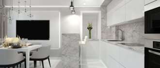
What goes with gray color in the interior?
Gray color is combined in the interior with all colors, while never ceasing to occupy its central place. Combining with the desired color allows you to maintain a unique design style and focus on details.
- The influence of gray color in the interior on the nervous system. If constantly wearing gray clothes can indicate a depressed state of the individual, then the gray color in the interior is a release for the nerves after a hard day. In south-facing rooms, the predominance of gray will add a little chill.
- Gray background in the interior. A room with gray walls or wallpaper looks restrained and neat. The interior of such a room will acquire its own zest due to various accessories, colorful textiles and original furniture. The gray background of the walls is always in the background; attention is focused on the decor in the room.
In the interior
- Gray color in a loft or hi-tech interior. Gray color can be called street color. Roads, concrete buildings, metal structures - everything is done in gray tones. Gray color occupies a central place in loft and high-tech interiors. Minimal furniture and distractions leave walls and floors the center of attention. You can play with shades on the walls. Highlight one wall in dark gray, perhaps with patterned plaster, and paint the remaining walls in a lighter mouse color. Gray floors will give the room the feeling of a single whole space.
Loft
High tech
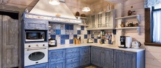
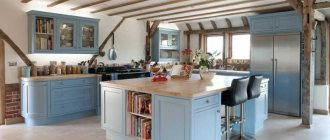
- Combination of colors with gray in the kitchen interior. Gray color will fit well into any kitchen style. The character of the interior is determined by the characteristics of gray - the shade can be matte, glossy, deep and voluminous.
- Furniture can be with cold steel structures or made of warm materials in gray tones.
- Soft pastels - beige, sand, cream - resonate well with the gray color of the kitchen . A wooden floor will balance the gray coolness and make the atmosphere homey.
- To make the interior of the kitchen cozy, gray paints are complemented with beige, sand and other pastel tones. A wooden floor will help balance the gray floor and gray furniture in the kitchen.
Gray in the kitchen
Combination with gray
Stylish kitchen
- Gray color in the interior is glamorous. Gray shades are often used in expensive interiors. The color of natural stones and precious metals easily fits into complex designs.
- A feature of the glamor interior is that the gray color is done in gloss, the surface of the wallpaper is silver, and the canvases shimmer with a gray sheen.
Glamor
Gray glamor
Tile
Light gray tiles add coziness and emphasize cleanliness. The winning option is gray walls and bright tiles. Large print designs are on trend and well dilute the monochrome calmness of the main color.
In small rooms, play with texture and size.
Choose large tiles with a rough surface for the floor and glossy ones for the walls. The tile pattern should be similar or in the same style. Make the floors a little darker than the walls. Some collections offer such options. As a result, the combination of gray surfaces, snow-white plumbing fixtures, lamps, and mirrors makes the room large and elegant.
Light gray tiles add coziness and emphasize cleanliness
If you buy tiles of the same color, a console toilet, or a washbasin without a leg, the room loses its clear boundaries, which becomes advantageous in small hygiene rooms. This color masks stains, small debris, and dust. The housewife will not have to walk around with a rag all day long, as happens if the color chosen is black or white for the tiles.
Use natural materials with these shades. You will be surprised how life and family relationships begin to change. It’s no secret that what surrounds us creates our inner “I”, helps us move forward or “die of boredom,” create masterpieces or regret missed opportunities. Choose what you like, you will see a completely new tomorrow.
Make the floors a little darker than the walls
The basic rule is the harmonious introduction of color additions to various shades of gray. Now let's summarize.
Gray color has advantages: it gives calmness and becomes the base tone for decorative items and furniture.
Pairs well with a variety of colors. To provide variety, decorate the walls of individual rooms with different shades.
Shades of gray in large quantities are depressing. Creating a historical interior requires skills. Only in this case, adding gray pigment to the paint will give bourgeois luxury and the walls will not look dirty. The gray color in the nursery needs to be complemented by a large number of different colored pieces of furniture and interior design.
The basic rule is the harmonious introduction of color additions to various shades of gray
The combination of dark gray in clothes
Black gives this tone a slight sheen.
To achieve moderate black and white contrast, dark gray is the ideal solution.
By combining different shades of gray, we get a stylish solution. You can always add black or white to it.
Warm, beige color will add an elegant, feminine component.
Bright brown tones are soft and natural.
Yellow can be bright or golden mustard, either way it takes on an autumnal look with dark gray.
Orange, in addition to the main color, will require black as a balance enhancer.
Bright red and dark gray can be strict and eccentric, although the main color mutes the red fire, it is not enough to extinguish it.
Wine tones are for a noble combination.
Hot pink and fuchsia colors add feminine audacity to the combination.
Soft pinks enhance light contrast and breathe lightness and innocence into the set.
The purple pair looks like a logical continuation of the main color.
Blue, like the sky or water reflection at dusk, tandem requires black.
Sky blue brings lightness and softness.
Cool greens transform dark grays to their advantage, especially if you add gold elements to them.
Warm, medium-dark tones of green fit organically into gray tones, and you can also add black to them.