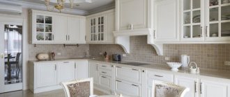
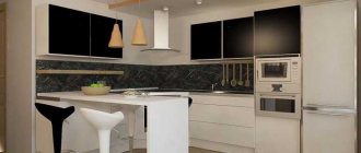
Matte and glossy kitchen facade
If you can order or buy any unique set, you can choose a white kitchen with a matte or glossy facade. The choice of a wooden countertop also depends on the choice of kitchen.
Glossy
A high-gloss white kitchen with a wooden worktop is suitable for a modern style, small kitchen. The gloss reflects light well and creates an airy atmosphere.
It’s easy to leave marks on a glossy façade, but it’s also easy to clean, which is important for a white kitchen. The gloss should be combined with a matte wooden countertop, splashback and floor.
The photo shows a glossy set that reflects the light of additional lighting and thereby makes the narrow kitchen more airy.
Matte
A matte white kitchen with a wooden countertop looks equally good in a modern or classic version thanks to the variety of types of furniture.
In a matte white kitchen, splash marks are less visible, but they are also more difficult to clean. It does not reflect light, so the presence of additional lighting is important. For an organic look, a wooden tabletop can be glossy or matte.
The photo shows a matte kitchen set in an eco-style, where naturalness and natural colors are combined.
Design features of a small white kitchen with wood
If the kitchen space is small, it is important to use it as thoughtfully as possible. A two-tier white set will visually expand the room and will be a winning solution if you need to keep dishes, spice containers and other items out of sight. However, using shelves instead of a top tier can add space even in a tiny kitchen.
On a note! The use of wooden tabletops will allow you to delimit the tiers and remove the feeling of excessive sterility. Accessories - curtains, lamps, upholstery on chairs - will add brightness and effectiveness.
Headset shape
It is important to choose a suitable form of furniture that will look beautiful in the kitchen.
Linear
A linear white kitchen with a wooden countertop is suitable for a medium to small rectangular room. All cabinets and pencil cases are located along one wall, including the oven. The length of the headset is selected independently. This is not the best option for a large kitchen in terms of saving time. Together with a white set, you can comfortably place a dining table in one kitchen.
Angular
A corner white kitchen with a wooden countertop is suitable for rational housewives and small spaces. This involves an angle that remains unused in a conventional layout. You can place a sink in a corner, and under it in an ergonomic cabinet you can store kitchen items that are not so often needed. The corner can also be made using a folding bar counter, which will help out for quick lunches.
U-shaped
A U-shaped white kitchen with a wooden countertop is suitable for a rectangular room, where at the top of the letter “p” you can place a sink or additional shelves or surfaces. With this layout, it is important not to crowd the window with furniture. In a small kitchen there will be no place to put a dining table, so it can be moved to a designated area of the living room.
The photo shows a U-shaped kitchen in the country, where the shade of the countertop matches the color of the floor and dining table.
Island set
A white island kitchen with a wooden countertop is best suited for a large area. With this form, a linear or corner set is combined with an additional large table in the middle of the room, which can be on wheels and act as an additional work surface with a sink or stove.
Tips for decorating a room
Even at the stage of creating a design project, you need to think about what and what color will be in the kitchen. Make notes on the project and account for each element. Only this will help create a truly harmonious palette in the design.
- Maintain a balance of light and dark - if you have chosen a dark gray set, then it is better to make the walls light. It is also appropriate to do the opposite. It is better not to use more than three colors. However, you can experiment with their shades.
- Make only non-voluminous objects bright and accentuated: vases, curtains, chairs, etc.
- Think over and decide what exactly you would like to get in the end - a cheerful and bright interior or a dark and brutal interior? Or maybe you need neither one nor the other, but a calm design with a predominance of pastel colors?
Ceiling
As for the ceiling, a white matte ceiling would be a universal solution. This is a 100% win-win option.
In what case would an emphasis on the ceiling be appropriate? Only if he is tall. But you still don’t need to use too bright shades. It’s better to complement the surface with something interesting, original and textured. For example, an insert into a suspended structure that imitates concrete, which can also be complemented with a beautiful lamp.
Most often, PVC film is chosen for decoration. Thanks to it, the ceiling is perfectly flat. Another advantage is that in case of flooding, it will retain water.
The palette of suspended ceilings is very diverse. And the gray color is represented by a huge number of shades: from light to almost completely black. The texture can be matte, glossy, satin, with a metallic or pearlescent sheen, or suede.
Please note that dark ceilings will visually appear lower.
But PVC film is far from the only option for decorating kitchen ceilings. You can also:
- paint;
- cover with wallpaper;
- trim with plastic panels;
- cover with ceiling tiles;
- use armstrong;
- plywood;
- drywall.
Floor
If we touch on the topic of floor design, then in a kitchen in gray colors the following will look best:
- gray tiles - tones can be different - from the lightest to the warmest;
- porcelain stoneware, laminate, parquet, PVC tiles - and all this in shades of natural wood;
- poured floor in light colors;
- tiles imitating marble (it is better not to use natural marble, because it is porous, which means that it will be almost impossible to clean it from stubborn dirt);
- tiles in neutral pastel colors.
In order not to visually make the room narrower than it actually is, it is better not to use dark gray tones when decorating the floor.
Walls
A gray kitchen in the interior suggests that the walls can be any color. Therefore, when thinking about the choice of design, consider, first of all, the concept:
- Gray paint or wallpaper is a wonderful overall background. If the kitchen is small or you have already chosen a dark set, make the walls lighter. This will open up the space and create a beautiful contrast. In large rooms you can afford darker, deeper shades.
- if you decide to make the interior monochrome, experiment with textures. For example, choose embossed wallpaper that imitates decorative plaster. Or use gypsum plaster straight away. Using very simple techniques, it can be made to look like concrete;
- if you paint the walls a warm shade of white or beige, the room will become more comfortable;
- use wallpaper with a pattern - it can be graphics or flowers;
- really want something bright? You can make one wall an accent wall.
Tabletop
Which countertop should you choose if you want a stylish gray kitchen? A kitchen top with a solid wood look and white or light-colored countertops will go well with a set in this color.
An interesting option is to choose a countertop that matches the facades and make it thin.
Those who like spectacular accents will like a set with a tabletop in bright colors. Imagine, for example, a gray set with a yellow countertop. Looks unusual, doesn't it?
When choosing a countertop, keep in mind that on dark surfaces, water stains will be most visible.
Apron
The gray facade provides an excellent opportunity to experiment with the design of the apron. Pay attention to tiles with a bright, unusual design or interestingly colored tiles.
At the same time, be sure to take into account what style the kitchen will be in and its overall color scheme. For example, the coolest option for finishing an apron for a loft interior is the texture of brick/stone masonry or concrete.
Contrasting grout when laying the backsplash with pentagonal tiles or “hog” tiles in a light shade is an interesting and at the same time quite universal solution.
Appliances, furniture
The set + dining group form the basis of the vast majority of kitchens. What to do if you have a gray kitchen-living room? This increased space can be supplemented with a sideboard and a sofa. It is not advisable to choose a furniture design that matches the walls. This will create the impression of a solid one-color spot.
How to proceed?
If the design of the kitchen-living room is in gray tones, that is, monochrome, then in order to somehow highlight the furniture against the general background, choose it a tone lighter or darker than the overall design.
Style selection
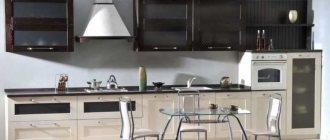
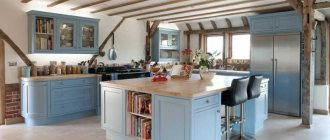
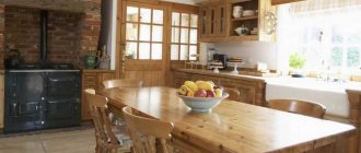
White color is universal, elegant and casual at the same time. It suits any style and makes the kitchen look different depending on the color and type of decor.
Modern style
A white kitchen in a modern style can have a matte or glossy surface. The facade should be without bevels, straight and simple in shape. The wooden countertop can be light, dark or ebony and can be combined with the floor or kitchen table. For decoration, watches with a simple round dial and contrasting roller blinds are suitable. For a minimalist style, a matte kitchen with blank doors and a dark brown countertop is suitable.
The photo shows a kitchen with an additional seating area, which is also finished in wood, like the countertop. The chalk wall and minimalist decor create a cozy environment.
Loft style
It can be created using a dark wooden countertop, a white kitchen with glossy facades, a brick wall above the work desk or at the dining table. Decor options include chandeliers with metal lampshades, chrome faucets, cacti, and glassware.
The photo shows a white loft-style kitchen with practical brick-like tiles in the work surface area.
Scandinavian style
Characterized by a love of white and brown tones and a mixture of minimalism and modern style. A white kitchen can be of any shape, and it is better to choose a wooden countertop from bleached or dark wood. For decor, images of mountains in a painting or photo wallpaper, translucent curtains, white pillows and dishes are suitable.
Classic style
A white kitchen should be exclusively matte with glass doors, carvings, scrollwork, gold-plated, black or silver fittings. The wooden tabletop should be made of dark solid wood to match the color of the laminate or parquet. For decor, short curtains like French or Austrian, Roman curtains, lambrequin, textiles for upholstery, tea set, round dining table are suitable.
The photo shows a classic-style kitchen with a matte cabinetry made easier by glass cabinet doors.
Provence
The style differs in the type of furniture, the way the sink is installed and unusual decor. The walls should be pastel green, pink, against which there will be a white kitchen with a wooden countertop. Suitable decor options include wildflowers, knitted textiles, embroidered curtains or printed cafe curtains, wooden clocks, and a ceramic apron with a geometric color pattern.
Eco style
Eco style is characterized by a combination of natural colors such as green, white, brown. The color of the wooden countertop does not matter, the kitchen should be white, the apron should match the furniture, contrast or match the countertop. Important decorations include pots with planted herbs or flowers, white or green curtains, a rattan dining room set, and natural textiles.
Kitchen design in gray colors: about styles
Gray is the perfect companion to other colors in the palette, so it can be used in almost any style. However, there are some directions in which gray will look most appropriate.
Minimalism
Gray here is monochrome. Looks great in duets with white and black. As a result, the kitchen creates the impression of a rather ascetic space, which you just want to complement with brightly colored details. However, the only decorative details that are appropriate here will be textures: wood, marble and other natural stones.
Facades with hidden handles or without them at all will help not to violate the canons of minimalism.
Loft
A gray set with a paneled or smooth facade will look perfect in this case.
Dark colors will add brutality to the kitchen. If the room is small, then it is better to abandon them in favor of light gray tones or simply leave dark colors to decorate the facades of the lower cabinets, and make the upper ones light.
Neoclassical
Modern classics in gray tones are a fashionable alternative to beige classics. It goes well with accessories in the form of gold handles, designed to look like antique bronze, brass, forged items, etc.
Choosing an apron
An apron in a white kitchen can be an accent or a neutral, functional decor. It can be made of durable glass with printing, laminate, tiles.
| View | Example |
| To match the tabletop | You can make an apron to match the color of the countertop from wood-look tiles or laminate. The uniformity of the work surface can be combined with the floor and look contrasting against the background of a white set. |
| Match the color of the furniture | A white apron will blend in with the facades; this solution is suitable if you have an idea to combine these colors. You can also make a gold stripe on the apron. |
| Contrasting | A contrasting apron will become an accent. It can be a landscape, a bright abstraction, a colored mosaic, a multi-colored ornament. Any bright shades will do. |
| Match the color of the tabletop in a different shade | The color of light or dark wood, which differs by several shades from the work surface. |
In the photo, the countertop, apron and table are made of the same material and the same color. The unity of natural color together with a white set creates a modern interior.
In the photo, the apron in the interior is matched to the color of the set and has a glossy finish that reflects natural light from the window.
Color combination in the kitchen interior: gray + ...
Brown/beige
Gray gets along well with these colors in the same space. Using the degree of saturation and warmth of beige, you can regulate the degree of severity and formality of the interior.
Such combinations will look best in tandem with wood surfaces. This could be a dining group, tabletop or apron.
Light blue/blue
These colors are just as cool as grey. And even if a lot of natural light penetrates into the kitchen space from large windows, such a duet will look great.
Incorporating interesting textures and bright accents into the interior will help get rid of possible boredom and impersonality.
Yellow
This color, as well as shades close to it - orange, mustard, turmeric - look just great with gray!
But try not to get carried away, because too many bright accents can be annoying. The optimal amount is no more than 30%.
Green
The duet of gray with this color, as well as with light green, emerald, and malachite shades, is beautiful! This happens quite often in nature. Green copes perfectly with the task of balancing the severity and coldness of gray! Most often, green is used as an accent.
Designers advise using it when decorating aprons and window spaces. Another great solution would be to place indoor plants in black/white pots.
Selecting material for the countertop
A wooden tabletop is one whose production is associated with wood or wood materials. It can be a tabletop made of MDF, fiberboard, chipboard, veneer, or wood.
- A solid wood tabletop is made from solid or compressed pieces of wood. Such a tabletop needs to be sanded and varnished from time to time, it lasts a long time and is not afraid of the kitchen microclimate.
- The veneered tabletop is covered with thin layers of wood on top of a slab of particle boards.
- MDF and chipboard boards consist of wood fibers and shavings, which are glued together with a synthetic (chipboard) or natural (MDF) adhesive.
Types of wooden countertops
Countertops are made from various types of wood. A denser surface made of oak or beech will last much longer than a product made of pine or spruce. Wooden countertops, according to type of execution, can be divided into three groups:
Solid array
Based on the name, the canvas for the future workpiece is cut out of solid wood. The denser the wood, the stronger and more durable the tabletop will be. Since hard wood is much more expensive than soft wood, the price will also be higher. The leader in demand is solid oak, due to the exceptional density of the fibers. In addition to oak, solid ash, larch, and beech are used to make countertops. It is not recommended to use spruce and pine, as they have a soft structure, which means the service life of such a countertop will be significantly shorter.
Solid array
Typesetting array
This material is somewhat cheaper than solid wood, but is not inferior in quality. The canvas is made by gluing (under a hot press) planks of wood. The outer coating and manufacturing method provide the workpiece with strength and moisture resistance. The material does not deform from high humidity and is resistant to mechanical stress.
According to the manufacturing method, this material can also be divided into two subtypes:
- Spliced - planks, small in size, are glued together using hot pressing, both in width and length. The slab for the countertop has a cobblestone appearance, reminiscent of parquet.
Spliced fabric
- Solid lamella - only long lamellas are used, soldering them along the width. The finished slab has a continuous pattern of annual rings, the seams are almost invisible.
All-lamella fabric
Veneered chipboard
Inferior to the first two types, both in characteristics and in price. To make the tabletop, moisture-resistant chipboard is used, which is covered with a long, thin cut from a solid mass. For such decor, oak, birch or beech are often used. If this decorative and protective layer is damaged, there is a high probability of deformation under the influence of moisture. This material, most often, cannot be restored.
Table top made of chipboard covered with veneer
Plastic laminated chipboard
The most economical material. The coating realistically imitates the structure, as well as the wood-like color. During installation, it requires additional protection of the cut areas, since there is a high risk of deformation from moisture. As in the case of chipboard with veneer, the finished material cannot be restored after exposure to water. Thanks to the modern method of applying patterns and textures, this material has a large palette. You can make the necessary samples to order.
Scandinavian oak tabletop
Combination with wallpaper
Wallpaper in delicate shades of pink, blue, green, cream and beige, wallpaper with a golden pattern, white wallpaper, bright orange, dark green, light brown, gray, lilac will suit a white kitchen.
The photo shows a combination of gray wallpaper with a pattern of brickwork near the work surface, where the wooden tabletop looks organic.
Wallpaper can be plain or with a design. It is better to choose vinyl wallpaper with a non-woven backing, which can be wiped with a damp cloth without harming the color and texture of the wallpaper.
The most frequently asked questions about gray kitchens
1. Gray set + gray walls = too pale combination?
If you play the shades correctly and choose textures, then no!
A good example: combining concrete with materials that have a smooth surface. Brutal interior solutions are trending now. And the texture of concrete cannot be called boring - the material is heterogeneous and with each application it forms various, unique configurations and patterns. Another good thing is that the grayness of concrete can be balanced by using black and white details.
If brutal notes in the interior are not an option for you, but the very possibility of boredom from total gray scares you, use the classic technique: duets of glossy and matte surfaces and materials. For example, the entire set can be made matte, but the inserts can be made glossy. Inserts made of dark solid wood are also appropriate.
Sometimes, to add variety to a monochrome interior, just one bright detail will be enough. For example, such a detail could be a bright red high bar stool. Imagine it on a neutral gray background - it looks very impressive!
And, of course, don't forget about countertops. If you make them white, cabinets with gray fronts will become visually lighter.
Grey/beige: which color is better?
Both shades are classic solutions for creating the most neutral and calm interiors. Plus, they look good together. Therefore, when looking through photos and references of popular designs, you will notice that such a color duet is found in them quite often.
For example, you can make the backsplash and walls beige, and the upper and lower cabinets of the kitchen set in various shades of gray.
And don’t forget that the dining group is also one of the components of the kitchen interior. In this case, you can make the table gray and the chairs in beige wood shades. Or vice versa.
There is another interesting way to combine gray and beige tones in the kitchen. For example, order a set of an ambiguous, complex shade, the perception of which depends on the lighting. The more complex the color, the lower the risk that you will get tired of it soon.
The same technique can be used in the process of painting walls. If you're having trouble deciding on a paint color, add a little gray to the jar. It will add nobility to any color.
To choose the right shades of beige and gray, follow these rules:
- do not create harsh contrasts. For example, if you chose a dark shade of gray, then the beige should be quite dense;
- a combination of light shades of baked milk with gray. The former will make the space warmer, the latter will cool it down. The result will be something in between.
Is it possible to combine gray with wood?
Of course yes. Moreover, this is a classic combination! Wood, just like beige tones, will “insulate” the interior, and gray will “cool” it.
For example, you can make the floor wooden, and gray slats on the ceiling. The result will be a truly Scandinavian interior. The effect will be enhanced if you decorate the backsplash with white tiles.
However, in the absence of any additional accents, perhaps such a design will still look too pale. Therefore, you can decorate the floor with tiles with some active pattern in a gray-blue tone.
Note that wood of a reddish hue has reappeared in trends. If it is combined only with milky and beige tones, there is a risk that the renovation will take on a touch of past years and will not seem modern. To avoid this effect, dilute the design with dense gray textures.
Gray tinted wood is another fresh trend. As a rule, plywood is tinted. And they do it in just one layer. That is, in some places the natural shade of wood still shows through.
What about stone textures?
The most popular option in this case is gray facades in combination with aprons made of material that imitates marble. If you dilute all this with accents of brass and gold, it will turn out very beautiful and stylish.
Option for the more daring: facades similar in tone to elephant skin + stone slab in ocher tones. Here the gray on the facades combines beautifully with the veining in the stone.
The combination of gray concrete and marble is a great idea for modern interiors. Here the whole “trick” is in an interesting contrast: the brutality and rough surface of concrete is contrasted with shiny smooth stone.
Combination with curtains
It is better to choose curtains of short length or with a lifting mechanism, Roman or roller blinds. Curtains with grommets and cafe curtains are also suitable.
In color they can be white translucent, coffee, red, green, matching the shade of the walls. From fabrics, it is better to choose linen and cotton with admixtures of synthetic fibers viscose or polyester so that the fabric retains its shape and color after washing.
The photo shows an example of decorating a wide window with translucent tulle with clamps that do not interfere with the passage of air and light into the room.
