- 1 of 1
On the picture:
In the interior, individual objects should be logically related to each other, just like the elements in the painting.
designer - decorator Huseyn-zade Ulkyar
Functionality or comfort?
My home reflects my personality and serves as my place to relax, so functionality and comfort are woven together.
I love creating my own story and filling my home with items and accessories that reflect my mood. Rich colors, furniture with soft textures, many corners for work, large windows and high ceilings, a lot of air and light to create a feeling of lightness and freedom. Read more
Functionality or comfort?
My home reflects my personality and serves as my place to relax, so functionality and comfort are woven together.
I love creating my own story and filling my home with items and accessories that reflect my mood. Rich colors, furniture with soft textures, many corners for work, large windows and high ceilings, a lot of air and light to create a feeling of lightness and freedom. Hide
Composition is the connection of various parts into a single whole in accordance with some idea, together making up a certain form.
Let's imagine the room as a painting canvas and use the rules for constructing an artistic composition. “Dynamics” / “statics”, “ri”, “symmetry” / “asymmetry” - choose the concept you need about composition in the interior and use it when decorating the space.
Symmetry
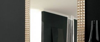
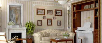
This is an equidistant arrangement of elements relative to the selected axis. A symmetrical composition in the interior is perceived by our eyes as orderly and harmonious. Agree that extravagant rooms with sharp corners, inclined walls and wavy surfaces put pressure on the psyche - after all, a person himself is initially symmetrical, and therefore strives for “mirroring”. Remember that a balanced interior does not have to look like two sofas facing each other: it is important not to forget about balance in tone and scale, because if one of the cabinets is as high as the ceiling, and the other is as tall as a chest of drawers, then there is no need to talk about any symmetry .
- 1 of 5
On the picture:
Symmetry can be expressed not only in the arrangement of furniture, but also in the arrangement of architectural details - doors, windows.
Contrasting composition
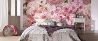
A contrasting composition implies the use in interior design of a bright effect of highlighting one color against the background of another. Such color combinations are also called complementary (complementary), as they enhance each other when paired.
You should be careful when combining contrasting colors in the interior, they create a lively dramatic effect, excite and increase vitality, which in turn is not appropriate everywhere...
It is better to use contrasting colors disproportionately, that is, so that there is significantly more of one color than the other. The combination of saturated and bright colors in the same proportions leaves a feeling of unbalance. And it is also recommended to vary the intensity of contrasting colors to get the most successful combination.
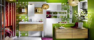
Interior color design in contrasting combinations, examples:
Asymmetry
Its structure is the opposite of symmetry, which means it causes subconscious anxiety in any normal person. A residential interior is not a place for experimentation, so we highly recommend planning the space itself symmetrically, and creating asymmetrical compositions using decor. For example, you can play with scale (contrast large and small furniture), combine dark surfaces with light ones, and bright colors with muted ones. If you have deliberately chosen an asymmetrical arrangement of furniture for the room, do not forget to highlight the center of the composition - this could be a fireplace, an eye-catching painting, or a group of lamps.
- 1 of 3
On the picture:
An asymmetrical interior is most often determined by the architecture of the space (rounded walls, protrusions, etc.)
Laws of balance
The filling of the room, or its furnishings, in turn creates the impression of the integrity of the image, its beauty, functionality and visual comfort. Consequently, objects around the compositional center can be located according to the laws of symmetry or assymmetry.
Symmetry
The uniform distribution of objects of similar size and shape around the compositional center is called symmetrical. Using a symmetrical composition will not cause any particular difficulties, especially in the horizontal plane. That is, if a fireplace is built in the living room, then objects should be placed around it at the same distance, for example: two floor lamps on the sides, two sofas in front of it, two chairs opposite, identical or similar in size and shape.
In the bedroom, near the bed in the center, place the same set on both sides, consisting of a bedside table, a lamp, a mirror, and add a mini-sofa, a banquette, and a chest at the foot of the bed. The symmetry of the composition will be complemented, for example, by a pair of shelves (chests of drawers, armchairs) installed opposite the bed, at the same distance from each other.
Vertical symmetry is about visually balancing the top and bottom of the room. For example, if the room is high and the furniture is massive, you can hang a large chandelier and “heighten” the ceiling with stucco, while the walls should not be empty - they should be decorated with decor at eye level, then the vertical composition will be preserved.
Asymmetry
It cannot be called the antipode of a symmetrical arrangement, but rather another interesting technique for creating a composition. Asymmetry, also, is not disharmony, as some people think, but a complex and ambiguous way of designing space. However, for it, as for symmetry, it is important to balance the visual load of objects in the interior setting.
For example, when the main items are installed on 2/3 of the area of the room, the third part should not remain empty. Here, in contrast, you can place one, but catchy, and fairly large object (cabinet, mirror, table, panel).
Rhythm
If symmetry is characterized by a calm balance of elements, then rhythm implies movement that can be extended indefinitely. The rhythm is set by repeated repetition: horizontal (cornices, friezes, belts) and vertical (columns, arches). In interior design, several pieces of furniture can set the rhythm. An interesting technique for composition in the interior is to “interrupt” the rhythm. Place several identical white chairs in a row, replacing one of them with a colored one.
- 1 of 2
On the picture:
When composing a rhythmic composition, it is important to remember that the rhythm will hardly be perceived if the color “fades away” as it moves away from the viewer.
Kinship and rhythm
Psychologists say that the human brain strives to perceive images holistically. Therefore, we feel more comfortable in harmonious interiors, the elements of which are united by texture, color, shape or repeating pattern. We subconsciously like repeating elements that allow us to form a complete picture.
The relationship of objects in a designer interior will never be too literal: it is not the same floral print migrating from pillows to carpet, but from carpet to curtains, it is an unobtrusive echo of patterns, shades and shapes. Thus, the rounded back of a sofa can echo the shape of a coffee table, an arched opening and a pattern on a poster, and the color of the curtains can be duplicated in the complex pattern of the carpet.
What is called “rhythm” appears in the interior due to the repeated repetition of related or identical elements. Examples include ceiling beams, columns, arched openings, matching lamps or dining chairs. An interesting design technique is to break the rhythm, for example: among identical chairs, one can be inserted that is contrasting in color or texture.
Dominant
It is the visual center of the composition; it is the one that first attracts the eye, and only then does a person begin to look at other objects. The dominant can be color or scale. In both cases, the dominant object “subordinates” the others. The dominant must be connected with other elements of the composition in the interior (otherwise the image will “fall apart”). Therefore, it is recommended to support the chosen color dominant, for example, with shades in accessories or textiles.
- 1 of 3
On the picture:
The words “visual center” should not be taken literally, because the dominant object does not have to be located in the center of the room.
Laws of composition in interior design (compositional center, elements and their relationship)
Hello dear visitors of the studyas.com interior design school! Today I want to talk about architectural composition, why it is a very important component of a harmonious interior, and why, and most importantly, how to use it in interior design.
In general, knowledge of the laws of composition is not a specific stage of interior design (interior design steps) - it is the fundamental basis for successful work in any activity related to art, and as a result, interior design.
The process of interior design is closely related to knowledge of the laws of architectural composition. Without knowing the basics of composition, it is impossible to create a beautiful interior. The construction of interiors according to the laws of artistic composition is what distinguishes the interiors of professionals from the interiors created by amateurs.
For people who do not have an artistic education, composition causes great difficulties and misunderstanding of what it is needed for and how to work with it. However, there are people who intuitively feel the basic laws of composition, which allows them to dress or furnish their home with taste, but there are very few such people. The rest, including many eminent architects and designers, had and still have to comprehend the basics of composition, first in theory (training in various specialized institutions), and then improve it in practice.
It may also seem to beginners that architectural composition and its laws are something intangible and difficult to understand and explain, and what’s even worse: composition is complete nonsense, they say, everyone has their own taste and knows best how best to furnish their apartment or house. However, this is not at all the case, and “beauty” (and beauty is created according to the laws of artistic composition) has its own rules and laws by which it is created.
So, let's try to figure out this “composition” and find out what it is.
Architectural composition is a compositional relationship of composition elements arranged in a certain order, from an artistic point of view, and having certain quantitative and qualitative characteristics aimed at achieving overall harmony, integrity and expressiveness of an architectural work.
In relation to interior design, the room, as the main design unit, with all the furniture, equipment, and design elements located in it (paintings, lamps, candlesticks), is considered by interior designers to be nothing more than a composition. At the same time, the plan of floors, ceilings, and the layout of each individual wall of the room is its own separate composition, which must be worked on to achieve overall harmony of the entire composition of the room, apartment or house.
Now let's look at the basic rules for creating a harmonious composition:
1. Any composition must have a compositional center . This could be any piece of furniture, decorative panel, fireplace, etc.
Statics
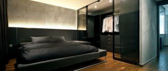
Assumes the absence of diagonal lines and curved surfaces. This composition in the interior is based on the predominance of horizontal elements (low cabinets, heavy deep sofas) and gives a squat and stable appearance. Static interiors are described with terms such as “stability” and “balance.” Most often we are talking about spaces decorated in a classic style.
- 1 of 1
On the picture:
A “static” interior is not at all synonymous with boring! Experiment with decor and accessories.
Contrasts and accents
Objects in the interior can be “made friends” not only through “kinship”, but also through contrast. Contrast of colors and/or textures is one of the main expressive means of modern design. A smooth matte surface next to a rough concrete wall or brutal brickwork, an active print on an accent wall in contrast with a minimalist finish, contrasting color accents on a neutral background - there are many options.
The main thing here is not to overdo it; if there are too many contrasts, the eye will stop detailing them and turn them into one blurry spot.
Dynamics
You can introduce elements of movement into a room where noisy groups gather. To express dynamics in the interior, you can use asymmetrical arrangement of furniture, elements with clear geometric shapes, a large amount of free space, diagonal directions of parquet or tile layout. The predominance of vertical lines will create the impression of lightness and upward direction.
- 1 of 1
On the picture:
Dynamic interiors are most often designed in a modern style, because the laws of composition began to be violated only in the 20th century.
Interior arrangement is similar to the construction of a frame in photography. Knowledge of design techniques and architectural laws helps to create an original style for the room. Otherwise, even the purchase of expensive pieces of furniture will not save the room from associations with a storage room. Composition in design plays the same role as artistic composition in painting. Therefore, next we will consider its basic principles.
Contrast
To create an original composition, it is recommended to use textures that are different from each other and clear colors. An unusual combination of relief decoration with smooth upholstery of the sofa, patterned designs on the walls with plain fabrics, minimalist decor with luxurious decoration of a separate corner, etc. All these examples are distinguished by the presence of contrast, juxtaposition of texture. Despite the clash of contrasting surfaces, a harmonious interior is born from their interaction.
