Psychology of color
Colors have a strong influence on people, and this is due to the associative series.
To explain our own attitude towards the color yellow, it is enough to remember where it catches our eye most often. And Mother Nature loves him very much. Yellow is the rays of the sun, dandelion fields, sand dunes, ripe bananas, exotic birds and fish. It exudes warmth, attracts attention, and in its brightest shades literally screams and is insolent. This is the difficulty of using yellow color in interiors: it will never agree to play second roles and, being in excess, will quickly get boring, or even completely reduce the design concept to bad taste.
Psychologists have discovered interesting properties of this color:
- invigorates, inspires optimism and sets you up for productive work;
- promotes concentration and memorization of large amounts of information;
- makes any room seem lighter, warmer and more comfortable, visually expands the walls and raises the ceilings.
Sociable, active, expressive, self-confident people, whose lives are filled with movement and bright emotions, feel good in yellow rooms. But for those prone to melancholy, calm and thoughtful natures, yellow walls will put pressure on the psyche, irritate and even provoke headache attacks.
The photo shows a stylish living room, where the yellow color of the walls is repeated in furniture and decorative elements and contrasts well with black details
What to combine yellow and its shades with?
The color yellow and its varieties have many spectacular and even edible epithets: sunny, golden, honey, wheat, lemon, caramel, apricot, peach, pumpkin, sand. They not only sound beautiful, but also look just as beautiful and stylish, combined with different elements of the color wheel, from related to contrasting. For bright, opposite tones, companions are needed: gray, beige, milky. In other cases, you can use white or another neutral tone as a third accent or background color.
White
The combination of yellow and white in a modern interior is a popular trend and a win-win option. White can set off any bright or pastel color, and in tandem with yellow they do a paired job: white will visually expand, add volume and air, and yellow saturates the room with sunlight, making it warm and cozy. An even more airy and light interior is created by a combination of snow-white and soft, pastel yellow.
Black
Black color will graphically emphasize yellow details, but this union needs to be diluted with gray, white or beige, otherwise it will give off a feeling of threat or tension that can’t help but unnerve. Mustard and gold elements look much calmer on a graphite or black background, and vice versa.
Chocolate
The chocolate color of the furniture and floor, as in the case of graphic black, will perfectly set off the yellow color of the walls, textiles, and other interior details. A bright yellow chest of drawers against a brown wall will look no less impressive. To prevent the room from becoming too dark, complement the two main colors with a soft lemon background, a shade of washed-out egg yolk, or classic white.
Blue and purple
Yellow and blue are on opposite sides of the color wheel, so their proximity is usually diluted with beige, gray, pink, and blue. Since blue is a cold color, cold shades of yellow, close to lemon, go better with it. Roughly the same rules apply to a modern interior with a predominance of yellow and purple accents. Gray, beige, milky will be the ideal background for this bright couple.
Green
The combination of yellow and green is often found in nature. Such a tandem in a modern interior will evoke associations with a field of dandelions or buttercups, a warm summer day and a carefree childhood. Saturated colors need a neutral companion (as usual, this is white, sand, gray), and faded and slightly faded tones (gentle olive, light varieties of pistachio, light green in combination with pale lemon, delicate ocher or a blurred shade of golden sand) look great in pairs in any room, as in the example in the photo below.
What shades are used in the interior?
The perception of yellow in interior design surprisingly depends greatly on the temperature and saturation of the hue. Pale, cool tones fill the room with air and help create understated, stylish rooms. Warm light yellow shades bring warmth and comfort, bright and dark shades bring dynamics and color.
Along with red and blue, yellow is one of the basic colors of the color palette and cannot be created by mixing. At the same time, the addition of a red pigment “warms up” the yellow and brings it closer to orange, and the blue makes it colder and greener.
A variety of shades, mainly natural ones, are used in the interior:
- solar;
- sand;
- citric;
- canary;
- banana;
- golden;
- cream;
- honey;
- straw;
- corn;
- woody;
- amber;
- mustard;
- saffron;
- curry.
In the photo, fuchsia-colored sofa cushions and the same bouquet highlight the rich greenish-yellow hue of the walls and furniture
Photo of yellow color in the interior
Read here Emerald color in the interior - the best color combinations and design options +140 photos
Did you like the article? Share 
How does it look when finished?
If we consider yellow color as the basis of the design concept, that is, paint all the walls with it, then let it be a calm, discreet shade. Even a convinced optimist or an exalted nature will not bring joy to whole days spent in a canary or banana reality.
When the soul asks for bright colors, and there is also a desire to zone the space or adjust the geometry of the room, it is better to make only one of the walls or a fragment of it yellow, and then play with this decision in furniture, curtains and decorative items.
It is not necessary to use continuous coloring - vertical or horizontal stripes will do. In the first case, you will solve the problem of a low ceiling, and in the second, a room that is too narrow, more like a corridor.
Speaking of the ceiling: it is quite possible to paint it some light shade of yellow or install appropriate stretch fabrics to enhance the feeling of lightness and warmth, but you need to be careful - this technique is only appropriate in spacious rooms with ceilings no lower than 2.7 m .
Yellow flooring is an easy to implement and successful idea for almost any living space, including limited ones, but the smaller the area, the lighter and more natural the tone should be.
In the photo, the bright yellow stretch ceiling in the living room is successfully combined with the same wall decor
Background for yellow accents
In which interior palette is yellow decor most organic? If we talk about neutral tones, the best background for yellow is white and gray, as well as a combination of black and white. From chromatic ones - blue, blue, green.
These same colors are also good as equal partners for yellow. That is, details of these tones can be introduced into the interior at the same time - for example, decorate a light gray room with accents of yellow and blue.
What styles is it suitable for?
The richness of yellow shades opens the way for almost any design direction:
- in classics, baroque, gothic and renaissance, warm, rich and rich shades similar to gold rule the roost;
- in rustic styles such as Provence, country and shabby chic, pale, shabby and faded tones would be appropriate;
- in modern trends such as minimalism, loft, hi-tech and avant-garde, bright “artificial” shades of yellow reveal their full potential;
- in natural styles rich in natural textures - Japanese, Moroccan, Egyptian, boho - the same natural tones (straw, sand, curry) are used.
In general, it is quite difficult to imagine a direction for which absolutely all shades of yellow would be alien. This is an amazingly multifaceted color, and if desired, it can be integrated into any design concept.
Pros and cons of yellow
Self-sufficient and expressive yellow in the interior can even be called daring, so it is important to immediately understand whether it is comfortable to be in such a space. However, it has a number of advantages that are difficult to argue with.
Fusion Chandelier
2500 ₽
Fusion Chandelier
2500 ₽
- Yellow color is light and positive, quickly lifts your mood and sets the right atmosphere.
- Its shades visually increase the area of the apartment and help make it lighter.
What could be the disadvantages of such a positive color?
- Yellow, like overly active people, can be annoying in large quantities.
- If the room faces the sunny side, then it will always be hot and stuffy.
- Overly sensitive people may even get headaches or dizziness from yellow.
Coffee table TWIN, 70x70x50, brown
22000 ₽
Coffee table TWIN, 70x70x50, brown
22000 ₽
Examples in the interior of rooms
The living room gives this color probably the widest scope for expression. Pale yellow tones are ideal for walls, while more saturated ones are ideal for furnishings and decor. Since this room is the “face” of the house, feel free to choose all kinds of yellow accessories for it: rugs, flowerpots, paintings, pillows, floor lamps.
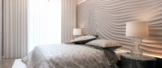
A bedroom in yellow tones, especially bright ones, is a dubious decision. This is the color of intelligence, motor activity and ebullient energy, and in the bedroom both the brain and the body should relax. Although, many people like pleasant pastel shades of yellow and do not at all interfere with a restful sleep.
A children's room is traditionally decorated in bright, cheerful colors, especially if we are no longer talking about a baby, but about a tomboyish preschooler. So some rich yellow elements will be quite appropriate, but you shouldn’t completely paint the walls in this color - it will disturb the child and prevent him from getting ready to relax in the evenings.
The kitchen is truly an ideal haven for any shades of yellow, not only the acidic ones, favored by fans of hi-tech and minimalism. Many products have a natural yellowish color (cereals, beans, butter, fruits and vegetables), and the interior in “edible” colors has a positive effect on appetite and inspires delicious cooking.
The bathroom is another suitable springboard for yellow. Entering such a room early in the morning, you will instantly wake up, recharge with vigor and positivity, and set yourself up for a fruitful working day. However, it is better to dilute the yellowness with a white or light gray background.
Surely there are people who, under no circumstances, would decide to use yellow in the design of their home. At the same time, there are devoted fans of this sunny, life-affirming color, ready to surround themselves with it to the maximum. If you are one of them, go for it!