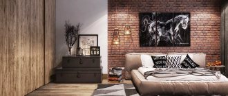
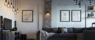
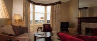
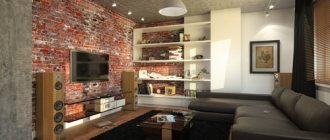
Combination with other styles
Nowadays, designers have begun to move away from the strict rules of interior design, which presuppose the presence of only one style in the design. Design done in one direction is boring. It is much more interesting to decorate a room in which there is a variety of combining elements. There are several rules by which you can combine several design styles:
- Mandatory predominance of one style over another. Basic - can be expressed in the layout, decoration of walls, interior items (furniture). The secondary one should harmoniously complement the design with individual elements.
- Designers do not advise combining more than two directions in the interior of one apartment, the design of which should be consistent with one concept.
Let's look at how an extravagant and unusual loft combines with other styles.
Convenience and pragmatism
What is the trick of loft-style apartment design and what it is, read in our separate article.
Hallway
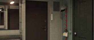
The hallway turned out to be small, but roomy. Behind the sliding doors, made in the style of the main doors, there is a spacious wardrobe for seasonal clothes. At the very entrance on the wall there is a large full-length mirror and a wooden console for storing all sorts of small things such as keys and perfume.
On the floor there is a ceramic granite carpet with a pattern.
Interior with classics
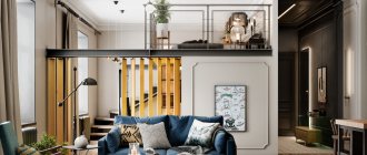
Loft, diluted with classic elements, is the most common combination in design. They have a lot in common:
- use of works of art;
- use of natural materials;
- antique interior items and stained glass;
- rare textiles.
Vintage interior items
Rare furniture
At the same time, the design becomes harmonious and unusual if it combines opposites .
- Heavy velvet curtains go well with raw concrete and cast iron radiators, making the design softer.
- The use of different finishing methods on opposite walls - brickwork and decorative plaster - gives a unique result that looks very impressive. If you place an antique black leather chair with beautiful carved legs against a raw wall, it will become the central decoration in the room.
- If, when decorating a living room in a loft style, there are open beams on the ceiling, then a crystal chandelier suspended between them will look very elegant.
- In the bedroom, a delicate canopy over the bed will help soften the design.
A loft with classic elements is an opportunity to show your originality and imagination when creating your dream home. Be inspired by the beauty and elegance of loft-style rooms by looking at our article.
Fireplace in front of a concrete wall
Elegant furniture made from natural materials
Four poster bed in the bedroom
Crystal chandelier suspended between beams on the ceiling
Bedroom
The bedroom also turned out to be bright, as the customers wanted. The only thing that stands out is the terracotta-colored accent wall behind the bed. The “Wings” bed is interesting because of its headboard – it resembles wings, hence the name. On both sides of the bed there are two classic bedside tables with forged lamps, also in the American style. They are supported by a classic chandelier and tulle with curtains with cornice mounting.
The dressing table was also chosen to be classic, and a makeup mirror was hung above it. Behind the sliding door is a dressing room.
Art Deco elements, kitchen design
Art Deco is a decorative art that began with an exhibition held in Paris in 1925. After the First World War, people wanted exaggerated brilliance and luxury, which were embodied in this direction of design. Art Deco involves the use of rare, valuable types of wood in the interior, leather, luxurious stained glass, velvet and brocade. They complement each other perfectly, as they are the most spectacular in nature.
Interior in black and white style
Furniture with a touch of patina
Thumbs Up Interiors combine luxury with industrial aesthetics to create a stunning mix of styles. Often in such interiors the loft is the main one. The raw walls are complemented by luxurious Art Deco furniture.
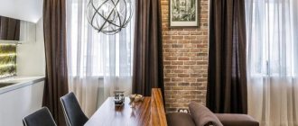
The kitchen space in this joint design looks very harmonious: the set with mirrored facades goes well with a ceramic panel that imitates brickwork, painted white. The natural wood flooring sets off the glass dining group with stained glass chairs. A watch in a forged frame will add brutality to the interior. You can read here what colors to use for a modern loft-style kitchen to make it beautiful.
Crystal chandelier and framed mirrors
Original mirror and wooden furniture
Neoclassicism in the interior - main colors
The main palette is calm natural colors. No contrasts or bright, synthetic shades. Therefore, preference is given to pastel colors.
Among the main solutions:
- Chocolate;
- Cream;
- Woody;
- Beige;
- Blue;
- Gold;
- Silver;
- Grey.
Often these are not pure colors, but muted and heterogeneous ones. Transitions are made smooth, not abrupt, without clear boundaries. Therefore, if the room is decorated in any shade, then several of its tones are used, combined with each other.
Matching grunge
These trends have many similarities, but at the same time they differ in the nature of their origin as independent styles. Both loft and grunge can become a standard to follow, since the design of premises in these styles is distinguished by its originality.
This video shows interiors in grunge style.
Common features of these directions:
- rough finishing of wall, ceiling and floor surfaces;
- interior items from different eras and styles;
- variety of textures and shapes;
- combination of simplicity and luxury;
- plenty of light and space.
Thanks to this, combining these two styles is very easy.
Elegance and convenience
Space and light
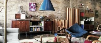
Leather furniture and brick walls
Comfortable ottomans and wooden floors
How much does a professional fashion interior project cost?
Calculate the cost of the project using a calculator by selecting the total area of the room in m². Keep in mind that the minimum cost of a design project is 230,000 rubles.
Sketch design only
Complete design project
Cost of a complete design project
Living room design is part of the interior design of a house or apartment, which can be ordered from. Our designers will develop a residential interior project, focusing on the style and color preferences of the customer, his habits and wishes.
Interior design as a gift!
For more than 25 years we have been creating unique interiors for successful people. We are ready to create such an interior for you for free if you do the renovation with us.
The living room renovation should be carried out according to a design project consisting of working drawings, 3D visualizations, and planning solutions. Such an integrated approach to the renovation of living space serves as a guarantee of quality. In the end, the living room, as we found out above, performs an image function. And any image must be thought through in detail.
When you order an apartment or house renovation from us, you receive a design project completely free of charge! uses exclusively modern technologies and materials in its work. And our designers and managers accompany the client at all stages of cooperation. We receive about 40% of orders from customer recommendations. We have fair prices and a clear algorithm of work.
Scandinavian comfort
Scandinavian style - space, minimalism, plenty of daylight and bright colorful accents throughout the apartment , lack of clutter with interior items. Despite the apparent simplicity, Scandinavian interiors look very stylish. Thanks to white walls and large windows, the room looks spacious and light. You can see what a loft style should look like in white in our separate article.
For examples of a combination of loft and Scandinavian style, see the video.
The advantage of combining it with a loft is that unfinished concrete and valuable wood coexist perfectly in the interior, and the ceiling with industrial patterns sets off the white walls. This design features simplicity of interior architecture and decoration. Just look at the photo with examples of such synthesis:
Plenty of daylight, carpet on the floor, ottomans
Wooden floors and comfortable furniture
Brick wall and minimalism
Colorful accents in the interior of the apartment
Warm Loft or Modern Classic
What is “Modern classics”, “modern style with LOFT elements and other hybrids unknown to architecture?
The gap between theory and practice It is no secret that the world of interior design is no less inclined to invent new words and meanings than the Cubo-Futurist poets. And many of the terms in the lexicon of designers and their clients (and what is meant by them) would be extremely puzzling to the art historians who wrote the volumes for the library. Why is this happening? There are objective reasons, including time and people. The environment of historical, social and other circumstances that contributed to the emergence of great European styles is long gone. And today the majority perceives them exclusively as decorative samples and sources of inspiration, of which there may be several. Hence numerous hybrids like “American classics with elements of Provence”, “chalets with elements of Russian style”, “loft with Gothic elements” and other “fusion”. There is a style that I call “mini-deco” - This is when furniture and style The entire interior is clearly inclined towards “minimalism”, but the accents (mainly lamps) are taken from Art Deco and there are a huge number of such complex combinations.
Agree among themselves In the Russian market, the concept of “style” exists for the most part more for customers than for designers - so that the former can roughly describe in words what they want. In practice, the concept of interior styles is very vague, which cannot be said about architectural styles. In Russia there is a basic set of concepts: classic, modern / minimalism, country / Provence, kitsch / loft. I would also include “modern classics” separately. Further specification of the style is determined not by the name, but by analogues that are discussed by the designer and the customer.
The customer doesn’t care what kind of baroque it is. If for historians of decorative and applied arts and culture the question of how, for example, original styles differ from their repeated comings (the same baroque or rococo came back into fashion several times) is important, then for interior design customers it is often No. In addition, the perception of a particular historical period is often influenced by films, fiction and other elements of pop culture, for which historical accuracy is not as important as a convincing artistic impression.
For the sake of a beautiful word Unfortunately, people often have poor terminology and identification of a picture with a title
Russian customers, for example, love the word “Provence,” although they often hardly identify it at all. They just like the term, but many rush to perform it as they understand it. Although, it would seem, what kind of Provence could there be in a modern multi-apartment high-rise? In addition to rethinking existing terms, the industry is constantly inventing new ones. And they are capable of confounding any architectural historian. Such insidious definitions include, for example, “glamour”, “modern classics” and even “eclecticism”, as well as other concepts into which everyone can put their own content.
For greater persuasiveness In order to sell something well, you need to show something new all the time. The task of surprising (in the good sense of the word) the customer is one of the main ones for a designer. After all, if he is not capable of this, it turns out that a person can make a project and repair for himself without him. Therefore, a large number of terms are used in everyday life that are in no way consistent with the history of art and architecture, but have a magical effect on people who have nothing to do with design.
Art historians are confused In classical art history, “eclecticism” traditionally refers to a specific period in the mid-to-second half of the 19th century, when obvious borrowings from various historical styles were practiced in applied art and architecture: Baroque, Rococo, Gothic, Renaissance and others. Different trends could coexist within one area, one house (where there could be a room in the Russian style, a Gothic dining room, and a couple of interiors in the style of different Louis), one room and even one item (furniture set or service). Fact: Historically the term “eclecticism” was often used as a pejorative. And the disdainful attitude towards him was never completely overcome. Practice shows that we usually call eclecticism something that, from the point of view of style, did not quite work out. But it was from the period of eclecticism, as many researchers of the issue believe, that the formation of the very concept of “modern interior” began.
What is eclecticism today? Over time, “eclecticism” began to be called everything that did not fit into the framework of a single stylistic concept. In modern interiors, this term is also interpreted very broadly. Many experts are unanimous: by and large, the vast majority of modern projects are eclectic.
If you look closely at the style of modern projects, professionals will easily notice the presence of two, three or more styles. It is often possible to give a precise definition of a particular style only by the presence of characteristic elements in forms, decor and materials, for example, ethnic ones. In most cases, the canons are erased.
What is modern style today? I call it “just a good functional renovation.” What is now popular in both economy and business class. You can call the resulting result a modern style with an element of art deco, with an element of eco-style, with an element of classics, and so on, depending on which accent elements predominate in the interior.
The elusive “classics” It just so happens that in our world “classics” are often perceived as synonymous with eternal values and a win-win option. This is the key to her popularity. What is meant by “classic” in the interior?
Russian customers, as a rule, distinguish between two styles: classic and modern. At the same time, he calls the classic “modern”. Often people say they love Art Deco, but when you show it in a book, it turns out that this is not what they meant. It takes a long time to understand the options for classic styles in order to understand which the customer prefers.
Beige style Very often you can hear from customers the definition of “light classic”, although such a style does not exist. By “light classic” we always imagine something beige with slightly classic shapes. But when we start to understand the customer, we understand, of course, that everyone means something different here.
The advantages and disadvantages of the “beige style” are a separate topic. It has both its supporters and opponents, who associate such interiors with a lack of imagination and an unjustified fear of trying something less “safe.”
The most common style that customers ask for is: “Everything is in beige tones for us.” And every time we try to dispel their ideas about a beautiful interior, offering something that is not beige at all.
Wealth and luxury Do not forget that classics in Russia sometimes mean variations on the theme of large palace styles. Russian customers have a “kitsch” style, which they call differently: classic or something else. “Everything that glitters” is collected there: more gold and expensive furniture, paintings and sculptures. The designer’s task in this case is to stop the client in time.
All our styles are Russian. Another powerful engine of progress and imagination that cannot be underestimated. The Russian customer, as professionals note, tends to perceive many things in his own way. Some explain this by a mentality at the intersection of European and Asian. Others - the specifics of life in the country in the 20th century and the Soviet legacy. Hence a whole bunch of “national trends”, and our own interpretations of famous European styles.
All our styles are “Russian”. For a long time, designers have not maintained a clearly defined style, because they want to please clients. This is where we get Russian Provence and Art Deco.” Some trends make you smile, others are mostly perceived with sympathy. There are certain established, very Russian images. Firstly, “traditional dacha style” - the style of old dacha villages of the early and mid-20th century: with white glazed verandas, Viennese wicker chairs. A little bit of antiquity and a lot of comfort and summer. Secondly, this is the image of the “intelligent Moscow style”: all the best that was in the interiors of Stalinist apartments, old apartment buildings, with an atmosphere of calm classics, without pretentious luxury and always with books.
Russian customers sometimes develop an irresistible love for everything “their own”, “natural” in the construction and decoration of a room - a symbiosis of Russian folk art in crafts made of wood and other materials and the Scandinavian style. If a competent designer works on a project, the result can be an extremely unusual, cozy and uncluttered space.
Among other things, designers also highlight the “terem” style: a richly decorated house with pronounced Russian attributes,
Eurorepair as the Russian style of the 90s Another legacy of the 90s is the unforgettable “European renovation”: a style that many designers would prefer to “reinvent.”
Some things are very sad to talk about. For example, the style of the “dashing 90s”: a wave on the ceiling, a wave sofa with armrests, a corner bathtub, a dolphin in the self-leveling floor, alive))) There is the hated, but so far completely ineradicable “European-quality renovation” - This is such a phenomenon of ours. Everything is predominantly in the same beige tones, with multi-tiered suspended illuminated ceilings, with furniture and accessories that are quite difficult to attribute to any style in principle, but this is usually done by the customers’ favorite designers: Foreman. Even very serious people with whom I talked and asked ;who made THIS “design” for you, they answered me; they couldn’t come to an agreement with any designer, but OUR FOREIGNER did everything magically!”))) Such foreman-designers approached “European-quality renovation” with imagination. For example, among the advertisements for apartments for rent there were “European-quality renovations in antique style” and other unforgettable options))
When habits decide We still have a special business style that prevails, which differs significantly from Western models. For example, business style is associated with solid wood shelving and a chair with a capito back. It is conceptually far from ultra-modern Western offices in light colors with glass and metal inserts. Hobby is another inexhaustible source of interior inspiration..
Russians have a “traveler style.” They love to bring items from different countries, which designers then have to assemble into a single interior.
There is nothing wrong with this, quite the opposite: things that are close to the owners add “life” to the space. Moreover, in the Russian soul there has always been a craving, firstly, for the exotic, and secondly, for collecting. It’s just that thematic hobbies do not always coincide with interior preferences, which sometimes makes the design task more difficult. But the result is often very impressive. So once the task was set to create a loft in the Pub style, and there should have been a favorite English telephone booth in bright red color and classic furniture). Now we would like to show photos of very successful combinations of Classic and Loft styles, what makes the Loft WARM and the Classic NOT LOADED.
.
.
Combination with eco style in the room
Info Eco-loft is the industrial splendor of a large spacious room using natural, eco-friendly materials that are inherent in eco-style.
Combining eco and loft in a room is a good idea. The room in this design looks very proportional; the unfinished brick walls in the room will favorably focus attention on the eco-leather furniture and the grass-green flooring. Instead of curtains, you can hang roller blinds made of natural bamboo on the windows. As decoration, photographs in natural wood frames are hung on the walls, and lamps resembling flower buds are attached to the ceiling.
Green Accents
Flowers in pots and brickwork
Bathrooms
The apartment has two bathrooms, the walls and floors of which are finished with decorative bricks and porcelain tiles imitating the texture of concrete.
Modern minimalist spots are placed on the deep black ceiling.
Minimalism
Minimalism is a complete rejection of interior decor and decorations ; the direction implies a minimum number of necessary modern household items with clear lines. These two styles complement each other. What they have in common is that both directions are based on large spaces with a minimum number of partitions.
Minimum amount of furniture
Designer's advice
A living room in dark colors is a solution typical of the loft style, allowing you to create an atmospheric and at the same time cozy living space.
In the interior of the living room of this apartment, the designer used medium and dark shades of gray in combination with rich red (burgundy, bright red) and black. Shades of gold and bronze are used as accents. In addition to gray and red, when creating a dark interior for a living room or bedroom, it would be appropriate to choose deep chocolate, blue or purple colors. For a successful combination of dark colors in the interior of a living room or bedroom, it is recommended to use tones of the same range of different saturations for finishing surfaces and in furniture - this way all elements will complement and emphasize each other, and not merge into one dark spot. So, to implement this living room project, the designer selected various shades of gray, with a lighter tone used for finishing the walls (liquid wallpaper Art Design 211, plain, rich gray), and a darker one for painting the ceiling (anthracite shade, two tones darker than the walls). A large corner sofa was also chosen to match the ceiling. Curtains and textiles are made in an even darker shade of gray - graphite, and finally, the darkest elements of the interior are bookcases and a black chest of drawers.
In large living rooms, as well as to create a chamber bedroom in black tones, it is justified to use dark shades in the reverse order - black wallpaper on the walls in combination with a lighter color of the floor, ceiling, furniture, textiles.
Using a chair as a bright accent in the living room is appropriate not only in a dark interior, and not only in a loft style - but to perform the function of an accent, the chair must be in a single copy.
The room has all types of lighting:
- a group of spotlights along the perimeter of the room;
- ceiling chandelier in black and gold;
- floor lamp with bronze-colored shade.
This set of lighting fixtures allows you to change the lighting scenario at the request of the apartment owners: from bright to dark, evening.
Materials used:
Art design 211
Possible options:
Provence 037
Miracle 1039
Miracle 1040
Art design 210
High tech
High-tech is a high-tech direction that breaks ties with the past. This style implies monumentality, pragmatism and manufacturability, complexity of forms. The most common materials used in high-tech are plastic, glass and stainless steel . These elements fit very nicely into an interior designed in a loft style, giving the latter a modern and ergonomic look.
Glass, plastic and metal in the interior
Bathroom and toilet
The bathroom and toilet are identical. There is gray marbled porcelain tile on the floor, and light colored porcelain tile on the walls. Italian “Atlas Concord” tiles with beautiful marbled patterns.
There is an installation in the toilet, above which there is a spacious cabinet. It will be possible to store household chemicals in it. An additional storage system is also organized in the cabinet under the sink.
The bathroom has a built-in sink in a cabinet with glossy beige fronts and a vertical cabinet in the same style. The bathtub is combined with a shower, and shelves for storing bath accessories are built into a niche in the wall.
In general, the apartment turned out to be spacious and bright. All the wishes of the customers were reflected in the interior.
See all photos of the project here.
Designer's advice
For a bedroom made in dark or black colors, as well as for a bedroom with black furniture, it is important to choose curtains and textiles that can emphasize the depth of the dark interior and give it an elitist look. In this project, to solve the problem, the designer selected curtains of an exquisite burgundy color, a dark turquoise carpet, and textiles in a rich gray shade.
Materials used:
Art Design 283
Possible options:
East 960
Victoria Du Monde Versailles V110
Victoria Du Monde Versailles V160
SILK PLASTER design solutions for dark interiors
The project is an example of the fact that an interior in dark colors can be not only aesthetically attractive, but also cozy and comfortable to live in. The dark color of walls and furniture brings a special aesthetics to the living space, noble and calm, and combines favorably with other shades.
SILK PLASTER finishing materials are the best choice for creating a stylish interior: a variety of dark tones of silk decorative plaster (liquid wallpaper) will allow you to choose the ideal solutions for your home. You can view the assortment and place an order in the catalog of the official SILK PLASTER online store or in branded showrooms in your city.
Return to list
Designer's advice
Dark furniture in the kitchen interior will look harmonious in combination with a light or medium-tone background for wall decoration and bright accents, which can be curtains, individual pieces of furniture and decor. In this kitchen project, the designer used accent elements in rich red color – chairs and pleated curtains; also, as shown in the photo, the accents combine well with the dark red decorative brick chosen for finishing the wall above the hob.
The kitchen work area is designed without upper wall cabinets; there is a separate hood above the hob. The kitchen apron and countertop are made of artificial stone to match the porcelain tile floor. Closer to the window there are display cases for dishes with lighting.
Instead of a window sill, there is a continuation of the table top. It will be nice to have a cup of coffee by the window overlooking Moscow City. To the right of the window is a cabinet with glass fronts and lighting, designed for storing drinks.
The center of the kitchen interior is a dark table, graphite color, which can be moved apart for receiving guests and family celebrations. The table is equipped with black and red chairs. Above the dining group there is a ceiling lamp with a metal body and balls.
Several types of lighting are used in the kitchen:
- a group of overhead lamps in black;
- metal chandelier with balls above the table;
- a strip of light profile above the tabletop by the window;
- hidden lighting for wall cabinets above the sink;
- furniture lighting for glass display cases and cabinets.
