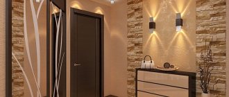
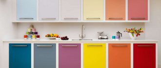
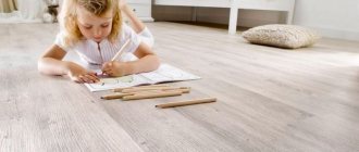
Hallway floor color
The hallway is one of the smallest and busiest rooms in the apartment.
It is this that significantly influences the final opinion about the apartment and the tastes of the residents, and the first impression is very difficult to change. The color of the floor in the hallway also plays an important role in solving complex specific problems. Many developers prefer dark floor colors, their reasoning is simple - dirt and mechanical damage are least noticeable on such surfaces.
Gray linoleum on the floor in the hallway
The excellent performance characteristics of modern flooring materials enable designers to break tradition and choose various light colors and their combinations. But there are also certain general patterns in the influence of floor color on the design of the hallway.
Small rooms should have light-colored flooring. Small inclusions of dark areas in the form of paths in the middle of the hallway are allowed. Thanks to this technique, it is possible to combine all the advantages of both colors. Light areas make the hallway more spacious, while dark ones hide dirt in places where people pass.
Option for combining tiles and laminate flooring in the hallway
The spacious hallway makes it possible to implement many ideas, including with different shades. Dark floors look great with white walls. The general rule is that the floor should always be darker than the walls.
Dark gray floor in the hallway
The bright floor is combined with light, plain walls. This option is better suited to rooms that do not have natural light.
Bright tiles on the hallway floor
The choice of color in the hallway is greatly influenced by the number, type and placement of lamps. If spot ones are planned, then the color of the floor must be chosen in such a way that it scatters the rays and makes the lighting uniform. Furniture should always be slightly darker than the floor.
Modern small hallway 2 sq. meters in the apartment
Light floor and black carpet in the hallway
How to choose interior doors, color tips
Designing heated floors general recommendations
First of all, you need to focus on the designer’s idea and maintain the already established style. It also happens that different rooms of the same apartment or house are decorated to the taste of people with different stylistic preferences. How to avoid creating dissonance and choose the best option? You can find and maintain a certain color line, common to all rooms, and buy doors of the same color. which will be equally suitable for both a strictly decorated room and a child’s room.
Neutral color
Interior doors in natural wood color will suit any interior and style: classic, country, ethnic, baroque... For classics, it is better to take shades of a more specific color: choose either very dark or very light. If you want to create a special design for your office, black tones will help make it more formal.
Image from 1podveryam.ru
Modern minimalist style does not favor textured wooden coverings in warm colors, so you should choose an interior door in a cool color. In this case, you can either fit the door into the general tone of the room and choose a suitable canvas, or play with contrast: black on white, white on black.
The modern style is emphasized by dark wenge wood panels with minimal finishing. In addition, doors in a minimalist style are suitable: black, white, metallic.
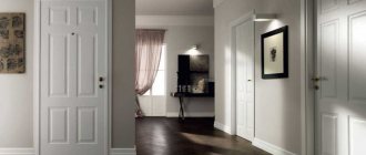
White color
The easiest option for choosing the color of interior doors in an apartment is to choose a white finish. An ideal option for those who are still in doubt. The white tone is universal and easily fits even into the darkest and gloomiest interior. In addition, it does not create a conflict or dissonance with other shades.
Image from postremont.ru
Match the color of the floor
An old method for those who don’t want their doors to blend into the walls is to match them to the flooring. However, it is not always the same color in all rooms.
If your floor coverings have completely different shades, then just choose doors that will not create dissonance with all of them.
Image from the site uznayvse.ru
If your hallways have flooring that matches the natural color of wood, then you can choose a slightly lighter shade of the doors. But if in other rooms the floor is of different tones, this method will not work and in order to avoid dissonance, you need to add other color combinations to the design: these could be shades of furniture, wallpaper, and decorative elements.
Under furniture
From the previous example, we can derive another formula for choosing the color of interior doors - to match the color of the furniture. At the same time, you don’t need to completely match it - slightly lighter shades or decorative inserts made of glass or plastic will help to avoid excessive gloom. You can use the once popular decorative fusing - in some cases, such canvases look especially original.
Image from decordoors.ru
If there are dramatic differences in the shades of furniture in different rooms, try making doors according to an individual design. For example, different canvases on both sides to match the colors of the rooms will help avoid dissonance. This is expensive, but the effect will pay for itself, especially when separating rooms of different functionality: a corridor with a bedroom or kitchen.
The original way to select the shade of the paintings, the third most popular, is to choose the shade of the walls. You can see this choice of color for interior doors in the photo.
Image from better-house.ru
If the floors and furniture in your apartment are radically different from each other, and you are not going to change them, then this is definitely your method.
Match the color of the walls
The ideal option would be to choose a neutral shade. There is one interesting method: choose a neutral or natural wood color for the interior door, which may not match any element of the interior at all. After this, to maintain the color line in the rooms, trim and baseboards are installed, as well as noticeable design details to match the canvas. A unified style is created that looks very original and leaves freedom in choosing other interior details.
Design options for interior doors in wenge color
Among the popular furniture factories that actively produce wenge-colored designs, the Verda company stands out. Almost all series of interior doors produced by it include products in similar colors. Most of the models are of the veneer or panel type - that is, they are inexpensive and available to everyone.
- League series - doors made of peeled reconstituted fine-line veneer with rectangular internal glazing.
- Orbita series - models made of PVC and timber, solid or with figured glazing on the inside.
- The Breeze series are inexpensive structures with MDF panels covered with PVC film. The frame is made of durable pine.
- Porto series - interior PVC doors with a vertical insert made of glass or plastic.
- Omega series - economy class models with MDF canvas and PVC coating. They have an interesting geometric pattern along the entire length. There may be a glass insert.
- Latina series – PVC coated doors with original floral patterns. In addition to the ornament, there may be glass inserts.
Combining wenge with other colors in the interior
Gray color in the interior, how and where to use it, rules for combining gray color. How to use gray color in the interior. The correct combination of gray color in the interior.
Internal details of any of the wenge colors will be simply an excellent option for those apartments and houses, the basis of the design of which is the contrast of color shades. wenge color will look
around the brightest walls and floor.
As for the question about what needs to be done to “revive” the interior, it is very easy to answer. As a rule, any accompanying items that have the lightest tones and shades act as a kind of “reviver”. Besides everything else, wenge combines very well with mirror and glass elements, as shown in the photo.
Among the shades of color that will provide a good contrast and at the same time will harmonize perfectly with dark burgundy or chocolate wenge, it is necessary to highlight light green, orange, orange, warm red and green colors.
Fans of cooler wenge colors are advised to pay attention to blue, crimson, gray and lilac shades of accompanying items. As for pink, blue and turquoise colors for accompanying items and design elements, they will be able to update the interior and will coexist perfectly with any of the colors, be it bright wenge doors, or, on the contrary, black coffee
How to accurately choose wenge doors
Before purchasing interior doors
any of the wenge colors, you need to think very carefully about what optical effect you plan to achieve, and also what floor color they will be consistent with. The thing is that there is a fairly large assortment of similar doors on the current market. Most of them have glass inserts or mirrors, which means the visual effect you get after installing them will be completely different than if you install solid internal parts.
Nowadays, one of the most popular and common combinations in the design of living space is considered to be a combination of doors with a film finish, having one of the wenge colors
and a laminate floor covering, the shade of which is a little lighter. As for wallpaper or plaster, bright and sometimes milky white shades dominate here.
Besides everything else, doors
Wenge oak will be very well complemented by wood products that, contrary to all expectations and prohibitions, will not only not “interfere” with wenge-colored doors, but on the contrary, will highlight their nobility and elegance. If you are still finding it difficult to make the right choice for yourself, take a look at the photo below, perhaps they will be able to dispel any last suspicions and find a much more urgent and optimal option.
Selection of harmonious shades
Despite all its apparent versatility, wenge color still does not combine with some specific shades, losing most of its attractiveness. You should not install doors (or other structures) in wenge color in rooms where materials with a pronounced texture were used - that is, color differences between layers are clearly separated and noticeable.
For example, wenge doors or furniture may get lost against the background of products or finishing made from mahogany wood, some types of walnut, bog oak or materials imitating them. Their texture is very bright and lighter than the main background - it can easily blur the impression of the exotic wenge color and distract attention from it.
Combination of wenge doors with floor coverings and wall color
Secrets of a high-quality self-leveling floor in the bathroom, expert recommendations 40 photos
It is necessary to use wenge-colored doors in the interior carefully, since it is difficult to combine it with shades of blue, pink, orange, light blue and light green. When choosing wallpaper, you should give preference to light colors: white, beige, sand, gray. The contrast between dark wenge and such wall material will be maximum, which will make the interior emotional, atmospheric, and bright.
Choosing a floor covering for wenge-colored interior doors in the interior is quite difficult. The main problem is that the texture of this African wood is so original that traditional laminate or linoleum options are not suitable for it. You should not combine interior doors and wenge flooring, this will overload the interior and make it difficult to perceive. When using doors of this color, designers give preference to floor coverings such as bleached oak, light beech and maple. As an alternative, you can choose a walnut with a predominant gray tint.
How to choose laminate for wenge doors?
The laminate can be the same shade as the door. Veneered doors can be perfectly combined with dark walnut and dark oak. The flooring must have a wood structure.
Light floors can be imitation cherry, alder, bleached or golden oak. Take a look at the photo.
Wenge color can significantly transform the interior. And if such a task is not worth it, in any case such doors are worth purchasing. Write in the comments how else you can fit wenge doors into the interior, post photos.
Choosing the color, door texture and combination with the floor, baseboard (2 videos)
Different models of wenge doors (48 photos)
What colors does it go with in the interior?
Deep tones of brown look beautiful against the background
- vanilla,
- creamy shades,
- delicate turquoise.
Cold sea notes will slightly extinguish the sultry passion of African wood.
Orange shades are incredibly wenge-friendly. Especially the peach shade. At its core, brown is orange with a drop of black added to it.
Pink tones will go well with purple shades of wood. Rich pink accents can be used for sofa cushions and vases. A scattering of red and burgundy splashes will emphasize the atmosphere of luxury and help make a lasting impression.
Interspersed with blue are allowed.
Since olive and grass green tones pair equally well with brown, purple and burgundy shades, they can be used as companion colors in interior design.
At the same time, you need to ensure that there are at least 65% light shades in the interior. If you want more wenge, be sure to dilute the dark tone with more windows and additional square meters.
Features of wenge doors
Wenge wood is easy to process (although difficult to polish), has high resistance to impact and bending, and is also resistant to rotting. Therefore, it is successfully used in the manufacture of doors. The density of such wood is twice as high as that of oak.
Why choose wenge
Wenge wood is practical, does not fade in the sun, and does not react to humidity. Due to its high density, it is not damaged by physical impacts and does not scratch.
It contains a large percentage of various substances and essential oils that have the ability to resist fungus and insects.
Wood has a long service life without losing its original attractive appearance.
What rooms are they suitable for?
Wenge is used where it is necessary to withstand increased loads: when decorating stairs, sports equipment, furniture. It goes well with various types of light wood (olive, maple, ash, zebrawood).
Wood of this species is often used for the manufacture of inlaid or artistic parquet of the highest quality, as well as for interior decoration.
Wenge door leaves are often purchased for residential premises in which they are installed as interior doors. They are also suitable for office spaces.
Combinations of wenge with other colors in the interior
Interior elements of any of the wenge shades will be an ideal option for those houses and apartments whose design is based on the contrast of color shades. One has only to imagine how bright the doors of any of the wenge shades will look, surrounded by the lightest possible floors and walls.
As for the question of what needs to be done to “revive” the interior, the answer is quite simple. Any accessories that have the brightest colors and shades can act as a kind of “reviver”. Among other things, wenge goes well with mirror and glass elements, as shown in the photo.
Among the color shades that will provide good contrast and at the same time will harmoniously combine with dark burgundy or chocolate wenge are pistachio, orange, orange, warm red and green.
Fans of cooler shades of wenge are advised to pay attention to blue, crimson, gray and lilac shades of accessories. As for pink, blue and turquoise shades for accessories and design elements, they can refresh the interior and will go perfectly with any of the shades, be it light wenge doors, or, on the contrary, black coffee
How to choose the right wenge color doors
Before purchasing interior doors of any wenge shade, you should carefully think about what visual effect you plan to achieve, as well as what floor color they will be combined with. The fact is that there is a fairly wide range of such doors on the modern market. Many of them have glass or mirror inserts, which means that the visual effect that you get after installing them will be completely different than if you install solid interior elements.
Today, one of the most popular and sought-after combinations in apartment design is the combination of laminated doors in one of the wenge shades and laminated flooring, the shade of which is a little lighter. As for wallpaper or plaster, light and sometimes milky white shades predominate here.
Among other things, wenge oak doors will perfectly complement wood products, which, contrary to all expectations and prohibitions, will not only not “interfere” with wenge-colored doors, but on the contrary, will emphasize their nobility and grace. If you still doubt the correctness of your choice, look at the photo below, perhaps they will be able to dispel your last doubts and find the most relevant and suitable option.
More information on the topic: https://dvernoigid.ru
Wenge and other interior colors
Color combinations are preferable with light warm shades. In the vast majority of cases, doors are chosen to be at least two or three shades darker than the walls and curtains, but can practically match the color of the floor. The furniture in African rosewood color also looks good.
Warm colors are suitable:
- pistachio;
- light green;
- pale yellow;
- peach;
- reddish brown;
- light tangerine.
Cold ones are used less often - graphite gray, soft blue, violet, emerald. A grassy green carpet on the floor, matching the same curtains, light brown furniture, and red and black doors looks great.
When the furniture, like doorways, is decorated with African rosewood, it is better that the upholstery of sofas and armchairs is lighter than the wooden parts, tables and chairs are one or two shades lighter than the doors, draperies on furniture, windows, and screens are contrasting. The necessary fittings are made: for cold shades of wenge, silver-gray, for warm shades – yellow-gold.
Choosing wallpaper for doors
Wallpaper is always chosen lighter than the door panels - for small, poorly lit rooms with windows facing north, white, beige, sand, and ocher are preferred. Spacious rooms with windows facing south will “like” cool colors - turquoise, blue, violet, pale green. An ideal complement to an “expensive” interior would be vinyl or silk photo wallpapers with images of a summer forest, sea sunset, village landscapes or animals. If the door leaves have stained glass, many patterns, various metal inserts, the wallpaper is selected in a single color and vice versa, a simple brown door looks good against a moderately colorful background. Wallpaper is sometimes glued simultaneously in two types, but with different textures, colors, and patterns. For example, two-thirds of the walls of a room are covered with wide greenish-beige canvases with small flowers, and narrower ones with large plant elements are glued between them. Another option is gray plain wallpaper on three walls, and colorful photo wallpaper on the far wall opposite the wide doorway.
Choosing flooring and skirting boards
The combination with a laminate imitating bleached or stained oak, and the same skirting boards, looks original and expensive. A wooden structure in the design of the floor is mandatory - this is the only way to create the most harmonious interior.
The most commonly used imitation of the texture of the following rocks:
- cherries;
- ate;
- pine trees;
- maple;
- mahogany;
- beech;
- Karelian birch.
Wenge laminate or floorboards of this color are used most often. Natural parquet made from Congolese rosewood looks great, but the middle or economy class will not be able to afford it due to the excessive cost of the raw materials. Here, less expensive wood that imitates wenge will come to the rescue, and high-quality linoleum will complement cheap doors covered with self-adhesive film.
For hygienic reasons, ceramic tiles imitating wood are often laid in bathtubs and toilets. Many manufacturers produce floor and wall tiles that resemble the texture of African rosewood.
It is recommended to match skirting boards for any room to the color of the door panels, which are sometimes combined with the colors of the window frames. In this case, floor details are preferable to be much darker than the flooring material. When the room is cramped, they are made as light as possible, giving the space lightness and airiness. When purchasing laminate flooring, sellers often recommend immediately taking a plinth of the same color; some companies even give it as a gift when purchasing large quantities of flooring, which is why this design is most popular. Sometimes they buy a plinth of the same color as the walls, but for very narrow corridors this design is not suitable - the room will become even narrower.
If the door leaves are made of natural wood, if possible, a wooden floor is also made - parquet or plank.
Specifics of wenge color
Wenge takes its proper name from the tree of the same name, the wood of which is considered one of the highest quality and most expensive in the world. It is able to withstand high loads while maintaining its original appearance. Taking into account the high cost of this type of wood, a large number of internal components of the wenge shade, which are demonstrated on the current market, are imitation, which combines the external specifics of wenge and a fairly inexpensive cost.
In most cases, black coffee is considered a fairly popular shade for interior doors. This is due to the fact that this particular shade can provide the desired contrast, image and modern design. Besides everything else, even an imitation of this shade will look unreasonably expensive and unique.
It is also necessary to emphasize that decorators suggest purchasing and installing interior parts in wenge colors only when the finishing of the walls and floors is already completed.
Selection of intermediate link - plinth
In Soviet times, the plinth was not yet so important for the visual distinction between walls and floors. Its task largely boiled down to closing the gaps that inevitably arise when laying the floor covering, and, as a rule, the color of the baseboard and the floor covering coincided
Today, the role of skirting boards in a room can hardly be underestimated. Thanks not only to the rich range of colors, but also to the significant variety of shapes and materials used, plinth has become an important element of the interior. Currently, it is customary to match this element to the color of the door, and not the floor, as was practiced in the past. Such a solution offers great opportunities in terms of providing a combination of different color schemes. In some cases, you can “play” well in contrast with the door.
In the photographs you can compare the advantages of both combination options:
Gray color combinations
Gray is very sensitive to complementary colors and does not have a variety of shades. The neutrality and tranquility of this color will recreate an atmosphere of comfort, hospitality and relaxation. Shades of gray should be used as a background, complemented by wooden elements in light yellow and reddish shades.
Living room in gray
Gray with white is the most win-win option. In this case, a naturally soft gray is chosen, and the white palette should include the color of coffee with milk, caramel, cream and milky white shades. Which will add lightness and warmth to the main color, which is gray.
Gray and white interior
The blue-gray design is cool and fresh, and is characteristic of a vintage style. The blue color is chosen to be a soft shade or a little brighter. Here you should take pastel shades of these colors. If there are rich tones, the interior will carry coldness, severity, and at the same time calm.
Gray-blue interior
The gray and yellow design is a controversial but stunning combination. With the correct placement of accents, the yellow color will act as a “sun” on a gray background. To do this, the yellow color should be used in small quantities so that the “glow” effect does not disappear. Gray is then the dominant color, but it is better to use several shades close to it.
Gray-yellow interior
The gray-green interior is warm and cozy. In a small room, gray walls and ceiling will elongate the room, visually making it spacious. And greenery will enhance this feeling without focusing attention. Gray color will emphasize neighboring colors, making them full. The gray-green combination is soft and unobtrusive, and is unlikely to ever get boring.
Gray-green interior
The gray-brown combination is a capricious but interesting pair. Based on the principle of contrast, dark and cold shades of gray and warm and light shades of brown are selected. For greater harmony, you can add a neutral white color.
Taupe interior
Gray-red combinations are popular. And by adding black, it turns out very glamorous, where red and black are just accents, and the gray background will emphasize and enhance this effect. You can also add white or cream to soften and make the room appear smaller.
Gray-red interior
A successful combination of gray and black. Gray is an intermediate shade of white and black. In this case, everything will be concise, strict and graceful.
Gray and black interior
Floor, doors, windows
Wenge color is used not only in furniture. It is good for floor coverings, creating a feeling of stability, confidence and security. In this case, it is desirable that the doors echo the floors at least with platbands.
Not every room can withstand the powerful pressure of dark color. And if you make the door leaves dark brown, it can significantly reduce the size of an already small room. There is an exit. It is enough to decorate only the extensions and platbands in a noble shade. And the doors in this case will be milky-creamy tones.
The same principle works for windows. In spacious living rooms and bedrooms you can install frames covered with high-quality imitation African wood. If the scope and concept of the project allows, then it is permissible to use dark window sills.
In rooms with a modest area, it is advisable to assign wenge the role of an accent and auxiliary shade.
At the same time, there should be an abundance of white and pastel colors around the noble color. In this case, you will achieve the desired result.
At the same time, there are cases when you need to create a subdued, intimate atmosphere. Billiard rooms, wine cellars, home cinemas, poker rooms - these are rooms in which an excess of dark chocolate color is appropriate. But even here it should receive an elegant frame in light colors. Instead of covering all the walls with wenge, alternate it with pearl gray, blue, pale pink, and turquoise. Give him coffee and tea shades as companions.
How to choose decorative elements
To give the room a touch of piquancy, elegance or personality, you need to use unusual decorations. A great idea would be to resort to accessories such as sconces, lamps, candlesticks, table or floor lamps, made in light colors. But depending on the stylistic design, lemon, tangerine, and pistachio elements can also come in handy.
Mirrors and objects with its inserts look gorgeous.
In the reflection of the mirror, decorative elements and bright colors are visible. Agree, without them the interior would be a little sad
Lightened door array
Light-colored doors are very common. Cool light shades visually expand the space, relax, soothe and give a feeling of peace. Cool colors are suitable for rooms with south-facing, illuminated windows. But if there is little light in the room, then cold shades, on the contrary, have a depressing effect and give the room some gloom.
If the windows face north, then the room should be designed in warm light colors: yellow, red shades. Warm colors create a cozy atmosphere and improve your mood.
The best option is when the door is a couple of tones different from the floor. To maintain the unity of style, the door leaf is chosen as carefully as the finishing of the walls and floor covering.
A dark floor and light doors are a contrasting and effective combination. If dark parquet is laid on the floor, then it is better to choose a door array made of natural lightened wood, rather than plastic or painted in an unnatural shade.
Doors look better if the baseboard is the same color. This way the contrast can be smoothed out a little, and the door will not look like something separate from the interior. The final coating of the walls should be slightly darker than the door lining. This achieves the effect of depth in the room, and the space visually increases.
// ]]>
The dark red and brown shades of the laminate combine perfectly with the creamy beige color scheme of the door leaf.
If both the flooring and the door array are lightened, then visually one continues the other. If the color scheme is monochromatic, you need to properly illuminate the room and use colorful details (for example, carpets).
Gender color and human psychotype
The color is chosen taking into account the recommendations of doctors, you should listen to them. People have different temperaments, behavior depends on genetic inheritance. Each type of temperament perceives the same color in its own way.
Choleric people feel calm in rooms with a predominance of orange color, but for phlegmatic people such an environment has a depressing effect.
Orange floor and pastel orange bath mat
Sanguine people are better suited to light green walls and a light floor.
Light green walls, light gray floor
For melancholic people, brown floors and light blue walls are recommended.
Brown parquet floor and blue walls
Science has proven that the color in a room has a serious impact on mental well-being.
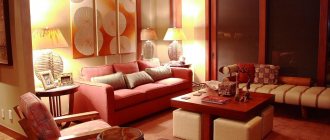
This is very important due to the fact that we spend most of our lives indoors. The red color causes a rapid heartbeat, can cause anxiety, sometimes a person becomes unreasonably aggressive
This color is categorically not recommended in bedrooms, kitchens and children's rooms. It is allowed to be used only in living rooms, and then in limited quantities.
Red furniture as a bright accent in the living room. Floor: light laminate
Red carpet on black parquet floor
The yellow floor brings the energy of activity, but without aggression and anxiety. It stimulates brain activity and can be used in workrooms and schoolwork preparation areas.
Yellow goes well with white and beige
Purple and blue are recommended to be used in limited quantities; prolonged stay in rooms with a predominance of these colors can cause depression. The pink floor gives the room a romantic character.
Pink marbled floors and pink walls go well with a black bed and black bedside tables
Green is considered the most friendly color for the human body. Make it the main one when decorating the premises and, depending on the shade, choose the color of the floor.
Modern interior with bright flooring
Green 3D self-leveling floor in the bathroom
Green tiles on the floor and walls
Shades of green flooring can be combined with wall decor or accessories filling the interior
Floor and door color
The color of the floor in the interior of any room should be combined not only with the walls, ceiling and furniture, but also with the color of the baseboards and interior doors. Some people think that the colors of the interior door baseboards should match the color of the floor, or at least be close. However, this is not at all necessary.
This combination can also be used in the hallway, especially if it has several interior doors. With this approach to color combinations, it is best that the doors are made of the same material as the baseboards, and the flooring can be chosen in accordance with their colors.
For example, wooden baseboards and doors will look great against the backdrop of flooring that imitates natural wood.
If the interior of the room is dark in color or the area of the room is small, then it is best to make the flooring, baseboards and furniture in light colors.
At the same time, modern interiors often use contrasting combinations, for example, a dark floor covering will go well with light or white doors and baseboards. It must be taken into account that the color contrast must be pronounced.
The color scheme of the furniture depends on the colors of the doors and baseboards.
There is one more nuance in the choice of colors, so if the color scheme of the doors and baseboards is light, and the floor covering is dark, then the color of the baseboard should be identical to the color of the door
Experts recommend not choosing floors, doors and baseboards of the same room in different colors.
Door styles
Interior wenge doors look great in a wide variety of interior styles:
- classic - a small number of ornaments - meanders, curls in the design of red-brown structures, successfully harmonizing with turned furniture legs;
- Provence – the lightest shades of Congolese rosewood,
- minimalism – “blind” doors that are as plain as possible, simple furnishings in “pure” colors – red, yellow, black, laminate floors and nothing more;
- ethnic - the interior color scheme is made in brown and green tones, the doors are the darkest elements, in harmony with wicker mats on the floor, indoor flowers in floor vases, and a variety of natural decor;
- modern - the emphasis is on wide doorways, which are decorated with brown and black horizontal stripes, there are light suspended ceilings, glass inserts above the doors;
- hi-tech - the abundance of light successfully emphasizes the shiny texture of the wood, the canvas is decorated with mirrored, metal inserts of clear geometric shapes. Primary colors – steel, white, black;
- contemporary - simple, cozy rooms, the entrances and exits of which are decorated with functional wenge doors, with a variety of patterns, duplicated on the built-in wardrobes and chests of drawers;
- oriental - the lightest shades of wenge in the design of doors, furniture, flooring, in harmony with bonsai trees on window sills, wallpaper with black and red hieroglyphs;
- loft - a style ideal for wenge, the rich brown design looks good against the background of simple brick walls, playing with all the colors when street light falls from the panoramic windows;
- baroque - luxurious doors made exclusively of natural wood, decorated with voluminous carvings, stained glass windows, a pronounced texture.
It is advisable that all the doors in the apartment, no matter how many there are, be of the same color, with similar fittings. Differences here are permissible only in the number of colored or transparent inserts and the width of the canvases.
How to choose a door color to match your interior
When choosing a door that will harmoniously fit into the design of the apartment, you can use four principles:
- combination of doors and floors;
- combination of doors and walls;
- combination of doors with furniture;
- combination of doors with each other.
You can combine them or stick to just one.
Combination of doors and floors
A room in which the door and floor match each other looks very stylish. This does not mean that they must be the same color: the color of the door can duplicate only one of the shades of the floor covering or be slightly lighter or darker than the floor
It is important that the shades of the door and floor are the same temperature: either cold or warm
Photo: Instagram boomplanner
Photo: Instagram design_interior
Photo: Instagram interior_ideas_home
Photo: Instagram interior_inside_home
Photo: Instagram interior_inside_home
Photo: Instagram interiorspb
Combination of doors with walls
When choosing the color of the door, you can focus on the walls. The rule is the same as with the floor: close, complementary shades
It is best to focus on the color of the walls if the floor is not very bright and does not draw attention to itself
Photo: Instagram boutiquedoors
Photo: Instagram geona_dveri_spb
Photo: Instagram interior_design_ms
Photo: Instagram zotkina.tatiana
Combination of doors with furniture
The door can be made in the same colors as the furniture, or even contain the same pattern. This move creates the feeling of a thoughtful ensemble.
Photo: Instagram anterior
Photo: Instagram ecojoy.ru
Photo: Instagram nomader72
Photo: Instagram roomtome
Combination of doors with each other
Another rule for selecting doors: similar or identical doors look good. If the apartment is designed in the same style or the hallway area is small, it is better to stick to the same models and colors.
If you want variety, you can unite the doors with some common feature. Let's say the color of the doors is the same, but the shape is different (for example, the door to the living room has a glass insert, but the door to the bedroom is solid). If the color of the doors is different, then, on the contrary, the material and their shape must match.
Photo: Instagram avesinterior
Photo: Instagram grand_salon_alians
Photo: Instagram viktoria_filimonova_interior
Photo: Instagram estee_design
Photo: Instagram interiorvam
Photo: Instagram maklakova_photo
Interior doors in wenge colors in the interior of the apartment
- If you decide to install interior elements of any of the wenge shades in your apartment, it is worth remembering that it is presented on the modern market in four different shades: dark chocolate, dark burgundy, black coffee and dark brown.
- According to professional designers, the use of decorative elements having any of these shades practically does not allow combination with wood texture, the structure of which differs from wenge. Otherwise, the visual effect of using wenge in apartment design will simply disappear. Experts also note that any light shades are simply ideal for the doors of the above shades.
- When choosing wallpaper, in this situation, you should pay special attention to vinyl and silk wallpaper, the shade of which will vary from milky to beige. Some color combination options can be seen in the photo below.
- Contrasting shades are allowed (light green, blue, pink and others), but you should be very careful with them. As for those who prefer to decorate the walls in rather dark colors, they should pay attention to additional design elements made in light colors, as well as the lightest possible floor covering, which will prevent gloominess in the design of the apartment.
- Having installed a wenge door, which floor is better? The flooring can be darker than the wallpaper on the walls, but at the same time, it is much lighter than the interior doors.
Related article: How to decorate the walls in the kitchen - the best options
Shades
The material may be brown with golden veins. In this case, any shades are possible from dark burgundy and purple to chocolate and almost black. The only thing is that you need to clearly convey the texture of the coarse fibers of natural wood and add characteristic black veins.
Designers spent a long time deciding which of the possible shades to use as the reference color. As a result, a single solution was found and expressed in different formats.
- RGB: 47, 37, 38 (used for website layout, television and printing).
- HEX: #2F2526 (web design hexadecimal system).
- HSV: 354°, 21%, 18% (you work with it in Adobe Photoshop).
Of course, living wood has a richer palette. However, a clearly defined shade helps in the development of building materials, furniture and textiles.
Manufacturers offer several shades of wenge. But when viewing catalogs, different shades may be hidden under the same name.
Wenge Melinge. Cool mid-tone range.
Wenge Tsavo. Warm mid-tone range.
Wenge Aruba. Dark deep burgundy shade.
Wenge Linum.