To create home comfort, you can use “delicious” combinations. For example, a person associates a cup of coffee with warmth and comfort. The same can be said about milk. Therefore, the color of coffee with milk in the interior is a favorable stylistic device. Its use is allowed in any room, and the variety of shades allows you to vary the decor palette. It is important that the composition is in harmony with the surrounding objects. This is easy to achieve, since there is a choice of colors from cream to rich brown. Let's consider the key features of using popular colors when decorating the interior design of an apartment or private house.
Design nuances
Often conservative people prefer coffee interiors. However, love for the classics is not the prerogative of the adult generation. Attractive colors have not gone out of fashion for many years. Designers choose soft colors because they provide a good backdrop for displaying various pieces of art. These can be paintings, sculptures, photographs.
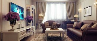
If we are talking about a small living room, then a coffee accent will look good on one of the walls. If the bedroom is characterized by a large area, then coffee with milk can become the main color of the room. It is also possible to use shades of coffee in the office. They will soften the interior decor, allowing you to devote yourself entirely to research or educational work.
The selection of textiles will play a big role in this. Replacing curtains alone can have a significant impact on the feel of a room. If the windows face south and the wall decoration is predominantly white, then coffee curtains will protect you from the hot sun. We can safely say that the shade of coffee can elevate any space. With its help you can create comfort and an atmosphere of luxury. It is enough to acquire pompous accessories (elegant figurines, antique elements, avant-garde paintings and expensive lamps). Embroidery on textile decorative items is also welcome. These could be decorative pillows, exquisite rugs, etc. You can dilute the background with inserts of red and blue. At the same time, it is better to avoid yellow and purple, as they make the space heavier.
What are the best combinations for the kitchen?
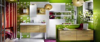
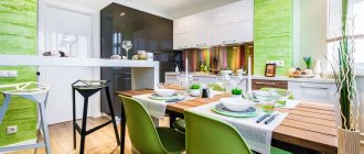
Decorating kitchen spaces in chocolate shades has become popular. Here, in addition to dairy wallpaper, you can add several coffee-themed paintings. Ideally, an apron with a picture of coffee beans is attached near the stove.
This decor is well complemented by metal accessories. For example, door handles, spoons, table tops. Modern glossy furniture is also suitable. It will help to visually increase the space of the room.
The appropriate shade ratio should be chosen based on the desired result. The kitchen room can be designed in a rustic, historical style. Or in strict minimalism.
What items to complement the “coffee” kitchen
Now many people love gloss in everything. Including in design. In this case, glossy, expensive furniture will match the color of coffee with milk. For example, a light sofa with matching pillows placed on it.
A snow-white fireplace or table will fit amazingly into a cozy coffee kitchen. Large high-pile carpet and plain chairs with cushions. You can alternate hanging cabinets by color. The desired color of the furniture can be selected to order. Also, various little things in a glossy design, hung on the wall or placed on shelves, will not be superfluous.
What psychologists advise
Most professional psychologists insist that coffee color can stabilize the nervous system. A cozy home helps to “talk” and discuss all possible problems. Since the milky color scheme does not imply the presence of cold colors, the winter period will be characterized by a warm environment. The absence of pressure on the psyche allows you to fully relax. In addition, the coffee palette in the interior is often called chocolate. And this product is a generally recognized antidepressant.
Let's look at some aspects of using this range:
- The room, which is decorated in coffee color, allows you to forget for a while from your worries. The interior does not have a burdensome effect on guests, and sets the hosts up for creative and intellectual work. Therefore, popular colors can often be found in offices;
- Brown wallpaper will be useful for those people who lead an active life. Because they just need a home corner where they can relax;
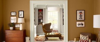
- Coffee color in the interior was previously used in the palaces of the aristocratic nobility. Thus recognizing him as chosen and elite. The color scheme of the room in chocolate wallpaper significantly adds solidity to the decor. This effect can be enhanced with the help of expensive furniture made from valuable wood species, as well as elements made from genuine leather. A luxurious Persian carpet on the floor can add a rich accent to a calm atmosphere.
Design ideas and successful combinations
Basic and neutral colors - white, brown, black, gray - go well with chocolate milk or cappuccino.
Cappuccino colored ceiling combined with white furniture
Chocolate range in the kitchen interior
Other good combinations:
- pink, purple, lilac;
It is better to use pink or purple in the kitchen interior as additional or accent colors.
- mint, turquoise, green, khaki, marsh, pistachio;
Light coffee sofa and two-tone set with green accents
Pillows on the sofa in cappuccino color in combination with the upholstery of the chairs in a marsh shade
Coffee and milk walls
Finishing in soft and calm colors will be an excellent backdrop for creating a bright and eclectic design.
Light brown walls
Among the assortment of wallpapers, it is not always possible to choose the right tone. But among the paints on sale there is much more choice. You can mix several solutions of different shades and get your own, unique one.
Kitchen set in cappuccino color
Among the options offered by manufacturers, there are often coffee-and-milk-colored sets with glossy facades.
More design ideas in the video:
The shine emitted by the surface of the furniture can in some cases create the desired effect, for example, visually expand a small kitchen,
But some options, such as those made from cheap plastic, can look tacky. Gloss is demanding on lighting.
Kitchen in dark chocolate milk color with matte fronts
Furniture with glossy facades in natural and artificial lighting
Monochrome range
This design looks best in classic, sophisticated interiors. Unlike the brown and beige colors, this palette will introduce a piece of modernity and dilute the prim traditional design.
Modern kitchen in monochrome coffee tones
Details in the interior
Some eclectic styles, such as art deco, can make good use of café au lait. Upholstered chairs with a carriage frame in delicate colors look very harmonious.
Other such details could be a small ottoman in the corner of the kitchen, covers on stools, curtains, etc.
Chairs and curtains in coffee colors
Tulle, apron area trim and other details in coffee shades in combination with the milky color of the furniture
Did you like the article? Follow new ideas from the world of construction, design, and useful tips in our channel. Subscribe to us in Yandex.Zen. Subscribe.
The use of coffee color in gloss for the kitchen is universal, since it goes well with a huge number of tones, both warm and cold. It smooths out overly bright colors in the interior and shades too pale tones. The presence of a large amount of chocolate beige color is not annoying, in contrast to the predominance of brighter and more saturated shades.
A pleasant combination that awakens the appetite and lifts the mood
Who would suit this color scheme?
Since beige and coffee tones are classic, restrained, they are usually chosen by people with an established view of the world. These are older people who do not like or no longer want change, enjoy watching retro programs, and are interested in art in the usual sense of the word. Modern installations, performances, abstract concepts are not for them, but world masterpieces of painting, sculpture, beautiful vases, framed photos are. By the way, objects of art look great against the backdrop of coffee with milk.
This seemingly inexpressive color allows you to concentrate on work or study and will not distract from important tasks. It stabilizes the nervous system and eliminates irritability.
If a warm tone is used, it warms in the cold season, brings comfort and a pleasant feeling of relaxation. Coffee, chocolate, cream are unique antidepressants that distract from unpleasant thoughts and give a good mood.
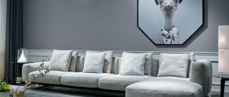
Living room in soothing colors for relaxation
Latte in the interior has an equally positive effect on the owners of the room and the guests. If relatives and even strangers gather, a relaxed, calm atmosphere is created. When residents are left alone, they can easily tune in to a creative mood or mental work. By adding several antique items, an expensive carpet and curtains, leather upholstered furniture, you will emphasize your high status and add solidity to the space.
Basic shades
A common practice is to use light colors for cladding surfaces, and dark ones for finishing furniture sets. This is due to the correct approach to interior design. When the main emphasis is on an aristocratic setting, which looks better on a light background. The use of light or dark colors alone is strictly not recommended, as the space will lose its shine and grandeur. It will cause boredom and cause gloomy thoughts.
Among the fashionable variations of coffee with milk are combinations of cream and brown shades, which are diluted with splashes of seasonal flowers. These can be turquoise or amethyst elements, orange or terracotta. If the room lacks freshness and exoticism, then you can use olive-colored inserts. It is also important to pay attention to quality lighting. Proper placement of light allows you to favorably highlight exclusive accessories and items of expensive furniture.
Very important! Experienced psychologists are convinced that decorating a child's room in a dark coffee color negatively affects the development of the child. The brown scale suppresses the desire to understand the world. Therefore, it is better to dilute the rich color with milk.
Coffee-with-milk manicure
Nude shades are trending in 2021, so all beige tones are in demand. Geometric and floral prints and matte finishes are popular. The café-au-lait nail design is ideal for a business or casual look, but to give it extravagance, it is complemented with minimalist decor - rhinestones and sparkles. The color of coffee with milk goes perfectly with all shades of brown, pastel, burgundy and black.
The color brown is named for its resemblance to piquant cinnamon or dark tree bark. In fact, there are many shades, as well as names - sand, chocolate, coffee and others.
The combination of brown in clothes attracts many ladies, but not all - there are categorical opponents of this shade. But, most likely, they simply did not find their tandem.
Take a style test and find out what you have worked on and what needs to be improved. At the end of the test, we will explain the correct answers and recommend materials for studying. Link to the test - www.glamurnenko.ru
The meaning of color from a psychological point of view is solidity, conservatism, hidden passion, stability. The psychology is categorical - brown tones, not frivolous and windy, but reliable, like the earth itself. Therefore, when combined in outfits, you can quite rely on them. In addition, it is always fashionable and relevant.
Using glossy colors in the kitchen interior
As mentioned above, the use of coffee bean color is strongly encouraged in the kitchen. This tradition has been around for many years. Modern subtleties of professional design suggest the possibility of using noble colors in any interior. It can be a romantic style, rustic, ultra-modern high-tech with metal elements, etc. Decorating the decor with the help of original accessories can well complement a glossy furniture set. Mirror surfaces visually increase the area. Harmonious combinations may imply the following set:
- A combination of milk wall racks and brown floor stools is used to create a lighter ambiance in the kitchen space;
- If you need to increase your appetite, then you should use a combination of brown and red elements on the cabinets;
- The use of gold fittings contributes to the atmosphere of luxury in the Byzantine style;
- The use of frosted glass in combination with the brown texture of dark wood allows you to create a sophisticated modern decor;
- The feminine form of the design involves mixing milk chocolate with pink elements. However, Switzerland has already begun to produce a pink product. Therefore, soon the shade will be called pink chocolate.
A coffee tone will also look good on glossy tiles. However, it is important to complement it with light shades so that the contrast neutralizes the slightest manifestation of a depressing impression. If a corner sofa is made in this range, then local lighting will be the way out of the situation.
Latte color matches other colors
The latte color combination follows the principle of a neutral shade. Any tone acquires some qualities against its background due to contrasts: thermal, light, brightness. However, they all invariably come to the fore, blooming against the background of neutral beige. Its undertone is also important, which helps to achieve greater harmony with some shades.
The combination of latte and rose is calm, with a slight touch of romance. It is better to choose warm shades of pink, with a red undertone. This is how beige unobtrusively flows into pink, maintaining smoothness and emphasizing harmony. For the palette we used royal pink, strawberry, sunset pink, flamingo, and raspberry.
The color of the latte - a combination with red - is bright, but at the same time stylish, since beige gives gloss and grace to all shades, even bright ones. Red tones can be used both light and dark, for example, garnet, light red, scarlet, ruby, wine.
Latte and orange combination is not a flashy color scheme, even bright shades will be neutral beige, so to make the color scheme complex, multi-faceted, respectable, use complex orange colors with a red tint, mixed with grey, white or blue. The combination contains light peach, orange-coral, copper, brick, and red.
Latte with yellow combines into a sweet, soft, flowing pair. It is better to shift shades of yellow towards orange, so the combination will be more expressive and harmonious. For example, consider pairs with apricot, saffron, amber, wheat, and old gold.
How to combine latte and warm green? As a neutral tone, a latte can support shades of any intensity, but when it comes down to it, the color has to be amazing. Rich, herbaceous colors will become a precious highlight in combination with beige, and dark colors will be exquisitely revealed against such a background. Consider examples such as light green, herbaceous, leafy, coniferous, brown-green.
The combination of latte and cold green will probably interest you too. This combination has thermal, brightness, and light contrast. Emerald, jade, malachite greens seem to glow, eclipsing everything. For the palette, jade, emerald green, kelly, emerald, and malachite were used.
The color of the latte is combined with blue, using the full power of thermal contrast. The rich tones of the water, from light to dark, like sand and sea, blend harmoniously and attract attention. Example: combination with blue water, turquoise, sea wave, Prussian blue, blueberry.
The color combination of latte and purple is light and evening. Shades of purple can have either red or blue undertones, but they should be expressive and eye-catching on their own. The table used blue-violet, lavender, amethyst, blackberry, and eggplant.
Color combination: latte and brown in the same range. Red-brown tones look like a continuation of the main color, so a gradient is created from light to dark. Rich tones of brown will attract attention. In the composition you see cocoa with milk, bark color, red-brown, mahogany, dark chocolate.
Lattes are combined with white, grey, beige and black, creating a neutral palette where crisp white refreshes the harmony. Gray and gray-beige shades continue the neutral harmony, while dark shades introduce a strict light contrast. For example, a combination with milky, gray-lilac, mouse, anthracite, black and gray.
Wallpaper in the interior
The selection of patterns on coffee cloths is carried out based on the functional purpose of the room. If we are talking about the kitchen, then the theme of small cafes will be a beautiful decoration. Contrasting ornaments and brown borders will look good in the hall. Because wallpaper alone is clearly not enough to welcome guests. For the bedroom, you can use Art Nouveau curlicues above the head of the bed. The coffee color can occupy one or more walls. In the study, you should use the alternating method: use spectacular dark wallpaper at the bottom, and light shades at the top. Where there will be a joint, you can place a decorative border.
In the hallway it is better to use a shade of milky cappuccino with vertical stripes, since the room is usually characterized by its cramped space. The contrast with wooden furniture will allow you to profitably increase the space and create a harmonious cocktail. Dark colors should be avoided. But photo wallpapers with still life, abstraction or engraving are welcome in every possible way. Industrial style also allows for the use of talented imitation of brick walls in the corridor.
Attractiveness of the palette
Coffee with milk in gloss is multifunctional and will suit almost any kitchen interior. In addition to conservative classics, this color will be appropriate for almost any style: from Provence and country, to high-tech or eco.
A café au lait kitchen can be considered a classic due to the versatility of the shade.
It’s quite easy to create a harmonious interior based on a coffee shade.
It is enough to choose individual accessories for each style and decide on additional tones. The best combination for coffee colors would be white, black and gray. When using any of these colors, you should think about bright details in the design. The cafe au lait kitchen is one of the particularly popular examples for contrasting solutions, because the furniture here is specially highlighted against the background of the walls. Another way to use a coffee-colored kitchen is to use upper tiers that are a lighter shade than the lower cabinets. This combination is associated with coffee with a fairly high foam. Using various combinations of finishing bases and textures, it becomes possible to create an elegant interior for your kitchen.
What else can you consider?
A huge advantage of the coffee with milk color is its unpretentiousness. To highlight the decor and arouse the admiration of guests, you don’t need to “bother” too much. It is enough just to buy new things from time to time. These can be souvenirs from long trips, coffee tables with carved legs, exclusive books, decorative vases, etc. Colorful posters or artistic abstractions can be placed on the walls.
Designers have mastered the art of combining coffee with milk or cream. All shades of latte, espresso, cappuccino and macchiato are used in them. It is not surprising that the popular range is used in catering establishments. It is used to decorate both walls and furniture elements. This allows you to organize a cozy space for visitors, and at the same time increase their appetite. However, it is not necessary to resort to the services of specialists to order neutral shades of coffee. You just need to take into account the basic recommendations:
- Avoid combinations with bright and acidic colors (green, pink, blue, sea);
- Dilute the overall background with decorative elements of a contrasting tone;
- Set up a local lighting system.
Among the practical tips for owners is the desire not to skimp on materials. Because the same paper wallpaper will quickly lose its charm and begin to fade. Moreover, you should not place them in the kitchen, where high humidity will instantly render them unusable. The same can be said about the adhesive binder. It must be of the best quality.
Cafe au lait bag
Accessories of this shade harmoniously combine with business style, complement evening and romantic looks, and even emphasize country style. A beige coffee-au-lait bag goes well with olive, bottle, pistachio, lemon, orange, purple, mint, coral, and blue. The accessory will complement an image with an animal, ethnic or plant print. At the same time, the rule stating that the bag should be the same shade as the shoes has long been outdated.
A classic women's bag in café au lait color will go well with a trouser suit or sheath dress. An elegant clutch, decorated with rhinestones or multiple zippers, will complement an evening or romantic look. For lovers of sporty style, a large rectangular bag or backpack is suitable. Among the many models, every fashionista will find something to her liking.