Features of airy and light color
What is cream color? Not every person imagines such a tone. It is actually very light, slightly yellowish, and has hints of white in it. Sometimes in cream you can see notes of pink, blue or gray. Its main advantage is the lightness and elusiveness of shades.
Light cream color is very often used as a basis in the interiors of rooms for various functional purposes. In completely different rooms the tone looks relaxed and elegant. When you are in such rooms there is no pressure, there is only tenderness and purity. When decorating interiors, it is very important to distinguish between shades of cream in order to correctly place accents by choosing furniture, textiles and wallpaper.
Preferred lighting
The choice of the right lighting plays a special role. The main problem is that beige color has a very negative attitude towards the abundance of sunlight. Its rays overly saturate this shade, making it more depressing.
The cream color of the walls in the interior, if the room is overfilled with light, loses its relaxing abilities and begins to act aggressively.
These circumstances are important when selecting wallpaper and furniture in any room. In areas exposed to bright sunlight, it is preferable to create an image in a different color scheme
However, the most gloomy room will be decorated with cream in the best traditions. Its presence will create a bright mood for the interior decoration. In such rooms, preference is given to the usual tone of the natural palette, with the exception of blue and yellow.
Combinations with the color of delicate cakes
The splendor and comfort of the interior, as well as its aesthetics, directly depend on the correct combination of cream color with others. If you look at the photos presented in the article, you can immediately appreciate the charm of such airy interiors.
The combination of cream and chocolate is the best. A little contrast creates a very attractive unity. Creamy beige or yellowish color also looks beautiful in interiors. These tones can be diluted with additional ones, such as gray or steel. The color of natural oak also goes well with cream.
The combination of cream color and gray is perfectly complemented by splashes of golden tones. Such an interior will be quite calm, but at the same time it will amaze with its sophistication.
You can decorate the nursery in pastel colors. Cream walls help make the interior light, calm, cozy and at the same time subtly light. You can complement it with various accessories to match, as well as paintings. All these elements will look good in a children's room.
It is quite difficult to combine purple tones in an interior, but similar shades combine very harmoniously with light cream. Such a union looks quite exotic.
What goes with it?
Versatile and unpretentious, cream feels comfortable with most colors. This allows your imagination to run wild. But all variations can be divided into two large groups, which we will talk about.
Monochrome interiors
Such interiors are distinguished by calmness and nobility, no matter in what style they are made. The following colors can act as a companion to the vanilla shade.
Gold. It is always associated with luxury and wealth. But don’t think that this brilliant color is completely unacceptable in restrained interiors. For example, beige furniture with gold fittings will not look pretentious. This option rather claims to be noble. The main rule is to know when to stop.
Contrasting combinations
The shade of baked milk goes well with bright colors. The best option would be to use it as a background. In this case, all accents will be clearly visible and create the desired picture.
It is difficult to list all the possible combinations of milky with other colors. Here you should be guided by your own preferences. For example, in a nursery, bright blue or pink furniture against a background of cream wallpaper will look great. And in the living room, a bright carpet will be an excellent color accent and will not “argue” with the vanilla-colored floor.
Light beige doors will also look very elegant. You just need to understand that all interior elements must be combined with each other.
Therefore, if you decide to give preference to cream color in the design of your apartment, think through all the details in advance. Don't go to extremes.
Other combination options
A wonderful solution for lovers of natural color would be a combination of yellow, gray, pistachio and, of course, light cream. A similar union can be used in the living room, bedroom, and kitchen.
When paired with fuchsia and hot pink, the cream color reduces the garish brightness of pink tones. Such combinations will look good in the interior of a living room or kitchen.
Cream color goes well with light blue tones. Such interiors are quite calm. Such combinations are acceptable for both ultra-fashionable design solutions and traditional classics.
If the cream color has a slight greenish tint, then it can be combined with terracotta, peach, orange and yellow. It’s also good to combine this tone with silver. This combination can be used to decorate a living room, dining room or kitchen.
Cream color goes well with deep wine, golden and fruit tones. Pairs well with champagne color. In the kitchen, cream napkins and tablecloths will add elegance and, of course, aesthetics. You can combine pink-cream color with warm pink shades. This combination would look good in the bedroom. If the main cream has greenish tones, then it will be combined with light light green shades. This union can be used when decorating a living room or kitchen.
You can also combine cream with red. This combination gives the room a sensual feel. Suitable for decorating living room and bedroom.
Cream color in clothes
Cream is included in the list of standard shades along with white, gray and black color schemes. It is a symbol of comfort, relaxation, flow and harmony. Sometimes some of the sad aspects are also included in it: despondency, sadness and monotony.
In clothing, this color is characteristic of individuals who are in an eternal search for themselves. They don’t want to stand out much in the crowd, sometimes they don’t want to be noticed at all. Sometimes these are people living alone with themselves, characterized by lack of confidence in themselves and their style. They rarely lead the crowd behind them, more often they are distinguished by their leadership.
Often under this shade there are hidden elements of internal tension, worries and tossing. Cream helps the personality associate with calmness and balance. Harmony and restraint go hand in hand with the owners of clothes of this color spectrum.
Who is suitable for cream shades?
The ideal would be to choose a tone close to your skin color. It can be combined with any shades that you prefer in everyday life.
If we are talking about pale girls, be it natural light skin tones or porcelain, you should not use cold tones of cream color: creamy gray, “cafe au lait”.
An excellent replacement for them would be tones that contain a subtle hint of pinkish, peach and apricot tones. Thus, you can wear an inappropriately cold cream suit, but dilute it with blouses with juicy peach, orange and purple notes.
When choosing skirts and trousers, as well as bags, shoes and accessories, these rules do not apply, since they do not have contact with the skin.
Along with beige and other light colors, cream can make you look fat if you choose the wrong style of clothing. But such a nuance cannot be solved by abandoning cream shades, but will only force you to be more careful when choosing the style of your future outfit.
What does the cream color palette go with?
The shade has been chosen, but what to combine it with? Let's look at the best variations:
A combination of cream and gray is undesirable. The image may turn out dull, boring and may not evoke positive emotions in its owner about her appearance.
Where is it appropriate to wear cream tones?
Office, university and any other events will easily accept various options for cream looks. We are talking not only about clothes, shoes and accessories for intra-office life. Cream perfectly fits into the line of outerwear: coats, knitted cardigans and even leather jackets.
On every date, a girl dressed in a cream dress will glow with feminine and gentle rays. For a restaurant or a lavish party, simply add some contrasting accessories and the tranquility will take on a touch of playfulness.
Author: Lyubov Uryvskaya
marselina.ru
The return of fashion to color
For quite a long time, the cream color was forgotten, and, as it seems to us, quite undeservedly. This was facilitated by the fashion for minimalism and the use of neutral white in the interior. Nowadays, trends in interior design welcome the return of “retro color.”
The interior in cream tones attracts with its lightness, peace and comfort. Sometimes experimenting with creative ideas gets boring, even tiring. Then you want simplicity, naturalness and tranquility. This is where “retro color” and its shades can be used.
Application
Cream-colored wallpaper used for walls brings lightness, tenderness and tranquility. The interior in this color scheme looks airy, despite the simplicity of the images and colors. However, the use of one color is not particularly welcome in design circles, so cream is very rarely used solo.
Cream is a very sociable color and, depending on its subtle, light shade, it can be used in combination with a variety of tones. At the same time, you can add this color to the interior of any stylistic orientation:
- In classic interiors, cream is quite appropriate; it will slightly smooth out sharp contrasts and add tenderness and comfort to the interior.
- In Art Nouveau style interiors, many colors from a light palette are appropriate, and cream is no exception. The practicality of this tone gives a special color to the room.
- In modern minimalist trends, the colors of the cream palette are designed to slightly warm up the cold urban interior, add warmth and comfort to it, and revive it.
- In light and unpretentious country and Provence styles, the color of cream most often acts as the main color, since it fully reflects the inner world of these stylistic trends.
High-quality wallpaper in one of the rooms of the house
If we consider the use of cream for the walls of various rooms, we get the following picture:
- For spacious living rooms and small halls, it is quite possible to use a cream color palette. Wallpaper for walls in this color will be an excellent background on which it is easy to place accents. Note that the cream style can be easily combined with classic luxury colors: burgundy, purple, rich blue, gold, silver, which can be used to create an expensive, chic interior.
- For bedroom walls, a cream color with a light, subtle pink tint is perfect. In this color the room will radiate tenderness, lightness, comfort and warmth. In addition, choosing furniture and curtains to match such wallpaper will be easy.
- For the kitchen, in the cooking area, you can choose a cream color scheme. It is very good if there is a slightly noticeable shade of green in it. Then in the eating area it will be possible to place a bright green accent, which is welcome in such rooms. To complement the light colors of the kitchen with its brightness and color, maybe terracotta or peach color.
- Pastel colors are quite suitable for children's rooms. In this room we strive to create a favorable climate not only for games, but also for relaxation, so it would be logical to choose such a soft and light wall color for the bedside area.
Styles
Creamy white color in the interior is becoming increasingly popular. Such a union creates an elegant airiness in the room.
In what interior styles is furniture in cream tones appropriate? For country, Provence, rustic and hunting. In similar interiors of bedrooms and living rooms, such furniture will look great.
Cream color with pink undertones is a preferred combination for shabby chic style. In Provence, classic and retro, a yellow and cream palette is used. And what to apply in modern directions? These styles are characterized by combinations of cream, greenish and gray.
In Empire style, cream color usually serves as the basis for creating interiors. In high-tech, this tone is also sometimes used, replacing white with it.
It is very rare to see a cream color in interiors in the style of: • Gothic (as this tone is too gentle and warm); • minimalism (because the traditional base is used: white, red, black); • avant-garde (characterized by sharper, brighter shades).
Characteristic color features
Dark brown and its combination
Cream color is a successful compromise between various shades of gray, red and white. Combining the best qualities of these beautiful tones.
This tone in the interior of any room does not tire, creating the most comfortable feeling.
The use of shades of cream color in the interior gives you the opportunity to use your own imagination to the fullest.
In past centuries, aristocratic society adored the airy cream color. Its exquisite shade was used in expensive outfits, and its participation was also noticeable among the precious interior decorations of that period.
After a while, this amazing tone was undeservedly forgotten; they stopped paying attention to it when improving housing. Cream color in the interior - photos of various options.
But recent fashion trends show its triumphant return. Progressive designers began to increasingly use cream color for various large-scale and expensive projects.
Now its use, in the interiors of luxurious bedrooms, is successfully combined with other colors of the palette in living rooms, or harmonizes perfectly in children's rooms.
Compatibility
We have already touched upon the topic of compatibility in passing, recognizing cream as a very sociable and friendly color, suitable for many other colors. It shows itself to a greater extent when paired with a contrasting tone, for example, chocolate or brown. The light color of the cream emphasizes the advantages of its companion and presents it favorably. In addition, wooden furniture in natural colors goes perfectly with this pair of colors.
Depending on the subtle shade of this color in the pastel palette, it can be combined with related colors:
- gray is suitable for creating a modern interior;
- for cheerful and bright orange or yellow;
- for the delicate and feminine pink, lilac;
- for natural and relaxing green;
- for a refreshing and light blue.
The white tone will always complement the interior with its lightness; it is appropriate not only for walls, but also for ceilings, windows, accessories, and furniture.
A modern interior can be made with the participation of light blue and cream; this pair has been used for quite a long time, starting with the ancient classical ideas about formal halls.
To create coziness in the bedroom, you can use a whole galaxy of pastel, light and soft colors, from cream, vanilla to caramel, coffee, chocolate.
The cream tone can be used not only as the main one; accessories in this color will be appropriate in many interiors. For example, napkins and tablecloths in this color will always add intelligence and nobility to the interior.
In conclusion, we note that this color does not really like sunlight, which highlights bright motifs in it, makes it become more saturated, colorful, from which its tenderness and lightness are lost. While artificial light is not able to do this, which means the freshness and lightness of the room’s design remains unchanged.
This feature helps in rectifying gloomy interiors with minimal presence of sunlight. Add wallpaper in a light cream color to your room and you will see how the room is truly transformed.
This color can be used in any interior and in any quantity. This color scheme is so simple and light that it cannot spoil any design, which is probably why cream-colored wallpaper is a dime a dozen. Choose this simple but pleasant pastel color to decorate the walls of your home and enjoy the result.
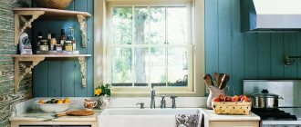
New look for your kitchen: cream color
If we decide to focus on cream color, we must definitely find out what kind of color it is? Because it’s not always possible to understand from the monitor screen. What color or shade is it? Moreover, women's perception of colors is generally subjective.
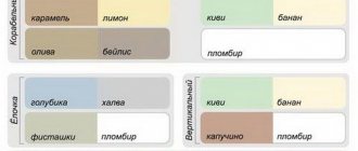
Color table.
Cream is a derivative of several colors that precede it (see photo). Therefore, this shade is unique in its own way.
The main advantage of cream color is that it is universal. Moreover, it is quite self-sufficient; it can be dominant in the kitchen interior, or can also be combined with other colors or shades.
Another advantage of this color is the fact that cream-colored kitchens will fit perfectly into any style. Do you want proof? Look at the photo below, you see real abstracts of colors with a predominance of cream, and in one case the high-tech style is shown, in the second - classic, in the third - minimalism. All these design solutions (as well as the necessary materials and accessories) are offered by the famous company Ikea.
Today, the classic style has begun to gain popularity again. More and more private or multi-storey houses are appearing, where the kitchens have quite decent dimensions. Despite the apparent pretentiousness, large multifunctional furniture is suitable for both spacious and small kitchens. The most important thing is to successfully select and arrange all the modules of the product.
Classic kitchen in cream color.
Be sure to keep in mind that light colors in classic furniture will perfectly highlight the existing decor.
Another interesting kitchen style where cream color is perfect is the ethnic style. The diversity of ethnic groups has left its mark not only in the culture of a particular people. But it also contributed to the formation of unique styles of room decoration. Of the most popular in the Russian-speaking space, it is best to highlight Provencal, Russian and Scandinavian styles.
In an ethnic style kitchen, cream color looks especially interesting.
Cream furniture facades are perfect for Provencal style (Ikea offers such facades). And if you add antiques in the form of scuffs, then it will be simply top class! Such a choice will reflect the spirit of the people, the essence of which you want to display in your kitchen.
Please note that the Provence style includes light warm colors (see photo). But cream color is just one of them. True, this does not mean that it is characteristic of various other ethnic styles, for example, Russian.
Kitchen in Provence style.
Modern style, or modern, will reflect the entire dynamics of your life. It will also especially emphasize the housewife’s desire to combine beauty and practicality in one item.
Kitchen in modern style.
Art Deco style is another one of those styles that cream color will suit. This style combines clear and concise lines, not to mention a colossal variety of colors, luxury and modern materials.
Kitchen in art deco style.
Country is the same rustic style in which light warm colors are perfectly applicable, that is, cream will again suit here.
Country style kitchen.
Ikea has a very large selection of country-style kitchens in its arsenal.
Cold and unapproachable hi-tech is conquered by cream color, and this despite the dominance of metallic shades. The fact is that even lovers of “kitchens from the future” want to add a little warmth and comfort to their kitchen design, and this is what cream color gives.
A high-tech kitchen interior for your kitchen is a qualitatively new level of your comfort.