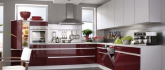
As practice shows, the question of how to choose a kitchen countertop by color arises for almost everyone who makes renovations on their own or chooses furniture without the participation of a professional designer. This interior detail can completely transform the appearance of the room, making it lighter and more harmonious.
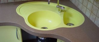
Stone countertop for kitchen
Dark or light countertop in the kitchen: which is better?
When choosing the color of a kitchen countertop, it is important to take into account its compatibility with other elements (a nearby window, household appliances, sink, stove). The palette offered by manufacturers is largely determined by the material of manufacture.
If for products made from MDF the choice of colors in light and dark shades is practically unlimited, analogues made from artificial or natural stone are presented in a smaller assortment.
When choosing, special attention should be paid to the service life and technical characteristics of the product (resistance to high temperatures, shocks, wear, mechanical damage).
Which countertop color is more practical?
When choosing a kitchen countertop color, the practicality of the option chosen is critical. The priority is beige, white, gray (and you can choose any of the presented shades). Also a recognized favorite are products whose surface imitates the texture of stone chips. It is on them that minor scratches, damage, streaks from dried water, and dust will not be noticeable.
Practical textures with stone chips
Types of aprons for the kitchen
In the design of modern kitchens, several types of aprons are most often used. Each of them has its own characteristic features that make it attractive in one case or another.
- You can make a durable backsplash in the kitchen that will last for several decades using tiles
.
This option is the most common, since the tile is very easy to clean, is characterized by heat resistance, moisture resistance, and is greaseproof. In addition, the tiles are universal, and a wide range of colors makes it easy to choose the right option for a backsplash in a kitchen of any style. Experts recommend that when choosing tiles for a kitchen backsplash, do not settle on options that are too textured. It is preferable to buy glossy tiles
, which will be easy to clean from dirt. - Another option for a durable apron for the kitchen is the stone design
of the work area. It would be most rational to make a stone apron for the kitchen from granite, since this material has a non-porous structure and does not absorb dirt. - Glass aprons or skincalis
are very popular today .
This method of designing a work area has a number of advantages:
- Price
. You can make a glass apron in the kitchen much cheaper than decorating a working wall with tiles or, especially, stone. - Fast and easy installation
. It will take literally a couple of hours to cover a wall with glass panels. In addition, after the installation of such an apron is completed, there will be no need for lengthy cleaning. - Wide range of design options
. You can apply absolutely any design to the triplex, which will allow you to create a unique apron and make the kitchen especially cozy. If the question of what kind of apron to make in the kitchen has been going on for a very long time and cannot be resolved, skinkali will also be an excellent option: on the wall near the work area it will be enough to install a transparent glass panel through which the wallpaper will be clearly visible. - Easy to care for
. Unlike tile cladding, glass panels do not have seams, which may require additional effort to clean.
However, glass splashbacks also have some disadvantages. The main disadvantage of skinkali is the impossibility of repairing it.
.
Therefore, those who decide on such an apron should only contact a very experienced and qualified specialist who will not allow any inaccuracies when taking measurements. In addition, making slots for sockets in glass panels will be quite problematic.
Another disadvantage of glass is the need to pre-level the wall.
, otherwise the panel will not fit tightly, which in the future may lead to the formation of condensation under it and the accumulation of dirt.
- If it is not possible to make a good-quality apron in the kitchen, the website sympaty.net recommends taking the simplest route: ordering laminated panels
for the work area from the same organization that will produce the furniture set. This solution will immediately relieve the apartment owners from all the problems with choosing an apron, since the laminated panels will perfectly match the color of the set and their installation will be carried out by craftsmen on the day of installation of the kitchen set itself. For a modern kitchen, such panels are made from laminated chipboards; a high-tech kitchen can be complemented with a neat apron made of steel plates. - If you have a limited budget, you can make a cheap apron in the kitchen from self-adhesive film
. This option is very good for temporary housing, as well as as a decoration for white tiles.
Sometimes the work area in the kitchen is decorated with mirror tiles, mosaics, and wooden panels.
It is quite difficult to make such an unusual apron in the kitchen yourself, so similar options are found in most cases in rooms decorated according to a unique design project.
In the case where it is not possible to entrust the creation of a kitchen design to an experienced specialist and the owners have to decorate the work area on their own, the problem of choosing its color also arises.
Possible tabletop colors
Their color does not affect the technical characteristics of the countertops in any way, but in general it is of decisive importance for the interior of the kitchen. The choice of the optimal color should be made based on the following melts:
- bright colored furniture looks most harmonious with light-colored materials;
- light facades go well with dark work surfaces;
- It is always important to make it from a material that matches the tone and texture of the floor covering in the room;
- the product can be the same tone as the wall near the work area (it is also called an “apron”) or made of a contrasting material.
In order for the kitchen design to meet your expectations, you should decide in advance on the choice of each of the key interior details. In this case, it is desirable that the tabletop matches the material and color with at least one (and preferably two or three) elements.
Colors and patterns of natural and artificial stone countertops
Drawings of marble countertops
The main argument in favor of choosing a stone countertop is its durability, ability to maintain its appearance throughout the entire period of use, and excellent mechanical characteristics. You can choose natural or artificial material for manufacturing. Modern technologies make it possible to achieve almost complete color and pattern matching.
The palette of available shades is determined by the mineral components that make up the stone and the characteristics of the selected rock. The following options are available:
- granite (scarlet, black, pink, gray, shades of beige and coffee);
- marble (on a white background there are veins of green, red, gray, chestnut);
- onyx (shades of brown, yellow, patterned beige, black or white);
- opal (bright or muted shades of blue, pink, gold, scarlet, milky, black, texture can be stone or wood);
- malachite (shades of green from turquoise to black with a transition between colors).
Color variety of MDF and laminated chipboard
Color palette of MDF and laminated chipboard
The technology for manufacturing furniture from MDF and laminated chipboard involves the use of PVC film. This allows manufacturers to offer a huge range of color solutions, many of which are not available when choosing a stone (for example, you can buy an eggplant, bright yellow, light green, blue, orange countertop).
At the same time, both monochrome materials and products with patterns imitating metal, fabric, wood, and stone surfaces are produced. Branched, metallized, patinated products, as well as those decorated with three-dimensional designs and embossing, have an interesting effect.
Wood textures
Wood textures
The main species used in this area of furniture production are oak, ash, and walnut. Birch, iroko, and wenge are less commonly used.
Materials may differ in tone, fiber pattern, degree of knotiness, and width of the beams. The photos in the manufacturers' catalogs show countertops in a wide range of colors from almost black to white with gray streaks.
The selected wood texture can become a bright accent detail in the interior. Especially if the material of the kitchen countertop and apron is the same color and texture and looks like a solid structure.
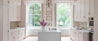
WHAT COLOR OF COUNTERTOP TO CHOOSE FOR A WHITE KITCHEN?
AND THERE IS WHITE AROUND
And we’re not talking about a snowy winter landscape, but about a white work surface in a white kitchen.
This choice can be called universal, because the design will be monochrome. The working surface can be made of different materials - laminate, stone, chipboard, chipboard.
Is this practical? Most often they say that a light-colored work surface is very inconvenient. But experience shows otherwise - dust, small scratches, water stains and other imperfections will be invisible to the eye.
WHITE KITCHEN DESIGN WITH BLACK COUNTERTOPS
A white kitchen with a black countertop in the interior – a barrel of honey with a fly in the ointment? No!
Black countertops go well with white and wood textures.
This is a classic combination, which means it is always relevant. The issue of practicality is more acute here than in the previous version. A white kitchen with a black countertop – it looks stylish in the interior photo.
It is on a dark surface that stains and dirt will be most noticeable, no matter how paradoxical it may sound. Therefore, you will have to look after her more often than others.
WHITE KITCHEN WITH BROWN COUNTERTOPS IN THE INTERIOR
The design of a white kitchen with a brown countertop is most often an option with a wooden work surface.
Light brown shade with a laminated wood texture.
By the way, lighting plays a role. The same kitchen from a different angle looks different. Experiment with light to get the best results.
Shades can be different - from light (beige) to dark (wenge) or red. A wooden countertop in a white kitchen is environmentally friendly, but quite expensive.
And it doesn’t matter that white and brown are opposites. They look very cool in a duet. This surface shade makes the set more noble.
A white kitchen with a brown countertop will look best in interiors in loft, modern and classic styles.
WHITE KITCHEN DESIGN WITH GRAY COUNTERTOPS
A white kitchen with a gray countertop in the interior is beautiful. After all, gray perfectly sets off the whiteness of the space in general and the headset in particular.
Dark shades of gray go well with white facades.
Such a work surface will not attract undue attention to itself. When it comes to gray, most often it is a white kitchen with a marble countertop - they look perfect in the interior!
Surfaces made of artificial stone are also often in a gray shade. It evokes the best associations with natural rock.
INDIGO IS UNUSUAL! ABOUT BLUE WORK SURFACES
Most often, the most unusual solutions can be seen in fashionable designs. The combination of a white kitchen with a blue countertop can be considered such a bold one!
Blue shades go well with white and metallic elements.
Suitable for modern, high-tech and marine-themed interiors.
If you make the tabletop dark blue, it will become a cool decoration for a Scandinavian interior. In the classics you can also find blue countertops, but here they should be lighter - blue or light blue.
RED
Red and white are a classic duo, but quite a bold solution for the kitchen. After all, white will only emphasize the brightness and boldness of red, so this combination is best suited for kitchens in the high-tech or minimalist style.
Red is a rather rare option. However, some people like it.
What can the color of the kitchen countertop be combined with?
When developing a design, a win-win solution is to combine the color of the tabletop with one or more key elements (apron, facade, window sill, floor covering, dining group). These are the main guidelines, the features of each of which should be given special attention.
Less often, the shade of the working surface is selected in accordance with the color of textiles and wall decoration. Moreover, this principle works in both directions.
For example, when choosing a cream-colored kitchen with a dark countertop, you can support this decision by purchasing a laminate that matches the shade (you can limit yourself to just baseboards), furniture, appliances, and splashback finishing elements.
Combination of tabletop shade with apron
Facades set
Depending on the design of the furniture, the facade of wall cabinets and floor cabinets can be the same or contrasting in color. This fact must be taken into account when choosing a countertop.
In addition, you should initially decide on the list of interior elements with which the product will be combined. Based on this, you can select good options for a façade that differs in tone from the working surface, matching the shade of individual furniture parts. Contrasting combinations also look impressive.
Apron
The color palette available when choosing an apron is virtually unlimited. Depending on the material of manufacture, you can purchase a product made of plastic, glass, or use ceramic tiles, artificial or natural stone, or porcelain stoneware to decorate this area. Often the work surface and the wall next to it are finished with the same texture, but in different shades.
When choosing a countertop and apron for the kitchen, the color combination can also be contrasting. This technique is especially in demand in a minimalist interior when using a neutral palette of shades. To form a structure that is integral in appearance, you can use one material.
Contrasting apron in the kitchen interior
Flooring
If the countertop is made in light or neutral colors, a win-win option is to choose a material for finishing the floor that will match in texture and color. The façade should be made bright and colorful.
The dark working surface of the table can contrast with the floor covering. In this case, it is better to use material of the same texture.
Lunch group
For the dining group and work surface, the set often chooses tabletops made of the same material. This technique helps make the kitchen interior look seamless, regardless of the features of the room. Such surfaces are practical and compatible with each other.
As a result, a large interior element will be formed, so you should not simultaneously use large-sized parts that match in color in the design.
Windowsill
The tabletop can be made of the same material as the window sill (or a different color from it). This technique is especially often used when the kitchen set is installed next to a window.
In contrast
A kitchen that uses contrasting color combinations looks especially impressive. At the same time, the question of how to choose the color of the countertops to match the kitchen set arises quite often. It can contrast with the apron, the facade or its individual elements, or the furniture in the room.
Color wheel for determining contrasting shades
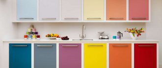
Bright colors
On the modern market there are many colored kitchen sets, and, consequently, countertops for them. However, when choosing such an ambiguous environment, you should take into account the influence of each color on the human psyche, because the kitchen is a place where a person spends a lot of time.
So, let's start in order.
Red
If you choose this color, remember that it helps stimulate appetite, so it is contraindicated for dieters. Also, people with high levels of anxiety or prone to aggression should not choose red - it can negatively affect the psyche and the person will become nervous and angry. A more classic, “expensive” color from this spectrum is burgundy.
Orange
The red tabletop is immediately associated with a fast food cafe. Because this color stimulates appetite, but not in the same way as red: you want to eat a lot, but quickly. If you like this color and want to add it to the interior of the kitchen, it’s better not to choose a tabletop of this color, but something smaller: a bright sugar bowl, a painting, a clock.
Yellow
Creative personalities, avid cooks, who want to cheer up in the morning with a cup of coffee - this item is for you. Because the yellow color of the countertop in the kitchen will help you not only wake up and get in a great mood - it will also stimulate you to create culinary masterpieces. Therefore, feel free to choose a tabletop in one of the shades: from lemon to honey.
Green
It is considered the most favorable for humans, as it is the color of nature itself. A green countertop will be an excellent solution in your interior. And a wide selection of shades - from soft green to malachite - will help you navigate and choose the most suitable color for your kitchen.
Light blue and blue
Blue countertops are often chosen by lovers of shabby chic. This color is gentle, soothing, unobtrusive: it can be either bright or faded. Blue is sharper, more contrasting; such a tabletop, of course, has a right to exist, but such a “deep” color can tire your eyes.
Violet
The color of mysticism, witchcraft, mystery. It also has many shades: from lavender, beloved by Provence, to the deep color of the night sky. Looks very nice in a monochrome kitchen. A gray, black and white interior, in which a purple tabletop will be a splash of color, will clearly not go unnoticed and will not look too strict and boring.
When choosing the color of your tabletop, do not stop at monochromatic options: consider variations with sparkles, stains, inclusions, with a “wood” or “stone” texture.
For tips on choosing a kitchen countertop, watch the video below.
How to choose the right countertop color for different kitchen colors
When choosing materials, you must initially take into account the difference in textures and available shades. If monochromatic interior elements are selected, it is quite difficult to achieve a 100% match when using different materials.
White, beige, cream, black and other neutral colors
If the question arises about which countertop to choose for a beige kitchen or a set of other neutral shades, you should initially decide on a list of interior details that contrast in color.
This could be a countertop. Then you should pay attention to black, red, terracotta products, any shades of wood and stone. If contrasting colors are chosen for other elements, you can make the work surface several shades darker than the facade. Any work surface is suitable for a black kitchen.
Bright countertop in the kitchen with white furniture
Countertops for colored kitchens
Sets with bright facades are very popular. Experts recommend choosing neutral work surfaces for them. Gray light or dark, white in warm or cool shades, beige, cream are suitable.
A colored kitchen with a black countertop will look impressive.
Work surface for a two-tone kitchen
When choosing a kitchen set, the combination of colors of facades and countertops largely determines the design of the entire room. For two-color furniture, a work surface that matches the tone of one of its elements is ideal. The introduction of additional bright colors in such a situation is most often not welcome. Only neutral colors can be used.
Choosing a countertop for a two-tone kitchen
How to care for your kitchen set
Each material has its own care rules. But we can identify a number of general requirements for caring for a kitchen set.
Proper care of your countertop will increase its service life.
- Rule #1. Proper care begins with proper installation. It is not recommended to place radiators nearby.
- Rule #2. Direct sunlight causes the color of furniture to fade quickly. This is especially true for wood.
- Rule #3. For cleaning, only soft products without abrasive particles are used. It is better to use rags made of flannel, cloth or microfiber.
- Rule #4. The use of hard, iron brushes is not recommended, especially for glossy surfaces.
The most popular and controversial color is white for the work surface.
After a detailed description of the general rules on how to choose the color of the countertop and apron in the kitchen, anyone can cope with this task. This does not require any special training or knowledge. It is enough just to take into account some recommendations.
The main mistakes when choosing the color of a countertop
Experts identify several mistakes that are most often made when independently developing a kitchen design:
- A large number of rich shades. Elements of bright colors make the room more cheerful and cozy, but you should not overuse them. A neutral countertop is better suited to this facade and vice versa.
- Impractical work surfaces. Black gloss looks impressive until stains, dust, smudges, and fingerprints are visible on it. It is much easier to care for a surface of the same color, but made of stone interspersed with other colors.
- The tabletop does not match other interior elements. In this case, it looks like a foreign addition, destroying the integrity of the room's design.
If almost no one has a question about what color of countertop to choose for a white kitchen, then the more complex compositions in this regard should be given special attention. You can find a balance quite easily if you initially develop a general concept for the entire room, and not its separate zone. All you need is knowledge of the basic principles of interior design and the formation of color compositions.
Combination of countertops and kitchen design
Continuing the theme of combining kitchen design and countertops, we can say that each style has its own design features. A Japanese countertop is unlikely to fit into a techno kitchen, and a colonial one into a steampunk kitchen.
An all-white kitchen is a win-win option.
In order for the final picture of the interior to look harmonious, it is important to observe combinations of styles. In rare cases, mixing gives good results. This only happens under the guidance of a professional. There is no need to experiment on your own. This will lead to wasting money and wasting your time.
Only a professional designer can successfully combine several styles.
Examples of combinations:
- The shabby chic style is characterized by pastel light shades of countertops. They can be white, pink or light green. Drawings of shepherdesses, flowers or birds of paradise are welcome.
- Dark shades and tones, angularity and restraint are suitable for brutalism. With rare exceptions, the color red is used, which adds its own unique feature.
- For a kitchen in grunge style, choose exclusively wooden countertops. It gives the austere room warmth and comfort.
What to combine with what
The first question that arises for those who have begun a kitchen renovation is: how to achieve a harmonious combination so that the selected elements are not separate parts, but create a complete composition?
The main thing is not to use all your favorite colors at once, so as not to make the interior chaotic and overloaded.
It is better to use no more than three color schemes in the interior and follow the 60-30-10 rule, where 60 is the main color, 30 is an additional color, and 10 is accents. Dominant is the background, the main color.
It is better to choose neutral colors that will not irritate over time, but there should be no more than 10% of bright accents. Otherwise, you can achieve the effect of a “spot” into which all the carefully selected details will merge.
An example of a bad choice of colors when all the details merge
NOTE: The tabletop must match the color of at least one detail in the interior, but better - with two.
You can match the facades of the kitchen unit, window sill, dining group, flooring, wallpaper.
Advantages of wooden furniture
White furniture combined with a natural wood top is reminiscent of nature. Wood brings its own energy into the kitchen. Such a surface seems to transfer its warmth to all dishes cooked on it. For a set with a wood texture, designers recommend white, wood and cream options. You can, of course, combine it with black, but be extremely careful so as not to disturb the harmony.
Tempered glass tabletops can be ordered in a variety of colors. Such materials are resistant to high temperatures, moisture resistant, and do not absorb odor or fat.
If your kitchen design involves two shades, then the color of the countertop should be as close as possible to the color of the upper cabinets. For example, with a headset with a “white top and black bottom” design, the top will be in harmony with the white tone. It is not necessary that the top be the same tone as the top. You can choose some medium tone. For example, a light chocolate-colored top will go perfectly with a wenge-colored set with cream hanging cabinets.
The color of household appliances should be taken into account. If it is black or white, then be sure to choose a white surface. If you have metal-look appliances, then a gray countertop tone is more suitable.
Now you know how to choose the color of the kitchen countertop. Let your kitchen look especially impressive with a new, correctly selected color scheme.
Colored artificial stone countertops
A tabletop is not just a workspace; it plays the role of a decorative element if it is selected taking into account the features of the interior. Modern kitchens are increasingly designed in the same style, harmoniously combining all the details. The peculiarity is that, in addition to aesthetic data, it must be practical and easy to use. All these requirements are met by products made from artificial stone, which are not inferior in characteristics to analogues from natural materials. Their advantage is also a rich palette of shades.
Table top yellow
A bright color creates a mood, but requires a competent approach when arranging with other shades. Being active, it does not tolerate rivals in space, therefore, when buying a yellow tabletop, bright or even muted, you need to soften its presence by using a calmer palette in the design of walls, floors and furniture. This is the color of the sun, sand, it is always associated with warmth, so a kitchen with a yellow countertop made of artificial stone will create an atmosphere of comfort and homely warmth.
What to look for when purchasing
It should be noted that no matter what colors of kitchen countertops are currently in fashion, you need to choose this attribute based on the overall design component of the room.
Any seemingly insignificant detail should be taken into account. The model you choose should fit harmoniously into the overall picture of the interior.
When choosing a material, you can rely on the color of the cabinets, apron, floor or dining area
What interior items can you focus on when choosing the colors of countertops for your favorite place in the house?
- To the headset . If you decide to choose a model that matches the color of the headset, you risk getting a “blurry” space without clear lines. In addition, tops are made from a different material than furniture, and accordingly, their color palette is different. The same tonality will look different on different textures.
It is better that the top is not identical in color to the shade of the headset
- For separate lockers. If you purchased a two-color set, then the tabletop can be matched to the shade of one of them.
With a two-color set, the shade of the top can match the tone of one of the cabinets
- On the apron . The combination of a countertop and an apron may be the optimal solution for those who are still wondering what color to choose. Firstly, both the apron and the top can be made from the same material - this will automatically remove the problem of choosing shades and textures. Secondly, thanks to this solution, the work area will become a spot of color in the interior of the room.
The apron and top covering of cabinets, made of the same material (example in the photo) will turn into a bright spot of the interior
The unity of the apron and the top of the lower cabinets adds integrity to the interior
- On the floor . The combination of top and floor can be done in one of two options. The budget option involves the use of laminite flooring and a laminated chipboard countertop as the base of the apron. A more expensive option involves using the same solid wood for finishing. The same can be done with stone surfaces.
The stone floor and the same covering of the work area look elegant and stylish, although the price of this option is very impressive
When the countertop matches the floor
If the tabletop and floor are chosen in the same color scheme, then you can find interesting solutions by choosing an apron to match the furniture. For example, in a white kitchen, a blue or blue apron, the color of which matches the upholstery of the chairs, will look beautiful.
Harmony can be achieved by choosing parts of the same color
There are many options, here are just the most popular:
- countertop made of laminated chipboard and laminate;
- wooden countertop and parquet board;
- stone countertop and tiled floor (it is important to use the same shades).
Countertop in a two-tone kitchen
“As long as the furniture combines spectral and neutral tones, the color of the tabletop should not add nuance or dominate.”
Today, combined kitchens are in fashion, in which two colors are combined in a composition. Which surface should the tabletop be combined with, provided that the set contains neutral colors? The color of the countertop is most often matched to the upper modules. For example, for a set made in the “white top – black bottom” scheme, the right solution would be a white work surface. In this case, everything in the headset will be balanced and harmonious. There is a similar association in beige-brown kitchens.
light countertop in a two-tone kitchen
It is not at all necessary to select a tabletop to match the top part. The top solution could be a tabletop, the color of which is something between the contrasting parts of the set. Let's say, if the cabinet is made in wenge color and the wall cabinet is cream, then this company will be wonderfully complemented by a coffee and milk surface. Tabletops of similar colors to the lower structures are acceptable; however, they will merge together, but this does not at all contradict the design principles. Which option will be more attractive for you, decide for yourself.
Provided that the furniture combines spectral and neutral tones, the color of the tabletop is not allowed to add nuances or dominate. She needs to become a gray mouse. In this case, the choice is made in favor of marble, cream, gray, beige shades.
blue countertop in a blue and white kitchen
Dark countertops in light kitchens
The black and white duet is a classic combination, so it will never lose its relevance. However, such a decision requires a careful approach, because when playing with contrasts in the color of the countertop and facades, you always take risks . Dark color is perceived as quite difficult, so you should make sure that the contrast is not too sharp. There shouldn’t be a lot of black, only in this case it will be able to create an atmosphere of some mystery and give depth to the space. The surface of a dark countertop must be glossy. In this case, there is a chance to get a wonderful design effect and the white kitchen is guaranteed not to turn out boring.
pale green countertop in a white kitchen
By and large, a tabletop in a luxurious black color will go well with sets of any color, although white facades, in this case, are the most chic. Classics of the genre always have an elegant and noble appearance. Agree, a white set is stylish, and the tabletop for it can be matched to any texture and from any material. By the way, for a black countertop, furniture facades can be chosen not only in white, but also in the shade of baked milk.
Tabletop purple
This color is an unusual and bold solution. On the one hand, this is an original option, but a serious, responsible approach to its use is required. If you decide to install a purple countertop , you need to choose white and black as accompanying shades. The first should be predominant (furniture, walls and floors), the second can appear in the form of accessories, the gloss of which will look impressive on the purple surface. The shine of metal objects won’t hurt either, these could be plumbing fixtures or even lamps.