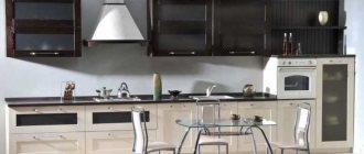
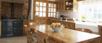
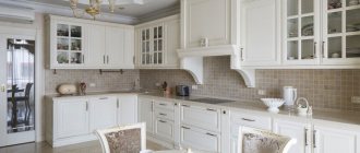
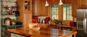
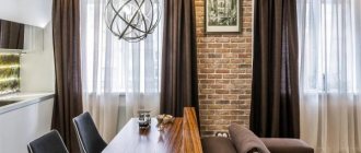
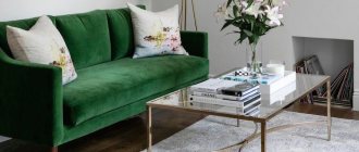
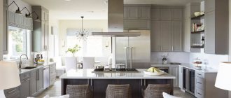
Modern technologies and an abundance of various finishing materials make it possible to implement the most daring decisions when arranging housing. However, the interior of a kitchen in a classic style will always remain in fashion, as it perfectly combines the innovations of technological progress and a presentable aesthetic appearance.
Modern classics are practical and beautiful. Gone are the days when conservatives who were not ready for bright experiments were considered adherents of the classics
Features of the modern classic style
The main feature of classicism is the combination of traditional design and modern finishing trends. This creates a huge number of variations and opportunities to create an individual project. The main thing is to observe the established features of this style.
There are certain features characteristic of the classical direction in interior design.
These include:
- Use calm, soft shades of paint.
- Decoration in a minimalist style.
- A simple and functional headset.
- Predominance of natural finishing materials.
- Stylized household appliances are usually built-in.
- Maximum brightness of lighting – both natural and artificial.
- The use of matte and glossy textures in design.
The above rules will allow you to create the most comfortable place, inviting with its warmth and feeling of complete relaxation.
What is the basis of style?
The interior, decorated in a modern classic style, includes soft finishing materials. As for the main designs, shapes and coatings that can be seen in photos of such kitchens in fashion magazines, these are:
- White or cream furniture.
- Stucco molding and multi-level ceilings.
- Arches and niches.
- Natural stone surfaces.
- Minimum bright decor. Soft shapes that are combined with strict geometry - for example, in the set, carved classic elements are complemented by laconic tabletops, and white facades are set off by textured wood.
- Household appliances - multifunctional, modern, but with stylized facades or built-in. A white, faceless plastic surface would be inappropriate here.
- Finishing materials are most often white, beige or cream, and they look incredibly impressive and give an atmosphere of comfort and freshness. The modern classic style combines matte and glossy textures well.
- The kitchen interior should have a lot of light so that white furniture becomes expressive. And this applies to both natural and artificial sources.
The choice of finishing materials for the interior of a white kitchen in a modern classic style
A distinctive feature of this direction is the maximum use of natural materials both in decoration and in the selection of furniture. Wood, stone - something that should radiate vitality, a connection with nature. A modern classic kitchen does not allow an abundance of plastic, awkward household appliances and flashy colors.
The interior of this white kitchen is only slightly diluted with wood shades, but such a little adds its own charm to the atmosphere of the room
Modern classicism involves the introduction of objects and color schemes from other styles
The use of artificial materials is possible provided that they are externally similar to natural analogues. However, you should not get carried away too much; compliance with moderation is the shortest path to harmony.
How to choose decor for a kitchen in the style of modern classics
Decoration plays an important role in creating an interior. Modern classic kitchen style implies restraint and harmony in all details of the ensemble. Therefore, stucco molding, paintings in a wooden frame, and small accessories are used. The main criterion is maintaining symmetry.
Decorative elements in the form of vases, paintings or candelabra can be placed on an open wooden shelf
A few dark spots that stand out in contrast in the overall setting look stylish.
The best decoration for a kitchen is dishes. Porcelain behind beautiful glass will look great in white. Additionally, you can place several fresh flowers in pots. A couple of islands of greenery will be enough to emphasize the naturalness of the surroundings. Metal candlesticks with beautiful candles, as well as vases, are used as accessories.
Features of modern classic kitchens
Features of the modern classic style are:
- furniture made from natural materials;
- good finish;
- clear symmetrical lines;
- calm colors;
- classic sophistication and elegance;
- coziness and comfort;
- maximum free space.
Advantages and disadvantages
Classic cuisine will never go out of fashion and this is its main advantage.
Like any other interior style, modern classic style has its advantages and disadvantages.
The main advantages of the classic modern style are:
- the relevance of this style for many years;
- use of high quality natural materials;
- discreet elegance, which is a sign of the high status of the room.
The only drawback of this style is the high cost of natural furniture and finishing materials, which are used in modern classic design.
Choosing the right lighting
Lighting is an important factor for a white kitchen in a classic style. It is the correct play of light that helps add zest to an individual design project. The primary source is the window. It should transmit enough sunlight during daylight hours. Therefore, it is not recommended to clutter the window sill with unnecessary details, and also to select curtains wisely.
A classic kitchen should be light, especially in work areas
Artificial lighting can be implemented in several ways, complementary to each other:
- Central lamp. A classic chandelier with several arms is ideal.
- Illumination of the working area headset. Implemented using small built-in lamps.
- Wall sconces. Placed directly next to the dining area.
This type of lighting arrangement is universal. During special events, it allows you to create brightness and proper presentation, and during a family dinner, dim the light.
Lighting should facilitate comfortable kitchen work.
Important! If you have a small kitchen area, you can use a chandelier with adjustable length. It will allow you to adjust the brightness by lowering or raising the lampshade.
Chandelier with adjustable hanging height
Signs of style
Kitchen design in a classic style will never lose its popularity. This is due to our desire to gather at a common table with the whole family, invite guests and create a cozy space for communication. There are no small details in the interior of a classic kitchen; even the curtains help harmonize the space.
What characterizes the kitchen interior in modern classics:
- Large area of the room, high ceilings are welcome.
- For medium-sized kitchens, choose wall decoration and furniture facades in light pastel shades.
- Small rooms in a classic style do not look so luxurious, but if you do not burden the furniture set with decorative elements, choose cabinets of simple shapes and stick to light, bleached colors, then a small kitchen will be unusually good.
- Interior design in a classic style is suitable for combined kitchen spaces with a dining room or living room. In this case, there is room to expand to reflect all the grace of the forms of furniture and decor.
- The luxury of the interior lies in the details: it is better to use natural materials in kitchen design. Wood, stone, metal are priority materials when choosing finishing and furniture. But in this case, maintenance is complicated, so by choosing furniture models made from MDF it is quite possible to create the desired atmosphere. When decorating walls and floors, it is better to give preference to ceramic tiles, natural stone, and wood.
Related article: Bedrooms in a modern style: decoration and choice of furniture (+40 photos)
- The color scheme is restrained, reflecting the style philosophy: nothing flashy. “The modest charm of the bourgeoisie,” perhaps, is how one can characterize respectability, external modesty and luxurious execution of every detail of the interior.
- The natural range of shades will help you decide on the color: brown, olive, pearl, gray, beige, dark and milk chocolate - this is not a complete list, but it is easy to add to it just by looking around.
- Traditional forged elements, stucco molding, bronze, blackening and gilding are used as decoration for the walls and ceiling.
- Textiles will add completeness to the interior: curtains, tablecloths, napkins, chair covers are made from natural linen and cotton fabrics.
How to choose a kitchen set
Many examples of classic kitchen interior design are present in the photo gallery. You can use them to guide you in choosing a kitchen set. A standard layout with lower and upper cabinets is recommended. The use of frosted glass for finishing compartments with dishes is encouraged. Maintaining symmetry is one of the fundamental principles of organization.
Rows of cabinets must be proportional to each other and match in height
Important! Classic style involves the use of natural materials. Therefore, the countertop is made of marble or other natural stone.
It is better to use built-in household appliances
The fittings should be barely noticeable. Silver and gold colors look great. Household appliances should not stand out. The ideal solution would be to select built-in devices that match the color palette.
Furniture in the interior of the kitchen in the style of modern classics
A vintage table and chairs will organically fit into the interior and emphasize classicism. However, such furniture is quite expensive, so the method of artificial aging is used - patination. The shape of the table surface is selected oval or rectangular.
A dining set in a classic style with carved elements is quite expensive
But you can always find more budget-friendly solutions that look quite decent
Don't forget about comfort. The soft upholstery of the seats and backs of the chairs will make a long feast more enjoyable. The color palette should match other textile elements used to decorate the room.
Furniture
The interior of a traditional kitchen is always equipped with a furniture set with upper and lower cabinets. When furniture is placed linearly, the center of the composition usually becomes the hood above the stove. The presence of a buffet is welcome, especially if there is a touch of time on it. The color scheme is decided in natural shades. Cabinet fronts can be either painted or varnished. The varnish will highlight the structure of the wood, allowing you to admire the natural shades of the wood; such furniture will look luxurious.
Attention is paid to the working surface; in the tradition of the style, it is made of marble or other natural stone. Modernity makes its own adjustments to the interior and decoration, and therefore composite materials will adequately replace expensive natural finishes, and they will last longer without any damage to themselves and people.
Classic sets are characterized by paneled doors, carvings, and paintings. The fittings are preferably bronze or golden in color; ceramic linings for traditionally shaped handles are desirable.
A large round or oval folding table is required in the dining area. The traditional form is emphasized by massive legs, carvings and natural materials, most often polished wood. Chairs are selected in a style that matches the table. It should be comfortable at the table, because the feast can drag on, which means soft seats and chair backs will come in handy. The upholstery of the soft parts of the seats, ideally, should match the curtains and other textiles in the room; in extreme cases, the general color scheme of the accessories should be observed.
Textiles in the kitchen in the style of modern classics
The color scheme of textiles must match the design of the walls, furniture and other elements. Expensive dense fabric is used as the starting material - velvet, satin, velor, brocade.
If desired, the chairs can be covered with covers, which will add comfort to the atmosphere of the kitchen.
Small pillows in warm colors will add coziness and comfort. Special attention is paid to the choice of tablecloth. It is the center of attention, so it should be in perfect harmony with the overall design. Don't forget about practicality. The material is selected to be durable and not lose its appearance over time.
Classic style requires the use of natural fabrics
How to choose an apron for a white kitchen
The apron is the main element of every kitchen, subject to temperature changes and chemical elements. Therefore, high demands are placed on the strength and durability of materials.
The color of the apron can be light or dark, it all depends on your taste
Made from the following materials:
- Ceramic tile. A classic, time-tested solution.
- Porcelain stoneware materials. A modern alternative. As a rule, they are made with a stone texture.
- Glass. Allows you to create a plot on the wall that emphasizes the interior and personality of the owner.
- A natural stone. Difficult to install, but has an attractive appearance.
The color of the apron does not have to be white. You can choose an ivory or other shade that is in harmony with the overall design picture.
An apron made of small ceramic tiles that imitates old masonry in a miniature design looks great
Layout
The choice depends on the area of the room. For a small kitchen up to 9 sq. meters, corner or straight are the only reasonable solution: in such kitchens it is possible to equip a full-fledged dining area.
Even in a small kitchen of about 7 sq. meters there is a place for neoclassicism. The photo below is an example of successful optimization of space by placing a compact set with a miniature dining area.
The bar counter and window-sill table are new items in a classic style.
Appropriate if they have the appropriate design.
Parallel, U-shaped and island layouts are suitable for kitchens from 12 square meters. meters. But developing such a design on your own is very difficult. Therefore, if you are not a professional in this matter, it is better to choose a more universal option - angular or straight.
Modern classic flooring
Linoleum, parquet, and tiles are used to finish the floor. Natural wood looks more aesthetically pleasing, but is not as durable as tile. If the next renovation is planned to be done in 10 years, then it is better to abandon the parquet.
From the point of view of durability, the optimal solution would be ceramics or natural stone
An important point is the reflection of naturalness, so the external texture is chosen to resemble wood when using artificial materials. Using a drawing you can also visually increase the area of the room, so you should be careful about your choice.
Diagonal laying of tiles will visually increase the area of the room
Decoration Materials
Walls. Preference is given to plaster finishing. Ideally aligned walls, painted in calm light shades - a traditional option for wall decoration. If you prefer wallpaper, then use trellises with a traditional floral print, stripes, discreet geometric patterns or plain ones. In the work area, the walls are finished with either natural stone or ceramic tiles.
Ceramics for walls are chosen without the glossy shine of natural shades or with a pattern imitating traditional tiled miniatures. Also popular in decoration are wooden panels, textile wallpaper, stucco moldings, and bamboo wallpaper.
Floor. For our latitudes, wooden boards are considered a traditional finish. It can be successfully replaced with laminate. But both wood and laminate are not very suitable for the kitchen, especially if the next renovation is planned in ten years - both materials are not very reliable in operation and are subject to the negative effects of both excessive heat and frequent washing. The best choice for room design would be ceramic floor tiles, mosaics or natural stone.
Ceiling. High ceilings in a classic kitchen are decorated with a stucco rosette decorating the central shade of the chandelier. The style is supported by wide ceiling plinths and moldings. A textured ceiling can be achieved using ceiling panels made of polystyrene foam, polyurethane and other materials. Traditionally, the ceiling is painted white, but a modern interpretation of the style gives a wider palette; it is important that it is not bright and is in harmony with the rest of the decoration.
Related article: Art Nouveau style: elements and details (+50 photos)
Kitchen ceiling in modern classic style
There are a lot of design options for ceiling coverings. From water-based coatings to tension elements with a smooth surface. The main criterion is the combination of colors with other elements. Available in white, beige, cream or milky colors. Light colors allow you to increase the brightness of artificial lighting at night.
If your kitchen is not impressive in size, the best option would be a flat white ceiling
Important! A perfectly smooth coating surface is a distinctive feature of the style. Do not use level differences or decorative protruding elements.
To finish the perimeter of the ceiling, you can use polyurethane plinth
Types of tables
Furniture sellers operate in two categories of kitchens: classic and modern. These are two conventional concepts that define design :
- modern kitchen is space and minimalism (materials: metal and glass);
- classic - a closed room filled with a variety of furniture (most often made of wood).
Therefore, before choosing a table, we recommend deciding what style the kitchen will be decorated in, otherwise it may later turn out to be out of place. Typically, kitchen furniture is purchased at the final stage of renovation, when almost all the work has already been completed.
Important! Before choosing, find out how many people the furniture is designed for, what size it is and whether it will fit into the area of your kitchen.
Modern kitchen tables are functional . Main models:
- Table transformer . What distinguishes it from a regular table is the presence of a sliding system. Mechanisms, guides, hinges, fasteners and other accessories must be of good quality, since the ease of use and reliability of the product depend on this. The models have special devices that make control easier. Some disadvantages (inconvenient placement of the legs, bulkiness, the joint line in the middle) make them unaesthetic.
- Extendable table . This model can be called a practical purchase for a small kitchen or living room. It looks like an ordinary classic table of a round, square or rectangular shape, which can be extended to increase the size of the tabletop.
- A folding table is an ergonomic, comfortable and stylish model that does not take up much space in the kitchen. Folding tables have simpler mechanisms and therefore are cheaper. In such models, part of the tabletop is attached using hinges. When it is necessary to increase the working area, the hidden part is raised/unfolded.
- A table with additional sections extending from the end. The mechanism is used in wooden and glass furniture. Sections are provided on one or both sides of the product.
Classic tables
Rectangular and oval tables are popular in classic style due to their impressive size. They leave virtually no free space in the kitchen.
Suitable styles for them : colonial, baroque, romantic, feng shui (for transformers with an octagonal shape). A beautiful kitchen table with a smooth surface and slightly curved legs goes well with natural stone or wood.
Interesting! Stone is an ideal material that is not susceptible to the formation of fungus, absorption of odors, grease and dirt, and mechanical damage. This furniture is easy to clean.
Modern tables
Modern design requires a lot of free space . Tables are preferably small, most often square, round or triangular in shape. The correct form is a prerequisite for minimalism or modernism. The whole family can fit at this table: they are designed for four or eight people, depending on the size.
If there are children in the house, it is recommended to pay attention to products with round tabletops : they are safer because they do not have sharp corners. But it is worth considering that a round table will not fit a large number of people, and if you buy a large one, it will be inconvenient to communicate at it. Moving it towards the wall is completely irrational. Round tables usually have three legs, freeing up legroom. The advantages of such models are mobility and lightness.
Attention! The ideal diameter of round kitchen furniture is no more than one and a half meters. If you choose a table with a larger diameter, you will have to stand up and reach for food.
Walls in modern classic style
Wallpaper with a uniform pattern and decorative plaster with stucco elements are used as materials for wall decoration. A more expensive option is to use wood - lining or veneer. The finish with thick fabric looks especially rich. However, it is worth remembering that such material absorbs odors quite well, which makes its use a very dubious idea in the kitchen, where cooking is often done.
The color of the walls is selected based on the dimensions of the kitchen, the rule is simple - the smaller the room, the lighter the finish should be
A combination of wallpaper with different patterns is acceptable. For a harmonious look, it is worth studying transition methods in advance. Examples of successful solutions can be found in the photo.
A floral print or a geometric one with monograms is suitable as a design.
Which curtains to choose in the style of modern classics
When choosing curtains, you need to remember the role of natural light in a kitchen decorated in light colors. Textiles should transmit the sun's rays as much as possible. Therefore, it is recommended to use light tulle without a pattern or with a minimum number of colored elements. A country style check looks great.
The color and style of curtains should be in harmony with the overall interior of the kitchen
Now it has become very fashionable to decorate windows with double curtains.
Additionally, thick curtains are selected. A large amount of drapery and decorative elements are inappropriate here. To add a slight retro touch, it is permissible to use curtains with embroidered elements. Tiebacks and lambrequins will add flair when used in moderation.
Color palette
Obviously, bright colors will not suit a classic interior, so it is better to give preference to calm, natural and even slightly muted shades. The most popular and suitable options:
- shades of beige;
- shades of white;
- brown;
- grey;
- olive.
To these basic tones you can add several rich shades, for example:
- black;
- burgundy;
- dark green;
- Navy blue.
But they must be dosed carefully so as not to overuse the dark range. There are several color solutions for a kitchen in a classic style.
Bright hues
A bright kitchen in a classic style is the most popular design option for such an interior. Different shades of white and beige are used. They provide the pomp and solemnity of the room, which are so important in a classic interior.
In this case, the walls remain plain or with a dim pattern - wallpaper is most often used. It is acceptable to use other decorative elements:
- stucco moldings;
- decorative plaster;
- panels;
- moldings.
It is desirable to have wood on the floor, or at least an image of it, for example, on porcelain stoneware.
Bronze and gilding will serve as excellent companions to light tones. If gilding must be used carefully and in doses, then with bronze there are no restrictions. You can find her:
- on the mixer;
- chandelier;
- in the form of interesting patina options on facades;
- and even on equipment with a bronze coating.
A combination of light and dark colors looks very beautiful in a classic kitchen.
Dark colors
This design option is only suitable for a spacious room, since dark colors can visually reduce the space, which is not what you would want in a small kitchen or studio.
The use of dark and even black tones adds a touch of modernity to a classic kitchen. And gilded decorative elements will become even more luxurious. But you can’t use black alone, since the design will quickly turn from classic to gothic.
There are dark brown, dark gray and dark blue options. These tones always look noble and aristocratic, so they are perfect for a kitchen in a classic style. But it is the contrasting combination of tones that best emphasizes the depth of color, so two-tone kitchens in a classic style are not uncommon.
Green
You rarely see green in a classic kitchen: it’s difficult to find a noble shade. Most often it is emerald or malachite - these tones will look “appropriate” even on facades. In this case, the environment in the form of walls, curtains and a work panel is chosen to be more neutral, for example, beige.
A gold or silver patina looks very beautiful on a green surface. Brown also goes well with green, but it shades it and does not reveal all its beauty.
Blue
And blue can be found in classic-style kitchens, but most often it is used as accents. For example:
- headset on the handles;
- in the countertop;
- apron with a pattern;
- decoration of the bar counter;
- textiles;
- wall patterns.
Sometimes the blue color can be found in a set, but most often it is used only on the lower part, so as not to overload the interior and not lose its sophistication. Goes well with brown.
