Color combinations
In order for the Marsala color to look good in your interior, you need to carefully select the rest of the palette, because this deep shade claims to be an accent color. Now we will analyze which shades will be the most advantageous in combination with wine.
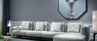
1. White – This is the default base color and the best background for a wine shade. It does not overwhelm the burgundy, on the contrary, giving it richness and highlighting. Both cold and warm shades of white are suitable.
2. Beige and brown tones - such natural shades in combination with Marsala will create an indescribable atmosphere of comfort and homely warmth. This combination will look especially beautiful in the living room, setting all family members in a homely mood.
3. Gray - This color perfectly balances the brightness and richness of Marsala, allowing this color to be used in all styles and rooms. This versatile combination looks good in all rooms.
4. Black – This base color pairs beautifully and brightly with burgundy. Since both shades are very saturated, it is worth making sure that only one of the colors predominates, otherwise there will be an overload, and the interior will not look harmonious because of this. This combination is also quite bold, so it is more suitable for more modern styles, for example, loft or minimalism.
5. Blue - this shade perfectly balances the bright and rich Marsala due to its cool undertone. Azure or mint will suit you if you want to create a calmer interior using burgundy. This combination will look beautiful and fresh in the bedroom.
6. Pastel pink - the affinity of this shade with wine helps to create a stylish and now very popular monochrome interior. You can even play with the proportions, making one of the tones predominant and leaving the other as details.
7. Yellow - despite the contrast, it looks very harmonious with wine and looks great both in the form of prints and in the form of wall decoration.
8. Blue and green - in the interior they are the personification of sapphire and emerald, therefore they look especially advantageous in combination with marsala in a classic or art deco style. It’s interesting that these shades look like prints. This unusual combination looks advantageous both in minimalist styles such as modern, and in more vibrant ones, for example, boho and art deco.
Combinations
Like all wine shades, Marsala is combined in the interior with light tones of a cold range.
Designers are confident that the best fit:
- white;
- grey;
- turquoise;
- blueberry;
- green;
- blue;
- aquamarine;
- gold;
- red;
- cream;
- vanilla;
- terracotta;
- ocher;
- herbal salad;
- woody shades.
Walls
The best option is not to paint all the walls, but to decorate an accent wall. If you use this color on all the walls, the room may look too gloomy. Now let’s look at the relevance of this color on walls in different style directions.
- Classic style - moldings and stucco moldings inherent in the style help the Marsala color to look most advantageous in the interior. Burgundy-colored walls also look very interesting in combination with furniture made of dark wood.
- Modern style - this direction takes a little more liberties than the classics, but it also has its own characteristics. The Marsala color in such an interior is best mixed with other dark shades, wood and geometry in the design.
- Minimalism - a combination of burgundy with basic and natural shades, such as white or gray, will look restrained and calm in this style.
- Mid-century - in this style it is worth using simpler forms of furniture and abstract paintings that would balance the brightness and richness of the finish.
- Art Deco - in this style direction both paint and wallpaper look great, the main thing is not to forget to add some interesting details made of brass or gilding, for example, lamps, paintings or mirrors.
- Boho - it is better to add interesting prints with this color to Marsala-colored walls in this style, and to make the atmosphere more harmonious, it is worth adding fresh flowers.
One of the basic rules in decorating walls with marsala is not to overdo it. That is why in many designs they make an accent wall. However, if desired, you can cover all the walls in the room. This is worth doing only if you rarely and do not stay in this room for a long time or if you live in these rooms temporarily. So you can safely decorate your bathroom or country rooms in a wine shade.
How does it look in the interior of the rooms?
This is not to say that Marsala is suitable or not suitable for certain spaces. It all depends on its use, interior style, color combination.
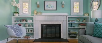
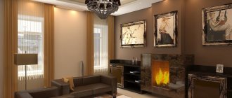
Living room
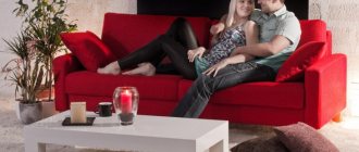
Marsala color in living room interiors is usually used in furniture, and more precisely, in a soft, cozy sofa. Model - any suitable one. From a sophisticated daybed with a carriage frame, to more modern options with voluminous pillows.
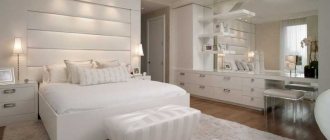
Bedroom
If you want to paint the walls in Marsala color, then the bedroom interior is perfect for this task. It creates the necessary darkness and coziness that is so necessary in this room. The only caveat is that the red undertone can interfere with sleep, but it can be drowned out by cool white, gray, blue, green.
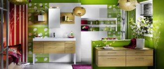
Kitchen
Do wine-colored facades seem too much? Use it in small but significant elements: upholstery of bar stools, apron. Or order burgundy doors only for the bottom row of cabinets, making the top ones white or gray.
Appliances in dark red look stylish and can serve as useful decor.
Hallway
Since textiles and decor are practically not used in the corridor, the only option to use wine color here is to paint the walls with it. It is not necessary to paint it completely - choose one accent side or decorate the lower half with another material (lining, panels).
Bathroom
Considering that plumbing fixtures are usually white, Marsala will be an excellent background for it: white on dark always looks advantageous. To prevent the interior from becoming boring, add color green or orange accents.
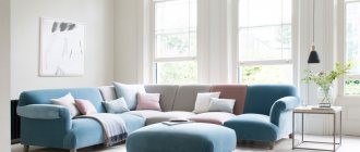
Cushioned furniture
Sofa - this piece of furniture in a wine shade looks incredibly beautiful, and in any style direction. However, in modern styles it is better to use more strict forms and a minimum of details, and in classic styles - voluminous armrests and a quilted back.
The chair is ideal for a living room or office. It will look especially advantageous in the art deco style in combination with other interesting and bright furniture elements, for example, yellow.
Pouf is furniture that fits perfectly into any interior. It can be a great accent without upsetting the balance.
Sectional set Mimic
With a removable fabric cover or fixed leather upholstery, the sofas can be purchased in several variations and sizes for two or three people. For buyers, this furniture is available in various colors. At the same time, the most interesting and impressive is the rich wine color palette.
Modular sofa Mimic
Corner option
The original Tongue chair was created in 1955 by Arne Jacobsen for the Munkegard School company in Denmark. The sculpted legs and organic wave shape of the seat allow you to sit comfortably and relax. The model is presented in various design options using wood, and at the request of the client it can be covered with fabric or leather.
Arne Jacobsen high chair with exceptional seat and backrest
The small cozy chair was designed by the talented craftsman Patrick Norguet. A beautiful contrast is created with the help of wooden legs that form simple and strict lines.
Chesto armchair by Patrick Norguet
The client can choose leather for the upholstery of this furniture or prefer a removable fabric cover. The following photo shows you a chic assortment of chairs, designed in a spectacular color palette.
Wide range of colors in the design of the chair
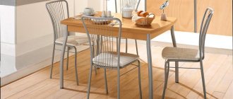
Chairs
It is not necessary to make the upholstery in burgundy; colored legs will look elegant in the same loft. Burgundy looks very interesting on various textures, for example, on velvet or leather. The first option is more suitable for classic interiors, and the second - for modern styles. Marsala-colored chairs look especially advantageous in kitchens with darker and more restrained shades, or made of dark wood.
About color
We learned about Marsala in 2015. It was then that Pantone declared the red-brown hue of Sicilian wine the color of the year and gave expert recommendations for combining with other tones.
The executive director of the Color Institute believes that Marsala is the ideal color for interior design as it enriches the mind, body and soul, exuding confidence and stability.
The color is a combination of red and brown shades that create a warm and elegant color accord. It is not surprising that wine colors are the same for all mature people and representatives of the younger generation.
Intriguing, like wine and soft, like velvet, the color attracted the designers. Its nostalgic brown shades evoke a 70s vibe, blending modernity with a classic spirit; matches perfectly with home details and decorations, complementing modern decor schemes.
The velvety effect of Marsala is enhanced when the color is applied to a textured surface. Carpets and furniture look stylish and impressive.
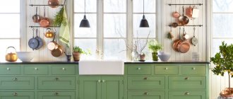
Kitchen set
A kitchen in burgundy color will look interesting and unusual in all style directions. In more modern styles, we simply minimize the number of details, leaving only smooth facades - this approach will be close to both loft and modern. Carved facades and details such as gilding and glass inserts would be more appropriate in a classic, art deco or boho style.
What styles is it suitable for?
Wine colors can be used in any style, you just need to choose the right shades and combinations.
But there are still some directions in which Marsala looks especially harmonious. For example, classic, ethnic, retro, country and eclectic based on these styles. But if you want to decorate an apartment in a loft or scandi style using wine shades, this is also quite doable. To implement such ideas, it is advisable to invite a professional designer who will help you choose the right color scheme and find balance.
Textile
Textiles will help you quickly introduce burgundy into your interior, because hanging curtains and laying a blanket is much easier than repainting the walls. Wine-colored items will serve as a good accent in your interior
Pillows and blankets will look interesting both on the sofa and on the bed, especially in a solid color.
Bed linen and bedspreads will add comfort and atmosphere to the bedroom. It will look best in a room with a dark design.
Curtains - in art deco and classic style, velvet curtains with tassels or fringe will look luxurious.
Carpets - minimalistic products without a pattern will look beautiful in all interiors, but for boho it is better to use an ethnic pattern.
Marsala color in the interior: design features
Encyclopedia mapAmong the new design trends is the deep wine-red color of Marsala, which is actively used in interiors.
The color is beautiful with its naturalness and warmth, evoking many pleasant associations - from juicy pomegranate seeds, velvety notes of red wine to the warm autumn sun. This noble shade gets its name from a variety of strong dessert wine from the town of the same name in Sicily.
The color is visually very beautiful, as it combines red, brown and burgundy tones, which make it very deep, velvety, warm and “delicious”.
The stylish and elegant color goes well with a variety of companions, creating color harmonies. In the interior, wine red can transform a space, making it cozy and homely, and in combination with bright colors, charge it with energy and cheerfulness.
Predominant in the room (for example, the walls are decorated in this color), it does not weigh down the space and does not act irritatingly, but makes the interior luxurious; — when used fragmentarily (for example, the wall behind the sofa, the wall at the head of the bed, the kitchen apron area), it acts as an effective and stylish accent; - furniture with such upholstery, carpets, curtains, sofa cushions and other accessories play the role of noble accents and “stretch out” even the most boring interiors.
No matter how this color is used, it brings warmth, calm and harmony to the interior, and gives it an aristocratic feel.
Features: - Marsala-colored walls visually reduce the space, like any dark surfaces. — Marsala upholstered furniture adds a touch of sophistication, elegance, and elegance. — Red within the range excites and increases appetite; it should be used with caution in children’s rooms and kitchens. But in bedrooms, bathrooms and other rooms with mirrors, the color Marsala is more than appropriate. — A soft undertone will help create a pleasant, calm atmosphere in any room.
Wine shade is used in interior design as the main one - for decorating walls, furniture, and other large surfaces. And as an accent piece: pillows, curtains and other textiles in a velvet texture look incredibly elegant.
Combinations with other colors
To make Marsala look really interesting, it is combined with a certain color scheme: - white, gray or brown; - creamy or creamy; - gold or silver color; - green, emerald or herbal; - blue or aquamarine; - wood shades; - neutral tones.
If we break down the color of Marsala into its components, we get red, blue and brown. Accordingly, the most harmonious combinations will be with these tones in their pure form. For example, a burgundy sofa on a blue wall looks appropriate, albeit contrasting.
Turquoise. Various shades of turquoise and greenish blue will be classic companions for warm red. For a more relaxed atmosphere, you should choose pale blue and soft turquoise shades, and when choosing red, give preference to slightly dusty tones. If the task is to create a bright interior, choose energetic, rich turquoise companions.
Studio head advice
Create the interior of your dreams with the designers of our studio
Each of our projects reflects the needs, taste and lifestyle of our client
Calculate the cost
Shades of white. In combination with white, vanilla, cream and pearl, this color turns the interior into a cozy and homely space; natural shades of bleached wood add nobility. The background is made white, and Marsala is used as an accent: sofa, pillows, curtains, bedspread.
Green. In order not to lose the clarity and richness of red, it is better to choose a muted green, close in shade to brownish sepia. If you choose a ringing herbal green, the wine companion should be made soft and whitened. With turquoise the interior will be cold, with olive it will be warm. The combination of red and green on the color wheel is called contrasting and is the most active possible.
Grey. Neutral gray serves as an elegant backdrop, highlighting the various shades of wine red. A rich and bright shade of Marsala in combination with gray should be chosen for functionally more active rooms: the living room, kitchen and hallway. To create a soft and relaxing atmosphere in the bedroom, it is better to combine shades of gray with a light and subdued wine color.
Other red shades range from cardinal and scarlet to carrot. Such a pair is called similar or analog and is considered the least active.
As the main color in the interior. A wine-colored space looks warm and intimate, rich and energetic. To prevent the interior from looking overloaded, it is better to use related colors - warm shades of wood (oak, walnut, cedar), as well as brown and wine-black.
Interior styles
As for the interior styles for which this color is ideal, these are classic and neoclassical, modern and postmodern, country and Provence, art deco and hygge, retro and rococo, brutalism and vintage, avant-garde and futurism, minimalism (as an accent).
Initially, Marsala in the color of furniture appeared in the classical style. In the English classics, Marsala echoes the shade of mahogany, favorably emphasizing expensive furniture. Used for upholstery of armchairs and sofas, in fabric decor, and as wallpaper on walls.
Modern interpretations present color differently. It has become matte and increasingly decorates walls. At the same time, the finishing does not require additional decor - plain burgundy surfaces are elegant in themselves.
The facades of furniture can also be matte: for example, a kitchen or a closet. In fabrics, Marsala has remained classic - in velor or velvet on pillows, curtains, and upholstery.
The color is also loved in ascetic styles: scandi and loft. In industrial design, wine velvet creates a contrast of luxury and poverty, in Scandinavian design it stands out against the background of white walls.
In furniture and decor
The main use of Marsala in furniture is velor or velvet upholstery. Thanks to the pile, the color looks even deeper and more elegant. Looks great both on its own and in combination with wood and gilding.
A sofa in the shade of marsala will become the main accent of any room, armchairs will help highlight the details and will go well with a neutral sofa. If you need a slight accent, choose ottomans.
Marsala favorably emphasizes not only soft armchairs, but also strict cabinets. Both matte and glossy textures look appropriate - it all depends on the chosen style.
Planning in an hour! Order a designer consultation and development of an individual layout for only 3,000 rubles.
Make an order
Wine decor is primarily about fabrics. Heavy curtains reminiscent of a theater curtain, cozy pillows, blankets and even carpets! With the right palette, textiles will create the right mood and make the space more comfortable.
Marsala color has the amazing ability to add sophistication worthy of aristocrats to any room. If you use it in doses and with emphasis, mistakes in creating a harmonious interior are excluded.
Living room
Marsala color in living room interiors is usually used in furniture, more often in a soft, cozy sofa. From a sophisticated daybed with a carriage frame, to more modern options with voluminous pillows.
Bedroom
Marsala colored walls in the bedroom create the necessary darkness and coziness that is so necessary in this room. To prevent the red undertone from interfering with sleep, it can be drowned out with cool white, gray, blue, green.
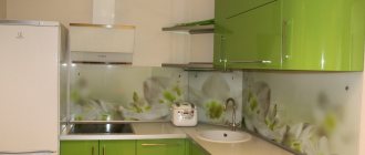
Kitchen
Wine-colored facades or small but significant elements: upholstery of bar stools, apron. Or burgundy doors only on the bottom row of cabinets, making the top ones white or gray.
Appliances in dark red look stylish and can serve as useful decor.
Hallway
Since textiles and decor are practically not used in the corridor, the only option to use wine color here is to paint the walls. It is not necessary to paint it completely - choose one accent side or decorate the lower half with another material (lining, panels).
Bathroom
Marsala will be an excellent background for white sanitary ware. To prevent the interior from becoming boring, add color green or orange accents.
Kitchen
Burgundy color is simply created for gourmets. A kitchen with such a shade is simply conducive to relaxing and preparing culinary delights. In a small kitchen you can use burgundy in detail, but in a large kitchen you can go wild - both on the walls and as a set.
Burgundy color - luxury and elegance
Burgundy is a dark, rich shade of red whose name refers to a noble, important wine from Bordeaux. For this reason, burgundy is associated with sophistication and elegance, and the color itself became an integral companion to all noble church and court events. It decorates royal insignia, complements the decor of temples and cathedrals, and ennobles interiors.
The stylish and salon shade of burgundy has come down from its pedestal and is also present in the rooms. The temperamental and dominant burgundy color brings a touch of sophistication and elegance to the interior, thanks to which even an ordinary apartment in an apartment building can be turned into a luxurious residence.
Burgundy color in the interior can be classified by deciding whether it will play a leading or secondary role. On the walls it will dominate the interior, while presented as a separate element (for example, an armchair or sofa), it will only be an accent that complements the rest of the room.
Living room
Burgundy is initially conducive to reflection, so it’s great if you have some kind of sophisticated hobby, because this color sets you up for a quiet and measured rest, for example, reading books. However, if you wish, you can create a more modern interior in which unrestrained parties would look organic.