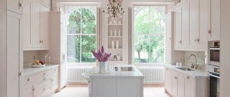
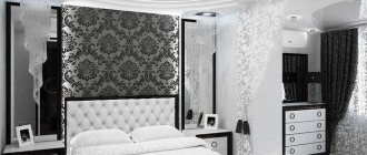
In a modern kitchen, not only practicality and comfort are important, but also the ability to please the eye and, sometimes, surprise guests. A red and white kitchen will cope with this task perfectly. This combination is quite rare, so it has not yet become boring and boring.
The use of red in the interior is suitable only for brave people who are ready to challenge standard solutions.
Let's look at different examples and photos of interiors on how you can decorate a red and white kitchen.
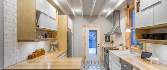
White walls - red set
A very bold decision, both in the opinion of consumers and designers. The fact is that white color is extremely impractical, especially for the kitchen - it will serve as an excellent contrasting tone for all the dirt that often appears in the work (and not only) area.
This is why deciding to go with white walls can be costly and cause headaches down the road.
But you shouldn’t give up your desires because of practicality or frugality. You just need to avoid the problem of difficult cleaning of the walls. For example, choose a non-staining material from which dirt can be easily washed off.
For an apron it can be non-porous tiles or skinned ones. The rest of the surface is washable wallpaper or paint.
Another issue to think about when choosing white tiles is the seams. It is this small space between the tiles that gives out all the information:
- how long ago the tiles were installed;
- how neat the housewife is.
To ensure that the seams retain a presentable appearance for as long as possible, you can go in two ways:
- initially choose dark grout - it looks very stylish;
- choose high-quality epoxy grout - it does not absorb water and dirt, so it will last longer and be more beautiful.
Note that these two ways can be combined and you can choose a dark epoxy grout. So it will look new in 10 years.
But there is another option - they threw it off. The glass sheet has no seams at all, so you don’t have to take care of them.
There are practically no requirements for the red headset at this stage. The main thing is to make sure that the tone does not look cheap on a white background. This happens a lot with red.
White kitchen - what color to choose for bright accents?
Light kitchens look amazing. However, the design can look stiff and boring. But the white interior of the kitchen with bright accents can charge you with positivity for the whole day. We drank coffee in the morning and went to work in a good mood.
The kitchen has long ceased to be just a place for cooking. That is why a lot of attention is paid to design here. The photo below shows a white kitchen with bright accents. Well, how can you not fall in love with this magic of color combinations?
Red as bright accents in a white kitchen design
Red is an ambitious and bold color. It should be used in doses in the design. And for accents, it’s just what you need. Add splashes of red to the interior of a white kitchen if you are thinking for a long time before deciding on something drastic. In such a kitchen, you will be able to more quickly and rationally assess various situations that require immediate action from you. This is what the design looks like with red strokes on a white background. How do you like this kitchen?
Take a closer look at these interiors if you feel like a squeezed lemon in the evenings. A cup of tea drunk in such an environment will prevent you from completely falling apart. On the contrary, it will help you gather strength and concentrate.
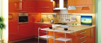
Bright orange accents in the interior of a white kitchen (with photo)
Orange is a low-key red. This color has a businesslike and assertive character, but at the same time it radiates a lot of solar energy and positivity. Check out how orange accents look in a clean white kitchen. Just looking at the photo lifts your mood. Imagine the boost of energy that you will get after having breakfast in such a kitchen.
Orange has no “contraindications”. However, not everyone is able to accept his directness and naturalness. Although this is a matter of taste.
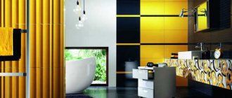
Bright turquoise accents in a dazzling white kitchen
The vibrant color of the sea waves, combining the natural strength of green and the tranquility of blue, is an excellent choice for adding accents to a white kitchen. Turquoise is liked by creative people who are full of ideas. Here's a look at the examples. The aqua color helps make the sterile interior of a bright kitchen warm and homey.
Dark blue color - can it be used as an accent color in a white kitchen? (+photo)
Blue is ideal for those who are too impulsive by nature. This color can calm the most hyperactive person. If you want to learn to control your emotions, add splashes of blue to your white kitchen. Over time, you will notice how much easier it becomes for you to control your temperament. Kitchens with blue accents create a sense of regularity and tranquility. Here, take a look at photo examples of the design.
Red walls - white set
Decorating the walls with bright colors is not a problem now. In every hardware store you can find:
- tiles;
- paint;
- wallpaper;
- Red brick;
- and even parquet for the walls.
And all of them are presented in a variety of colors. There are even dozens of shades of red. And with the right tone, you don’t have to worry too much about cleanliness at all.
But the white color in the kitchen can again become a problem, especially if we are talking about an inexpensive set of chipboard or MDF.
The fact is that a greasy coating can form on the surface of the facades, which will be especially noticeable against a white background.
A good and powerful hood will help avoid this. It will also smooth out strong changes in temperature and humidity, which will save the material from destruction.
In addition, all defects and dents are especially noticeable on white, so you will have to handle such a set very carefully.
What can act as a bright accent in the kitchen? (With design examples)
A large design object, such as a stove, can be a bright accent in the kitchen. As a descendant of the stove, it symbolizes the hearth and therefore is the center of gravity of this room. Take a look at photo examples.
But the heart of the kitchen is the dining table. It can also be highlighted.
Interiors with bright chairs look nontrivial.
How do you like it?
You can also focus on small elements. Place colored jars with spices on the shelves. Choose textiles made in the same color scheme (kitchen towels, potholders, napkins, tablecloth).
Here the curtains are a bright accent.
By the way, it should be noted that monochrome interiors are no worse. There are many beautiful kitchens made in the same color palette. It's about something else. How to bring something new if the existing design is a little boring.
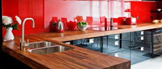
Red apron - white countertop
An apron can be called a part of a set that protects the wall in the cooking and washing area.
An apron is necessary to prevent drops and splashes from the work area from hitting the wall. That is why you should choose this red headset element from easy-to-clean materials. As mentioned above, tiles and glass are excellent options.
Quite often in red and white kitchens, it is the apron that is made in red. This decision is quite logical both from the point of view of style and practicality.
But the tabletop remains white, because it is a large element. For this reason, the decision to leave the countertop white will significantly expand the space, which will be very useful for a small kitchen.
But it’s worth abandoning monochrome-white countertop options. This again is impractical, because all the crumbs and dust particles will be visible, as if under a magnifying glass. It is better to take a closer look at options with an unobtrusive pattern: wood, stone or simply abstract.
Principles of color combinations
A freshly decorated kitchen in a fashionable red color is not a monochrome room, but a two- or three-color room. One of the colors is chosen as the main one - it accounts for 60-65% of the total decor, additional - 25-30%, the rest - small accents. Beautiful transitions from one tone to another are also welcome.
A freshly decorated kitchen in a fashionable red color is not a monochrome room, but a two- or three-color room.
See alsoHow to choose a resin for pouring a countertop: useful tips, review of popular brands
Red and white kitchen
A modern red and white kitchen that fits perfectly into any size room. The idea is optimal for a retro or pin-up interior, with bright colors and simple shapes of household appliances, curtains and other draperies with large polka dots. White, being the base tone, softens the aggression of bright red.
A modern red and white kitchen that fits perfectly into any size room.
See alsoHow to choose a coffee machine for your home, what you need to know when choosing, useful tips
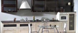
Black and red palette
This design is solemn, mysterious, and very effective, but you will have to work hard on the lighting so that the room does not become too dark. The main color is red-orange, matte. They decorate walls, floors, individual furniture elements, and make zoning. The ceiling is black and shiny, as are the facades of the furniture, the kitchen apron, and the sink. The design is suitable for Chinese, Arabic, modern style.
This design is solemn, mysterious, and very effective, but you will have to work hard on the lighting so that the room does not become too dark.
See alsoFeatures of designer kitchen chairs
Gray-red
The combination with gray in the photo looks very harmonious, discreet, and neat. This decor is suitable for both high-tech and modern. The main advantage of gray is that it doesn’t show dirt or dust, which makes cleaning much easier. Kitchen appliances, sinks, hobs, floors, doors will be painted in this tone; everything else will be coral.
The combination with gray in the photo looks very harmonious, discreet, and neat.
Red-green color scheme
This design looks dynamic, but aggressive, since the colors are opposite. Here it is advisable to abandon stripes and checkerboard-type prints, but “Scottish” checks on textiles are quite acceptable. A calmer design comes out using red-pink and olive, matte crimson and yellowish-green, fern and brick red.
This design looks dynamic, but aggressive, since the colors are opposite.
Red-brown
A great idea for such an interior is a bright red glossy refrigerator. The furniture will be made of dark wood, the floors will be cherry. Pottery and terracotta-colored pots of indoor plants on the windowsills will successfully complement the design. For classic design, as well as loft style, this is the most suitable option.
For classic design, as well as loft style, this is the most suitable option.
Turquoise-red combination
The red-turquoise interior is associated with the sea. The “ship” here will be a scarlet corner sofa, and the same “sails” will be the top and bottom of the kitchen cabinets. Floors, thin tulle on windows, dishes, sofa cushions, countertops or kitchen aprons are painted with turquoise.
The red-turquoise interior is associated with the sea.
Beige-red
Beige is a neutral color, which is usually made the “leading” color. It looks best with cool shades, such as crimson, ruby. Ceilings, countertops, upper cabinets are painted beige; they are used for working or dining areas, and sometimes even floors.
Beige is a neutral color, which is usually made the “leading” color.
Yellow-red interior
Art Nouveau style is styled in these colors. The background will turn yellow - these are wooden floors, doors, walls covered with wallpaper with reddish flowers. It is also advisable to select all models of equipment in golden shades. Reddish lighting will add uniqueness and comfort to the space.
Art Nouveau style is styled in these colors.
Blue-red
Two completely opposite colors create the most dynamic design. The smooth gradients on the walls and furniture facades look interesting here, individual zones are highlighted with different colors, and the levels on the suspended ceiling are painted. The set itself is designed depending on which color is more saturated - dark colors are recommended for lower cabinets and floor cabinets.
Two completely opposite colors create the most dynamic design.
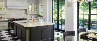
Timeless tricolor - white, black, red
A black, white and red set in a kitchen looks the most interesting and original. This is a very “strong” combination, each color here looks very rich. Intricate ceramic tile patterns are acceptable here; white appliances do not need to be repainted. The basic rule is that the smaller the room, the more “bright spots” there are in it.
A black, white and red set in a kitchen looks the most interesting and original.
White top - red bottom
This red and white kitchen design is one of the most popular because it is considered universal - suitable even for a small kitchen in a Khrushchev-era building. The main thing is to choose not a bright, but a calm tone of red, for example, raspberry.
White upper cabinets will add volume, freshness and lightness to the kitchen. Glossy facades are preferable because they reflect more light, but you can also opt for matte ones.
Article on the topic: Which kitchen to choose, glossy or matte?
But it is better to leave the floor cabinets glossy. But you have to be prepared that fingerprints will remain on them, so if you have curious little children, it’s better to give up this one or stock up on microfiber wipes, which are good at removing such traces of curiosity. But the plus is that deep tones will give the kitchen solidity and nobility.
The standard solution is a white top, gray tabletop and red bottom. It is worth paying attention to the neat combination of black plinth and black and white tiles.
It is important to make a smooth transition from red to white, so the set is complemented with a two-color apron, and scarlet decor or just kitchen utensils, for example, a knife stand, are placed on the white tabletop.
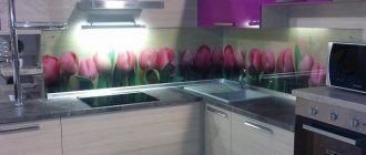
A good option for a two-color apron is a skin with an image of red poppies on a white background.
Rules for combining red and white colors when arranging a kitchen
A kitchen decorated in red and white colors is often called royal. It emphasizes the individuality of the home owner and looks bold and unique.
In order to “pull out” the full potential of a room furnished in such colors, you should competently approach the issue of their combination - in other words, choose the right proportions and place accents. The main options for combining white and red should be considered separately:
White top and red bottom
In this case, the lower part of the kitchen facades and the floor covering may be red. This option can be chosen for arranging a kitchen in the “modern” or “high-tech” style. In this case, red can be glossy, and white can be matte.
To make your kitchen look expensive and stylish, you should choose more muted shades of red or burgundy, avoiding too bright tones.
White bottom and red top
It is known that red color has the ability to visually “bring closer” objects, this is especially acute on a white background. Accordingly, the choice of combinations of “white bottom and red top” is possible only when arranging a spacious kitchen with a high ceiling. Otherwise, such a room will look somewhat aggressive. In any case, the red color in this version should not be bright, but muted, preferably matte rather than glossy.
White kitchen with red apron
An excellent option for arranging a kitchen in almost any style. To make the room more interesting, you can adopt one of the following options: decorate the backsplash with bright ceramic mosaics, make an apron from tiles in the form of a red and white checkerboard, or choose a bright red ornament made on white tiles.
The option of using monochrome red color when arranging an apron is also quite good.
White kitchen with red countertop
This option is suitable for decorating a kitchen in the style of “minimalism,” “modern,” “high-tech,” and “art deco.” It is best to use artificial stone, tempered glass or plastic as the material for the countertop.
Zoning a white kitchen with red details
An excellent solution for arranging a kitchen that also serves as a dining room. Some levels of suspended ceilings and bar tops may be red. Red color should also be present in the decorative elements of the room.
Red top - white bottom
Using a white tone in floor cabinets will also visually expand the space, especially if the apron and tabletop are made in the same tone.
But red color has the property of bringing objects in the interior closer, reducing space, so this design is suitable only for spacious rooms.
It is best to choose red in dark shades, for example, ripe cherry, and the surface of the facade is matte: this way the set will look especially organic. The dining group (table and chairs) is selected either in neutral colors or to match the color of the upper cabinets.
White kitchen - red apron
If you want your work area to be the center of attention, you need a red apron. Both single-color options and small mosaics or tiles will look equally organic.
You can experiment with tiles of two colors and lay them out in a checkerboard pattern, but this is considered a very bold decision.
The advantage of this design is that it can be repeated even in a small kitchen if the rest of the set is done in white. But you can choose a scarlet one for the dining group. Or at least choose red seat cushions.
Combination
You need to combine red and white correctly
The combination of red and white is considered a classic color, so it can be found quite often in interior design. White balances the brightness of red, making the interior more elegant and noble. In the combination of red and white, there are only two options:
- Red and white and equal proportions;
A red and white kitchen should be harmonious
- Or a white kitchen on a red background.
White kitchen with red elements looks juicy
In any of these options you can make an interesting solution for the interior, but at the same time it is very easy to overdo it with red and make the interior flashy and tasteless.
White background
White kitchen with red decor looks charming
A white kitchen with red splashes looks noble and elegant. This kitchen looks very calm, but at the same time stylish thanks to splashes of red.
Red is always an accent
Red color can be used:
- When finishing a kitchen apron or countertop. On a white background, a bright apron looks very exotic;
- When decorating the dining area. A bright red tablecloth or red wallpaper in the dining area will draw attention to this part of the kitchen;
- Red floor or ceiling. This is an unusual solution for the kitchen, but it looks amazing;
- Red decor. This could be dishes, sofa cushions or curtains, table settings. You can learn about combining wallpaper in the kitchen in this article.
For a small kitchen, a white kitchen with red elements is preferable, since a bright color visually makes the room smaller, while a light white one does the opposite.
Interior of a red kitchen in a designer's project:
By the way, if you want to give your kitchen a warm, homely atmosphere, then the red and white combination is not the best option. In this case, it is better to replace white with vanilla color or the color of baked milk.
Red
The predominance of red in the interior is not common
This is an unconventional approach , but it also has a right to life. This combination is good to use over a large area, since in this case the red will not put as much pressure. But even in this case, there is a danger in creating a garishly bright room. You can find out about the Viennese chair in the kitchen interior by following the link.
Don't forget about white
In kitchens with a predominance of bright colors, it is better to use several shades of red: wine, scarlet, burgundy to slightly smooth out the flashy extravagance of the color.
Use calm shades of red: brick, terracotta.
The beige shade will add warmth
The ceiling should be white. If you decide to paint the kitchen and furniture red, then there must be white elements on the floor.
Browse interior solutions in red colors:
White kitchen - red countertop
You rarely see a red countertop in hardware stores. Most often, such options are made to order. The following materials are popular:
- fake diamond;
- thick glass - always tempered;
- high quality plastic.
The list of styles in which such a design would look appropriate is not so wide:
- high tech;
- minimalism;
- Art Deco.
Red and white set - black countertop
It is not necessary to use only two colors in your kitchen design. Designers recommend using three tones, but no more.
To such a bold combination as red and white, it is better to add neutral tones. For example, a black countertop. Here again, it is important to choose not a monochrome coating, but with some kind of pattern - such a tabletop is much more practical.
To maintain color in the interior, you can choose black household appliances, for example, a microwave oven, a kettle and even a hob. It is better not to buy a black or red refrigerator, as all touches will definitely be noticeable on it.
What wallpaper to choose for a red and white kitchen
Red wallpaper can be used to decorate not every kitchen room - the use of this color depends on the chosen interior style and other factors. You should not choose red wallpaper if the kitchen is small. In this case, it is better to use this color when decorating other details, and still make the main background white.
Red wallpaper is appropriate when decorating interiors in the style of “country”, “minimalism” and even “high-tech”. The main thing is that the room is spacious. When arranging a kitchen in a country style, it is best to choose patterned wallpaper rather than monotonous red wallpaper.
In the remaining proposed options, the wallpaper should have a monochrome red color, without patterns. You can decorate such walls with the help of decorative elements - paintings, mosaics, hanging clocks, etc.
Black and red set - white accents
Another option for such a bold trio. If black color is added to the set, then it is better to make the rest of the furniture, apron, kitchen corner, tabletop, curtains, tulle and even walls white rather than red.
We are talking not only about monochrome black, but even adding it only as a design, for example, “rain”. In such options, the facade is decorated with stripes imitating flying raindrops. The drawing can be either vertical or horizontal.
Suitable for modern design trends like Art Nouveau.
An excellent example of such a combination is presented in an article about our reader’s kitchen: “My mother’s cozy kitchen - cherry modern and proper nutrition for 8 square meters. meters"
Secrets of red kitchen design
The design of a red kitchen requires not only imagination, but also taking into account some rules and secrets that allow you to arrange the room as comfortable and “favorable” for the psyche as possible.
The secret to proper wall design:
If the kitchen has an elongated shape, then there is no need to talk about monotony in the design of the walls, since in this case it is necessary to achieve proportionality and visual deception.
Thanks to this contrast, the room acquires visually correct dimensions. In addition, very often designers make only one wall red, thereby emphasizing the style, but expanding the space with light tones.
The secret to the right color combination:
everyone knows that an all-red kitchen will not only seem completely tasteless, but will also have a negative impact on the psyche of even the most balanced person.
In order for the red kitchen design not to be annoying, you need to play with colors correctly, which not everyone can do.
For the most harmonious combination, you should choose a combination of red and white, red and beige, red and gray (metal color) and other light shades.
The secret to choosing red curtains for the kitchen:
Since curtains tend to fade, light-colored curtains made of dense and natural fabrics are suitable for the kitchen in this design. However, in this regard, curtains have some weakness - they are able to absorb odor and lose their attractive aesthetic appearance after frequent washing.
Today they are increasingly purchased for the kitchen. This option for decoration and sun protection is more practical because it is protected from fading, does not require ironing, and is also available in a wide variety of options.
One of the most popular were stings depicting fruits and still lifes. When closed, such blinds not only protect from excessive light, but also add variety to the design.
The secret to choosing furniture:
the design of a red kitchen involves furniture in white, beige, gray colors or various combinations of them (red and white furniture, red and gray, red and black, etc.).
The secret to choosing household appliances:
the color of the equipment should also be in harmony with the overall design, but white household utensils are most often used, since they are more affordable.
The secret of choosing the right accessories:
How interesting and fashionable the kitchen room looks depends on what accessories are used and how they are arranged. This means that vases, clocks, door pendants, chandeliers, lampshades, etc. deserve attention.
Red kitchen design will always be in demand, since it is the red color that gives the room gloss and style, which means that in order to avoid mistakes, you need to carefully study all the nuances, and only then proceed with such a fashionable design.
Red and white set - gray countertop
This is a very stylish and elegant color combination. Gray is universal, so it goes well with both bright red and vibrant white, emphasizing their features and hiding excessive brightness.
The ideal version of this combination is as follows:
- top drawers - white;
- floor cabinets - red;
- table top - gray.
Household appliances are also available in gray, except for the refrigerator. This option is suitable for use in a medium-sized kitchen.
Red color interior
Red and white kitchen: very stylish and impressive
In order for the red color to look less provocative, it is often pacified with calm and neutral tones. It can be light beige, gray or white. It's worth moving away from bright colors if you don't want a colored kitchen. Interestingly, in combination with these three colors, red is perceived differently :
- The combination of red and beige looks warm, like a warm, sunny autumn day.
- The combination of red and gray looks noble and discreet despite the extravagance of red.
- The combination of red and white - the elegance of white emphasizes the richness of red, but together creates an interesting and colorful interior design. You can read about the combination of pink and gray in the interior here.
The combination of red and white is a play between people and flame. This combination is amazing, extravagant, unusual in its simplicity, but at the same time incredible style.
Sometimes you can already get a hint on how to combine red and white by purchasing furniture
Red and white tiles
The most popular option for tiles in two different colors is checkerboard. It looks young, perky and even a little defiant.
To smooth out this effect, it is better to allow only one color to dominate - white. You can choose an option where the white tiles are large, and the red tiles are smaller and play the role of decoration.
You can support the red tones with the help of an accent wall - simply by painting it or applying some kind of designer print or photo wallpaper.
Interesting read: Decorating a wall in the kitchen near the table - methods and photos of successful ideas
If you don’t want to take too many risks, then a similar experiment is carried out on the wall behind the furniture - this way only small bright areas will be visible. The best option for a small kitchen.
Kitchen interior in red and white colors
Red bottom white top in a modern kitchen
The combination of white and red is a classic combination that looks great in both a small kitchen and a large room. White color can balance rich red and make it more saturated.
When creating a kitchen interior with your own hands, you should not make the entire kitchen contain red and white tones. It is necessary to decide on the main color in which the entire kitchen space will be decorated. This color will be dominant, and the second color, additional, will accent certain interior details.
Which color will be chosen as the main one is determined by the effect and atmosphere that you plan to achieve in the end.
Read also the article about two-tone kitchens.
White tone - basic
White top red bottom modern kitchen
This is a calmer and more neutral option in which a white and red kitchen can appear. And in order for the kitchen to acquire richness, unusualness and contrast, bright red accents are added and correctly placed.
The size of the kitchen must be taken into account, and if they are small, then white should be the main color. And in a smaller area of the room, shades of white should be present in greater quantities.
Tip: If you want to create a truly homely feel in the kitchen, contrast should be kept to a minimum. In this case, soft shades of red and warm shades of white will be preferable: for example, the color of baked milk or ivory.
Read also the article “White kitchen – classic never goes out of fashion.”
Main tone – red
Predominance of red color
This option is used much less frequently than the previous one. If the kitchen takes up a little time in your daily routine, when you only go into the kitchen to have a snack, then a red kitchen with a white design will help to add energy. In addition, in such a kitchen you will be charged with positive energy and receive inspiration for your activities.
If you spend a lot of time in the kitchen, excessive intense red color will cause feelings of fatigue, irritation and make you nervous. When putting red in the lead roles, you should give preference not to a pure, saturated color, but to calmer shades, such as terracotta, crimson or brick.
If the kitchen set has bright red colors, then there is a need to dilute it when finishing the floor and walls. And on the contrary, if the kitchen walls are richly red, then furniture with white and milky colors will serve as a balance.
Red and white ceiling
Another option for daredevils. In this case we are talking about two-tier plasterboard ceilings in very large rooms, for example, kitchens and living rooms.
In this case, the ceiling can perfectly perform the function of zoning. For example, the lower red tier will only be above the dining or work area.
It is better to choose muted tones so that the ceiling does not “press” on the owners. And yet the main tone should be left white.
White kitchen - red bar counter
If the work and dining areas are combined, for example, in the kitchen-living room, but one way to delimit the space is to put a bar counter.
To achieve an even stronger effect, you can put a red bar counter with a snow-white set. But the rule is that scarlet should also be present in the rest of the interior.
Red curtains - a neutral set
One of the possible color accents in the kitchen is red curtains. It is better to abandon this idea if the set is made in scarlet color. And not necessarily all of it, but only the top or bottom.
In the case of bright red kitchen cabinets, curtains and other textiles in the kitchen are selected in neutral tones - white, gray, beige.
If the entire kitchen is done in this neutral tone, then you can add fire using curtains, for example, from a soft stripe. It will look absolutely normal if they are complemented by an apron or tabletop, or even a dining group with a large soft chair.
Even more interesting red and white kitchen ideas can be found in the following video.
RED KITCHEN 50 kitchen ideas in red tones. Red Kitchen ideas.
It would be useful to get acquainted with the opinions of people who have already made a red and white kitchen for themselves and tried it out in practice.
How to combine a red and white set with the interior
Curtains
Scarlet curtains are suitable for a white kitchen with a minimum of bright details. For dark small rooms, it is better to choose a light frame for the window.
Floor and ceiling
Red zones can be highlighted when building a multi-level ceiling in a large kitchen. However, the predominant color of the ceiling covering should remain white. In small rooms, a red floor is suitable to create a bright accent. It can be made of ceramic tiles, lay laminate flooring, or order an epoxy self-leveling floor with dye. When choosing a shade for the floor, it is better to give preference to a burgundy tone, which will create a more relaxed atmosphere.
Wallpaper
Red walls can decorate a spacious and bright room. In a bright shade, you can decorate just one wall or an entire corner, for example, in the dining area. This solution is appropriate in modern high-tech and minimalist styles. For a country kitchen, it is better to choose wallpaper with a simple red pattern on a light background.
Dinner set
For a bright contrasting set with many red spots, furniture in calmer colors is suitable. The table can be chosen with a transparent work surface and chrome legs, and the chairs can be decorated in a third companion color.
Apron
When choosing light colors for the backsplash and tabletop, it is better to choose a cream color or give the white background a beige tone or a subtle gray tint. If the surface is decorated in contrasting colors, then it is better to choose a light, monochromatic tabletop.
Appliances
Black or steel-colored appliances will fit well into a red and white set, but for those who like unexpected solutions, you can install a bright red refrigerator in a room made in light colors.
Reviews
Alexandra: We installed a red set with a silver-gray tabletop, so all the equipment was also painted metallic. And the wallpaper too - silver, but with a black pattern. It’s been standing for two months now, it’s pleasing to the eye, it doesn’t put pressure on the psyche and it’s not boring, as many “warned.”
Valentina: I have a very non-standard kitchen, so I thought about it for a long time. The room is small - 7 square meters. I chose a corner set, a sink by the window sill. The facades are glossy ripe cherry, the countertop is matte black, and I decided to make the apron a mosaic - black and white. I am very pleased with my decision, I have been pleased with the kitchen for several years now. But some guests say it turned out a little dark. Here the felt-tip pens have different tastes and colors, I’m happy with everything. But we must take into account that EVERYTHING is visible on the red gloss! The child walked over it with a plastic toy - there were white stripes left that nothing could remove. L. But we still planned to renovate the apartment in 5 years, so we weren’t too upset. But I really liked the color scheme, maybe I’ll repeat it, only I’ll make the top white - it’s still more airy.
Svetlana: I made a red kitchen and was happy with everything. Then I read an article on the Internet that the color red stimulates the appetite. This may be good for a child - a growing organism. But together with my son, I also became a growing organism. I stepped on the scale - indeed - +5kg to my usual weight. Perhaps if it weren’t for the article, I wouldn’t even have known about it, but now I’m thinking about it. You have to monitor your diet more carefully. But pomegranates, lemons, oranges and green apples look very impressive on the table.
Did you like the article? Tell your friends about it:
- 7
- 2
Red apron
Particular attention should be paid to. This part of the kitchen, located between the cabinets and the countertop, is quite important not only from the point of view of aesthetics, but also practicality.
A red apron will not only give the kitchen style and a complete, bright design, but will also save housewives from everyday cleaning, since red is less susceptible to stains and stains, unlike white.
Due to the fact that the color red has a fairly long range of shades, the apron can be similar in shade to the furniture and walls. In this way, you can avoid the effect of “merging” and diversify the already bright design of the kitchen space.