Bright accents in the interior help create a unique atmosphere and make the space visually pleasing to the eye. It's no secret that the environment around us determines our mood. Some colors promote relaxation and relaxation, others, on the contrary, invigorate, while others can make you nervous and even cause aggression. Therefore, when decorating any room, it is important to think through everything to the smallest detail so that the space is as comfortable as possible. A wide variety of shades can be used for walls in interiors. You can also experiment with furniture.
Rich colors in decoration
Bright interior design scares off many, however, if you think through everything correctly and choose matching colors, you will be able to create a space that will lift your spirits, and not just create comfortable conditions. One of the options for decorating the space is an interior in light colors with bright accents. This way you can decorate any room and emphasize the bright individuality of the property.
Color accents in home design are placed on different surfaces. This could be one of the walls, part of the ceiling, or any individual decorative elements. For example, a painting, textiles, a figurine, etc. Experienced designers can easily figure out what to do to make the room unique thanks to accents.
Colored ceiling
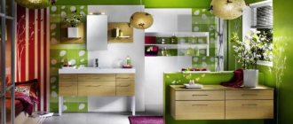
A bright apartment design can be achieved by decorating the ceiling. For this purpose, as a rule, tension fabrics are used. With this design, different colors are used, combining them in different ways. Surfaces can be matte or glossy, satin. Therefore, it turns out to create a unique design that attracts attention. Different shades on the ceiling also help solve the following problems:
- zone the space;
- highlight a separate part of the room so that it immediately attracts attention;
- visually expand the space, make the room more comfortable.
Another option for decorating the ceiling is to use coverings with photographs, images of nature, and the sky. This way you can make the interior unique. It is important to understand that when using different colors, it is important not to overdo it so that the space is harmonious and easy for visual perception.
Colored walls
Colored walls in the interior become bright accents. As a rule, two types of decorative coatings are combined. Make one or two walls bright, the others calmer. It is possible to combine wallpaper of similar shades, some of which have an ornament. You can do it in different ways, since modern manufacturers produce a sufficient amount of decorative materials. It is not at all difficult to implement even the most complex design idea in our time.
How to create bright accents in the interior?
We create stylish accents in the interior
The ability to use bright and original details allows you to create a stylish space in which you want to stay for a long time and admire it. Often we don’t know where to start, or we use too many decorative elements and colors; this overloads the interior and disrupts the unified style. Choosing and placing accents correctly in the interior is an art. And today we will touch on it, looking at the most interesting features and accents that can be safely used in the interior.
Color accents in the interior
Let's start with the most important thing: color in the interior. After all, before creating bright spots in the room, you need to decide on a general palette. The color accent in the interior is the decor, which is contrastingly different from the main color scheme of the room. For example, for a bedroom in white tones the accent will be a blue bedside rug and blue curtains, and for a rich green children's room the accent may be white upholstery of the chair and a blanket.
Such bright spots make the interior more pleasant and “alive”. At the same time, if there are a lot of such accents, the room will become colorful, and the effect of the accent will disappear, because all its charm lies in its moderate use.
The accent should be unique and not repetitive, so just a few details in the accent color are enough. Otherwise, the color will be “blurred” and become auxiliary.
In this interior, a warm yellow color, as an accent color, dilutes the cold color scheme of the walls, creating a feeling of warmth and comfort. Imagine what this same interior would look like if the bright yellow tint completely disappeared from it! Now you understand what a huge role minor, at first glance, accent details have.
Here are some more good and interesting examples.
Another important rule when combining colors in the interior and arranging color accents: do not confuse an accent color with an additional one. It should be a different color, and not a shade of the main one.
Now let's explain it more clearly. For example, you have a room in beige tones. To create an accent you need to choose green or purple color, it will be an accent color. And if you choose light brown, it will simply be a slightly darker shade, so brown in a beige room can only be complementary.
Here the main color is light beige, complemented by the dark brown color of the chairs and floor, and the accent color is blue.
In this case, shades of blue are used very effectively as accent colors, while the main color is white and the secondary color is light beige.
Now it will be easier for you to choose the color scheme for the room. You can just remember one simple rule that will help you not to make the interior monotonous and boring, but at the same time not to overdo it with an abundance of different shades.
The interior uses 3 colors in approximately the following proportion:
60% - main color;
30% - additional (secondary) color or shades of the primary color;
10% is an accent color.
Look how beautifully you can combine shades in the interior!
Where to place bright accents?
Accents are designed not only to diversify the colors of the room, but also to give the space personality and mood. They will tell you about your hobbies and interests, create a special atmosphere, inspire and delight you, and impress your guests. Therefore, only you can choose which objects and decorative elements can become leading in the interior ensemble of your home, and we can offer some tips and ideas in this regard.
It is very easy to create a noticeable and stylish contrast in the interior with the help of a bright accent wall. It is decorated in a contrasting color, which should be darker in relation to the main color of the walls. Use simple wall painting, wallpaper, decorative textured materials such as stone or Venetian plaster - let your imagination run wild!
Paintings for interior
Repainting a wall may seem like a drastic decision to you, especially if you have not been at the renovation stage for a long time and are not yet ready for global changes. There is another way to draw attention to a particular wall and create an accent. Of course, these are paintings!
Since ancient times, paintings in the interior have been considered a sign of taste and luxury, and only the aristocratic strata of society could afford them. To this day, paintings are an integral part of a stylish and beautiful interior, and thanks to modern technologies that significantly reduce the cost of products, everyone can please themselves with a painting on canvas in their room.
One large or several small decorative paintings in the same theme or color scheme will create the mood and transform the interior of the room. Complement them with a few more items in matching shades, and your accent ensemble is ready. Very simple and stylish! The painting will not only create color contrast, but will also stylistically emphasize your interior, be it colonial style, loft, classic or modern minimalism.
Looks luxurious, don't you agree?If you want to update your interior right now, then look at the Decoretto collection of paintings for the interior. Paintings on high-quality German canvas have a beautiful textured surface that is resistant to light and stains. You can choose and buy paintings on canvas of any size in the style of classical painting, abstractions, still lifes, landscapes, graphics, paintings with animals or children's paintings. By ordering a canvas painting from Decoretto, you will receive your order within 4 days. Together with Decoretto, creating your dream home is incredibly pleasant and easy!
Textiles in the interior
Many designers argue that textiles should be chosen at the same stage of renovation, when you choose the color of the walls and floor, and certainly not later than the choice of furniture, so the importance of textiles in the interior is difficult to overestimate. It is with its help that you can easily create any color accent. But even if you completed the renovation a long time ago, but want changes, updating the textiles will lead to a significant transformation of the entire interior.
Does the room seem monotonous to you? Bright bedspreads, blankets, pillows, curtains, richly colored carpets will fill it with comfort, brightness, and make it more positive. And for a room with dark floors, walls or furniture in which you do not have enough light, pastel-colored textiles are suitable: light, light curtains, lampshades for warm-colored lamps. White textiles will give the room freshness, harmony and spirituality, and soften the motley interior.
In a word, contrasting combinations most often look impressive and expensive, so this is a win-win option!
Do not forget that home textiles include not only pillows, carpets, upholstery or curtains: these include towels, tablecloths, hot pots, napkins, and bath curtains. All this can be used in the kitchen, in the bathroom, placed in a prominent place and combined with other interior elements. Attention to detail is very important when creating accent spots!
What else can become an accent?
As you already understood, in order to add bright colors and contrast to the interior, it is not at all necessary to renovate or necessarily change the color of the walls. Textiles, decorative wall decorations such as paintings, and the right color combination of all these elements will be sufficient. What other interior items can take on the role of accents and complement the ensemble? It can be anything you like: from soft toys to bright book bindings. For example, if you like to care for plants, then you can create accents in green tones, which are especially effective in bright Scandinavian-style interiors, as well as in loft or minimalist styles.
In the children's room, accents will be soft toys or colorful containers and boxes for them.
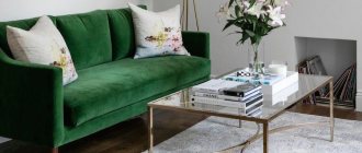
And as an accent for the living room, we suggest using a regular coffee table, which we decided to tell you about in more detail. Do you think that such an insignificant item in your living room or bedroom does not deserve attention at all? But professional interior designers and decorators are sure that a coffee table or coffee table can become the highlight of the room!
First, decide: what should decorate your table? Remember, there should be few items so that the surface is not cluttered. And ideally, they should match the color scheme of the accents that you have already planned to place in the room. Let these be things that you really like, give pleasant memories and inspiration.
Are you planning to decorate the sofa in the living room with dark beige textiles? Then let there be a vase, decorative balls and plates of the appropriate color on your table.
And your favorite books and magazines can be arranged in neat piles; it is desirable that the covers are bright and colorful and match the colors.
Look how harmoniously the book spines match the colorful pillows!
A “living” element or object, be it a small plant in a pot, a vase with fresh flowers, a few pine cones or an ikebana of twigs, will significantly refresh the surface of the coffee table.
Don't know how to complement the composition? Add a vase, glass, ceramic or metal dishes where you can place decorative balls, beads, stones or fruits.
Use the tray as a base to bring everything together for a finished look and the ability to quickly put items away when needed. This can be an ordinary kitchen tray, a wicker basket, or a ceramic dish.
Remember the rule of 3 colors: use two neutral light shades and one dark one, which will become an accent in the design of the table.
Try creating layers and playing with heights. Let books and magazines lie in piles, and small decorative objects will be placed on top of them. Don’t forget to place something tall next to it, for example a candle or a figurine, then the composition will be dynamic and harmonious.
Feel free to fantasize and don’t forget to update your table: you can add an unusual souvenir from your trip, a vintage camera, a jewelry box, a shell from the sea coast and other things dear to you.
Don't be afraid to experiment with contrasting combinations and bright accents! After all, creating the interior of your dreams is much easier than you could imagine!
Colored doors
Neutral colors in the interior can be combined with colored doors, which also attracts attention and makes the room bright and unusual. We are all accustomed to the fact that door leaves usually come in the colors of different types of wood or white.
But you can do something completely different and choose bright and unusual colored canvases. They can be combined with bright interiors and more. It is important to choose harmoniously combined tones to make the room comfortable to be in. Different colors of door panels are combined with light. Therefore, it’s not difficult to come up with an interior in unusual colors.
What is an accent wall and why is it needed?
Many people have heard about such a thing as an accent wall, but not everyone knows what it is and what it is needed for. First of all, it is used to designate a particular area, for example, highlighting a living room or dining room in a studio apartment. But often this technique is used to visually deepen the space or distract attention from any shortcomings of the room.
This is interesting: Pipe decor in the interior: original ideas (50 photos)
The best and winning color combinations
When decorating, it is important to consider the compatibility of different colors for walls and other surfaces. For example, all shades of beige can be diluted with red, orange, and purple tones. Gray color can be combined with blue, green, burgundy. Blue tones are in harmony with silver and bronze. There are many more color combinations, the use of which for the interior will help to decorate it in the best possible way.
It is not necessary to use two colors; you can choose three. It is important not to overdo it so that the room is easy to perceive and does not have a negative impact.
Bedroom
There is not much choice here; basically, the wall or part of it at the head of the bed is used as an accent wall. Wall paneling with wood panels also looks very nice in the bedroom. Take a look for yourself and appreciate the uniqueness and unusualness of this design.
And a few examples of how an accent wall looks in a hallway, a nursery, and how it can zone a spacious room. Notice how attractive it is when the pattern on it matches some decorative elements.
Let's splash colors!
It is known that even a small splash of bright color can enliven a picture, making the overall look more interesting, attractive, and effective. This technique works flawlessly for interiors, landscapes, and the external image of a person. For example, bright ties transform men in formal suits, and accent bags and scarves transform women in neutral outfits. Even one flowering flowerbed is enough to make the garden much more beautiful. By adding a few bright “spots”, we will bring a “spark of life” to the interior.
Placing bright accents in the interior is not as easy as it seems at first glance. Difficulties arise at the stage of selecting an accent color and determining its quantity. If there are a lot of color accents, the room will turn out to be overly bright. And the effect of accenting will be lost, since the accent color will “blur” in space and turn into an auxiliary one. If there are not enough accents, the desired result will not be achieved.
Split
A split complementary color scheme uses one color and two colors adjacent to its complementary colors. For example, one color is yellow, then two others will be selected from the blue palette. In this case, it is advisable to make a yellow accent.
Triadic color scheme
A triadic color scheme uses three completely opposite colors, making them quite difficult to combine. As an example, we can give this option: yellow, purple, blue-green. Blue-green is the most calming and neutral in this collection, so it can be the main color.
Blue and green are both cool colors, as is purple, so purple would be a better secondary color in this combination. Yellow is a warm color and will make a wonderful accent in this vibrant palette.
The Power of Color Psychology
First, let's look at the meaning of primary colors. This information is useful if you are going to mix colors for your website design.
- White is the color of perfection. It symbolizes purity. A blank board or piece of paper in white, where this color can be a symbol of creativity and innovation. White is a neutral color that will not spoil the design of the site.
- Black - has many good meanings: intelligence, strength, stability, professionalism. This is the color of luxury and sophistication. This is another classic shade along with white. It can be very useful when used for web design.
- Gray is the most neutral color, quite calm, and means stability. However, be careful when using it. Too much gray can look dull and monotonous. But a small accent in the form of gray will weaken the color scheme and make bright elements more noticeable.
- Orange is one of the most positive colors in general. It is the color of social, physical and mental stimulation and activity. It makes people think and communicate.
- Yellow is the color of the sun, so you don't need to explain how positive it is. Yellow color inspires new thoughts and original ideas. It usually does not act as a dominant color because it is so bright that it can blind readers.
Balancing on the accent line
“Remember, the smaller the number of
bright accents in the interior , the more noticeable they are, and therefore the more they attract attention, both to themselves and to everything that surrounds them”
Designers have classic parameters that look like a ratio that looks like this: 60:30:10. What do these numbers mean? The first indicator reflects the percentage of the primary color in the setting. The second one talks about the number of secondary shades. The third number indicates the proportion of bright accents in the interior. If the decor is monochrome, that is, in the absence of additional companion colors, the proportion of accent shades may increase.
in this interior, two paintings placed on both sides of the corner and being part of one image are a bright accent
It is often enough to add only one, but large and spectacular accent element to the decor to get the desired result. Such an element could be a colorful sofa, a section of wall or a magnificent chandelier. These original accents make the atmosphere in the room very impressive. The brain immediately draws analogies with a black cat with shocking emerald eyes or a snow-white winter forest with a rowan bush blushing against its background.
Remember, the smaller the number of bright accents in the interior, the more noticeable they are, and therefore the more they attract attention, both to themselves and to everything that surrounds them.
chandeliers attract attention not only with their futuristic design, but also with their color
How to choose the right color?
Before placing bright accents in the interior, you need to decide on a color. It is necessary to choose not a shade from the range already presented in the interior, but a color. The final result depends on several options:
- Warm and cold palette. If the room is decorated primarily in warm colors (beige, sand, orange, peach, brown), then a cool shade should be chosen as a rich accent. This will emphasize the warmth of the room and cool the space a little. And, conversely, a cool-colored interior will look advantageous if it is diluted with warm-colored items.
- Using a “complementary” scheme. Using this method of transforming the interior, the room can be powerfully charged with strong energy. This scheme is relevant for rooms where a large number of people accumulate. These rooms include living rooms, kitchens, and playrooms. Shades that are opposite each other are used as complementary colors. The accent color is the one that is complementary to the main color scheme. For example, if the room is made in orange, then the blue and light blue palette should act as bright accents.
- Using an “analog” circuit. This option is perfect for quiet rooms where harmony and comfort reign. In order to make this idea a reality, you need to give preference to a palette that is located next to the primary and secondary colors. If the room is made in blue, then it is advisable to choose green shades. The interior of a peach color scheme can be transformed using a berry color scheme.
- Neutral interior and accents. If the interior is made in a restrained color scheme, then you can use any palette. If desired, you can use several colors at once to create bright spots.
Choosing an accent color
Accent in the interior are those objects or elements that have colors different from the background colors. In white and blue decor, the role of color accents can be played by orange furniture, accessories, and textiles. If this space is filled with light blue objects, then they will only become a complement to the main color. For lilac-beige rooms, the accent will be greenery. Lavender, cream and purple will remain additional shades. The decoration of a purely beige interior will be pink, and an additional spectrum will be a light brown palette. And there are many such options. It is important to learn how to combine them correctly.
a multi-colored panel at the head of the bed and a non-standard shelf are bright decorative elements in the bedroom interior
- Warm-cold option .
If you want to emphasize the warmth of the design of a room made in “sultry” colors (yellow, peach, orange, apricot, terracotta), you should use colors representing a cool palette as bright accents in the interior. In this case, you will not only complete the task, but also somewhat cool down the “ardor” of the situation. In a cool and gloomy atmosphere, warm shades will be indispensable:
a) honey;
b) orange;
c) yellow;
d) red.
With this proximity you will make the perception of the coldness of the decor more comfortable.
wood with shelves - a bright accent in a children's room
- Option "addition".
This technique helps fill the interior with vitality, energy, and play of shades. For emphasis, with this approach, a tone is used that complements the main or secondary interior color. For example, in an orange decor, additions should be in blue or blue shades, and vice versa. In this version, red and purple elements are added to the green room. The scheme in question is quite complex in emotional perception, so similar accent colors are recommended for use in the interior of dining rooms, playrooms, and living rooms, that is, where the family does not spend much time.
- Option "analogy".
This scheme will appeal to those who love a calm environment. In this case, as an accent inclusion, choose a color that is as close as possible in the color wheel to the main background of the decor or secondary shades of the decor. It is good to fill a blue room with green or light purple (lavender, lilac) accessories or elements. The peach interior will be refreshed with red and berry colors. Since this accent option brings with it an atmosphere of peace and harmony, it will be in demand in bedrooms, relaxation areas, and the library.
panel with figured carved elements in the living room interior
- Accent colors for a neutral interior.
Neutral decors include decors made in:
– beige,
– black,
– gray,
– white,
- brown tones.
decorating an accent wall in a children's room
Looking at this list ,
it becomes clear that almost any of the existing colors
can become a bright accent in such an interior . Moreover, there can be several of them in the decor at once. In pale, overly light interiors, it is correct to add accent elements in a wide variety of colors. In this case, you do not need to particularly consider what place the colors you choose occupy on the color wheel relative to each other. The only thing that needs to be monitored is that the selected shades are in harmony in terms of intensity, depth of color and its brightness. Pale blue will look good framed by pink, pistachio, lilac, but in the company of burgundy, jade and deep purple it will simply get lost.
yellow cushions and table lamps as bright accessories in a gray living room