Advantages of blue color in the interior
The blue color and all its shades are quite bright and saturated colors that attract the viewer’s attention. Among practicing psychologists, the direct influence of color combinations on a person’s psychological state, his mood and performance is widely known.
There are also entire areas of psychological science that describe the influence of certain colors on a person’s appetite. The advantages of using blue color and its tones include the following aspects:
- Kitchens in blue have a calming effect on the nervous system.
- Most shades promote appetite and improve the functioning of the digestive system. The course of chromotherapy is based on these properties.
- In practical terms, blue tones combined with neutral colors give the kitchen and dining area some color, style and chic. Dark blue kitchens look nice in any type of layout, they are beautiful and quite practical: stains of grease and soot are hardly noticeable on the surface of the walls, floors and facades.
A kitchen in blue tones is a representative of “cold” interior styles, and therefore requires the simultaneous use of “warm” curtains, floors, and ceilings. This combination (for example, a white and blue kitchen) allows you to give the room a kind of subtle contrast.
What to paint blue?
When you hear the phrase “blue kitchen,” the first thing that pops into your head is blue furniture or walls. These are not the only options that can be decorated with this color, although they are the most popular.
Kitchen set
A blue set will definitely attract all the attention in the kitchen, so it is better not to duplicate this tone in the room or choose very small decorative items to match the tone, for example, a vase or dishes. Antique metal handles look best on such furniture, for example, from:
- bronze;
- become;
- copper
Chrome or nickel plated surfaces are also suitable. Not everyone will decide to buy a completely blue set, so there are also analogues on the market - for example, a white or beige top and a blue bottom.
It is important to think about the apron - it should be combined with the blue kitchen. The following tones are perfect for this:
- grey;
- white;
- cream;
- brown;
- yellowish.
It is worth paying attention to the material from which the set is made. The options are completely different.
Materials for blue facades
The kitchen is a room with rapidly changing conditions: temperature and humidity, so you need to choose a high-quality set so that it is not afraid of all these changes, but endures them with dignity. The main thing that is responsible for quality in a headset is the material. Let's consider different options for blue facades:
- MDF is a popular and budget option, which is compressed wood shavings. It is not impeccably durable, but will last 10–20 years;
- array - environmentally friendly, expensive and beautiful. The disadvantages include susceptibility to changes in temperature and humidity, which is very out of place in the kitchen;
- plastic - the set is not completely made of plastic, but is simply covered with it. The base can be made of MDF or chipboard. This option can also be considered a budget option; the bonus is resistance to damage;
- Laminated chipboard is another budget option. Only laminated chipboard is not environmentally friendly, as well as good stability and service life. Modular options are often found. It will be appropriate only in a rented apartment or for rare use in the country.
Headset shape
When choosing a headset, it is important to focus not only on its material or color, but also on its shape, because a suitable option will greatly simplify the life of the owner. There are not many options:
- linear (single-row, straight) - suitable for even the smallest kitchen, the set is installed only along one wall;
- double-row (parallel) - an excellent solution for a wide kitchen, the work areas are located opposite each other. You might want to think about a layout without top drawers. There is one minus - there is often not enough space for a dining area;
- corner is the most versatile option for arranging furniture. It turns out to be a very convenient working triangle; by using the angle, a lot of storage space is created;
- letter P - characterized by a huge and comfortable work area, but most often the dining area is moved to another room. One of the sides of the letter P can be made in the form of a bar counter and act as a partition in the kitchen-living room;
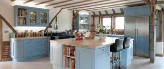
- island - requires a very spacious kitchen. You can also move a work area to the island, for example, an oven, a sink, and also arrange dinner gatherings if the family is not very large.
Matte or glossy
The latest kitchen design trends say that glossy finishes are, of course, better. But such a decision has its negative and positive sides.
They look luxurious and stylish, reflect light and visually enlarge the room. But at the same time, dust, drops of grease, and scratches become much more noticeable than on a matte surface. Dark glossy facades are especially guilty of this, since imperfections on light ones are not so noticeable.
Matte surfaces are not so demanding to care for, and all kinds of dents and dust particles are much less visible, so the fresh look will last longer. But aesthetically they are often inferior to gloss.
We wrote more about which kitchen to choose, matte or glossy, here >>>
Tabletop and apron
Another design option in blue is the work area. This can be a separate apron or tabletop, or both items at once.
In any case, the work area should be in harmony with the rest of the room’s decoration - walls, ceiling, floor, and kitchen unit. Since the work area does not take up as much space as the set, its blue tone can be duplicated in curtains or a dining area.
Often the countertop and apron are made of the same material. This creates a very harmonious atmosphere, especially with a corner layout.
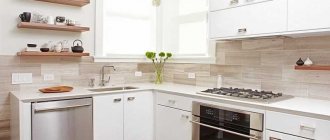
The classic combination of a white kitchen and a blue countertop. Pay attention to the fittings and small inserts in the apron
Materials for the blue work area
The blue color greatly limits the number of materials suitable for finishing the work area. For example, first of all you will have to abandon natural and artificial stone, as well as untreated solids. But there are still many options to choose from.
| MDF and chipboard | These panels are wood chips, just processed differently. In this regard, these options cannot be called durable. In addition, due to contact with water, they can swell, so such surfaces should be treated very carefully. |
| Ceramics | Ceramics have long since taken root on an apron, and on a countertop it will look very original. This is an excellent material - resistant to moisture and temperature. The only negative is the seams. They will become clogged with grease, dust and dirt, and over time, fungus may even appear. |
| Steel | A very practical material - durable, easy to care for and resistant to high temperatures, water and chemicals. It’s not for nothing that restaurant kitchens use steel for everything. But the kitchen in the apartment is not a service space, and the style of steel is very difficult to fit into the interior. Most often, comfort disappears instantly. |
| Strained glass | Another practical option - it does not absorb dirt and grease, and is not afraid of water and temperature. It is more suitable for an apron (more details in this article), since it is afraid of strong impacts and falls. But there are also glass countertops. |
Notice how beautiful it looks, not the typical white boar, but the blue one. Epoxy grout will keep the seams in their original condition for a long time
Floor
Blue flooring is a rare solution in the kitchen. If it does occur, it is most often about dark tones. Still, for a kitchen floor, practicality comes first, and only then beauty.
For this reason, the leading position in flooring is occupied by ceramic tiles or porcelain stoneware. In addition, they are easy to choose the desired shade. Finding blue laminate or linoleum is much more difficult.
An innovation in flooring – self-leveling polymer floors – is also gaining popularity. They can be chosen in absolutely any shade, since the material is tinted like paint. You can put any image on top - even a photo of your favorite cat.
If we talk about color solutions, there is a universal rule - the floor should be at least a shade darker than the walls.
Walls
If you are a little afraid of painting all the walls blue, you can “practice” on one, making it an accent color. This is a very trendy solution that will always look stylish.
It is better to make the remaining walls light - monochrome or with an unobtrusive blue or light blue pattern. Monochrome blue walls are not suitable for small rooms - it will feel like an aquarium.
You should only choose vinyl or non-woven wallpaper, since paper ones will not be able to withstand the complex kitchen atmosphere. Paintable wallpaper is also popular - an excellent solution that will allow you to quickly update your interior.
If the kitchen is small, then you can take a closer look at photo wallpapers depicting a landscape or space. It is important to choose a photo with a deep perspective - this will make the kitchen seem larger.
How to choose wallpaper?
It would be logical to choose wallpaper based on the intended style of the kitchen:
- a light floral pattern will decorate the interior in Provence and shabby chic style;
- “red brick” wallpaper would be appropriate in a room in a loft or country style;
- Plain painted options are perfect for a classic or, conversely, modern kitchen.
The main thing is to remember the rule: the smaller the kitchen, the lighter the walls.
Curtains
Blue curtains will be a real lifesaver in cases where you want to add bright colors to the kitchen, but there is a fear of going overboard, for example, in a white kitchen.
If the window is small or standard, then you should take a closer look at light, flowing fabrics that can let light through. The only exception is the sunny side: it needs dense material that could save the room from the sweltering heat.
As for fabrics, it is better to take a closer look at mixed options, as they are considered the most practical, but linen or organza will also work. As for the types of curtains, you can limit yourself to ordinary curtains, Roman or roller blinds, or blinds.
Disadvantages of using blue color
Despite all the obvious advantages, the design of a blue kitchen is quite rich, which immediately catches the eye.
When choosing materials for finishing a kitchen, you should carefully evaluate the surface texture of tiles, panels, and furniture facades. A blue kitchen in the interior in combination with a corrugated coating can irritate the human visual system.
Another difficulty is the need for a special approach to the selection of finishing materials and furniture.
Color and style
The Empire style was unofficially attached to the sky-colored kitchen. And everything comes from history. After all, in the Empire era it was fashionable to whitewash walls with the addition of blue. Empire style has sunk into oblivion, but blue has remained in the design of our kitchens for a long time. Today, blue cuisine is the exception rather than the rule. But with the right design, a cornflower blue kitchen will fit into any style.
- Classical. Warm shades of blue. A few wooden attributes.
- High tech. Cold range. Metal and glass furniture.
- Modern. Light blue shade. A few bright accents.
- Provence. Blue-green color scheme. Many attributes that add comfort.
- Country. Checkered blue curtains and tablecloths.
See how to create a beautiful blue kitchen in your apartment:
View our photo selection of using blue, cyan and turquoise in the kitchen:
The blue shade of the kitchen will appeal to extravagant, but at the same time open and sociable natures. In the indigo kitchen they will talk about life, indulge in their thoughts, and relax. A blue kitchen encourages peace, tranquility and relaxation after hard everyday life.
We also recommend that you familiarize yourself with design ideas for the kitchen in this material.
Gray and white kitchen: graphite color in the interior
Which kitchen color to choose: beautiful and fashionable sets - the latest trends
Apple color in the kitchen interior: combinations and design solutions
Black and beige kitchen: combination with red in interior design
Turquoise shades
They are distinguished by a softer perception for the viewer, beautifully changing their shade depending on the angle of incidence of light rays, the intensity of natural and artificial lighting.
Blue kitchen finishing options
To decorate a kitchen in a blue style today, any possible variations are used:
- Finishing the kitchen apron.
- Purchasing (or making to order) a kitchen set decorated in a blue design.
- Using blue curtains or curtains.
- Finishing wall panels.
- Self-leveling floors using patterns in blue tones.
All presented options allow you to give your kitchen a unique style. Sometimes there are combinations of several design ideas, but there is always a risk of making the room uncomfortable and conspicuous.
Companion colors
The variety of cold and warm shades of blue is amazing. Just look at the color wheel that professional designers use:
- turquoise, aquamarine, cyan are adjacent to green;
- sapphire, ultramarine, cobalt, azure, blue are in the center of the blue sector;
- periwinkle, cornflower blue, lilac, lavender, amethyst, violet, indigo already border on the red color palette.
Undoubtedly, each of these shades is good in its own way. But, as noted above, monochrome is unlikely to decorate a blue kitchen. Therefore, it is customary to combine this color in the interior with other, usually warm, colors.
The following combinations are considered the most winning.
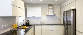
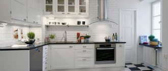
- Blue and white kitchen. An almost win-win and easily implemented tandem, evoking memories of the sea. Some “frostiness” of such an interior is easily smoothed out by interspersing a small amount of warm shades, for example, milky or sandy.
- Blue-orange (yellow) kitchen. A time-tested, impeccable union in which the coldness of blue is balanced by the cheerfulness of a sunny palette.
- Blue-beige (sand) kitchen. This duet of warm blue and “natural” shades of brown is perfect for decorating cozy country-style kitchens.
- Blue-gray kitchen. The interior can turn out to be restrained and elegant if you correctly combine the main shades (pale lilac with pearl, lavender with silver, deep blue with classic gray) and complement them with white or light beige.
- Blue-green kitchen. A very harmonious combination. A competent addition of blue with light tones of green shades will bring the breath of nature itself into the room.
- Blue and red kitchen. A bright and bold solution, which will most likely be successful if one of the colors openly dominates, and the second only assists it.
Installing a blue headset
Kitchens with blue facades are very popular today. Furniture stores (for example, IKEA and Leroy) and custom-made furniture companies offer their customers a huge selection of ready-made projects.
Any furniture facade can be decorated in one shade of blue. The blue kitchen-living room looks very original, the furniture in which is presented in the form of interesting islands.
For such a furniture complex, surfaces for contrast are especially carefully selected: these can be warm cream and mint sofas, shelving, as well as a bar counter made of artificial stone with a pearlescent sheen.
Advantages and disadvantages of blue color
When choosing a blue color to decorate your kitchen, you need to be careful. In order not to make a mistake with the shade, it is important to study all the pros and cons of a sky-colored kitchen.
- Kitchen in blue – blue is a shade of cleanliness and coolness.
- The positive effect of the blue tint on the human psyche.
- Restoring normal pulse and blood pressure.
- Reducing symptoms of depression, blues, stress.
- The effect of relaxation after a hard day.
- Visually, the azure shade expands the boundaries of the room.
- This interior option is bold and creative.
The cornflower blue hue of the kitchen reduces appetite. This solution is ideal for people who are on a diet and need to lose extra pounds.
There are also factors in which indigo cuisine is strictly contraindicated.
- When losing weight, azure will only be a plus. But in the absence of weight problems, you will simply experience decreased appetite for yourself, family members, and guests.
- If there is a lack of sunlight in the room, a blue kitchen will only make the situation worse. This shade will give the kitchen even more coolness and absorb the remaining light.
- If you are the happy owner of a large kitchen, then turquoise is not your color. Expanding the space of an already voluminous room, it will turn the kitchen into an empty room. The interior will not look complete.
- If the design of your kitchen is strict, laconic, devoid of accessories, then the worst choice of color for it will be blue. It will only enhance the impression, making the room more official than homey.
Do not give preference to a too dark shade of blue. Such colors have a depressing effect on the psyche. There should be a positive aura in the room where the whole family gathers.
Curtains in the kitchen interior
Another element of any interior that allows you to highlight design features is blue curtains for the kitchen. You can choose the shape, size, and cut style at your discretion:
- Traditional short curtains that won't get dirty on the first day.
- Long curtains to the floor.
- Wide canvases for the kitchen and dining room with a bay window. Most often, to decorate such beautiful rooms, elegant Japanese curtains with a corrugated pattern on the surface are chosen or sewn.
- Roman blinds, paper or textile fabric for which can also be decorated in blue tones.
Curtains, regardless of their style and cut, favorably accentuate attention and highlight the smallest details of the interior.
Cons of blue color
Despite the undeniable advantages of blue, we should not forget about the dangers it poses.
Firstly, some of its shades, too dark and cold, can create not a peaceful, but a depressing and depressive environment in the kitchen.
Secondly, blue color has been proven to reduce appetite. Needless to say, the characteristic is not very suitable for using such colors in the kitchen. Unless you set a goal to lose a couple of extra pounds.
Thirdly, the passion for blue in poorly lit rooms will also play a disservice. Especially those facing north. In this case, the kitchen is in danger of turning into a gloomy and uncomfortable corner of your home.
Fourthly, you need to use blue very carefully in large kitchens, since it, while visually adding space, will make them simply endless and therefore somewhat empty.
Fifthly, it is better to abandon monochrome blue interiors in the kitchen, which are overly strict and lifeless. From the same point of view, when decorating large surfaces, it is advisable to use warmer or neutral shades, and save cool ones for bright accents.
Interior finishing of wall panels
You can very advantageously decorate your kitchen in cornflower blue or cobalt tones by selecting materials for the interior decoration of wall panels. The following variations can be chosen as the main finishing material:
- Liquid wallpaper that lies evenly on the underlying surface, giving the walls a special gloss and texture. The peculiarity of using such a coating is the ability to choose the shade you like.
- Washable vinyl wallpaper. Such coatings are absolutely not afraid of moisture and synthetic detergents.
- Ceramic tiles, wood panels or chipboard panels can also be used for interior wall decoration.
Blue walls in the kitchen are best combined with a set of natural walnut or beige colors. A combination of a white kitchen with blue wallpaper will look great.
Characteristics and features of blue color
Most people recognize this color as calming and peaceful, but when it comes to its use in the interior, the impressions can be completely different:
- Too many rich and bright blue tones can be annoying. It is important to maintain a balance of light and dark, that is, the thicker and darker the blue, the more light areas and details there should be in the interior. Imagine a small blue-black monochrome kitchen with bulky furniture in the same shades. Gloomy place, isn't it?
- Blue needs a partner. At the same time, the color of the sky can act as a primary, additional, or simply decorative color - it is very universal. The ideal proportions are as follows - 60% primary color, 30% additional and 10% decor.
- Blue needs good lighting. During the day, a powerful stream of sunlight enters the kitchen, so it is better to leave only a thin curtain on the windows or leave it completely “naked”. As soon as it gets dark, numerous lamps take the initiative - chandeliers, sconces, floor lamps, spotlights, and so on.
- Blue actively affects the temperature of the room. If it brings coolness on a hot day, then in winter you can freeze, so it is necessary to add warm colors to the interior.
Blue dulls the feeling of hunger, so a person will eat less. In addition, the taste of the dishes may be distorted, but there is nothing harmful in this - especially if the owners have long wanted to lose weight. For better results, you should also buy blue dishes.
Advantages and disadvantages
Although blue is considered a universal color, it is also complex. It has a lot of positive aspects, but there are also negative ones. Before choosing it for your kitchen, you should familiarize yourself with all its characteristics.
Reasons to say yes to blue include:
- calming effect if applied in the right amount;
- decreased blood pressure;
- beneficial effect on intellectual work;
- creating the effect of rigor and nobility;
- creating a fresh atmosphere;
- visual change of the room - for example, you can narrow it and lengthen it;
- Great for almost any style, but especially for Scandinavian, Mediterranean, Art Deco and Empire.
But there are also negative sides to this solution:
- a decrease in appetite is good only for those who want to lose weight, but children with their growing bodies do not need such an effect;
- must be used with caution on northern windows to prevent the creation of an “icy” room - be sure to add warm beige, yellow or orange shades;
- if there is little natural light, a chamber effect may appear;
- if the kitchen is too spacious, then blue can make it even larger - a feeling of emptiness will appear, and the comfort will disappear.
Some disadvantages cannot be offset by all the advantages, so before starting to renovate and decorate the kitchen, you should think carefully.
Self-leveling floors with blue ornaments
A very interesting idea for decorating a kitchen or dining area would be to fill the floor with a blue pattern. As a rule, epoxy resin with the addition of pigment dyes is used as the main coating.
The obvious advantages of using self-leveling flooring include the unique ability to combine colors, creating amazingly beautiful combinations, shades and compositions.
Using special accessories and paints, it is possible to give the flooring a 3D effect of sufficient depth. Floors in aqua blue or stylish cobalt are best combined with white or yellow furniture and walls in a neutral shade (cream, buttery, light beige).
How much blue should there be in the kitchen?
To avoid the disadvantages of blue listed above, it is better to use it not as the main color, but as an accent, which will give the same freshness that was mentioned as an advantage of this color.
Blue paints can be used in the following parts:
- Dishes, curtains, kitchen apron or facade set.
- One of the walls is what will contribute to the visual elongation of the room.
- Dark blue is also great for countertops.
If you decide to use blue as the main color in the kitchen, then it is better to combine it with a warm palette, which will compensate for some of the disadvantages. Let's talk in more detail about possible color combinations when decorating a kitchen.
Optimal color combinations
A kitchen decorated in cornflower blue or rich cobalt should have neutral tones in the interior. The possible options depend on the type of layout and the use of certain details of the kitchen furnishings.
The most successful color compositions are deservedly recognized:
Blue-gray kitchen, which is used in such interior styles as Scandinavian, strict minimalism and modern high-tech. Sometimes such combinations are found in the classical direction of design.
The pleasant combination of indigo with steel gray colors pleases the eye without irritating a person even after a long stay in the room.
Yellow-blue kitchen in the interior. Another great option for practical use. Yellow shades of varying degrees of intensity combine very optimally with rich cobalt paints. You can find ready-made kitchens finished in similar color combinations in large furniture stores (for example, IKEA).
Combinations of mint and cornflower blue, azure wave and beige wall decoration are very progressive and bold. Such ideas are quite creative, but they are popular among designers due to their special flavor.
When is blue beyond competition?
Digressing a little from the main topic, let us remember how the color blue affects the human psyche. The contemplation of blue calms, while the pulse and blood pressure decrease. Being in a room made in ultramarine tones is useful for depression and stress.
Thus, the blue color in the kitchen interior is suitable for those people who are busy with intense work all day. When they come home, they will be able to relax with a cup of tea surrounded by cornflower blue.
In addition to calming, blue helps reduce appetite. If a person has a goal to lose weight, an indigo kitchen is what they need.
When the windows of the room face the sunny side, the burning rays stay in this room all day, heating it and making a. The specificity of the kitchen is that it often gets hot there during the cooking process.
These two processes turn it into a desert. In this case, a cool blue color would be the ideal solution.
Azure is capable of expanding boundaries, so it is perfect as a color scheme for a small kitchen.
For housewives who strive for cleanliness in everything, the color of the sea will be an excellent solution for the kitchen. Associated with the element of water, it will create the impression of a wet cleaning that has just been done.
Many people choose a blue tone for the bathroom, living room, bedroom and children's room, but not for the kitchen. Be the first person you know whose kitchen will be transformed by the use of a non-standard color. By choosing the right shades and placing accents in the design, you can become the owner of a blue kitchen that everyone will envy!
Lighting ideas
The design of the kitchen area, made in blue tones, requires a special approach to lighting. Excellent options for arranging artificial light sources are:
- Built-in spotlights. Miniature lamps are installed along the contour of the kitchen unit, apron, along the lines of decorative arches, at the entrance. The minimum amount of light allows you to highlight the colors of all surfaces.
- Wall sconces, which are equipped with frosted lampshades. Such accessories gently diffuse the incoming light, emphasizing the interior details of the blue kitchen.
Today, furniture manufacturers, including lighting fixtures, offer their customers a huge range of finished products, lamps of various shapes, sizes, and designs.
The peculiarity of the lighting design of a cobalt kitchen is the need to use exclusively soft daylight, which contrasts with the cold shades of blue.
When blue kitchen is contraindicated
There are several cases when the turquoise color in the interior of this room will look out of place. Even if it is your favorite color, give up on the idea of an all-blue kitchen. Give preference to another or use your favorite color only in small accents.
When choosing a shade of blue, you should take a close look at it. Does it really bring peace? Dark colors can have a depressing effect on a person, which is completely inappropriate in a room where members of the whole family gather for lunch or dinner.
If a person is on a diet, a blue kitchen design (photo below) will play the right role in curbing appetite. However, if there are no problems with weight, there is no need to get carried away with this tone. Both you and your guests will experience decreased appetite.
Blue color will absorb light in a room whose windows face north, or if the room located on the ground floor is darkened by trees on the street side. In this case, the blue tint gives extra, unnecessary coolness.
In the design of spacious kitchens, it is better not to use blue in large quantities. By expanding the space, it will make the room empty and its image unfinished.
Photographs of many interiors show that blue color will make austere kitchens, devoid of comfort and pleasant details, even more official and uncomfortable. In this case, it is better to get by with aqua-colored accessories. You can also dilute the cold azure with warm tones.
Check out more expert advice: