In which interior styles to use
Copper, brick, honey, carrot and other shades are suitable for interior decoration in the following styles:
- Loft;
- Vanguard;
- High tech;
- Country;
- Minimalism;
- East style.
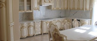
Classic, Rococo, and Empire styles do not like orange.
Orange room: finishing elements
Depending on the interior, the purpose of the room and the preferences of the residents, orange shades can be included in various types of decoration or decor.
Walls, floor, ceiling
The walls in the room can be decorated with wallpaper, plaster, brickwork or paint. It is not necessary to use a plain orange coating; there are options for creating a more original interior. For example, you can stick photo wallpaper or companion wallpaper, add interesting interior stickers, or adopt unusual artistic techniques for painting walls. The kitchen apron can be laid out with orange tiles, but only on the condition that orange is not found in the color of the set or is not dominant.
Self-leveling orange floors are an original solution. Most often they are introduced into interiors in retro, vintage, and modern styles. You can use tiles with an orange pattern in the bathroom and kitchen, and beautiful carpets in the living room. Orange ceilings are rare in residential homes, although they will definitely make the room memorable. It is better to decorate the ceiling in a high room in this way so as not to create a pressing effect.
Orange furniture
A sofa in a rich fruity color is sure to become the object of everyone's attention in the living room, clearly defining the seating area and separating it from the rest of the room. It would be best if the sofa is made of velvet, thick fabric, or leather. The color of armchairs and chairs can be combined with the tone of the sofa, or these pieces of furniture become independent accents in the room.
Shabby chic, country, and oriental styles often use bright cabinets, including antique cabinets. Their surfaces can be glossy or matte, with mirror inserts or with pieces of translucent plastic. The orange color of a cabinet or chest of drawers can have both facades and separate shelves and drawers. An orange-colored bed is a rare occurrence; it is much easier to decorate it in this rich shade with the help of bed linen or a bedspread.
Accents in the interior
Accent elements are designed to create the mood in the room and enhance the style of the interior. Here are the main furnishings that can be orange and give the room a finished look:
- paintings;
- curtains;
- unusual curtains;
- pillows;
- rugs;
- photo frames
In which rooms is orange appropriate?
This color suits any room:
- Orange color is often used in the kitchen interior to make the environment more homely, warm, and cozy.
- The bathroom, decorated in orange tones, energizes and invigorates. A good option for those who need an extra boost in the morning to wake up. Tangerine, pumpkin, and peach shades are a common choice for children's rooms. The color of joy, carelessness and irrepressible energy comes in handy here.
- You can use orange color in the interior of the living room to create a comfortable homely atmosphere, conducive to long gatherings and communication.
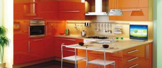
Features of an orange kitchen in the interior
Orange color has a beneficial effect on the human psyche and his condition in general. It has been scientifically proven that it prevents a person from becoming depressed and makes the emotional background more stable. The kitchen in the house is one of the best places to use it.
Color characteristics
When choosing a design with orange color, you should consider its features:
- in any shade it looks sunny and looks best on the north side;
- if you decorate the entire kitchen in this color, it will look overloaded, so it is better to choose one thing (curtains, facades, walls, etc.);
- it visually adjusts the layout, that is, wallpaper in this color, for example, can visually expand the room;
- suitable for people who suffer from indecision and apathy, as it dampens excessive emotionality and indifference;
- the orange tint causes appetite, so it is not suitable for those who are on a diet;
- not suitable for people prone to excessive excitability;
- stimulates intellectual and physical abilities, reveals the spiritual side of a person.
Based on this, it is worth understanding whether this color is suitable or whether it is better to choose another option.
Pros and cons of this color scheme
Classic Color Combination
Orange kitchen is a generally cheerful color that most people associate with warmth and summer. However, it is not suitable for everyone
To better understand this issue, you should pay attention to its pros and cons
The advantage of this solution is, first of all, comfort.
- Even on the coldest and hottest days the apartment will feel warm. Such a kitchen will charge you with energy and vivacity.
- Orange, on the one hand, is very bright, but on the other hand, it does not excite the nervous system as much as, for example, red, and causes a feeling of peace rather than anxiety.
However, this color scheme can quickly get boring and this is its main drawback. It is worth considering this when choosing furniture. Perhaps it needs to be diluted with something calmer and more universal. Also, orange color will be inappropriate in a small Khrushchev-era kitchen, as it visually greatly burdens the room.
If the sun shines through the windows most of the day, then the eyes may hurt from an excess of bright light.
Effectively orange combines with elements made of metal, plastic or glass. This is especially true for minimalism or hi-tech style.
Orange as a main color or just an accent
Orange accent on the apron
If orange tones are chosen as the main color, then when choosing a kitchen, first of all you should pay attention to what kind of atmosphere reigns in the kitchen throughout the day
- If it’s mostly shadow, then you can safely choose rich tones.
- If the kitchen gets sunlight all day, then soft shades, such as peach, are better.
- When a bright tone is chosen, it is better to dilute it with something calmer, otherwise the kitchen will look aggressive. For example, make a bright apron.
For a small kitchen, it is better to immediately choose softer shades. Moreover, they should be diluted with light walls, curtains or other elements. This combination will look light and at the same time bright.
The refrigerator, stove and other appliances in such an interior can be white, black, or chrome.
For those who like bright details, but at the same time discreet, a suitable option is to simply focus on neutral shades. This could be a tabletop, a chandelier, decorative elements, etc. An interesting solution could be appliances in orange shades.
A universal option would be bright curtains or blinds. It will not look colorful, but will create a certain mood.
Typical mistakes when working with color
Despite the positivity it emits, orange can cause discomfort if used incorrectly. Avoid the following mistakes:
You don't need too much orange, especially small objects and details. This color attracts attention, and if present everywhere, it creates a feeling of “accent overload.”
In sunny and hot rooms it is better to use cool shades: the orange palette will only “raise the temperature”, which can cause discomfort in the warm months of the year.
For small rooms, only light colors are suitable: carrot, brick or copper can visually “eat up” the meters in the room.
The only thing worse than the above is choosing the wrong color combination. For everything to work out, remember what colors orange goes with in the interior. Let's look at the 5 most successful combinations.
With white
White is too calm compared to orange, but when two colors coexist in the same space, the result is a rich, fresh and expressive interior.
It doesn’t matter what is orange and what is white – furniture or walls. This combination is suitable for a bathroom, minimalist kitchen, or a teenager’s room.
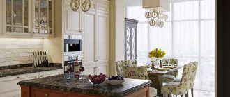
Kitchen in orange colors - ideas and secrets of proper design
White kitchen cabinets look fabulous with orange accents. Brilliant orange and white kitchen units in a modern style can be combined with all neutral colors and brown shades of natural wood. Paint and wall tiles, wood laminate or antique wood create beautiful color schemes for modern designs.
Wallpaper patterns and wall tiles in shades of orange give a fresh and warm look to modern white kitchens. And accent colors, kitchen curtains, floor mats, tableware or small decorations in this vibrant color are perfect for filling gaps and adding interest to a modern kitchen design.
Deep orange color schemes feel relaxing and welcoming. They are perfect for country kitchen designs, which have a charming, rustic feel with solid wood beamed ceilings, wooden cabinetry and ceramic kitchenware.
Adding blue accessories and accents harmonize color schemes beautifully. Mediterranean hand-painted ceramics and unique tapestries will highlight the interior and create spectacular decor in a country house or simply in Mediterranean style.
With green
At first glance, the green-orange interior is associated with the holiday and lifts your spirits. But of course, this is a “New Year classic” - tangerines and a Christmas tree.
The combination is very “natural”, unobtrusive, cozy, and therefore ideal for decorating a living room or nursery.
Combinations with other colors
When choosing companions for orange, you need to be careful, because not all shades are suitable for it. There are those colors that cause too extravagant combinations or get lost against the orange background.
Black
The combination of black and orange is suitable for daring, self-confident people; it turns out brutal and even a little aggressive. The orange color will look even brighter, which is not always appropriate. In a living room, it is better to dilute this combination with white, soft pink, and beige shades.
White
This color is ideal as a pair for orange, emphasizes it, while softening itself and no longer looks cold. Orange and white will look best in the kitchen, living room, and bathroom.
Green
Green, like orange, is found in nature, and the combination of the two will resemble a fruit basket or tangerine tree, as well as being associated with the holidays. It is best to choose warm, soft shades of green so that it does not contradict the warmth of the orange tone.
Yellow
The combination of bright orange and delicate yellow colors is ideal for lovers of rich, cheerful interiors. This palette will bring summer notes, remind you of sunny days and bring you back to a carefree childhood.
Blue
Different shades of deep blue have a positive effect on a person’s emotional state, symbolizing the sea and sky. When combined with orange they create an attractive duo. However, bright blue tones should be used sparingly, as accents, as they are quite dark and can cause a depressive mood.
Blue color in combination with orange will remind you of summer with its clear, cloudless sky. Such a “natural” tandem will perfectly form the basis for the interior of a nursery, living room or bedroom, especially if orange is also not too bright, but belongs to a light color scheme.
Beige
By its nature, beige color is very calm, so it helps to balance the richness, energy of orange, and reduce its “fieryness.” A good option would be a room in which the wallpaper and paint on the walls are beige, and the furniture or textiles are orange.
Grey
The duet of orange and gray can be considered successful, since the achromatic tone mutes the excessive saturation of the bright color. However, orange in excess can absorb gray, which will simply be lost against such a rich background.
Brown
Brown color is preferred by people who need rest and crave peace after a hard day at work. Using an orange palette will not allow brown to make the room gloomy and dark. The combination may look too strict, but at the same time it gives solidity and elegance. If such an effect is not needed, you should use chocolate shades of brown in combination with flashy tones of orange: then the interior will turn out to be unusual and eye-catching. Beige and grayish tones will help to dilute the combination a little.
Violet
The combination of purple and orange is not always successful because these colors are difficult to combine. The duet turns out to be too harsh and contradictory, although it looks beautiful in living rooms and hallways. To make the interior attractive, the similarity of shades according to the following indicators is important:
- brightness/dimness;
- blur/saturation;
- cleanliness/dustiness.
The brighter both colors are, the more aggressive the room will look, so introducing a light shade is a must. Ideal options would be cream, white, gray, sand tones. It is better to complement orange walls with purple decor, and not vice versa.
Pink
This combination is rarely used in the interior, since the colors do not harmonize well with each other if used as a duet. Merging, they visually create intermediate tones, and not always successful ones. This combination is also not expressive, although under certain conditions it may be unusual. You can improve the picture by using different shades of pink as accents, as well as by diluting the duet with white, gold, blue, and green colors.
With blue
Opposites attract and together can look quite harmonious. This is a story about blue and orange, about sea and sun, about ice and fire.
Don’t be afraid of this combination; feel free to choose different shades - turquoise or indigo, amber or orange. A rich, contrasting interior of a hallway or living room will delight household members and guests.
Note!
- Olive color interior: 135 photos and video description of how to use olive color correctly
- Turquoise interior - TOP-180 photos and videos of interior options in turquoise tones. A palette of combinations of shades and textures. Selection of furniture and decor
Red interior - 140 photos and videos of rules of use and subtleties of placement when decorating the interior
With black
This is the only color in combination with which orange loses some of its playfulness. The interior begins to “sound” deeper and more interesting, it looks strict, graphic, and solid.
This brutal combination is suitable for decorating a “bachelor” apartment, a modern bedroom, a kitchen, or a bathroom.
What is contraindicated to combine
The combination of orange with other colors in the interior can be extremely unsuccessful - because of this, the atmosphere of the room can be “sweet,” put pressure on the psyche, be associated with aggression, and cause feelings of discomfort.
Such combinations are still sometimes used, but they are classified as “not for everyone.”
We are talking about combining orange with:
- Violet (the problem is excessive contrast);
- Pink (difficult to choose the optimal shades);
- Other shades of orange (it turns out to be “oil”).
Note!
- Black interior: 160 photos of interesting options on how to use black correctly
Dark interior: 140 photos and video description of how to create a unique style in dark colors and shades
Brown interior - interesting ideas and beautiful uses of brown (130 photos)
What about fashion collections? After all, the listed combinations can be seen on the catwalks! The answer is simple: do not confuse clothes with interior design.
A trendy item carries a message of challenge: you must stand out from the crowd. These things are not worn every day.
Your home interior should surround you with coziness, give you comfort, and create an environment for relaxation: you are in it every day.
Base or accent?
Recommendations for those who want to see orange in the interior, but are unsure whether to use it as a base or accents:
If the room has a small area, to visually increase the space, choose a lighter and cooler base, and make the accents orange, or choose a light, delicate shade, such as peach, as the base.
If you previously lived in a calm or “cold” interior, then getting used to tangerine or carrot may be difficult. When choosing a dominant tone, you should consider calm shades.
Light shades of orange are suitable as the dominant color for the bedroom, children's room, rich and bright shades - for the kitchen, living room.
When using orange in design, it is important to maintain balance and not lose a sense of proportion. But the most important thing is something else: your home is your personal comfort zone, so when decorating it, you can break the rules, because taste is individual.
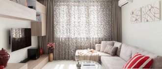
Orange color in the living room interior
Orange would also be appropriate in the living room. Especially if the room area is rather large and the windows face north.
In this case, orange will warm the room, add sun and warmth to it, and create an atmosphere of comfort and celebration. The whole family will happily gather in the evenings in an orange-colored living room; such a room will welcome guests at home as well.
But, with a certain courage and skill, it is quite possible to increase the amount of this sparkling color. Orange looks best in living rooms decorated in the style of pop art, minimalism, retro (60s era), country, art deco, avant-garde and oriental ethnic style.
To ensure that the living room interior is harmonious and not overloaded, designers recommend choosing complex orange-brown (ochre, terracotta, copper) and soft light shades (peach, pumpkin, honey) for the walls, and dark shades of wood for the floor - an excellent background for an orange carpet !
In this case, upholstered furniture can be chosen in gray, beige or white colors. Orange decorative pillows and a blanket will complement the interior. A coffee table with a glass top or a console with twisted legs will also fit perfectly into such an interior.
If you prefer to make a bright accent on the furniture, then the best option would be an orange sofa. The ideal “background” for it would be walls of white, cream, gray, green and light shades of blue. Moreover, the lighter the furniture upholstery, the lighter the shade of the walls should be.
But in the living room we not only had bright accents in the form of orange furniture, but all the walls were covered with wallpaper in orange tones. And, you know, none of the guests ever complained that the color was too bright and boring, but for me it generally seems good: warm and festive.