Red is the strongest color in the solar spectrum, which is why it is given so many sacred meanings. Since ancient times, in European culture, red has been associated with blood, struggle, battle. The color described is a symbol of the masculine principle - yang. We should not forget that in many nations the presence of red in an outfit symbolized belonging to the highest strata of society: only kings had the right to wear it. In the modern world, psychologists have discovered a pattern that different shades have completely different effects on the human psyche. For example, bright scarlet is identified with passion, desire, emancipation. Maroon - with aspiration, vitality and restraint. Carrot red - with cheerfulness and positivity. If we deduce the general concept of red, then it is a symbol of strength and energy. In the interior, red is used in public places: living room or dining room. In clothing, red is intended to emphasize the passion of nature; it is used either as a background tone or as a bright accent. In any case, red looks advantageous. Let's figure out which colors go most harmoniously with it.
Dark red color in the kitchen interior
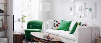
Red furniture in the interior
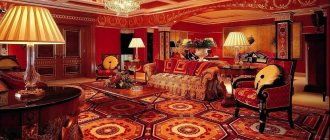
Living room design in red
Scarlet and achromatic colors
There is a gradation into chromatic and achromatic. Chromatic are all the colors of the rainbow and their shades. For example, red is a chromatic color. Achromatic - not included in the spectrum of bright colors. If we go into the etymology of the word, then “achromatic” is translated from Greek as colorless. Interestingly, the most classic color combination is the combination of red, white and black.
Red and white are two noble tones. Their collaboration is the brightest, but at the same time sublime and filigree duet of colors. Despite the simplicity of this combination, it has its own nuances. So, for example, bright scarlet must be combined only with snow-white white. If you combine scarlet and cream, the latter will look dirty and not neat.
Bright room with striped red wallpaper
Kitchen design in red
It is important to understand that the combination of these colors in clothing is suitable only for women with the “winter” and “spring” color types, whose appearance itself looks bright and unusual.
In the interior, the described combination will visually enlarge the room, making it light, playful and cheerful.
Red and black are a combination that you can’t take your eyes off. It combines glamor, luxury, lust, sex, desire. This combination is ideal for evening and cocktail dresses. A woman in such attire will look bright and sexy, but not criminally and mysteriously. Such collaborations are rarely chosen for interior design. The duet of colors presented overloads the space, while compressing it. Red and shades of gray are a calm mixture of colors. Gray balances the aggressive red. Anyone can safely choose this combination when choosing an outfit. A design with similar colors will look expensive and advantageous, but not pretentious and light.
Bright red color in the kitchen interior
Red color in the living room interior
White kitchen with red color in the interior
See also: Combination of pink with other colors
Burgundy and its neighboring shades: is it worth combining?
When figuring out what color goes with burgundy in clothes, you cannot ignore tones similar to it. Pink, red, plum, cherry, dark lilac, nectarine shade - all these colors go well together with noble burgundy.
The ideal solution for your taste would be an onion, where ripe plum-colored trousers are complemented by a burgundy-colored pullover. It’s also not a bad option when delicate pink sets off rich burgundy, giving the owner of the outfit a playful and romantic mood.
For neighboring tones and halftones, regardless of their intensity and depth, combinations with burgundy color in clothes are always good. This fact is worth remembering when combining sets for office everyday life, an evening date and a relaxing walk.
When buying burgundy outfits for her wardrobe, a girl should remember about the psychology of color - about how others around her will perceive her on a subconscious level. Noble burgundy always gives a woman mystery and mystery, but at the same time it has long been considered the color of kings, emperors and kings. Because of its historical background, it often symbolizes to others the possible treachery and unreliability of the bearer of a bright shade. Therefore, you should not choose outfits in burgundy tones for important meetings and negotiations.
The combination of colors with burgundy in clothes is always perfect in everyday and festive settings. Here the shade can only symbolize luxurious femininity, impeccable elegance and nobility of the owner. Burgundy color is an exceptional solution for ladies who always want to stand out among others, look stylish, expensive and bright.
Did you like the article
? Share with your friends:
(+13 )
Quantity 042
We have selected articles that will be of interest to you
- What to wear on March 8? … Further
- Just Valeri, Autumn-Winter 2016/17
… more - Fashion trends spring-summer
... more
- Lera:
Burgundy color is popular this season. For the second year already, the range of wine shades has held the leading position. Marsala is the color of 2015 according to Pantone, and that says a lot! Chic, attractive shades, everything in this range is delightful, be it skirts or dresses, trousers or jackets, as well as outerwear. Clothing in these shades has no age restrictions, this is not fuchsia or lettuce, there are no “screaming” shades in this color scheme. Be sure to treat yourself to a new product this season, be on trend).Answer
Red and chromatic colors
As described earlier, chromatic colors are bright and rich shades: yellow, green, blue and others. A harmonious and pleasant combination of bright colors can be achieved by using shades related to each other. Since red is the dominant color in the color wheel, with its participation two color groups are formed:
- red-yellow;
- red and blue.
Related hues are shades of colors within thirty degrees on the color wheel. That is, these are shades of the same color, differing in warmth, brightness, saturation and white balance.
Contrasting and related combinations are located within 90 degrees on the color wheel. These are colors that do not conflict with each other, but form harmonious associations.
Beautiful kitchen design in red color
Red color in the interior of a white kitchen
Contrasting combinations are mixes that differ sharply from each other in all respects.
There is a concept of nuanced associations - these are light connections that do not overload the eye, between which there is a slight difference. Often this combination is used to create a gradient effect, when a brighter tone turns into a less aggressive color. For example, burgundy and dark burgundy, scarlet and carrot red. But, it is important to understand that in the case of red, any combination of colors will be bright, provocative and catchy.
The farther from red on the color wheel the tone with which the color is combined is located, the more striking the combination of shades will look. But this does not mean that they will not be perceived harmoniously.
Kitchen design in light red color
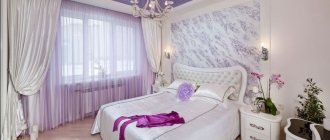
The combination of red, white, black in the bedroom interior
Red color combined with blue in the kitchen interior
See alsoColor wheel. Combination of colors in the interior.
What colors does burgundy look more flattering with?
The convenience of the burgundy shade is that you don’t have to go through your wardrobe and painstakingly create sets when choosing burgundy products. Skirts, trousers, dresses and even coats look great with almost all shades.
When choosing which colors to combine burgundy with, you should initially focus on achromatic options - black, white, gray. Each of these tones gives burgundy its own mood:
- Black. A classic solution, often expressed in the accentuated introduction of color into the image. Black gives burgundy additional luxury, strength, and adds elegance to the image. The combination with the burgundy color of black is ideal for an office solution, when the dark bottom is in harmony with the deep red shade of the top, but is often used for formal evening options - a burgundy dress looks harmonious with black accessories - a clutch, gloves, shoes.
- White. An impeccably light shade in combination with burgundy looks very elegant and strict. White and burgundy are an excellent solution for an office look with a slight emphasis on the festiveness of the outfit.
- Grey. A unique color that has the power to reveal the depth of any rich shade. The combination of colors in clothes burgundy and gray guarantees the brightness of both tones. Gray approaches noble silver, and burgundy acquires mystery and originality. A chic effect can be achieved by experimenting with materials of different densities - chiffon and leather, wool and silk.
A separate theme of color juxtaposition is the combination of burgundy with adjacent or opposite shades of the color wheel. As the analysis showed, there are no prohibited combinations here. All you need to worry about is choosing the tone and quantity of each color in the ensemble. It is recommended to use burgundy as the main shade, and dilute it with other colors or accents. For the brightest and most natural combinations, designers choose:
- Blue. A traditional choice for casual style lovers. A blue bottom and burgundy top will be a great solution for an everyday outfit. The color combination of burgundy and blue is also acceptable for an office look. True, here the tones should change places: the bottom is burgundy, and the top is ultramarine.
- Beige. It always has a romantic and gentle mood and perfectly reduces the luxurious aggressiveness of burgundy, adding femininity to the outfit. The combination of burgundy and beige in clothes requires compliance with some rules. First: it is better to use burgundy as an accent or take it in equal proportions with beige. Second: the ensemble will become more sexy and elegant if you use several shades of beige.
- Green. When considering what burgundy goes best with, green is often ignored. Should not be doing that. The game of contrast in this case is very effective and advantageous, emphasizing the originality of the bow and its stylishness. To achieve optimal color juxtaposition, it is worth using both shades in equal proportions, and including an achromatic color - gray, black or white - as a third composition tone.
- Gold and silver. The combination of these colors with burgundy is worthy of the best evening dress. By adding gold as an accent, the look will become luxurious and extravagant, while silver provides an elegant and stylish mood.
- Leopard print. This, of course, is not a color, but an animalistic pattern - very popular and bright - but burgundy looks so impressive with it that designers increasingly prefer this combination. Leopard print and burgundy color in clothing should be used very carefully - ideal when the “animal” pattern is taken as a small accent.
The remaining options can be easily selected experimentally, and what’s good is that when creating a bow, the likelihood of an error in color combinatorics is virtually eliminated. But there is another direction: when burgundy color is considered in combination with other colors of its own group.
Combination of red and greenish shades
Just twenty years ago, the combination of red and green was considered the height of bad taste, bad manners. But modern designers, relying on examples of the natural world around us (red flowers on a green stem), boldly introduce this collaboration everywhere. Since the 2000s, a mix of colors has become firmly established in fashion: young people are increasingly choosing suits with these colors. Interior designers kept up with fashion. This is how red and turquoise are successfully combined in a fusion style.
It is important to understand that for the correct combination of red and shades of green, you need to carefully select the toning range. They are the ones who influence the harmony of the final ensemble.
Kitchen design in red
Red color in the kitchen interior
See also Art Deco in the interior: design, photos, tips
Contrasting combinations
One of the most interesting options is a combination of contrasting red and green. In the photo of the red interior, emphasized by green shades, you can see how well these shades complement each other.
Yellow color in the interior: 115 photo examples of combinations in the design of rooms and premisesGray color in the interior - stylish and beautiful combinations in modern interior design (102 photos)
- Wall color in the interior - choosing a base and combining it with the style and design of the entire apartment (105 photos)
And yet, designers recommend smoothing out the contrast somewhat so as not to overload the space with color. Namely, use more muted tones or dilute the interior with accessories in light shades.
An excellent option would be white, cream, ivory or champagne. An interesting solution would be to add a dark twist to the red-green tandem, for example, black or chocolate.
Red and pink colors
Ensembles based on the two colors presented don't just have a place, they have some potential. Due to different white balances, red and pink rarely clash. But it is worth choosing shades with the same warmth index. For example, blue-pink goes well with cool red, and playful crimson goes with carrot. In the interior, such accents should be used with caution, carefully selecting them to match the style of the room. In clothing, such colors are suitable for young girls with light skin tones.
Bedroom design with red color
Red color combined with yellow
Red ceiling in the interior of a blue room
See alsoWhite interior: lighting, advantages, photos
Red color in psychology and the types of people who prefer it
When working with color perception, psychologists pay special attention to red colors. People who prefer this tone are charismatic, self-confident, persistent, and have strong leadership qualities.
But along with positive qualities, this color reflects a person’s intolerance, temper, excessive emotionality, and sometimes the presence of cruelty in behavior.
Men
Lovers of red colors strive to dominate and always be the center of attention. They do not suffer from low self-esteem; on the contrary, they tend to consider themselves superior to others.
In the life position of men who prefer scarlet color in clothes and everyday life, there is always a share of selfishness. Such people place their own ambitions above all else, pushing family, friends and social norms into the background.
They easily move up the career ladder. Purposefulness combined with determination brings natural success in work.
Women
“Holiday girl” - this is how one can describe a lover of ruby color. Women who prefer this color are characterized by energy, self-confidence, and sexuality.
They do not recognize any barriers or restrictions and are guided only by their own opinions. Such women always strive for the best result.
Possessing a strong character and clearly aware of their desires, they go towards their goal without seeing any obstacles. A red tone can indicate a person’s tendency towards cruelty and aggression.
Woman in red.
Children
If a child says that his favorite color is red, you can immediately draw up an approximate personality portrait. These children are overly energetic and sociable, and they often exhibit hyperactivity.
People around them call such children fidgets. They are difficult to subjugate; they do not tolerate commanding tone. The desire to shock and be the center of attention pushes children to act rashly.
Combinations of red with primary colors
As described earlier, red is part of the group of primary colors. In addition to red, it includes yellow and blue. The combination of ruby with these two colors is called a combination of primary colors.
Red and yellow are a cheerful and bright combination of colors. Both colors are warm, which makes this combination juicy. Its use is appropriate in the clothing of young people and girls. It also looks great on children's clothing. This combination is also appropriate to use in kitchen decoration. Red and blue complement each other. They add dynamism and freshness to blues, and blues calm aggressive bloody ones. You can safely use it both when creating your own image and when decorating rooms in your apartment.
Red sofa in the living room interior
Red color in the kitchen interior
See also Arches in the interior: types, materials, photos
Who would suit red and its combinations?
Red color has firmly established itself in the wardrobes of modern fashionistas and fashionistas. Nowadays, red is actively used to create all attributes of external appearance: dresses, trousers, outerwear, skirts, accessories, shirts and so on. What attracts people so much to this color? First, red inspires confidence, subordinates attention and increases the interlocutor’s concentration on you. Second, red shows the world around you that you are a strong and courageous person who is worthy of your time. Third, red is a fairly universal and practical color. For example, during the day, red trousers with a formal shirt are a good office option, and in the evening, a black top and red trousers are an option for a party.
You need to understand that wearing red clothes concentrates people's attention not only on you, but also on your figure. Therefore, it is necessary to select things in a given shade with due competence, based on the advantages and disadvantages of your silhouette. Slender and thin young girls can use all shades of red in all variations of clothing. Girls with curvy figures should use darker shades (burgundy, brick, wine), focusing on the upper part of the body.
Dark red color combined with blue
Red color combined with chocolate
Red furniture in the living room interior
If you are afraid of making a mistake with the selection of red tones in clothes, then you should use the rules that have been perfected over the years. For example, does the selection of shade depend on the color type of appearance? Of course yes. Ruby is suitable for absolutely every color type, however, for each type of appearance there is its own palette of shades.
- “Winter” is a kind of snow queen. Cool white skin tone, dark hair, sensual facial features. Such a peculiar vamp woman. She exudes charm, nobility and sexuality. The fatal image will be perfectly complemented by bright colors, for example, scarlet. Wine and dark red shades will also go well with the skin. When choosing a color combination, you should turn to related and contrasting-related combinations, so as not to turn the image of an influential woman into the image of a village simpleton.
- “Spring” is a girl whose appearance is light and simple. Her image, like the season itself, is constantly playful and cheerful. The skin is a velvety golden hue, the hair is a light shade and the eyes are warm tones. For this type, frivolous, if you can call them that, shades of red are perfect: pinkish, carrot and orange. They will make it even more airy and unearthly.
- “Summer” has a soft, but at the same time languid and strict appearance. Blueish skin, light brown or dark hair, aristocratic facial features. The girl doesn't look like a vamp, and she doesn't even aspire to be. She has her own special cold beauty, which she can perfectly emphasize with a dark tan. There is a certain mystery in it that no one can understand. The image of such a lady will be decorated with cool shades; they will perfectly emphasize the color of hair, lips and eyes.
- “Autumn” is a playful, mischievous appearance. Red hair, freckles. The girl is the sun. A charmingly alluring feature of this appearance is its attractive golden, cheerful look. Bright, rich, rich shades can decorate “autumn”: coral, brick, carrot.
Red combined with white in the interior
Red sofa in the living room interior
See alsoTurquoise color in the interior: tips, photos
Combination: red and white in the interior
Red and white in the interior is a colorful overview of a clean, active space. It is elegant and elegant. White color is an integral companion of red. Firstly, it neutralizes its excessive effect. Secondly, the combination of red and white means care, justice, integrity, which unconsciously attracts people. From an aesthetic point of view, this combination expands the space and pleases with fresh contrast. Black elements are often added to red and white. Red color is the closest to monochrome colors, so a three-color range of these tones will be the most stable and contrasting.
Red color in the interior
For quite a long time, the color red has been in fashion in the field of interior design. Most often it is used when planning public places. Red is often used in the design of cafes, bars, restaurants and canteens. Since it is believed that it is red that awakens appetite and energy. It is also used with enviable frequency for the design of entertainment venues.
Red is a fairly rich and powerful color. It is strictly contraindicated for use in small spaces. It will make them visually even smaller. You cannot use red as a background image, otherwise the room will be perceived as cheap and unstylish. It is best to use red as a spectacular accent. For the perfect combination, you should choose colors that are related or contrastingly related to red when creating a combination for the overall design of the space.
There is no need to be afraid to use the described piece of the palette. The main thing is to choose a harmonious combination that will emphasize your temperament, your individuality and your special character.
See alsoWenge color in classic and modern interiors
History of red
Various shades of red have accompanied people's lives since ancient times. In primitive society, this color occupied a dominant position and was associated with sacrifices, hunting and battles.
Initially, animal blood served as a sample for paint. But to apply designs on leather and stones, a more durable pigment was required. Then man began to use clay, ocher, carmine and the stems of a plant called madder as a dye.
With the emergence of ancient Greek mythology, red began to be identified with the image of the goddess of love Aphrodite. At that time, a scarlet rose as a gift was considered a declaration of love.
Later in Ancient Rome, the scarlet tone became associated with fire and military campaigns. They were used to celebrate victorious commanders who were favored by the god of war.
The rich ruby tone symbolized strength and power. Only particularly distinguished citizens had the right to wear scarlet clothes. During this period, ruby accessories become an indicator of the status of their owner.
Red is the most versatile color. Therefore, with the beginning of the development of the fashion industry and architectural design, it became necessary to come up with names for the most popular shades.
As a result, more than 50 tones were identified, each of which has its own name. And new names keep appearing.
Some of them have extremely unusual names:
- Bismarck furioso;
- Cardinal;
- Flaming Magenta Crayola;
- Pink Forest;
- Sanguina;
- Scarlet;
- The color of vanity;
- Santa Claus hat.
In Rus', bright scarlet symbolized beauty. Many phraseological units and set expressions are associated with this: “red maiden”, “Red Square”, “red summer”, “red corner”.
Festive outfits, hair ribbons, towels had a ruby tint or were decorated with scarlet embroidery. The pigment was traditionally obtained from onion peels. Later, a bright mercury paint called cinnabar came into use.
Today, scarlet paint is widely used in the textile industry, architecture, and interior decoration. And the latest technologies for production and paint tinting make it possible to bring the most extraordinary ideas to life.
Symbolism
For many centuries, scarlet symbolized wisdom and power. Therefore, kings decorated their clothes and crowns with scarlet velvet, thereby emphasizing their exceptional status. And also the scarlet color personified flame and fire.
In the Christian faith, the bright scarlet color symbolizes martyrdom and is actively used in church rituals. At the same time, this tone is associated with hellfire and sin. Catholic cardinals use ruby colors in their robes.
At the beginning of the 20th century. color was assigned the role of a warning element. It began to be used for road markings and prohibition signs on roads. Later, the scarlet flag began to be considered a symbol of the revolution.
Modern designers associate this color with leadership, courage, passion and inner strength.