[ads1]
Color combination options are always surprising. No matter how many combinations are invented, new groups of combinations are always found. Their colorfulness and uniqueness always pleases the eye. Everything looks especially impressive when completed, when, as they say, there is already a finished picture, the result of the work done. How to combine colors? Which ones are suitable for this or that color, and which ones are not? How to choose? Is it easy?..
In fact, color combination is a whole science. But everything is possible: follow fashion, and there will be fewer questions.
What does fashion dictate? There are dozens of trends and options. You just try to choose what you like, and then consult with specialists about the selected options.
So, for example, you chose a burgundy color, burgundy (or burgundy, as it is also called) for the interior of one of your rooms. How will this color behave in combination with other colors? Will it go well together? Let's talk about what combination of burgundy color with other colors in the interior will be impeccable and harmonious. .
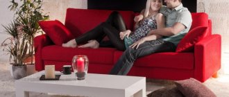
Bordeaux cuisine, photo
The meaning and psychology of burgundy color
A mysterious burgundy shade is formed from a combination of strong, bright, self-sufficient colors - black and red. The result of the combination is a multifaceted tone, alluring with its mystery.
The color was named after the famous French wine Bordeaux. Many compare the effect of contemplating the shade with a light, intoxicating haze that occurs after drinking a glass of an exquisite drink.
For interior design, burgundy is chosen by charismatic, self-confident people. They want to get an additional source of inner strength and create it themselves with the help of decor. Fans of this color strive to defend their positions, to be attractive, witty, and mysterious. The same goes for the interior - through the unusual design of rooms they want to gain admiration and approval from others. They succeed, because the stunning deep burgundy tone in the design leaves no one indifferent.
Bordeaux in the interior of the room
Shades of burgundy in the interior
So far no one has been able to fully unravel the mystery of the mysterious Bordeaux. But the designers managed to highlight several shades of color. In the table you will find the main variations.
| Shade name | Characteristic |
| Marsala | Garnet shade with a distinct brown undertone |
| Burgundy | Deep red-burgundy |
| Carmine | Rich dark red with brown notes |
| Merlot | Tone closest to brown |
| Brown | Muted shade with a predominance of brown |
| Sangria | Bright burgundy with pronounced red notes |
| Cardinal | Shade with leading bright red tones |
| Terracotta | Soft tone with pronounced reddishness |
However, the matter does not end with choosing a shade. The next step on the path to creating a stylish design project is to consider variations from the spectrum of light and dark tones.
Advice! You should not combine more than two shades of color in the interior of one room.
It is important that the tones relate to each other, create a game, and complement each other.
Color Features
The burgundy shade appeared as a result of the fusion of red and brown, which means it has the qualities of these colors. Red gave him its brightness, impulsiveness and some impudence, and the influence of brown slightly cooled the ardor, adding calmness and depth. Different proportions of color mixing, as well as inclusions of other shades, divided the Bordeaux palette into many tones: ruby, wine, Marsala, burgundy, sangria, cherry, etc.
Most shades of burgundy were given their names by varieties of elite wines from France, Spain and Italy, apparently, this causes strong associations with sophistication and wealth. Within the walls of a burgundy-colored room, you don’t want to do everyday household chores; you’re drawn to relaxation and rest. Therefore, the choice of this shade is typical for mature individuals with delicate taste and a craving for luxury.
What colors does burgundy go with?
To create a design, it is not enough to choose your favorite shade - you need to determine which tones it will harmonize with. Let's consider options for successful companion flowers:
- Grey. This elegant neutral color does not draw attention to itself, but is considered an ideal base in combination with bright representatives of the palette. You can use all shades - from light to rich. The ensemble of gray and burgundy in the interior is good for spacious rooms.
- Green. This is a natural shade that harmonizes with most other tones. If you are not afraid to make bold decisions, include it in the design of the room. A neutral third tone will look great in a green-burgundy interior. For example, beige, white, light brown.
- White. This color visually expands the room, making it bright and attractive. The combination of white and burgundy will look unusual and elegant. And the main advantage of the combination is versatility. The ensemble is appropriate for any interior style.
- Brown. Brown can be an excellent companion for burgundy. These are related shades, but they harmonize perfectly. To make the room feel cozier, add a little white, beige or gray.
- Black. If you use color in doses, you will get a noble and luxurious interior. It is better to give black the role of an accent, highlighting several elements in the room with it.
- Blue. For some, an interior in blue and burgundy tones will seem strange. But this is one of the classic neighborhoods! It is important to choose a deep, rich tone without being too bright. When combining, designers recommend making one shade the main one, and the second one complementary. Then the design will “sparkle” and will not seem gloomy.
- Beige, light brown. These are neutral colors that can serve as a base in any interior. Want to highlight the richness of burgundy? There are simply no better options.
- Yellow. But this juicy shade is just right as the main one. There should not be a lot of burgundy elements - two or three bright details are enough to create color. You need to choose warm yellow - lemon in such an ensemble looks somewhat aggressive.
- Gold. A pompous option for classic interior styles. The burgundy and gold design is suitable exclusively for spacious rooms. In a small room, such a proximity will hide the space.
- Orange. Two rich bright colors in one room look bold and non-trivial. This duet is not suitable for all areas of design. Professionals often use a combination for an ethno style. The shades look good in approximately the same ratio.
Advice! Shades of crimson, pink, lilac and red in combination with burgundy are allowed only as a light addition. Designers categorically do not recommend combining them or using them as a base.
We invite you to look at the photo of burgundy color in combination with other shades in the interior. These examples are the embodiment of the best ideas of designers for decorating rooms in different styles.
Burgundy with gray
Burgundy and gold
Burgundy with green
Burgundy and white
Burgundy with black
Burgundy with blue
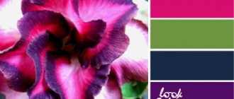
Light burgundy color. Noble burgundy palette: 20 combinations of chic and style for your look
Burgundy color is popular among females of any age, because it is rich and multifaceted.
The combination of brown and red is a classic burgundy color.
However, there are many variations of burgundy. For example, a mixture of burgundy and pink gives a soft peach tint, and blue and burgundy gives a lavender tint.
In any case, choosing clothes in any burgundy tones will add chic and elegance to your look. Therefore, burgundy color is also called royal.
It is known that black color always visually reduces shape and makes you look slimmer. Rich burgundy has the same property, stretching the silhouette.
Burgundy color can be combined with various others, and these are the variations we will offer you.
Noir in a duet with ripe cherry color
The color combination of dark cherry with black is the most common. Outfits with such a duet are perfect for a celebration, a date, or even for the office.
If you want to highlight the burgundy color, then it is better to choose small and elegant black accessories to complement your wine-colored outfit.
A burgundy outfit with a black insert will further highlight your figure, visually elongating it.
In second place in popularity is the combination of burgundy with gray and white colors. Such combinations look very elegant.
Fashionistas can experiment with types of fabrics, their textures and clothing styles. A burgundy and white outfit is perfect for a business lady and will help diversify the black and white office style.
Expressive ultramarine and burgundy
Despite the psychological contrast of color meanings, blue and dark cherry harmonize interestingly with each other.
The blue color symbolizing calm and the burgundy color signifying the strength of vital energy can be combined with each other in combination:
- jeans and burgundy jumper,
- burgundy trousers and a blue top for an office look
- a cherry skirt with a blouse or a sweater if you want to be bright.
As a result, the blue color makes your image unusually bright, and blue shades add calmness and harmony.
Burgundy caramel - feel like a queen!
An interesting combination is the duet of burgundy and caramel colors.
It is fashionable to choose things of various shades of caramel and cream and wear them with burgundy in equal proportions.
Or make small accents on the color of ripe cherries, diluting the color scheme with a light creamy shade.
Interesting combinations of your image with bardo color:
- An elegant combination would be a classic cut beige coat with a burgundy dress and a clutch in an exquisite shade of burgundy - ruby color.
- You can also wear cream trousers with a burgundy blouse on top, a caramel-colored sweater and terracotta trousers, or a wine-colored dress and a cream clutch for a romantic date.
- Also, don't be afraid to play with different variations of these colors: brown, white and black.
Nobility of Bordeaux with gold and silver
Burgundy color, like Bordeaux wine, tends to combine with seemingly incompatible colors. For example, the combination of burgundy and shades of green is interesting.
When choosing such a duet, it is better to focus on small accessories, remembering that the dark malachite shade of accessories will be the most advantageous option.
In what interior styles is burgundy color appropriate?
The solemn burgundy shade used to occupy a place of honor in the interior of noble houses. Today, elegant tone is used mainly in classical styles. It will fit perfectly into such styles as Baroque and Empire.
There is another interior style that tends towards pomp and grandeur. We are talking about the modern direction of Art Deco. This design also uses a burgundy shade in combination with brown, black, and golden colors.
Color can act as a bright accent in pop art, hi-tech, retro, minimalism, and country interiors. It is better to use it in combination with laconic pieces of furniture and decorative elements. Excessive pretentiousness will lead to violations of the canons of style.
Best couple
Burgundy in the interior is used to occupying a dominant position, allowing other shades to only bask in the rays of their glory. In order not to make a mistake and choose the best company for this impressive color, you can use the following combinations tested by designers with other tones.
Burgundy and black
A gothic and gloomy combination of burgundy and black at first glance is suitable not only for the interior of a medieval castle, it may well exist in a modern apartment with certain conditions:
- all main areas of the room should be highlighted with artificial light;
- The presence of light-colored furniture and decorative elements is required;
- the ceiling should remain light;
- glossy surfaces are welcome.
Burgundy and white
This combination does not require additional recommendations; it is equally suitable for all rooms. White will allow burgundy to reveal itself in all its splendor without drawing attention to itself. In response, burgundy will gratefully emphasize the main advantages of white: purity and freshness.
Burgundy and light gray
A calm and peaceful combination is also suitable for decorating any room. Gray will slightly calm the impulsiveness of burgundy, smooth out the excessive harshness of the interior, giving residents the opportunity to relax and unwind.
kraska.guru
Accessories and wall decoration
The overall impression is always made up of details. Properly selected accessories will complement the completed design project. Don’t chase the amount of decor - the more accents, the more tasteless the interior.
Burgundy wallpaper
Most often, there are three wallpaper options on sale: plain, with laconic patterns, and with a light shiny coating. On such a surface, floral patterns look organic. It is better to paste wallpaper in a spacious room or highlight an accent wall with it. We invite you to explore beautiful design ideas
Burgundy wallpaper in the interior
Sofa pillows, blankets
In dark burgundy rooms, such products look out of place, but in light rooms they are perfectly perceived by the eye. Two or three plain pillows on the sofa will already be considered interior decoration. If you combine them with products of a different color, you get an amazing design composition.
You can cover the bed in the bedroom with a burgundy blanket. A small but significant detail will not hurt in any interior style.
Burgundy blankets and pillows in the interior
Furniture in burgundy color
Such products can easily be called the embodiment of modern chic. Even the most laconic item will look luxurious, but not defiant. We would like to introduce you to the popular “heroes” of the setting.
Sofas
Most often, burgundy sofas are upholstered in a matching shade. There are options in leather, velvet, textiles with a “carriage screed” decor. Specific examples from the catalog will tell you better than words. The La Rosa straight sofa with the aforementioned carriage screed upholstery definitely deserves a place in your living room. Pay attention to the more laconic Peterhof model. The third option is the Sydney sofa bed in a classic style.
buybuy
Sofa La Rosa
buybuy
Sofa Peterhof
buybuy
Sofa Sydney
Storage furniture
This category includes wardrobes, cupboards, chests of drawers, dressing tables, and cabinets. In the assortment of designer salons you can find products in one of the shades of burgundy, but most often such models are made to order. Therefore, they can become a detail that sets the tone for the interior.
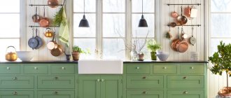
Kitchen sets, tables, chairs
Burgundy kitchens are the embodiment of good taste and the desire for novelty. Models with a two-color design, such as white and burgundy, look especially original. To add a rich shade to the kitchen, in addition to the set, you can purchase bright Bordo chairs or stools.
buybuy
Stool Bordo
buybuy
Chair “Venus Diamond”
Burgundy tables are exclusive furniture models. Most often they decorate kitchens in modern styles.
Textiles in burgundy color
It’s rare that a house can do without textile decoration. If you decide to add burgundy colors to the rooms, you can consider just this option. Let's talk about two prominent representatives of the interior textile industry.
Carpets
The burgundy color on carpets is already considered a good tradition. There are products on sale with amazing patterns, high soft pile, geometric shapes, and laconic prints. Homespun rugs with woven burgundy threads and items decorated with Burgundy wine-colored fringe are extremely popular among designers. Such models look amazing in hallways, corridors, children's rooms, and ethnic living rooms.
Burgundy carpet with patterns
Burgundy plain carpet
Curtains
A refined wine shade is often present on curtains made of opaque fabrics. The products look strict and solemn, therefore they are suitable for such styles as art deco, baroque, and classic. It's better to hang them in the living room or bedroom. A good choice is plain drapes, curtains decorated with dark or golden patterns and large flowers. You can use tulle with them.
For a children's room, office and kitchen, light curtains in shades of terracotta or marsala are preferable. Curtains should let in natural light and play with a soft shine in the sun's rays.
Burgundy curtains can be used not only for window decoration. They are ideal for creating fabric partitions between areas of the room.
Burgundy curtains in the interior
Combinations of burgundy in living rooms
What colors goes with burgundy in the interior? According to experts, there are no barriers to burgundy color. He will feel completely comfortable in different areas of the apartment. Whether it's a living room or maybe a bedroom, a kitchen, even a bathroom - it doesn't matter.
Adhering to the rules, it can be used in any of the rooms. Perhaps you can be a little careful in the hallway and children's room. The main thing here is to do everything rationally, with a sense of proportion and with a certain dosage.
What color goes with burgundy in the interior? Light shades are ideal with burgundy (Bordeaux) color: white, milky, beige, ivory, light gray. In addition, burgundy color with coral, orange, pale turquoise, and black will look impressive and quite bold.
Let's look at the combination of burgundy color in the interior in the following video:
After the general overview, we move on to a more detailed one, where we will consider the role of burgundy color in each of the rooms of the apartment.
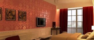
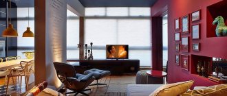
Burgundy living room
The burgundy color in the interior of the living room will create the effect of a lush room, which, of course, will perfectly host various receptions and celebrations. In such a room, your guests will always feel like they are chosen people - VIPs. And I think everyone will agree that this is extremely pleasant.
Burgundy-colored IItors in the interior, photo
If your room is well lit, be sure to add white. As much as possible. Lighting in combination with white and burgundy colors will create the presence of some incredible energy and slight arrogance.
Burgundy wallpaper in the interior, photo
If you pair a burgundy color with a brown color, you will also get an excellent burgundy-brown combination, which is traditionally considered classic. Brown will only emphasize burgundy. This slightly “twilight” combination will make you feel protected from the everyday hustle and bustle of the world.
Easily pair with any of the recommended light shades from the white and beige pastel palette.
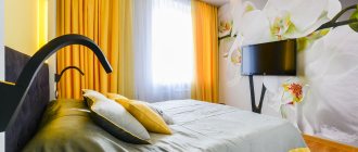
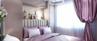
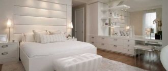
Wine-colored bedroom
Let us remind you that the burgundy color is partially composed of red, therefore, it would be logical to think that it is associated with love and romantic relationships. But given that it is quite deep and rich, be careful with its use. Here you should adhere to the same rules as in the children's room and hallway - arrange everything rationally, with a sense of proportion.
A large amount of burgundy can turn a room into an overly conservative, strict and intimate room. And this is the last thing I would like. Say NO! maximalism.
To help decorate your bedroom interior with burgundy, choose one of the light tones or colors: white, milky, beige, ivory, light gray. An interior in burgundy tones in combination with light shades will symbolize the stability of your family union. A gentle and warm atmosphere is also guaranteed to you.
What color combination with turquoise interior color? See the collection of photos and find out the best color combinations for your bedroom, living room or kitchen.
Read about making a stencil of flowers on the wall with your own hands in this article: simple but very stylish decor when you want to update your decor.
Burgundy in the nursery: is it worth it?
There will be few tips for decorating the interior of your child’s room in burgundy tones. Remember the above-mentioned points that relate to the interior of the nursery. Here again the role of red in the creation of burgundy color reminds us.
If we are talking about a baby and his first years of life, experts recommend not using burgundy color at all. It is better to decorate the room in pastel colors.
In a teenager’s room, use burgundy in doses: let it be textile accessories, a chandelier, and burgundy curtains in the interior will also be appropriate. The classic duet of white and burgundy will also sound great.
Kitchen in the colors of ripe cherries: sounds delicious!
The burgundy color will look special in the kitchen interior. Let's start with the fact that, unlike some other flowers, it does not particularly contribute to the digestive process and appetite in general. In the kitchen it can cause some discomfort.
A good combination would be mixing tomato-burgundy with peach. Then the kitchen will look truly “delicious”.
If you give preference to burgundy tiles, you will hit the top ten. It will look elegant and expensive!
Read about how to make a butterfly stencil for cutting out paper of different sizes yourself.
See here a photo selection of interiors after finishing with artificial stone.
Photo gallery at: https://prostilno.ru/kvartiry/studiya/26-kvm-dizajn.html - will tell you how to equip a studio apartment of 26 meters.
Burgundy color in the interior of different rooms
We've come to the main thing - tips for decorating premises. Don't forget that creativity is always welcome in design. Recommendations from professionals and imagination will help you successfully express the facets of your inner world through decor.
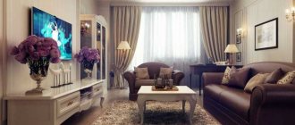
Living room in burgundy color
It is best to use burgundy here. This room is one of the most visited places in a house or apartment. If your interior is made in a classic style, the shade will be complemented by patina, stucco, and items made from natural materials. You can place furniture in the room with burgundy upholstery, such as a sofa or armchair.
In a modern style, furniture in a burgundy shade will also look appropriate. Laconic products with black trim look good.
If you are decorating the living-dining room in a modern style, you can complement the design with burgundy plastic chairs. The ideal ensemble with such items will be an ivory round table.
Feel free to use a burgundy tone to decorate the walls. There are several options - decorative plaster, wallpaper, panels. Mirrors in figured frames look amazing on bright walls.
Burgundy modern interior design
Kitchen in burgundy color
Bright kitchen is a fashionable trend in modern interiors. For this room, it is better to choose noble warm tones or an alluring shade of sangria with playful red notes.
There are three ways to radically integrate color into the design of a room - purchase a set with burgundy facades, or decorate the walls or ceiling. You shouldn’t get carried away and implement all the options at once, otherwise the furniture will simply get lost against the background of the design.
In a burgundy kitchen, you can experiment and add silver accents. This cool shade is most often present in decoration or fittings.
The ideal option for floor decoration is burgundy-colored tiles. It is better to leave the ceiling light.
Burgundy in kitchen design
Bedroom
Wine shades are also welcome in bedroom decoration. Choose soft color combinations and place accents wisely. Textiles can play the main role: small decorative pillows, curtains, carpets.
Furniture in burgundy color also has the right to settle in the room. If you find an elegant burgundy chest of drawers, a stylish wardrobe or a soft pouf, do not hesitate to place them in the bedroom.
Shades of burgundy in the bedroom interior
Bordeaux in the nursery
The receptive child's psyche responds well to bright, slightly muted tones. Ideal shades of burgundy: sangria, terracotta, carmine. It is better not to give these colors priority in design, but to use them as accents. One piece of furniture or decorative element is enough.
Hallway
Bordeaux in the hallway is an atypical solution. Typically, shades of this color are rarely used due to the small size of the room. If you choose the right spot lighting and place light furniture, you will get an amazing combination. Another option is a burgundy floor or ceiling.
Burgundy color in the hallway interior
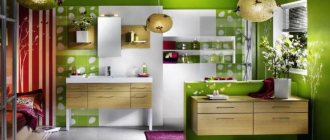
Bathroom
A bathroom in burgundy tones is a dream for connoisseurs of classicism. Any shades of color look organic in this room. They go perfectly with a massive cast-iron bathtub, mirrors in wooden frames, and wall lamps. A proven wall decoration scenario is burgundy tiles. You can make a monochrome design or add another rich color to the rich shade.
Burgundy color in bathroom design
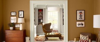
Cabinet
If your office is spacious, you can easily decorate it in burgundy colors. Interiors with leather sofas look solid. The abundance of bright details will play a bad joke - you simply will not be able to concentrate on work. Let the room be decorated with unexpected details that will attract the eye at moments when you need to escape from routine affairs and find inspiration.
Shades of burgundy in the interior of the office
Bordeaux in detail
For all its nobility and charm, the burgundy shade has several nuances that are worth remembering when trusting it with your interior:
- This color is recommended to be used in doses. Especially in living rooms. Bordeaux is a shade of red, although more calm and sophisticated. In large quantities, it can have an impact on the psyche, so it is necessary to neutralize the pressure with the help of light colors.
- A lover of pomp and solemnity, burgundy is not used to being crowded into small spaces, visually making the size of the space even more modest. It is better to introduce this color into a small room only as an accent, diluting the light palette.
- It is worth remembering burgundy’s love for light, both natural and artificial. Since the shade has the ability to absorb light, the room must have a sufficient number of lighting fixtures.
Burgundy wallpaper
A languid wine color is suitable for painting the walls of a fairly spacious and bright room. If it seems that burgundy will “eat up” too much space, you can give it only one wall, choosing the shade as an accent rather than the main color. Burgundy is endowed with a unique set of qualities: it gives the room solemnity and at the same time promotes concentration and induces creativity. Therefore, burgundy wallpaper will best fit into the interior of a living room or office.
Wallpapers of this shade with classic patterns, floral patterns in the Art Nouveau spirit or Art Deco graphics look impressive and elegant. Another wallpaper decor option is inspired by the classic design of the last century: a gallery of photos, paintings, portraits, mirrors and sconces on a plain burgundy surface.
Burgundy ceiling
A burgundy ceiling is a rather risky decision that needs to be approached correctly. Firstly, the ceiling must be high enough, otherwise it will visually exert pressure. To make the burgundy ceiling not “fall” on the residents, but “soar”, you can make its surface glossy and well illuminated. Secondly, not every room is suitable for implementing this extravagant idea: for example, in a bedroom it will quickly turn from a highlight into a flaw.
Burgundy floor
The burgundy-colored floor automatically adapts to the design of the entire room. The shade of the furniture should not be allowed to repeat the color of the floor covering; ideally, you should give preference to furnishings in light colors. Just as the red carpet obliges you to strictly adhere to the dress code, the red floor forces you to carefully think through the remaining details of the interior.
Burgundy curtains
Curtains in the color of ripe cherry or Burgundy wine are also a dominant interior detail that requires support. A fabric that combines a burgundy shade with gold braid or patterns in light colors is suitable for the living room, and blackout curtains, plain or with dark decor, are designed for the bedroom. Their light-proof fabric will prevent the sun's rays from disturbing the residents' sleep. It is important to complement the curtains with light tulle so that the atmosphere does not seem gloomy.
Burgundy carpet in the interior
Perhaps burgundy is the traditional carpet color. Today, in addition to the familiar Persian ornament, designers offer a lot of options for design and placement of the carpet in the interior. It can be plain or printed, with long or short pile, cover the floor almost completely or zone the room, emphasizing a certain area.
Burgundy furniture in the interior
When choosing burgundy furniture, you should follow the same rules as in other cases of using this shade in the interior. If burgundy is chosen as the main tone of the furniture, then it is advisable to make all other details light, with the exception of the interior of the study. If wine-colored objects play the role of accents, for example, a bright sofa or armchair, then the rest of the design depends on the prevailing style.