SHARE ON SOCIAL NETWORKS
FacebookTwitterOkGoogle+PinterestVk
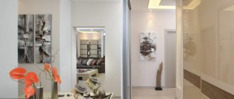
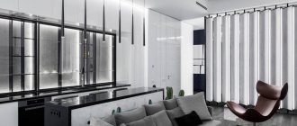
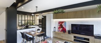
The minimalist style in the interior of modern apartments is the rejection of unnecessary details in favor of functional elements. There is decor in the interior, but in the form of mobile elements, for example, a bright flower vase. It is very important for minimalism to have thoughtful and closed storage systems. The main motto of the style is to quickly and easily create order in any room. The features of the direction, the design of the bedroom, kitchen and hallway will be discussed in this publication.
Characteristic features of the minimalist style are rigor, geometricity and functionality
Minimalism style in the interior: the history of the formation of the direction
Minimalism as an interior style originated in the 20–30s of the last century. Its appearance was preceded by constructivist trends, which are characterized by a clear and thoughtful organization of room space. After the First World War, the population gravitated towards lightness, conciseness and a lack of overload in the situation.
Minimalism style is the rejection of unnecessary details in favor of functional elements
The formation of the direction was completed in the second half of the 20th century. It replaced the decorative Art Nouveau style, which, with its pretentious appearance, evoked negative associations with the bourgeois way of life. At the same time, the pace and style of life changed: society gravitated towards simplicity and reliability.
Initially, minimalism is a Japanese movement that penetrated Western culture after the war. The main characteristic features of the minimalist style are rigor, geometricity and compliance of the appearance with its functional characteristics.
It should be noted the architect Frank Lloyd Wright, who in the post-war period equipped housing for workers. The main features of these premises are functionality and simplicity. The results of the architect's work were very popular with the public.
Speaking about the history of the development of the movement, it is impossible not to recall the German architect Ludwig Mies van der Rohe. It was he who first proposed simplifying the appearance of buildings as much as possible in order to free up space. The motto of his work was the rule: “Less is better.” All this influenced the formation of interior designs in the minimalist style, and this also explains the long-term popularity of this trend.
Minimalism style involves the use of textiles mainly in the bedroom
Helpful advice! Textiles are practically not used in minimalist interiors. The only exception is the bedroom. In this room, it is permissible to use plain bedspreads and pillows, and a soft carpet with long fibers can be spread on the floor.
Style basics or basic techniques to use
Interior design in the Scandinavian style expresses simplicity, naturalness and conciseness. The Nordic style has absorbed the most striking features of the Scandinavians - restraint, silence, love of nature and even a certain severity. For this reason, the interior does not have fancy shapes, a big game of contrasts, or a riot of colors.
Main features of the Scandinavian style in the interior:
- light colors that tend towards white. Pastel delicate shades can be seen throughout the interior design - from the color of the walls to the sofa cushions. At the same time, the room does not look homogeneous, but looks very “alive”;
- light wood in design. Furniture and wooden accessories should be made of light wood. In addition to natural light wood (for example, birch), you can use other options painted with white paint;
- simple design of window openings. Curtains and other curtains should not have extra folds or draperies. The material should be as transparent and light as possible. Curtains are often completely excluded in Nordic-style interiors;
- light floor. Unusual to our eyes, but very calm, a light floor can be made of natural wood, floorboards or laminate. There are several options, but it must be in a light color scheme;
- open plan. Modern Scandinavian style in the interior is expressed in a free layout and any lack of boundaries in space. Doors are only used where the room requires privacy. And you can separate the guest area from the kitchen simply by using the back wall of the sofa;
- maximum lighting. Large windows, almost transparent curtains and many sources of artificial lighting are all characteristic features of a Scandinavian-style interior.
Interesting! The most famous designers in the Scandinavian modern style are Alvar Aalto and Arne Jacobsen. Finn Aalto created wooden plywood blanks and called them “pasta”, and the Dane Jacobsen designed everything: from a building to spoons in a hotel. In his understanding, this was the design of the 21st century.
Advantages and disadvantages of minimalism in the interior: photos of rooms
The advantages of minimalism include the following qualities:
- availability of free space in the rooms;
- psychological relief;
- thoughtful design;
- ease of cleaning;
- ease of repair.
Anyone who is in a room decorated in a minimalist style gains a sense of freedom. This is especially important for small apartments, since such an interior design will help to reduce the feeling of pressure. Thanks to simple shapes, neutral colors and open horizons, the room evokes feelings of peace and tranquility. This direction is optimal for those who have a complex, nervous job and a life filled with stress.
Simple shapes, neutral colors and open horizons evoke a feeling of peace and tranquility
However, only well-placed accents and pleasant textures can transform a cold and uncomfortable, at first glance, minimalist interior into a comfortable and cozy home.
It is necessary to get rid of unnecessary things that are stored just in case. This action will help create the effect of psychological relief. You can easily verify this by looking at real photos of the interior of an apartment in the minimalist style.
To design a truly minimalist interior, you need to remove unnecessary elements and leave only carefully thought-out details. For example, if you buy a chair, it should be as comfortable as possible; if the decor is selected, then it is exclusively unique, concentrating attention on itself.
Minimalism is ideal for people who do not like to spend a lot of time cleaning up their home. Smooth and empty surfaces are very easy to wipe, and there is practically nothing for dust to accumulate on, since storage systems are often closed, and only the essentials are present from books and textiles. There is a downside to this situation: even the smallest mess immediately catches your eye.
Minimalism is suitable for people who do not like to clean - there is practically nothing for dust to accumulate on
Another feature that is often perceived as a disadvantage is that it is difficult to add or remove any element from a ready-made room design in the minimalist style, since the interior will then lose its essence. This style is not suitable for those who like to collect cute little trinkets and store them in a visible place.
Not everyone can afford laconic and functional things. Moreover, minimalism especially values exclusive designer items, products that perform several functions simultaneously, and also involves the use of transformable furniture (all this is not cheap). Adherents of the minimalist movement believe that purchasing one expensive item will be cheaper than purchasing several cheap items of dubious quality.
Minimalism leads to one inconvenience: it can be very difficult to decide to say goodbye to things dear to the heart, of which quite a lot accumulate in every home. And becoming a minimalist means getting rid of unnecessary things without regret and leaving only everything that is most beautiful and necessary.
Minimalism values exclusive designer items, as well as products that perform multiple functions.
We create an interior in a Scandinavian style: we select the color of the walls and other finishing materials
Scandinavian style refers to a number of living styles that have a base and are completed as you live in them. First, the living space is decorated, basic furniture is placed, and accessories and other missing elements can take months or even years to remove. For this reason, the interior may seem a little eclectic, but this is only at first glance.
It makes no sense to disassemble the Nordic design direction into details in the same way as can be done with the classical style or art deco. But you can outline the basic principles of how to design the interior of an apartment or house in a Scandinavian style.
Walls: their color and method of covering
The color palette in the Scandinavian style gravitates towards light pastel, even white shades, and the leading link in such an interior is the walls. They are the basis for creating stylish modern design.
The simplest and surest solution would be to paint the walls white. In fact, the white range is very wide and has a large number of shades. White can be cold and “goes” into gray notes, it can be warm with admixtures of beige or champagne, or it can have a blue undertone, as well as look like an eggshell.
Please note that a full-fledged Scandinavian style is formed by creating a single space thanks to the same color scheme of the walls. This means that to create the most authentic design in a Nordic direction, it is better to cover the walls in all rooms with the same color of paint or wallpaper.
In addition to white, light gray, dove, light blue and other pastel shades are also allowed for walls in a Scandinavian-style interior. The main thing is that these colors are not just light options, but very bleached ones. It is white and the colors that tend to it that reflect the sun's rays well, creating a bright and cozy room.
Painting all rooms the same color goes against the open plan principle. All the rooms seem to flow into each other, leveling the boundaries. An exception to the finishing may be the bathroom, as a room with high humidity, and part of the kitchen space where the apron is decorated. Both the first and the second are best done with the help of laconic white or gray brick tiles or “hogs”, as they are also called. At the same time, the grout does not have to be light. On the contrary, it is better to give preference to a dark, even black color.
As for the wall covering material, practical Scandinavians love to paint their walls. The paint is easy to apply, changes quickly, has no seams, and does not come off the walls over time. Of course, if you really want to, you can cover the walls. Modern wallpaper companies have even released entire collections that express the Nordic direction in the interior. Choosing one of them will not be difficult.
The basic element of the interior is the floor
Scandinavian style flooring is designed to be light, warm and cozy. He, like the walls, tends to be white. This can be parquet made of bleached wood, or laminate, which resembles bleached pine or birch. If you are renovating an apartment where there is already a coating, you can paint it with white paint and this will be an excellent solution.
In addition to white and its derivatives, the floor can also have a beige, grayish or slightly yellow tint. It is important that all these colors are of natural origin and “sound” very gently in the interior. A combination of several colors in parquet looks original: for example, white painted tiles and natural beige ones when creating a herringbone pattern. A non-trivial solution would be to reuse old wooden boxes to cover the floor, which have various inscriptions and marks on them. For example, these could be special boxes for transporting cognac.
Ceilings in a Nordic stylistic direction
A noble and calm style is not the case when the ceiling is of great importance. A room in this direction does not require an intricate upper-level solution. Simply put, the ceilings in the interior of a Scandinavian-style apartment should be as laconic as possible, smooth and painted white. This is the only and most important point where deviation from true principles is not allowed. It is better to leave the ceiling white, one level, simply painted or pasted over. Scandinavians do not accept tension, multi-level and other extraordinary solutions.
All about doors
It is not often that one of the main characteristics of a style is the concept of “single space”. This is important for the Scandinavian stylistic direction. For this reason, the use of doors is kept to a minimum. Doors are located where necessary or based on the principle of privacy. In appearance, the door leaf should support the color scheme of the interior, be laconic in design and made of natural material. Doors in white or natural wood will look most organic. According to the principle, they can be classic on hinges, or they can be sliding. Both options are valid.
Openings where there are no door panels can be decorated with light-colored trim. Another solution to this issue could be the complete absence of any accent details on the opening. Neatly painted or glued smooth corners would also be appropriate.
Minimalism style in the interior of an apartment: main characteristics of the direction
The modern style of minimalism is characterized by:
- use of natural materials in decoration and interior design;
- a lot of free space;
- using only modern functional furniture;
- geometric shapes;
- symmetrical, clear and proportional lines;
- using a monochrome color scheme or using no more than two or three shades at a time;
- big windows;
- closed storage systems;
- hidden light sources;
- lack of small decor.
You can free up more space in the room if you remove partitions and replace interior doors with arches. The most common colors used in minimalist design are white, gray, silver, black and beige. These shades can be complemented with other bright colors: green, yellow, red.
Minimalism is characterized by the use of natural materials, namely: stone, leather, wood, linen and others. Usually they are not processed, focusing on the rough texture of brick, concrete and plaster. The use of metal in the interior gives the design a more modern look. A combination of natural and artificial materials is also allowed, the main thing is to combine them harmoniously.
Minimalism allows the use of both natural and artificial materials
The main feature of the direction is the rejection of excessive decor. In the interior of a minimalist home there is no room for small and cute little things. As an exception, you can use two or three strict objects or paintings in simple frames.
Helpful advice! Lovers of bright ornaments and expressive decor are better off not choosing minimalism. After all, the main thing in the chosen design direction is a reflection of the character of the homeowner, and a minimalist interior will fetter creative people.
Bathrooms with smart layouts
In utilitarian rooms, the principle of simplicity and functionality, dressed in an attractive shell, is stronger than in any other room. In the bathroom, it is important not only to create a convenient layout of plumbing fixtures, accessories and storage systems, but to do this with a high level of ergonomics. The arrangement of plumbing fixtures and furniture should be such that the owners spend a minimum of time on sanitary and water procedures in the morning and can comfortably relax in the evening after a hard day.
The space under the sinks is used with maximum practicality, not only to conveniently place all the necessary accessories in the bathroom, but also to minimize the time and effort required to find them.
Using ceramic tiles to decorate a shower room is the most practical and aesthetic option. Even ceramics in neutral tones look more impressive if you use a combination of products of different sizes and shapes. The combination of large and small subway tiles on the walls and honeycomb-shaped mosaics on the floor and in the niches created an interesting design for the functional segment and the bathroom as a whole.
When decorating a bathroom, you can not limit yourself to finishing materials with a high level of moisture resistance and use the finish you like in color and texture. For example, a cool dark emerald shade of the walls, which looks luxurious in combination with the shine of steel interior elements.
Features of renovation in the minimalist style: wall decoration, choice of furniture and lighting
Concrete, glass, and natural stone with pronounced relief are used to decorate the walls. You can also finish it with textured plaster or paste it over with plain wallpaper without patterns or designs. The choice of wallpapers in the minimalist style is quite extensive. As for the ceiling, the simplest solution would be to paint the surface.
Concrete, glass and natural stone are used to decorate walls in a minimalist style.
For the floor, you can choose parquet, laminate or porcelain tiles. The main rule when choosing a material is the absence of patterns and ornaments, as well as neutral and solid colors.
Optimal room design assumes that minimalist furniture occupies only 20% of the total space of the room. Features of minimalist furniture are geometricity and simplicity of forms, functionality and the use of natural materials.
The best option for a minimalist style is transformable furniture, for example, a sofa bed built into the wall of a wardrobe. Such designs save space. Built-in household appliances are often used for the same purpose.
Great attention is paid to the natural lighting of the room. Large windows without curtains or tulle are preferred. This allows you to create a spacious air space. As a last resort, the use of horizontal or vertical blinds or roller blinds is allowed.
Minimalism implies excellent natural lighting in the room
The best choice of artificial lighting for a minimalist design is hidden light sources. These can be spotlights or multi-level ceilings with lighting. It is acceptable to use laconic floor lamps and lamps of simple geometric shapes.
You can unusually decorate the laconic design of a minimalist room with the help of a panoramic or hanging fireplace. This design allows you to see the flame from different sides. In addition, the fireplace will harmoniously fit into a minimalist living room.
Helpful advice! The lack of small decorative details in the design of a room in the minimalist style can be easily compensated for by a few simple large-sized elements. For example, you can highlight the design using an abstract sculpture, or a black and white photograph, or a picture. Thanks to this, minimalism will become not boring and original.
Greek style in the interior: laconicism, freedom and restraint of color
I have long wanted to collect information on this style and, moreover, to make some kind of thing with a Greek character 
Here, I have collected information - get acquainted. I'm still thinking about work 
If we try to briefly describe what the Greek style is, then its most striking and characteristic symbol will be a circle inscribed in a square - one of the most beloved and often used ornaments by the Greeks. This is the whole Greek style - harmonious, simple, aesthetic, clear and rational.
A characteristic feature of Greek interiors is majestic simplicity; they do not have pomp and luxury, an abundance of gilding and bright colors, as in the Roman style. But at the same time, all the elements look expensive, but discreet and elegant.
Greek country stands out for its laconicism, freedom and restraint of color. White shades reign supreme here, emphasizing the blue of the sea outside the window. Echoing the sea, blue-blue shades appear in the interior - in painting, textiles and decor. There is a lot of air and the feeling that a fresh wind rushes into the room and walks freely in the space of the house. Such artless simplicity and clarity in everything.
There are some things that are especially characteristic of Greek interiors. Wooden ceilings can have their natural look, but most often they are painted white and sometimes blue.
It is enough to imagine a small and cozy village house on the seashore with wicker furniture and numerous forged accessories to think about the appearance of the walls in such a home. The walls of Greek houses are the direct opposite of those surfaces that are considered ideal in ordinary city apartments; the more textured they are, the better.
It’s a paradox, but sometimes you even have to specially bend the walls in order to achieve full compliance with the style. Naturally, it is almost impossible to paste wallpaper on such surfaces. Therefore, plaster is most often used as a finishing material for walls. Plastered walls are painted the same tone as the ceiling. Greek design looks much simpler due to the predominance of snow-white walls throughout the house.
In Greek houses there is only one, or at most two, flooring options, and, as a rule, tiles are used in all rooms, be it the living room or the kitchen. A peculiar cliché of the style is marble mosaics on the walls and floors - an exquisite and traditional element of Greek country. Wooden floors are extremely rare and out of place. Here, even in the bedroom and living room, very often the floors are created from all kinds of tile patterns. And on top they are covered with carpets or mats made of natural fibers, for example, reed or seaweed with a pronounced texture. Due to the rough texture of such coverings, the house invariably creates a feeling of pristineness and closeness to nature. This is especially noticeable when walking barefoot.
The color scheme of Greece is mainly calm, light, cold tones. The colors of the surrounding nature - the endless sea, cloudless sky, endless olive groves and vineyards, wild beaches - this is the color palette of Greek country. The color can be light gray, lemon yellow, soft blue and snow white - from white to olive, brown, all shades of blue, blue-green, bluish-green and emerald. There are not many shades used in interior design, but each of them, combined with sunlight, can create an unforgettable feeling of lightness and delight. These shades create a feeling of spaciousness and vastness of the world.
The Greeks’ approach to the color of walls and floors is very interesting. Snow-white is fundamentally important, unacceptable in many other styles of interior art. Moreover, the floors, walls, and ceilings are made the same. This becomes the ideal backdrop for bright textiles and accessories.
An unusual chandelier above the dining table is a common attribute in Greek-style interiors.
Furnishing a Greek interior is again simplicity and conciseness. A classic of minimalism with refined and perfect lines. This is light, squat furniture of simple geometric shapes made of oak or pine - Mediterranean pine with carvings. Greek country also accepts a variety of wicker furniture; wicker furniture made of rattan or bamboo with a minimum of upholstery fits organically into it.
The simplicity of the furniture is perfectly compensated by decorative accessories.
In Greece, it is customary for large groups to gather, so the living room should have a huge amount of “seating”: several sofas with open wooden or wrought-iron frames, armchairs, chairs - either metal with pillows tied to the seats, or wicker from reed or seaweed. The set will be complemented by a chunky coffee table, bookshelves and bookcases, which in Greece are made from fragrant pine or bog oak, and for storing family “treasures” - hand-painted ceramics - an open bookcase with intricate forged patterns is perfect. The highlight of the living room can be an arched wardrobe, and pillows on the window sills with a print in the Greek style will add coziness to the room.
Bathrooms are simple but stylish. The warm colors of the ceramics and plaster complement the color scheme and bring stability to the earth.
The rounded soft shapes of the partitions and natural materials emphasize the spontaneity of life in nature and closeness to the elements. Like, for example, the stone suddenly exposed in this bathroom.
As a rule, a Greek kitchen also includes a dining room. Moreover, a large dining table with a tiled or wooden tabletop - the main piece of the kitchen set - is placed in the center of the room, and the work area is hidden in a spacious niche equipped with autonomous zone lighting. Household appliances in the kitchen look simple and inconspicuous - the stove and dishwasher appeared here only thanks to inexorable technological progress. But the furniture, although it seems too “rustic” and handmade, certainly attracts attention with the help of open wrought iron structures and everyday items displayed in a painted sideboard with an aged effect. Tiles in a Greek home are absolutely necessary in the kitchen and shower room, at least in the form of protective aprons over the sink and bathtub. Moreover, both the floor and a fair portion of the walls can be laid with the same tiles. Typically, hand-painted tiles are used, which makes the room bright and cozy. Some walls, usually above the stove, around the fireplace or above the kitchen table, are left in their original form, deliberately exposing the brickwork. Such elements add a special flavor to Greek country.
Colored textiles and fabrics with patterns are used very rarely. As a rule, they are assigned the role of upholstery and table linen. Tablecloths, towels and napkins are made from bright colorful fabrics. The most popular shades are soft and solid, the best colors are striped or checkered. Floral motifs are rare. Although any fabric that matches the color palette of the entire interior as a whole will harmonize with it and fit harmoniously into the overall ambience.
Woven rugs and self-woven runners look great on stone and wooden floors; carpets and mats fit wonderfully into a country-style interior. There is little textile in the interior; there are shutters on the windows instead of curtains. The exception is the bedroom, where you can find lace pillowcases, embroidered white bedspreads and hand-knitted “tracks” on chests of drawers. Table linen is cotton or linen, napkins and tablecloths are plain, occasionally a pattern in the form of a cage or stripes, there are practically no floral motifs.
A bright rug will add national flavor to the Greek interior.
The highlight of Greek country is, of course, ceramics. There is usually a lot of it, and only high quality. Everyday pottery is displayed on open shelves and cupboards. These are often glazed kitchen utensils with naive hand-painting.
The Greeks arrange the landscape according to a single model - a lawn, a flower garden, a barbecue, sometimes a gazebo, that’s the whole design of Greek country. The Greeks do not like to garden; abundant gardens and vegetable gardens are characteristic only of indigenous rural residents. Everyone else prefers life in the lap of nature. But flowers are the national card of the Greeks, as well as all of southern Europe, but where there is not much fertile land, plants are treated with special reverence. Every Greek house has a climbing plant. The Greeks treat the grapevine with awe and love, and want to see it everywhere. It is a symbol of fertility, continuity of life and happiness. Even if not grapes, but at least carved ivy should take up residence in the house. Cissus, for example, translated from Greek means “climbing plant.” Well, olive, Greek olive - where would we be without it?
This tree is about 3000 years old. It is considered the oldest in Greece.
Windows should be large and open. A panoramic glazed wall, windows in three-quarters of the wall, and windows in the ceiling will look great. The more light and space, the better the view of the surrounding landscape, the better.
A window in a Greek-style interior should attract attention no less than the ceiling. However, decorating it in traditional ways, such as curtains, is not recommended. Curtains and window textiles should generally be used to a minimum or abandoned this method altogether.
This is the Greek style... Casual comfort, welcome coolness on a hot day and a resort mood. You need to approach the design of a home in the Greek style, armed with these very sensations, then the room will really turn out to be light and soulful.
Minimalism style in the interior of an apartment: rules for decorating premises
The design of an apartment in the minimalist style is characterized by streamlined shapes and a large amount of free space, while the apartment and house remain cozy and attractive. This is confirmed by numerous photos of houses in the minimalist style.
Plumbing fixtures for bathrooms in a minimalist style, it is better to use natural shades, but non-standard shapes
When choosing furniture, it is important to pay attention to interior elements of a simple and laconic form. In an already furnished room, it is recommended to remove the furniture that you can do without. Only functional details should be left on tables and other furnishings. The result is a room characterized by an abundance of light, air and space.
Related article:
Kitchen in a minimalist style: an interior that requires order and conciseness
How to correctly recreate style features in a kitchen combined with a living room. Features of layout, selection of furniture and decor.
You can make the room feel light and airy if you select the furniture in such a way that the cabinets and other interior elements blend into the walls and ceiling. It is important to remember that all personal items must be hidden. Therefore, shelves with doors and closed shelving are optimal for minimalism. It is also recommended to buy a low sofa.
Kitchen in minimalist style: interior photos and design options
A strict design, where every little thing is in its place, is an ideal choice for small kitchens. This rule is especially appropriate for the cooking area. This minimalist room must radiate cleanliness and order. For this direction, excessive saturation with unnecessary items is unacceptable, so all household appliances must be built in.
Strict design, where everything is in its place - this is very important for minimalist kitchens
There is a wide choice of materials for wall cladding: natural stone, brick and wood. Partial use of glass and chrome steel is allowed.
To create a beautiful kitchen interior in a minimalist style, it is better to use beige or white. It can be complemented in an original way with the help of gray and brown shades. It is better to cover the floor with parquet boards or tiles. Furniture should be chosen in a simple form.
The optimal solution for the kitchen is voluminous and cabinet furniture, which makes it possible to accommodate all household appliances and other kitchen attributes. The fittings of such furniture should not be bright and unduly attract attention. Ready-made kitchen interiors in the minimalist style can be viewed on the Internet.
Straight lines, smooth textures and solid colors all combine to create a calm atmosphere. Due to the lack of decor and protruding elements, a kitchen in the minimalist style is easy and simple to clean, which means that order and harmony will always reign here.
Smooth textures, straight lines and solid colors are the main features of a minimalist kitchen
Helpful advice! You can emphasize minimalism in the kitchen by replacing the large dining table with a bar counter. If you still need a table, then it is better to opt for a small-sized product, as in small cafes.
Bedroom in minimalist style: restraint and comfort in one room
To implement minimalism in the bedroom, for this room you should choose a large and spacious room with a lot of sunlight. When painting walls, it is advisable to choose calm, warm shades. A combination of lilac and beige colors, as well as white and gray shades, is acceptable. A plain carpet will look harmonious on the floor.
The ideal minimalist bedroom interior should be cozy. You can create it by placing a small amount of furniture in the room. Built-in wardrobes and bedside tables are ideal for storing things. The best solution for a bedroom in a minimalist style is transformable furniture:
- sofas that convert into beds or have a pull-out table;
- a bed with drawers for storing linen or other things.
For bedroom windows in a minimalist style, it is advisable to use blinds or the simplest curtains
It is better to mount mirrors and lamps into the wall. For windows, it is advisable to use blinds or simple curtains.
A laconic shape is the main feature of a bed in a minimalist style. The bedroom, which has a wide bed with a wooden headboard, looks beautiful, stylish and cozy. This is the model that most designers prefer. Next to it, functional cabinets look advantageous, on which strict lamps can be placed.
You can decorate your bedroom using massive pots with plants. You should definitely look at the photo of the bedroom interior in the minimalist style. They will help you choose the design specifically for a specific room.
Helpful advice! An original and practical solution for a minimalist bedroom is a double bed, which, when raised, hides into the wall.
Laconic shape is the main feature of a bed in a minimalist style
Living room design in a minimalist style: elegance and restraint
An apartment in the minimalist style is a modern, beautiful, elegant, discreet and at the same time luxuriously decorated room. A properly equipped room should be bright and carry positive energy.
Classic shades are used for decoration: black, white, beige and gray. For decoration, bright and rich colors are used, such as orange, red and green.
Large tiles of light shades, polished natural stone, and modern linoleum are used as floor coverings. The self-leveling floor looks great. Minimalism allows for the presence of a light geometric pattern on the coating.
The optimal solution for the living room floor in a minimalist style is natural wood or laminate. These materials fit perfectly into the overall style of the room, creating an elegant, warm and cozy atmosphere.
A living room in a minimalist style involves flooring in the form of large tiles in light shades
Carpets or carpets that occupy the entire floor area in the living room are rarely used. You can lay a small rug in the seating area near the sofa, but this is not a necessary condition for minimalism.
Decorative plaster looks beautiful on the walls in the living room. A painted concrete base or brick wall would correspond to minimalism. This will give the room a unique charm. Less commonly, wallpaper and decorative cladding panels are used for the living room. They must be light and simple, without complex patterns.
In a living room decorated in a minimalist style, it is advisable to install a suspended ceiling. It can be either glossy or matte - it depends on the size of the room and the personal preferences of the owner. The choice of color is determined by the main range that prevails in the interior. Classic colors are silver-gray, white, ivory or any light cream shades.
The design of a hall in the style of minimalism must be thought out to the smallest detail. The room should harmoniously combine open space, strict forms and functionality.
A very important feature of a minimalist living room is proper lighting.
A very important element of a minimalist living room is proper lighting. You can provide a lot of light and visually increase the size of the living room with the help of large windows. Built-in wardrobes and a hanging TV will save room space. Multi-tiered structures, built-in cabinets and other useful little things are extremely popular. For example, there are furniture options when the bases of armchairs and sofas turn into full-fledged cabinets and cabinets.
Helpful advice! You can decorate your living room in a minimalist style using a large plant. Paper fans, scrolls with hieroglyphs, drawings depicting sakura or bonsai plants will help to emphasize the Japanese notes in the design of the room.
Photos of interior design in the style of minimalism: design of a bathroom, nursery and hallway
Minimalist interior design is distinguished by restraint and rigor. The same rule applies to a bathroom designed in this direction. However, creative people, even when decorating a given room, want to somehow express themselves. In minimalism this is very easy to do - just add a few extraordinary touches. When arranging a room, you should not use more than two primary colors at the same time.
The best flooring for a minimalist bathroom is tile or waterproof laminate
Do not burden the floor of a minimalist bathroom with patterns, colors and textures. The optimal solution is to lay tiles or waterproof laminate. Tiles with a large pattern and several bright accents look impressive, each of which is continued in other details of the room. The design of the bathroom in this case excludes the use of paintings and bas-reliefs.
A minimalist bathroom is a room with a simple geometric shape that does not involve the use of unnecessary details. Shelves with roller doors look beautiful and advantageous. They look neat and do not overload the room. You can highlight a snow-white bath using one dark wall.
Very small rooms can be visually expanded by using winning shades and textures. In this case, it is recommended to decorate ash-gray walls with soft notes with wicker accessories in a natural wood shade. It is better to purchase plumbing fixtures in classic colors, but in non-standard shapes.
To decorate the hallway you should also not use more than two colors. You can use white, beige or milky shades as a basis. To store shoes and clothes, you need to choose a functional closet of the correct geometric shape. To visually increase the space of the hallway, you should buy furniture with mirror surfaces. Light should be diffused and come from sources that are in harmony with the decor of the room.
A good solution is when the furniture and other interior elements in the hallway merge with the walls and ceiling
The minimalist style is ideal for decorating a children's room intended for several children. Functional furniture makes it possible to save space. To store books on the wall, you should attach several hanging cabinets. It is better to paint or wallpaper the walls of the room. Minimalism is characterized by the use of wallpaper in light, solid colors.
A pull-out bed is ideal for a teenager's room in a minimalist style. The furniture consists of two parts, where the lower one is pulled out for sleeping and hidden during the daytime. The use of transformable furniture will allow you to save space in the room. Such a room will be a wonderful place for children's creativity and games.
Laconic apartment interior: focus on minimalism and technology
The main wish of the customers (a young married couple) was to place a collection of their favorite CDs and records in the interior. The creation of just one storage system was not enough; the architects designed something more - a multifunctional structure, a music lounge area where you can enjoy music and admire the city at the same time.
Dining table, e15. Chairs, COR. Floor lamp, Artemide
The walls, painted in a light shade, play the role of a background in the interior for a three-dimensional structure with a storage system made of walnut wood, made according to the architects' sketches. The floor is finished with travertine.
The walls, painted in a light shade, play the role of a background in the interior for a three-dimensional structure with a storage system made of walnut wood, made according to the architects' sketches. The floor is finished with travertine.
Dining table, e15. Chairs, COR. Floor lamp, Artemide
The authors of the project decorated the volume along the panoramic windows with panels made of textured walnut wood, and behind one of them, a sliding one, they hid an audio system. To store CDs, records, and books, vertical niches were installed in the surfaces, and the podium at one of the windows was equipped with a soft chaise lounge chair and an icon of modern design—a brutal floor lamp from ARTEMIDE. Technical openings were made in the floor and ceiling through which ventilation and heating of the space occur. The result is a cozy wooden volume; the authors themselves jokingly call it a music box. By the way, the panels with which it is finished do not come into contact with the surface of the floor and ceiling. Thanks to the gap and built-in lighting, an interesting visual effect is created: it seems that the volumetric structure is floating in the air.
Armchair, Walter Knoll
Fragment of the music lounge area. To store discs and records from the owners' collection, the architects equipped vertical niches in the wall panels.
Fragment of the music lounge area. To store discs and records from the owners' collection, the architects equipped vertical niches in the wall panels.
Armchair, Walter Knoll
Architects skillfully work with plasticity and volumes. The kitchen-living room space is designed as a single whole. Built-in elements, furniture, surfaces - everything is tied into a single composition, and lighting in this system has a special role.
Sofa, COR. Kitchen, bulthaup
The zoning element between the living room and dining room-kitchen is a voluminous partition with light oak facades, behind which a TV, wine and cigar cabinets, and a bar are hidden.
The zoning element between the living room and dining room-kitchen is a voluminous partition with light oak facades, behind which a TV, wine and cigar cabinets, and a bar are hidden.
Sofa, COR. Kitchen, bulthaup
There are practically no pendant lamps in the apartment; the light is exclusively technical, emphasizing the strict geometry of the space. “Today it’s bad manners to strictly follow the style, you need to set directions, highlight elements,” notes one of the authors of the project, Ivan Kolmanok. — The laconic interior only seems simple; it necessarily contains expensive accents, such as natural stone and wood. There should be harmony in everything, which is what the architect is trying to achieve.”
View from the living room to the entrance hall. Built-in wardrobes are made according to the architects' sketches.
View from the living room to the entrance hall. Built-in wardrobes are made according to the architects' sketches.
The design is similar to the interior of a yacht. It is not for nothing that complex wooden modules made of walnut wood and other interior structures were made to order at shipyards in Germany. Many pieces of furniture in the living room, bedroom, nursery, and hallway are also made according to the architects’ sketches. The kitchen was manufactured according to individual drawings by the BULTHAUP factory. The architects even designed hinges and guides for another multifunctional storage system, in the depths of which a cigar cabinet, a wine cabinet, a bar and a television panel are hidden.
Bedroom
Bedroom
A modern interior is unthinkable without the appropriate equipment - the apartment is equipped with the latest technology. Various engineering solutions are used here: automatic blinds, climate control system, smart home.
The author of the project, Alexander Tomashenko, notes: “Our projects are always thoroughly verified solutions. In this apartment, we relied on manufacturability: engineering systems are invisible to the eye (heating and ventilation are built into the floor and ceiling), surface joints and element connections are impeccably precise. The audio system and music collection belonging to customers are integrated into a complex three-dimensional structure. The materials used are natural and noble: stone (slate, travertine, limestone) and wood (solid walnut, oak). They made the laconic minimalist interior respectable and cozy.”
Fragment of the office. The volume near the window is designed according to the same principle as the music lounge area in the living room. The walls, ceiling, floor and windows are finished with walnut panels. Armchair, Walter Knoll.
Fragment of the office. The volume near the window is designed according to the same principle as the music lounge area in the living room. The walls, ceiling, floor and windows are finished with walnut panels. Armchair, Walter Knoll.
