About painting
Painting is one of the many types of fine arts. It arose in ancient times, when the cave ancestor of man began to draw colored pictures on stone walls, depicting what surrounded him every day. This was approximately 30–35 thousand years ago.
Paints were made from natural materials - colors ranging from pale yellow to reddish-orange were obtained from iron oxide, and manganese was also used. Pigments were mixed with animal fat, and painting was done using sticks and bristle brushes.
About 5 thousand years ago the Egyptians began to paint. They applied paints to walls coated with lime and clay. Painting developed and improved; in the Middle Ages, picturesque icons spread, which were used to decorate the interior of churches. During the Renaissance, full-fledged portraits and landscapes appeared, and from the 18th century, art schools began to open in various European countries. If the 19th century was very romantic, and painters strived for the ideal, then in the 20th century art became tougher, somewhat rebellious. The 21st century has brought the latest digital, including 3D technologies, but many artists still continue to paint in oil on canvas.
Typical examples of Soviet housing in the works of artists (26 photos)
Author: 3dmonkey
December 16, 2013 11:53
Tags: USSR interiors apartment artists
13474
26
We present to your attention a selection of paintings by Soviet artists, in which you can see examples of Soviet housing. Who knows, maybe you will remember your childhood apartment and at least for a couple of minutes you will again find yourself in the warmest and most carefree time of our lives.
0
See all photos in the gallery
Visiting grandchildren. Laktionov A.I.
0
Moving to a new apartment. Laktionov A.I.
0
Painted stools, carpets with colored diamonds, portraits of leaders... Morning. Yablonskaya T.N.
0
...kerosene lamps, stoves, family photos, still lifes, wooden mezzanines - many of these items could be found in almost every Soviet apartment. They were also reflected in the paintings of that time. Corner of the artist's studio. Kugach Yu.P.
0
Today, such interiors are rare, although you can still meet older people who live in the old fashioned way, without changing the design of their home for many years. Interior. Pantsirev Yu.N.
0
Interiors. Mashenkin V.A.
0
You can often hear complaints... ...that in Soviet times there was not a large selection of finishing materials. Like, everything was the same and the furnishings in the apartments were similar. But when looking at these works of fine art, such statements become insignificant. Lyrical housewarming. Pimenov Yu. I.
0
Even in the absence of a huge assortment, people strived for variety, tried to create comfort with their own hands, and add their own flavor to the overall interior. Some embroidered pillows, some painted pictures and decorated the walls with them, and some knitted covers for chairs or napkins, tablecloths for tables. In an old apartment. Zubtsov Sergey
0
Reading woman. Grinyuk I.A.
0
Girlfriends. Nevzgodin A.N.
0
A richly laid table. Pimenov Yu.I.
0
Yes, it cannot be denied that there were similar things. Lacquered cabinets, coffee tables, numerous bookshelves, folding sofas, puffy armchairs with velvet upholstery. Universities. Istomin K.N.
0
In new conditions. Semakov Gennady
0
My grandfather's house. Krasavin A.N.
0
At home. Agababaeva-Shebasheva V.A.
0
Gorelov N. Son is sick
0
Dachas and village houses are a topic that requires special treatment and attention. In Soviet times, being a summer resident was considered fashionable. Many had their own small plots of land and houses where they could devote themselves to free creativity: caring for trees, planting flowers, arranging the dacha itself. In the morning. Belaya A.V.
0
At the TsIPK hotel. Korotkov S.F.
0
Kitchen. Travnikov G.A.
0
In the rooms. Pimenov Yu. I.
0
Evening at the house of artist Andrei Tutunov. Gritsay A.M.
0
Wooden walls and floors, Khokhloma painting... ...a samovar and a drying rack on the table, light windows painted in blue paint are characteristic decorative elements in Soviet dachas and village houses. Country house. Kubarev V. A.
0
Life in the village. Fedosov N.P.
0
Muftyuga village. Our room. Storozharov V.F.
0
Stozharov V.F.
0
In a workshop. Stozharov V.F.
Source:
Related links:
- These things in the bedroom are a sign of poverty, according to an expert
- 40 interior samples from the USSR
- An enterprising couple from Lithuania rents out an apartment with Soviet-era interiors
- Carpets on walls: Revealing the true purpose of wall carpets
- Interior of the first nuclear icebreaker Lenin
Tags: USSR interiors apartment artists
Do you like to remember how things were before? Join us, let's feel nostalgic together:
167 8 159
Liked
159 2
8
Partner news
Types, genres
There are only five types of painting:
- monumental;
- easel;
- miniature;
- theatrical and decorative;
- decorative
There are more painting genres:
- portrait is a self-portrait, costumed, retrospective, religious, ceremonial, chamber, miniature, etc.;
- landscape, including marina - depicts the surrounding nature, sometimes modified by human activity. Marina – sea views, any events on the vast expanses of water;
- still life - a composition of several inanimate objects (dishes, fruit, books, draperies), usually located on a table, window, or any other surface;
- animalistic - shows animals, birds, fish in all their glory. Furry art depicts anthropomorphic creatures;
- battle - depicts in detail scenes of battles, military events, battles at sea;
- historical - reflects real, mythological, biblical events that influenced or allegedly influenced human history;
- architectural – types of architectural structures from the outside, interior decoration;
- genre - usually depicted the everyday life of people doing work, eating, walking in nature, relaxing;
- religious - icon painting, almost any subjects related to religion;
- decorative - it is divided into monumental (directly on the walls of buildings), theatrical (sketches of costumes, scenes), painting (performed on walls or any other objects).
Functionality in the interior
The functions of paintings in design are very different - from simple decoration to blocking a hole in the wallpaper, namely:
- the finishing touch to the overall decoration of the room;
- “smoothing” the proportions of furniture;
- unique accent detail;
- adjusting the shape of the room;
- positive effect on mood;
- bring elements of luxury.
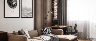
The painting should correspond to the purpose of the room: large canvases with landscapes are placed in the living room, delicious still lifes in the kitchen, abstractions in pastel colors in the bedroom, flowers, fish, animals in the nursery.
It is not recommended to hang overly bright canvases with aggressive subjects in the living room - they will tire your eyes and the atmosphere will be tense.
Sharp plot
Of course, choosing the subject of a painting is a personal matter for everyone. However, interior designers warn against buying a portrait with an unpleasant face or a landscape that is too acidic. Pictures that have a strong psychological impact can become a real problem over time. It is advised to give preference to calm, creative subjects or abstractions.
How and when did transformable furniture appear?
It may seem that the need for transformable furniture appeared only in the 20th century, when the massive construction of apartment buildings was in full swing, and the areas of apartments and rooms became smaller and smaller.
The assumption is logical, but not true. The first folding furniture appeared in Ancient Egypt. The work must correspond to the mood and functional load of the room. A still life is appropriate in the kitchen, in the living room, for example, abstract painting, in the bedroom - a painting that conveys an atmosphere of calm and tranquility. Of course, these tips are not literal; the perception of art is individual for each viewer.
The use of painting in interior styles
Various types of painting are used in almost any interior:
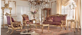
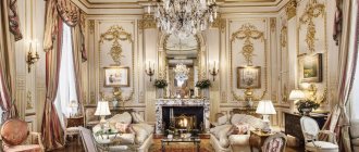
- classic - portraits, seascapes placed symmetrically, genre paintings, bright still lifes, luxurious palace scenes, gilded frames;
- loft - canvases with clear details - landscapes of modern cities, detailed images of cars, motorcycles, buildings;
- country – preferable landscapes, including those done in watercolor, with a rustic theme, still lifes, genre scenes;
- Provence - these are images of flowering fields, still lifes with lush bouquets, rural animals, birds;
- minimalism - a simple canvas in the style of cubism, surrealism, modular paintings are suitable;
- baroque - “rich” design of the frame with carvings, patina, portraits, landscapes, images of palaces, temples of the 17th-19th centuries - both originals and copies;
- Art Deco - here antiquity is combined with oriental motifs, the canvases are mostly bright, the frames are voluminous;
- Japanese - paintings without frames with oriental subjects - portraits of people in Japanese national clothes, cherry blossoms, inscriptions from hieroglyphs.
interior
There is no doubt that the painting by V.V. Pukireva, which he brought to the academic exhibition in 1863, was written in the wake of the personal catastrophe of the young artist, which had an irresistible effect on him. “An Unequal Marriage” is the only painting in his work that can be called truly talented and out of the ordinary. The picture made an incredible impression on his contemporaries: they say that many respectable elders, having looked at Pukirev’s work, refused to marry young women, among them was the famous historian N.I. Kostomarov. Description of the painting: Unequal marriage by Vasily Pukirev →
essays on paintings by famous artists on 1001kartina.su
A magnificent genre painting, but who would want to hang something like this in an office or study? Undoubtedly, this must be a subtle connoisseur of art who understands the avant-garde. Description of the painting Polishers by Kazimir Malevich →
essays on paintings by famous artists on 1001kartina.su
No, that’s not it, Van Gogh seemed to say to himself. Emotion is texture, paint, color, stroke thickness. The world is coming, the world is attacking. The expansion of the world is everywhere, it captures a person who cannot resist the overwhelming influence of the environment. There are passions everywhere, horror all around: something inhuman (or too human?!) dominates, oppresses, overcomes. If you visit a night cafe, it means that you are visiting “a place where you can go broke, go crazy and commit a crime.” This is how Van Gogh wrote, this is how he thought, this is how he portrayed. Description of the painting Night Cafe by Vincent Van Gogh →
essays on paintings by famous artists on 1001kartina.su
It is not easy to see a Vermeer painting here. You can get some impression from the reproductions, and, of course, from the inspired descriptions of eyewitnesses. Only a few dozen works by the master have survived to this day; the “Milkwoman” stored in Amsterdam is one of them. Description of the painting by Vermeer of Delft Thrush →
essays on paintings by famous artists on 1001kartina.su
Ilya Repin’s painting “We Didn’t Expect” makes the viewer a participant in a scene full of emotions, placing us in the center of an emotional whirlwind, an explosion of feelings. The old, black, obsolete is replaced by the new, green, revolutionary. Contrasting pure painting is actually full of reflexes, realistic and beautiful even in the depiction of prosaic life and clothing. But the faces... These are Repin's faces! Great artist. Description of the painting We didn’t expect Ilya Repin →
essays on paintings by famous artists on 1001kartina.su
The famous painting by the Soviet artist Tatyana Yablonskaya depicts a joyful morning and in it is the artist’s daughter. The canvas is permeated with sunlight. Description of the painting Morning by Tatiana Yablonskaya →
essays on paintings by famous artists on 1001kartina.su
Fyodor Reshetnikov’s painting, stunning in the number of layers of emotions shown and unspoken hints, depicts an academically unsuccessful schoolboy who has returned from an educational institution with yet another failure. Description of the painting Again, deuce by Fyodor Reshetnikov →
essays on paintings by famous artists on 1001kartina.su
Variety of subjects and themes in painting
Subjects are chosen that correspond to the design of the room, the personal preferences of the residents - one loves exclusively Russian realism such as K. Bryullov, I. Repin, A. Savrasov, another loves the New York school of painting, which is abstract expressionism, the third likes avant-garde or surrealism.
Chinese painting is characterized by only three genres - portrait, water and mountains, flowers and birds. Since in China everything is decorated in accordance with the traditions of Feng Shui, each element has its own sacred meaning and should be placed not only in a certain room, but also in accordance with the cardinal direction. Russian painting is divided into entire eras - some feature ladies in lush dresses and luxurious palaces of the 18th century, others - the life of a Soviet worker or peasant of the early 20th century, and third - modern man in the developed infrastructure of a metropolis and the reality surrounding him.
The most popular subjects of paintings used for interior decoration:
- people – half-length, group portraits, characters engaged in some activity, resting;
- animals – wild, domestic, as well as birds, aquarium fish;
- still lifes - dishes, any food, flowers, compositions of small household utensils;
- landscapes - rural, urban, sea, forest, with different seasons, buildings, structures;
- fantastic - obscure but intricate plots related to surrealism, futurism, metarealism, etc.;
- geometric - contrasting colored stripes, circles, cubes, fractals that have a clear shape;
- abstractions – the plot is blurred or absent, usually blurry spots, stripes, unclear silhouettes;
- inscriptions - words, letters, phrases, text passages, hieroglyphs, originally designed in color.
A win-win option for any room is portraits of the inhabitants of the room, realistic or cartoons.
Live like an artist: designers recreated interiors from famous paintings
In the breaks between important commissions and plein airs, artists of all times were inspired by simple things: scenes of everyday life, home decoration, the comfort of routine views and actions. Today, for us, such paintings are not only an opportunity to enjoy the work of painters, but also to see with our own eyes the interiors of those years. Where did people sleep at the beginning of the 19th century in France? What did dining rooms look like in Russian houses at the beginning of the 20th century? And what rooms would the queen consider “modest”? Painting gives the answer to all these questions.
British creative agency NeoMam Studios showed what famous interiors would look like in real life. At the request of the Home Adviser portal, 3D graphics specialists and interior designers created three-dimensional models of six residential premises. A serious approach to the task is supported by attention to detail: for example, on the walls you can see the works of artists whose paintings are reproduced in the model.
Vincent van Gogh "Bedroom in Arles", 1888
According to the artist himself, the bedroom in the French city of Arles was for him the embodiment of peace and quiet. Simple furniture, eye-pleasing shades and sunlight softly entering the room through the window - all this has been carefully transferred by the designers into a realistic interpretation.
Grant Wood, The Sun Is Shining on the Corner, 1928
Artist Grant Wood is best known for his painting American Gothic. The presented canvas produces a similar impression: the atmosphere of melancholy and silence of village life seems to hang in the air. The designers’ version looks more cheerful, and the similarity is achieved by maintaining the contrast between the faded gray walls and the lively, bright greenery of the plants.
Wassily Kandinsky "Interior (my dining room)", 1909
The painting was painted during a transitional period for the artist, when Kandinsky had already begun to experiment with abstraction. The image of the dining room perfectly conveys this mood of the author: the unrealistic colorfulness and expressive manner here are obviously a figment of the artist’s imagination and imagination. The designers depicted the room as closely as possible to the reality of that time, adding liveliness through a variety of textures.
Konstantin Korovin “Interior. Okhotino", 1913
The simple comfort of a country house contrasts especially strongly with Kandinsky’s city dining room: wooden walls, a whitewashed stove, sideboards with kitchen utensils and a beautiful tablecloth on the table... It’s like you’re visiting your grandmother 
Roy Lichtenstein "Interior with calm paintings", 1991
The comic 2D graphics of this work turned out to be one of the most difficult tasks for the designers. However, realistic decor only benefited by abandoning the variegated patterns. Transformed into a variety of textile textures, pop art began to sparkle here with new, completely modern colors. And the walls of the 3D model were decorated with two paintings by Lichtenstein himself - as a tribute to the original.
Eduard Gau "The Living Room of Empress Alexandra Feodorovna, Cottage Palace, St. Petersburg, Russia", 1835
The most magnificent decoration in the selection, in fact, served as a “rest for the eyes from all this gold” that surrounded the Empress in the Peterhof Palace. The painting itself is photographically realistic, so recreating the details is a matter of technique 
Photo: homeadvisor.com
Like, add the publication to your Favorites and share your impressions in the comments. Thank you for your attention!
Choice by color
The color design is selected to match the colors of the interior - contrasting or similar colors. Each room requires different colors - light, warm ones visually increase the space, therefore they are recommended for cramped rooms with windows to the north, dark, cold ones - on the contrary, narrow them, so they are hung in more spacious rooms with windows to the south.
In the kitchen, it is recommended to place compositions in green-orange, red-yellow tones - the composition should stimulate the appetite and stimulate the speedy preparation of food. Among the artists recommended are P. Cezanne, G. Klimt, P. Gauguin.
For the bedroom, soft tones, simple subjects, not too colorful are selected (battle scenes, works by F. Roubaud, rough cubism from P. Picasso are completely unacceptable). Colored, monochrome portraits in the nude style by A. Matisse, G. Courbet, brown-yellow-green landscapes by I. Shishkin, pink-orange-blue sea scenes by I. Aivazovsky are suitable.
In the living room they hang large canvases with a bunch of details, a variety of colors - such that guests of the house and owners would be interested in looking at them for a long time. Depending on the style of the room, paintings by I. Bosch, P. Bruegel, S. Botticelli, M. Chagall and others are suitable.
The nursery is decorated depending on the age of the child - toddlers and primary schoolchildren will like “naive art”, fairy-tale popular prints in soft pink-yellow-blue tones; teenagers – neo-realistic painting, colorful pop art, black and white stencils .
How to combine correctly with other decorative elements
Paintings are correctly combined with everything in the room, without creating dissonance. A portrait in a heavy baguette frame will not fit into a minimalist Japanese interior; an abstraction without a frame will not be suitable for Empire, Classic, Gothic, which include luxurious carved, patinated furniture.
Typically, paintings are hung at eye level: large ones - at the same distance from the nearest pieces of furniture; small ones can be placed randomly if they are all on the same wall or at the same height when placed on two or more walls. One and only one is placed in the most visible place, but if space allows, it is not left alone.
The image on the canvas becomes a continuation of the interior or duplicates individual decorative elements located in the room.
Tips on where and how to hang
Interior design of different styles involves different placements, mainly on the wall, but it is permissible to hang paintings on columns or internal steep slopes of attic floors.
Helpful tips for placement:
- You should not place the canvas near the stove or stove - soot is extremely difficult to wash off;
- they should be hidden from the sun - otherwise they will gradually fade;
- the nail on which the structure is supported should not touch the canvas - damage may occur;
- it is advisable to place it at a slight angle relative to the wall - then the dust will settle mainly on the frame;
- Paintings should not be hung near heating appliances - high temperatures spoil them and the paint will crack.
If desired, the paintings are illuminated, drawing attention to them.
Difficulty of choice
When choosing a painting, it is important to take into account the principles of interior design: style, layout, color scheme, and lighting.
To create a harmonious interior, it is important to select canvases of the appropriate style so that there is no dissonance with the general atmosphere of the apartment. If your house is designed according to the principles of a metal high-tech style, then it is unlikely that a piece of the Renaissance era will suit it. The interior can be minimalist, then a painting or photograph will add character.
Textiles in the interior. Fall fashion trends
According to the “fashion pact” adopted by the main manufacturers of home textiles, its production should move to a new level. Now it should become more environmentally friendly and cause minimal damage to the environment. This has significantly influenced the general global trends in fashionable interior fabrics.
However, everything has its exceptions to the rule. In our case, these are styles based on a mixture of aesthetics - fusion, eclecticism, kitsch. In such an interior, a painting or sculpture does not occupy a central place, but is one of the additional details. The principle of kitsch style redundancy is just a technique for creating the desired atmosphere. But such specific interiors are not for everybody.
How to care for oil paintings
Paintings are painted in oil on canvas, other fabric, thick cardboard, and wood. To impart light resistance, protection from water and physical damage, they are coated with a special fir varnish. It is not necessary to protect such a canvas with glass.
The painting is cleaned from dust and dirt with a velvet or flannel cloth, but not too wet - the surface will absorb water and the textile will be damaged. The canvas can be occasionally vacuumed from the back side; if it sag or a noticeable dent has formed, the back side is slightly moistened with water so that the canvas stretches.


