What are posters and what is their fundamental difference from other various interior and other paintings?
The title of my article sounds somewhat ambitious, but no one really has yet given an intelligible answer to this question. Try typing the phrase “what is a poster” into a search engine and you will immediately see several sites that supposedly explain the essence of this printed product. In fact, they all only cite the English interpretation of this term from Wikipedia, which has long corresponded neither to the meaning nor to the form of a modern poster. And they do this only to advertise their products, and not to shed light on this issue. At the same time, even product manufacturers call it this and that. Either a painting or a poster.
What are posters and how do they differ from paintings?
You are probably reading this article not because you have no idea what a poster is. Most likely, lately you have simply stopped understanding what a painting is and what a poster is. And why are posters called paintings in stores? Maybe they are one and the same thing, just called that in a modern way?
Don't be disappointed if I tell you that there is no definitive answer to this question for the reason that the poster has now ceased to fulfill its original function.
And it consisted only of being an effective advertisement in the form of a bright, attention-grabbing poster. As you understand, now completely different products are called posters. But the posters remained posters.
But since there is still no concrete answer to the question “what are posters” in the modern understanding, let’s give it by thinking logically.
I suggest doing this by process of elimination. I will show you examples of different types of fine art, and we will answer the question whether one or another of them can be called a poster, or is it still something else.
Let's start with what is beyond doubt, namely, with authentic paintings by artists. Since we are talking about the original works of artists, it is stupid to come up with any other name for them other than a painting . It can be on canvas or paper, if we are talking, for example, about watercolors, but it is still a painting. Traditionally, they are stretched over a stretcher and placed in the frame.
Here are some examples of actual works by artists currently offered for sale. Just don’t think, please, that I’m advertising them. These are just examples. Now and in the future, I will indicate the order of prices so that you can indirectly understand what it costs and how one differs from the other.
Painting by N.D. Prokofiev "Seascape with fishermen" size 68x96cm. valued at 425,000 rubles.
Price of the painting by Proskurnin I.M. “Rocky coast” size 48x68cm. is 735,000 rubles.
This painting by A.N. Stepanov “Landscape with Cows” measures 58x80cm. valued at 950,000 rubles.
This authentic painting by S.S. Voroshilov “Hunting. Pskovitch" size 97x175cm. estimated at 2,000,000 rubles!
In addition to the original works of artists, there are also copies of these paintings, which can be made by both the authors themselves and other artists. All this is done by hand using the same technologies as the original painting. As a rule, this is done in order to obtain additional benefits. At the same time, sometimes even fairly famous artists did not consider it shameful to paint a copy of some very famous painting. After all, this also requires considerable abilities.
Here are some examples of copies of famous paintings.
This copy of Vasily Perov’s painting “Hunters at a Rest” is valued at only 8,750 rubles. In my opinion, she is not worth more. Below you can compare it with a good reproduction of this painting. And the choice, I think, will not be in favor of the copy.
For a copy of Yuri Neprintsev’s painting “Rest after the battle” they are asking 20,000 rubles.
A copy of Repin’s painting “Ivan the Terrible Kills His Son” is estimated at 25,000 rubles.
Copy of a painting by Cornelis Springer, size 60x40cm. (canvas, oil) is estimated at 46,000 rubles.
And so, we realized that in this case we are dealing with copies of paintings , and calling them posters also makes no sense.
In addition to copies of paintings, there are also reproductions of paintings. This is when a famous painting is photographed and printed on thick paper or a special canvas using so-called plotters. Modern plotters allow you to print reproductions of paintings with very high accuracy. In this case, a non-specialist will have difficulty distinguishing a reproduction from a real painting, especially if it is printed on natural canvas and treated with a special varnish and textured gel. But still it will be nothing more than a reproduction of a painting , and not a poster at all.
I would like to draw your attention to one very important point, in my opinion. In this case, a work of fine art created by the artist’s hand is replicated through printing. I’ll tell you why this is important a little later.
Here are some examples of painting reproductions.
Reproduction of Vasily Perov’s painting “Hunters at a Rest”. The average cost of such a reproduction on canvas measuring 50x33cm. about 3800r.
Reproduction of Pieter Bruegel's painting "Hunters in the Snow".
Reproduction of Van Gogh's famous painting "Starry Night".
Basic rules for creating a wall newspaper
Everyone is welcome to participate in the process of creating a wall newspaper. Parents, teachers and educators will come to the aid of preschoolers and primary schoolchildren, but high school students can easily cope with the creative task on their own. In work collectives, as a rule, activists deal with organizational issues.
First, you need to think about the style in which the wall newspaper will be decorated. There are no restrictions on creativity here - everything that can be realized on paper or fixed on a sheet is allowed. The work includes elements of scrapbooking, quilling, patchwork, embroidery, origami and applique.
Here is a photo of arts and crafts elements that can be used to create a poster:
Most often, hand-drawn wall newspapers are found - they are trusted to be created by those who have certain artistic talents. Let the “artist” do the sketches with a simple pencil, and someone else will do the coloring, text and decoration.
Before creation, you need to outline how the main elements of the poster will be located - inscriptions, applications, drawings, congratulatory messages, photographs, etc.
It is important that the composition is balanced - the title should not take up much space, otherwise the text will have to be made too small
Pay attention to the color scheme - the poster should be bright, but not provocative; it is better to design it in a single palette:
A wall newspaper, as a rule, is drawn up on whatman paper in A1 format, and for large-scale ideas, several sheets are used. The work will look more impressive if you think of a textured colored background to place the main elements. There are several ways to tint paper:
- dip a dry brush in gouache and make strokes in one direction;
- spray paint with a toothbrush;
- stamp the space with a piece of foam rubber and paint.
Whatman paper is tinted, leaving a couple of centimeters on each edge so that the poster does not merge with the wall.
In addition to drawings, applications and compositions, New Year's posters include the following information:
- achievements of the class or school over the past year - victories in competitions and olympiads, sports records, participation in creative and artistic events;
- Happy New Year greetings in prose and poetry;
- interesting facts and history of the New Year holiday;
- joint photographs;
- interactive block with competitions and awarding of winners;
- an envelope in which everyone can leave their New Year's message.
Here are the options for placing the main words:
What then should be called a poster?
To define this concept, let's first look at some examples of what is offered for sale in addition to everything that was listed above and what we have already decided on. Here are some examples.
The examples presented above are all very different both in style, genre, and performance technique. But they all have one very important property in common. Unlike copies and reproductions of paintings, the primary source for their images is not a work of fine art created by a human hand, but an electronic file obtained using one of the digital technologies. This can be a photo or video image, or a file obtained using computer graphics. It, in turn, is divided into raster, vector, three-dimensional and fractal. Each of them has its own advantages. For example, vector graphics are good because they allow you to increase the size of the source file practically without distortion or loss of quality.
3D graphics allow you to create unusual, impressive images. Fractal graphics are the most modern and promising. It is based on the principle of inheritance of object properties, therefore it provides very wide opportunities for creativity.
This property of the above products allows us to call them posters .
For the poster in its original form was also the brainchild of printing products, which most often did not use works of art as source files, but created stories using the technologies available at that time. Such, for example, as applied printed graphics.
Here is one of the surviving advertising posters for the film "Metropolis" (Germany, 1926).
Although this poster is over 90 years old, it is not much different from modern posters of this theme.
Go deeper into theory
You can also read a little in your spare time. It never hurts.
Books
You can start with the history of graphics and poster art.
A collection of more than 500 selected Russian advertising posters.
For those who pay great attention to color. New to the book market - a study by French medievalist Michel Pastoureau on the history of the color blue in Western culture
It should be very interesting.
For those who are fluent in English, this is an excellent book on using color in design.
Bestseller in the world of English-language typography. The authority of the book is recognized both by lovers of the classics and by supporters of the avant-garde.
Websites
Great site for choosing color schemes.
Selection of colors according to color theory. A scientific approach to choosing shades.
Popular color palette for web design with codes.
A great resource about fonts, typography, lettering and letters. You can learn something or just read something new.
Library of cool typography.
What kind of posters are there?
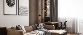
Of course, nowadays the purpose of posters has changed significantly. There are still advertising posters, but the vast majority of them now serve a different purpose. They are used as interior paintings for decorating residential and public spaces.
Digital technologies, with the help of which modern posters are made, make it possible to create images of various topics, styles and genres. Therefore, the choice of posters is much larger than reproductions of paintings. This explains their wide distribution. And their price is quite affordable.
Conventionally, posters can be divided into several categories.
One of the popular categories is photo posters. These are posters created based on beautiful, rare, unusual high-resolution photographs.
In this group, you can separately highlight original posters or so-called prints.
In this case, the author of the photographs agrees to print only a certain, not very large number of prints, thereby increasing the cost and prestige of such a poster.
There are thematic posters dedicated to different sports, art, cars and motorcycles, and cities.
A separate group consists of retro and black and white posters. There is a demand for them too.
Use a library of clipart, fonts and backgrounds
How to make a poster stylish and unique? It’s worth decorating it with stickers and text, decorating photos with frames and masks. The program includes more than 100 ready-made frames and masks, which are divided into categories. You can find a suitable one in the "Effects and Frames"
. There you can also create your own design. To do this, just use the editor.
The process of adding masks and frames to photos
Built-in frame generator window
Photo COLLAGE has a built-in clipart library that contains over 300 different images. They are divided into categories: for example, animals, beauty, flowers, romance. You can also upload your image as a sticker.
The process of transferring clipart to a poster
Section "Text and Decorations"
allows you to create an inscription. It can be changed:
- Set the font, size, style and position.
Use a color from the palette, a ready-made or created gradient, a texture or an image from your computer as a fill.
Add a shadow, outline and adjust their color, width, softness and angle parameters.
The program also includes more than 40 ready-made text styles.
Window for selecting a ready-made style for the inscription
How posters are designed
There are several options for the external design of posters.
The most common of them is when the image is printed on photographic paper, pasted onto cardboard using mat and placed in a frame. This is a fairly cheap option.
A poster on paper using mat size 50x33 costs approximately 2300 rubles.
There is an even less expensive version of posters, when the image is printed on a special canvas and simply stretched onto a stretcher without using a frame.
This poster on canvas without a frame, size 50x33 cm, costs 1,350 rubles.
This option has another version, which received its own name. We are talking about so-called modular paintings or modular panels. In this case, the image is also printed on canvas and stretched onto a stretcher, but only first it is divided into separate segments. The look is quite original, but the price is slightly higher.
Since this article aims to answer the question of what posters are, I note that modular panels are also posters with an image divided into several fragments.
Such a modular painting on natural canvas measuring 75x50 cm will cost 3,000 rubles.
Well, the last option for the external design of a poster is to print the image on canvas, stretch it on a stretcher and place it in a frame. This option is relatively expensive.
Such a poster 50x33 cm on natural canvas and in a natural wood frame will cost 2800 rubles. And if you order a textured gel coating, the cost will be 3,700 rubles.
Canvases for the living room
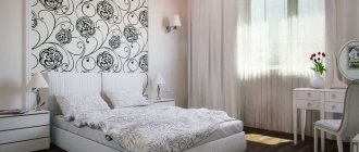
Most often, it is the living room that they try to decorate as much as possible with decorative elements. A black and white canvas will make the room restrained and strict, while a bright colored one will make it dynamic.
Symmetrically hung canvases will add a sense of severity. Canvases of the same size will give the room the appearance of a business office. Large paintings should be placed symmetrically and at a large distance from each other. Then each image will be perceived separately.
Oil paintings with any image will look good in a “classic” living room. A Renaissance painting will fit into a room with dark brown tones, and a painting with a seascape or portrait will fit into a light room. For a living room in the style of “minimalism” it is better to choose bright canvases with city landscapes or trees.
Properly selected canvases structure the interior. A canvas hung in the center of the room will emphasize symmetry. A large painting on an empty wall will create a feeling of integrity.
Related article: Plasterboard partitions: features and installation (+42 photos)
Modular paintings consist of several segments of different sizes, connected by one idea. For the living room, it is advisable to select canvases depicting sunflowers or a rural landscape.
What determines the quality of a poster?
The quality of a poster mainly depends on several factors.
The first is the quality of the materials used. A high-quality poster is printed on natural cotton or linen canvas, stretched on a stretcher and placed in a natural wood frame. To protect against harmful external influences, the canvas is coated with a special protective varnish.
The quality of the source file is important. It must have sufficient resolution to produce clear, large-sized images.
It matters what equipment the products are printed on and what technology is used. A good option is eco-solvent technology, which produces a clear, durable image on canvas without any foreign odors.
The qualifications of specialists matter. If a serious company is engaged in the production of products, then they have modern equipment and a professional team that values its reputation. In this case, for obvious reasons, I do not consider Chinese companies, but Russian companies, for example, meet the described requirements, for example, Artwall.ru. By the way, it was their products that you saw in the previous section, where poster design options were described.
Rule #1
Posting rules.
• Horizontal row. This type of hanging can decorate any empty surface. It is better if the number of posters is odd. A horizontal row of posters will balance out the free space and give it volume.
• Rectangle of four posters. This placement is suitable for a room with a high ceiling. Place them closer to each other so that they visually look like a single unit, and a “window” effect will appear. The main thing is that the pictures are light and the frames are thin. You can not limit yourself to four posters, but take six or eight - the number depends solely on the size of the room.
• Symmetrical arrangement. Posters with similar images, the same size and the same frames are suitable for this. Symmetrical hanging will balance the interior of the room - the reflection effect will work.
• Asymmetrical arrangement. In asymmetrical hanging, it is better to use posters of different sizes. Here you can experiment - arrange them according to plot or theme. The distance between them should not exceed the size of the palm, otherwise the overall composition will be disrupted.
Summarize
First of all, I must remind you that I have given you my own, subjective version of what posters are. It seems to me that the arguments presented are not without logic. In any case, I don’t know of any other reasoned version on this matter.
And such a situation arose, I think, because the term “interior paintings” appeared, indiscriminately combining all types of these products, be they copies, reproductions of paintings or posters. Moreover, the modular panels that have become popular were for some reason called modular paintings, which also added uncertainty to this issue. As a result, many no longer understand anything and prefer not to bother with terms.
In addition to this article, information on the topic of paintings and posters is available here.
I will be glad if my reasoning turns out to be useful to you, and you will be able to more intelligently choose interior paintings for yourself, including posters. Moreover, they really are an excellent means for decorating interiors, giving them comfort, originality and some kind of semantic meaning.
If you consider yourself a creative person and are interested in paintings and posters, then perhaps
Horrible office
Poor Reliability Convenience Appearance Price Support Functionality
Minuses
Integration with smartomato does not work at all
Every day the terminal freezes and does not turn off for 3 hours
They absolutely do not know how to solve problems that arise; in our case, they spent 2 years solving 2 problems and did not solve them
They will not compensate you for anything if they caused you damage. Even the subscription won't be renewed properly
Very narrow-minded employees on the technical support line absolutely do not understand and do not want to understand the problems of their clients and ignore their solutions
They can easily block your ability to contact them if they don’t like the way you communicate with support, even though this communication will be justified, because you are suffering huge losses, and they do not solve the problems that arise
Very often the service doesn’t work at all, the servers just go down and that’s it
We worked with them for 2 years and now we are leaving for another service, I strongly advise you not to contact them, otherwise, just like us, you will lose a lot of time, money, clients and nerves. In 2 years we lost more than 340,000 rubles and a bunch of clients. I sincerely wish this office to close and not create problems for people
Common mistakes and solutions
We have discussed with you how to postpone publication on VK - we have provided all the existing instructions. Now let’s briefly outline the problems that novice VK users face:
No timing key
Please note that this option is only available to community owners or personal page owners; Can't make a delayed recording. Check if you have exceeded your daily or total limits? VK posts pending posts ahead of time
Make sure there is no confusion with time zones in your case. For example, you, as an admin, lead a Moscow group while being in Kaliningrad. Please be aware of the time difference. Customized posting does not help increase reach. Perhaps your timing is not the best. Try not to use round numbers (as most people do). For example, don't post exactly at 5:00 p.m. or exactly at 6:30 p.m. It's better to do it on 17.06 or 18.39. In this case, your posts will not mix with others and will appear separately in the feeds. The trick is very minor, but very effective, believe me!
Happy administration! What posting features do you use? Share!
Where to get images for a poster
Draw it yourself
If you don’t want to use existing images and have someone else use your images in their work, create them yourself!
You can use a graphics tablet, Adobe Illustrator, Photoshop, or other tools to create images.
Free download
There are a sufficient number of resources with free images. The same Flickr. But the danger is that thousands of marketers like you can search for images on these resources. In addition, not all photographs can be used in advertising, primarily because none of the people in the photographs signed the model's release.
Buy on stock
The best option is to buy an image from a photo bank. If you don’t know which license to choose for a specific project, here is an article where everything is described in detail.
See more photos at.
Registration requirements
Creating a poster presentation is not a creative process limited by strict boundaries, but there are useful recommendations, adherence to which will help make the message as informative and easy to understand as possible.
To attract maximum attention, you should follow these recommendations:
- place information vertically on an A0 sheet (unless the organizers have other requirements for media size);
- use a minimum of text (no more than 25% of the total material), express ideas clearly, giving preference to simple sentences and lists;
- to highlight the names of sections and subsections, use bold font or larger letters;
- the font size should be sufficient for easy reading from a distance of one to two meters: the main text is at least 24 pt, headings are 28–44 pt);
It is advisable to use sans serif fonts, for example Arial or Helvetica. Unlike traditional Times New Roman, they are better suited for reading at a distance.
- the color of the text should contrast with the background, the unspoken rule is dark text on a light background and vice versa;
- graphic material should be varied: tables, drawings, diagrams, photographs;
- All illustrations must have sufficient resolution (at least 300 dpi) to avoid pixelation.
