A beautiful and cozy kitchen is the pride of every housewife who spends a lot of time there. Therefore, it is important that the interior of this room is not only stylish and beautiful, but also replenishes the supply of vivacity and energy. Red kitchen design is a difficult but interesting solution that copes well with this task, if only you know how to correctly use its shades in interior design.
General recommendations for decorating a kitchen in red
For some reason, many people do not dare to use red when decorating their kitchen; they prefer calmer and softer ones: brownish, beige or snow-white. And in vain: reddish tones in the interior look original, unusual and even festive.
They create a warm atmosphere in the room, improve mood and give vigor.
But you need to take into account that they are not suitable for everyone and that the red color in the interior has its disadvantages:
- Red shades in the kitchen should be used sparingly or completely abandoned if there are hypertensive or hyperactive children in the family.
- This design is not suitable for introverts and people who prefer a quiet, calm environment. They will feel uncomfortable in the red kitchen and will want to leave as quickly as possible.
- The color red greatly excites the psyche; it does not provide the opportunity to relax and relieve stress.
- The red color scheme for the kitchen interior is considered unsuitable for people engaged in strenuous work.
- Dark shades, such as cherry, are not suitable for decorating small kitchens, as they visually “steal” the space and make the room less bright.
And yet, red kitchens have more pros than cons:
- They attract attention and make even the simplest room design memorable.
- Red increases blood pressure and is therefore excellent for hypotensive people.
- This color improves brain activity and encourages a person to be active.
- Shades of red give confidence.
- Reddish tones go well with many other colors.
- Red brings a touch of luxury to the room: in the old days, it was considered the color of the aristocracy and ruling houses.
- Allows you to create interiors in a wide variety of styles: from Romanesque to high-tech and loft.
To make a red kitchen look interesting and attractive, you need to carefully think through its design down to the smallest detail.
IMPORTANT! It is not recommended to make monochrome interiors, since in large quantities this color increases aggression, causes a feeling of anxiety and a feeling of discomfort.
It should be used locally, for example, by making furniture facades or the ceiling, or walls, or floor red. But only separately, and not all at once.
If we are talking about a small kitchen, then red should be used as patterns in one of the shades of the mosaic or multi-colored tiles.
Red kitchens: how to use fiery colors correctly?
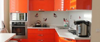
Red is quite dominant, but by combining it correctly with other colors you get a slightly different effect every time. The easiest way is to paint the walls different colors. You can decorate one of the light surfaces with an original sticker depicting poppies or use a decorative template. All you need is a special mold with a design cut out and a can of red spray paint. It is also worth experimenting a little with furniture fronts and accessories. Red lower cabinets will look great with snow-white facades of hanging structures.
Organizing a kitchen in red is quite difficult, as it is easy to create multi-colored clutter. That's why it's good to choose 2-3 colors to create a harmonious composition. Red cuisine is bold and original. It can be fiery and more delicate, for example, coral. Red combines harmoniously with black or wood color, creating a contrasting effect. Walls, furniture or accessories can be a fiery color, but you should definitely focus on only one of these elements. Red looks beautiful on high-gloss furniture. To liven up the interior, you just need to apply a red accent in the form of several cabinets.
Important! When choosing a color for a room, it is worth considering the proven rule that 60% of the area is the main color, so most often this is the color of the walls or furniture, 30% is an additional color, which consists of the floor, curtains and other things, and 10% is small items of equipment (decorations, paintings, dishes, etc.).
Choosing a red set
In a red kitchen set, the red color should be combined with other shades. A combination of different materials will look advantageous. For example, plastic or wood with glass inserts.
Often red sets are made in the Art Nouveau or minimalist style. Their bright, rich color goes well with laconic forms and the absence of excessive decor or flashy fittings.
Spectral red is not used often; tones such as terracotta, cherry, coral or wine are more popular.
Wooden furniture in muted reddish shades is also suitable for country style. They will also be good when decorating an interior in a classic style, but they will need to be combined with softer and calmer shades, such as white, ecru, beige, and brown.
IMPORTANT! The red kitchen set can be either matte, suitable for classic styles, or glossy, ideally fitting even into ultra-modern styles.
Choosing curtains for a red kitchen
To avoid rapid fading of textile shades, give preference to curtains made of high-quality dense natural fabrics in light colors. If the kitchen is located on the shady side, then it is better to use translucent thin fabrics in a reddish color scheme.
Curtains in rich darkish shades greatly weigh down the room and visually make it gloomy.
It is not necessary to use single-color curtains: patterned curtains often look more original and impressive.
IMPORTANT! If the walls in the kitchen are covered with wallpaper with a large, rich pattern, choose plain curtains in neutral tones that match the main color scheme.
For country-style kitchens, a good solution would be curtains in medium-sized white and red checks or vertical stripes, which will give the interior a touch of rusticity. In a classic interior, red curtains with golden patterns in Roman or Empire styles will look good.
Choosing wallpaper
The abundance of red and other bright colors has a negative effect on the psyche. When choosing wallpaper for a red kitchen, it is better to give preference to neutral tones, such as light gray, white, ecru, and beige. Light coffee wallpaper or natural wood shades are also suitable.
In large kitchens, you can create an accent wall and highlight it with wallpaper in a contrasting color.IMPORTANT! A good solution would be photo wallpaper that can be placed in the dining area or in the living room combined with the kitchen.
If the kitchen set is light, the walls are decorated in red colors like this:
- A single color accent wall on a main patterned background. You can place hanging open shelves, photos or framed paintings on it.
- Patterned wallpaper, the pattern on which repeats the tone of the headset.
- Wallpaper with a large pattern, which repeats the same pattern as on the apron.
Wallpaper and furniture should be in the same style. A carved antique set will look bad against the backdrop of modern wallpaper with a bright abstract pattern, or furniture in the Art Nouveau or high-tech style if placed in a kitchen decorated with “baroque” wallpaper with monograms.
Regardless of its design, wallpaper in the kitchen should be waterproof, easy to clean, not fade in the sun, and withstand high temperatures well. You should not save on their purchase, since cheap wallpaper turns out to be fragile and soon begins to move away from the walls or swell with bubbles.
You should only purchase wallpaper for your kitchen from trusted manufacturers, and not those that are easier to find or cheaper to buy. Such dubious savings often cause the need for new repairs much faster than desired.
Red wallpaper in the kitchen
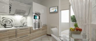
The kitchen is perhaps the last place where wallpaper is chosen as a finishing material. However, more and more interior design magazines are featuring proposals for kitchens decorated with patterned wallpaper in red. How is this possible? Are there wallpapers for which grease, moisture and high temperatures are not a problem? Of course, these are vinyl canvases! This wallpaper is very wash-resistant and easy to apply, and at the same time has an interesting and original design. Today you will find high quality, fashionable red wallpaper. If you want to see an example, then look at the presented photo gallery of this article.
Properties of red vinyl wallpaper for the kitchen
Non-woven vinyl wallpaper is not just a simple alternative to conventional paint or tile. This is the best solution. These wallpapers are made of durable material, vinyl, which is resistant to temperature and humidity. They can also be washed, since the structure will not be damaged even with intensive cleaning of the walls. Unlike conventional paints, red vinyl wallpaper for the kitchen can be washed with a sponge and detergent without affecting its color or pattern, which means that it is not afraid of kitchen stains. It's hard to imagine a more practical covering for kitchen walls than washable wallpaper.
Moreover, vinyl wallpaper is fire-resistant, which increases the safety of using the room. It is not without significance that they improve the acoustic properties of the interior. Thanks to their use, the morning sounds of grinding coffee or mixing smoothie ingredients will never disturb other family members.
But this is not all the properties of red vinyl wallpaper. With their help, you can also strengthen the structure of the walls and significantly disguise various defects, such as cracks or minor flaws in the plaster. In addition, vinyl wallpapers are UV resistant, so they retain their beautiful appearance for many years!
Pasting without unnecessary interference
An important advantage of vinyl wallpaper is also its ease of pasting. For this type of wallpaper, the adhesive is applied directly to the wall, without the need to spread it onto the wallpaper itself. This significantly speeds up renovation work without tedious cleaning.
How to decorate your kitchen interior using red vinyl wallpaper?
What style will the vinyl wallpaper look like? Absolutely in everyone. Red wallpaper can cover an entire room or provide an interesting accent on one wall. With red, you don't have to worry about how quickly the color will stain. Even light shades will retain their charm for a long time. Consider examples of projects for the chosen design, which can inspire fashionable renovations.
Although the only limit when decorating a red kitchen is your imagination, it is worth remembering that wallpaper, especially bright or bold ones, can optically make the interior appear smaller or larger. If the kitchen is low, then red wallpaper with vertical stripes will be a wonderful choice, making the room look taller. For a small kitchen, you should pay attention to bright colors and small prints, but for a large kitchen, you can confidently experiment with fashionable geometric wallpaper.
Choosing an apron
A kitchen apron protects the walls from drops of water, grease and fumes getting on them and only then performs a decorative function. It should not only be beautiful, but also durable, heat and moisture resistant. It is important that water, drops of grease or other contaminants can be easily removed from the kitchen apron. That is why it is better to give preference to materials with smooth rather than embossed textures.
The kitchen apron can be decorated in red tones. The ideal material for it would be ceramic tiles or mosaics. These wall coverings are beautiful and durable; they will delight owners and their guests with their almost new appearance for many years and decades.
Such an apron can be made in the same shades as the set or be contrasting with it in color scheme.
You can also choose a kitchen apron made of impact-resistant glass. It can be transparent or decorated with photo printing, special interior stickers or hand-painted.
Glass aprons depicting fruits, flowers or abstract patterns, as well as forest, mountain landscapes or city panoramas fit best into kitchen interiors.
If you don’t like a red kitchen apron, then make it black, white, beige, grayish, silver or light brown.
IMPORTANT! From materials other than ceramic tiles and mosaics, you can choose natural or artificial stone, metal or brick for such an apron.
Photo gallery
Red and black kitchen
The combination of these colors is considered classic, but the red and black interior of the kitchen does not always work out well. An excess of black elements will make the room dark and gloomy. If red predominates, the kitchen will look too bright and provocative.
The most difficult thing when developing a design is to achieve the correct ratio of black and red colors. But if you manage to do this, then the room is literally transformed: it becomes more interesting and more attractive.
Most often, such designs are dominated by a black bottom and a red top. But if you want to experiment with this bold and beautiful combination, then try placing the headset sections and drawers in a checkerboard or random order.
This design solution will allow you to avoid monotony in the kitchen and make its interior more dynamic and original.
Red and white kitchen
The combination of red furniture and white walls results in a harmonious and bright interior design that visually enlarges the ceiling. In this case, it is considered acceptable to use bright spectral shades.
IMPORTANT! If the walls are red, it is better to give preference to muted tones, such as cherry or wine.
Red and gray kitchen
For red-gray interiors, it is preferable to use cool gray-violet and bright reddish-orange tones. To smooth out too sharp a contrast, they can be complemented with brownish or beige shades with a cool undertone.
A combination of these shades with steel elements will also look good, especially if the room is decorated in a modern style.
Black and white red kitchen
With this combination, the tonal and color contrast of red and black is somewhat smoothed out and the interior looks harmonious and original. Experienced designers recommend arranging these colors like this:
- The bottom set is black or black with small inserts of red elements.
- The top of the furniture is red.
- The apron and wallpaper are white, perhaps with a small, discreet pattern.
IMPORTANT! This color scheme fits perfectly into modern styles, but it also looks good in a classic design.
Red-beige kitchen
The red and beige interior looks stylish and elegant. It does not create too sharp contrasts, like a combination of red with black or white, but it creates an atmosphere of comfort, home warmth and family coziness in the kitchen.
In such a kitchen, furniture or parquet made of natural wood would be appropriate. It is also important to consider that beige goes best with bright and warm reddish-orange tones.
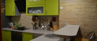
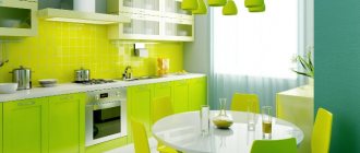
Red and green kitchen
The combination of red and green in the kitchen interior makes it original and at the same time brings it closer to nature. But it is necessary to remember that not all tones of red and greenish combine well with each other.
IMPORTANT! The optimal solution would be a combination of only warm or exclusively cold shades.
For example, red-orange with lime or cool raspberry red with emerald.
Dark red kitchen or burgundy
Dark reddish tones look noble and elegant. They fit well into most styles. Colors such as wine or burgundy do not irritate people's psyches and do not tire the eyes.
Burgundy and dark red shades look good in classic interiors, such as Empire or Victorian style.
But you need to remember that these tones visually make the room smaller and are not suitable for small kitchens.
Yellow and red kitchen
Such a room seems filled with warmth and comfort. But to make it less “hot”, it is recommended to alternate red and yellow design elements with more neutral colors. White, black, grayish, brown and beige or milky shades are suitable for this.
It is important to take into account that this color scheme is better suited for rooms facing the shady side.
IMPORTANT! If in winter you want to “let in” as much light and heat as possible into the room, then in summer it will not be very comfortable to be in a red-yellow kitchen due to the increased warmth of these colors.
Also pay attention to the fact that you will need to choose the main and additional shades: in equal proportions, red and yellow will “interrupt” each other with brightness and saturation, such an interior will look inharmonious and even flashy.
Fashionable red kitchen: photos of real interiors
A red kitchen can be the real pride of an apartment, but everything must be thought out. Interior designers warn against an excess of flaming shades, therefore, when choosing red walls, you should focus on the neutral color of the furniture and vice versa. Too many carmine accents can irritate, tire your eyes and overwhelm the interior.
A red kitchen looks great in a modern style. Smooth, shiny surfaces attract the eye and add glamorous style to the composition. Functional furniture with straight lines will look great when paired with black marble countertops and glass accessories. A red kitchen cannot do without designer lighting. It is worth betting on halogen or LED lamps.